Weatherdem's Weblog

Bridging climate science, citizens, and policy


Leave a comment

Colorado Sues Longmont over Longmont’s Stiffer Drilling Regulations

The state of Colorado wants to do everything it can to facilitate fossil fuel development, even if that means putting drilling rigs in the middle of housing areas.  The city of Longmont doesn’t think drilling should take place amidst residential areas, but the Colorado Oil and Gas Conservation Commission doesn’t care about local controls – they’re pro-drilling no matter the consequences.  So the Boulder County DA is suing Longmont to invalidate the city’s common sense regulations.

The federal government cracked down on Colorado medical marijuana dispensaries that were within 1000ft of schools earlier this year.  Does anyone think the feds will crack down on drilling rigs within 1000ft of those same children’s’ homes?  Toxic pollution from drilling is okay, but not a facility that has similar legal rights to exist and participate in commerce.

Does the state really want to fight for fossil fuel drilling instead of children?  What kind of public policy is that?


Leave a comment

1st African Tropical Wave of 2012 with a Chance of Development

The Atlantic basin has been relatively quiet so far this year.  While four tropical storms formed prior to July (the earliest on record), all of them were weak and short-lived since they formed on the western side of the basin.  This situation is largely due to higher wind shear than normal and a strong high pressure region, which pushes air toward the ground instead of lifting it.

The National Hurricane Center in Miami, FL has issued an outlook for an area of disturbed weather currently centered 1,150 miles southwest of the Cape Verde Islands.  The center is giving Invest 99L a 20% chance of tropical cyclone development within the next 48 hours – still pretty low, which means the system bears watching as it makes its way across the Atlantic over the next week.

The system is near 9°N 36°W.  9°N (click for a decent IR satellite image), which is relatively close to the Equator as far as tropical systems are concerned.  Disturbed weather at this latitude have a hard time acquiring the angular momentum necessary to grow into a cyclone.  If the system were to angle northwestward for a few days, it would stand a much better chance of development by the time it reached the Lesser Antilles.

Wind shear is minimal in the area (5-10knots).  Sea-surface temperatures have been warm enough for tropical cyclone development for months, so that’s not an issue with this system.

The GFS ensemble members project Invest 99L to move through the eastern Caribbean island chain sometime next week.  The specific timing for this will have to wait until we’re much closer in time.


6 Comments

Graphical History of 100 Degree Days in Denver & Possible Warmest July/Month

After a little bit of digging, I found the local NWS Office’s list of 100 degree days in Denver since 1872 – a 140 year history.  I’ve graphed number of occurrences by year:

Photobucket

The data is valid through the 28th of July, 2012.  As I’ve stated in previous posts, the previous yearly maximum number of occurrences took place in 2005 with 7.  So far this year, the temperature has exceeded 100°F 13 times.  At this point, I do not expect the NWS to record another 100°F day during the rest of this year.  While it has been warmer than normal in Denver, the North American monsoon season has kicked into gear, which suppresses daily maximum temperatures due to cloud formation.  The afternoons cannot get as warm with widespread, thick clouds as they could prior to the monsoon when the sun warmed the ground throughout the day.

Note that while 100°F day incidence appears to be increasing, I am not making any claim as to the statistical significance of such a development.  The linear trend (not shown) over the entire dataset is slightly positive, but these events are too rare from which to draw robust conclusions.

That said, the average temperature through the 28th of July in Denver is 78.9°F.  The Denver/Boulder NWS Office has the top-10 warmest Julys list:

10 WARMEST JULS
(1872-2011)

77.8 1934 #
77.7 2005
77.6 2008
77.3 1936
77.1 1939
76.9 1966, 2003
76.8 1954
76.7 2000, 2001
76.6 1901
76.4 1980

With only three days remaining, July 2012 has a very legitimate shot at the hottest July in 140 years’ of record-keeping.  If the average temperature remains near 78.9°F, 2012 will also beat out 1934’s 77.8°F by over 1°F!!  And while the 1930s were a very warm decade, note further that 5 of the warmest Julys on record occurred during the 2000s.

What is the `#` symbol in the table?  The NWS notes this:

# Warmest Month in Denver History.

If July remains anomalously warm from today through Tuesday, July 2012 will be the warmest month in Denver history.  This follows on the heels of the hottest June on record: 75°F, which beat the old record of 73.5°F (June 1994).


Leave a comment

41st Day of 90°F+ Heat In Denver, CO

While 90°F might sound like a low threshold for many across the US Midwest, the total number of 90°F days for Denver in 2012 is racing for the record books.  An average year yields 32 90°F days in Denver – or at least an average year in a cooler climate.

Through the 26th of July, 2012, Denver, CO has recorded a total of 41 days of 90°F+ maximum temperatures.  Wednesday was the last day that could have registered a sub-90°F temperature, but 90°F was the recorded high for the day.  As such, the latest streak of 90°F+ days continues: 16!  That streak edges out the 15-day streak Denver already recorded earlier this summer.  So not only have temperatures been warmer than normal more often than normal, they’ve been warmer than usual for extended periods of time.  That means that ecosystems haven’t had their normal chance to recuperate from such high temperatures – a point that I will spend more time on in an upcoming post.
That streak is likely to continue: the forecast for the next 7 days includes highs in the mid- to upper-90s.  Denver could witness a July with only 4 days below 90°F.  So far this month, the average temperature departure from average is +4.7°F.  That isn’t as high as June (+7.6°F), but the general trend is clear: 2012 is very warm for Denver, CO and other locations across the mid-section of the US.


Leave a comment

13th Day of 100°F+ Heat In Denver, CO

This is a short update to a recent series on this topic (last post here).

Through the 23rd of July, 2012, Denver, CO has officially recorded a total of 13 days of 100°F+ maximum temperatures.  The previous year with such heat was 2005, when the NWS recorded 7 such days.  We are on the cusp of doubling the previous number of 100°F+ days.  Due to Denver’s latitude (~40N) and altitude (~5,200 ft. above sea level), 100°F days are rare.  This year is developing a series of very anomalous heat and drought observations.

Denver has also now recorded 38 days of 90°F+ days, so only 12 more such days need occur the rest of this year to make the top-9 list.

Denver is also in the midst of another consecutive 90°F+ day streak: 13 through yesterday (11 Jul – 23 Jul).  That is in addition to the previous 15-day streak the city recorded from late June through early July.  The streak will continue through today before slightly cooler temperatures (only 89°F?) occur Thursday, then right back into the 90s starting Friday.

The thought of autumn and cooler temperatures is very appealing.


2 Comments

NASA & NOAA: June 2012 Was 4th Warmest On Record

According to data released by NASA and NOAA this week, June 2012 was the 4th warmest June globally on record.  NASA’s analysis produced the 4th warmest June in its dataset; NOAA recorded the 4th warmest May in its dataset.  The two agencies have slightly different analysis techniques, which actually helps to reinforce the results from each other.

The details:

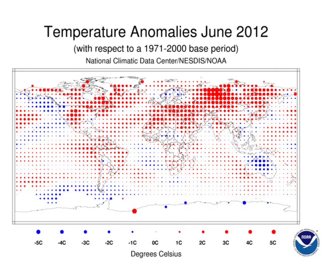
June’s global average temperatures were 0.56°C (1.01°F) above normal (1951-1980), according to NASA, as the following graphic shows.  The warmest regions on Earth coincide with the locations where climate models have been projecting the most warmth to occur for years: high latitudes (especially within the Arctic Circle in June 2012).  The past three months have a +0.59°C temperature anomaly.  And the latest 12-month period (Jul 2011 – Jun 2012) had a +0.52°C temperature anomaly.  The time series graph in the lower-right quadrant shows NASA’s 12-month running mean temperature index.  The recent downturn (post-2010) is largely due to the latest La Niña event (see below for more) that recently ended.  As ENSO conditions return to normal, the temperature trace should track upward again.

Photobucket

Figure 1. Global mean surface temperature anomaly maps and 12-month running mean time series through June 2012 from NASA.

According to NOAA, June’s global average temperatures were 0.63°C (1.13°F) above the 20th century mean of 15.5°C (59.9°F).  NOAA’s global temperature anomaly map for June (duplicated below) reinforces the message: high latitudes continue to warm at a faster rate than the mid- or low-latitudes.  Unfortunately in June 2012, almost the entire Northern Hemisphere was warmer than normal.

Photobucket

Figure 2. Global temperature anomaly map for June 2012 from NOAA.

The extreme warmth over Siberia is especially worrisome due to the vast methane reserves locked into the tundra and under the seabed near the region.  Methane is a stronger greenhouse gas than carbon dioxide over short time-frames (<100y),which is the leading cause of the warmth we’re now witnessing. As I discussed in the comments in a recent post, the warming signal from methane likely hasn’t been captured yet since the yearly natural variability and the CO2-caused warming signals are much stronger.  It is likely that we will not detect the methane signal for many more years.  Of additional concern are the very warm conditions found over Greenland.  Indeed, record warmth was observed at a 3200m altitude station earlier this month.  3.6°C may not sound that warm in July, but look at the station’s location:

Photobucket

Figure 3. Location of Summit Camp, Greenland.

The station is in the middle of the massive Greenland ice sheet at ~10,500ft elevation.  It is difficult to warm this area enough to register above freezing temperatures.  Multiple stations on the top of the ice sheet similarly observed record warm temperatures recently.  What happens when air temperatures are above freezing with the mid-summer sun shining down for most of the day?  Record flooding occurs.

These observations are also worrisome for the following reason: the globe is still exiting the latest La Niña event:

Photobucket

Figure 4. Time series of weekly SST data from NCEP. (NOAA)  The highest interest region for El Niño/La Niña is NINO 3.4 (2nd time series from top).

As the second time series graph (labeled NINO3.4) shows, the last La Niña event hit its highest (most negative) magnitude more than once between November 2011 and February 2012.  Since then, SSTs have slowly warmed back toward a +0.5°C anomaly (y-axis).  La Niña is a cooling event of the tropical Pacific Ocean that has effects across the globe.  It is therefore significant that the past handful of months’ global temperatures continued to rank in or near the top-5 warmest in the modern era.  You can see the effect on global temperatures that this last La Niña had via this NASA time series.

As the globe returns to ENSO-neutral conditions this summer and early fall, how will global temperatures respond?  Remember that global temperatures typically trail ENSO conditions by 3-6 months: the recent tropical Pacific warming trend should therefore help boost global temperatures back to their most natural state (i.e., without an ENSO signal on top of it, although other important signals might also occur at any particular point in time).  Looking further into the future, what will next year’s temperatures be as the next El Niño develops (as predicted by a number of methods, see figure below)?

Photobucket

Figure 5. Set of predictions of ENSO conditions by various models (dynamical and statistical).  To be considered an El Niño event, 3-month temperature anomalies must be measured above +0.5°C for 5 consecutive months.  Approximately 1/2 of the models are predicting a new El Niño event by the end of this year.  The other models predict ENSO-neutral conditions through next spring.


Leave a comment

Short Arctic Sea Ice Update – 20120723

Here, in a sneak peak of my monthly `State of the Poles` post, I wanted to mark a significant event: the area of Arctic sea ice has fallen below the climatological minimum.  This occurs with ~6 weeks left in the Arctic melt season.  In similar fashion as in other recent years, UIUC data show Arctic sea ice area values at a stunning -2 million sq. km. below the average value for this date in time.  Instead of 6.5 million sq. km., today’s value is 4.5 million sq. km., the record lowest for this calendar day.  Conditions on the Pacific side of the Arctic sea ice pack (another graphic here) are starting to deteriorate, so rapid melt of additional hundreds of thousands of sq. km. of sea ice could occur in the next month or so.  The recorded history yearly minimum sea ice area is ~2.91 million sq. km.  Stay tuned for this year’s minimum, which will likely occur in early September.


3 Comments

10th Day of 100F+ Heat In Denver, CO

Through the 19th of July, 2012, Denver, CO has officially recorded 10 days of 100F+ maximum temperatures.  The previous year with such heat was 2005, when 7 such days were recorded.  Due to Denver’s latitude (~40N) and altitude (~5,200 ft. above sea level), 100F days are rare.  This year is developing a series of very anomalous heat and drought observations.

Denver typically experiences 32 90F+ days per year.  With most of the summer still to go, Denver has already surpassed that mark.  It appears the city is targeting the top-10 90F days in a year.  That record is held by 2000 when there were 61 days of 90F maximum temperature or higher.  Note that six years since 2000 populate the top-9 list: 2000, 2002, 2005, 2006, 2007, and 2011.  There are only four years prior to 2000 in the top-9 (three are tied for 9th): 1994, 1978, 1964, 1960, and 1874.  The 9th place years recorded 50 90F days.

So far in 2012, there were 2 90F+ days in May, 17 in June, and 15 so far in July, for a year-to-date total of 34.  Denver likely recorded an additional 100F day today and will do the same thing tomorrow.  The extended weather forecast doesn’t call for a high less than 90F for the next 7 days.  Beyond that, above-average temperatures are forecasted for both the next month and the next 3 months.  90F daily maxima are not unheard of in the first couple weeks of September and I don’t at this point expect conditions to be cooler than that this year.

15 consecutive days were 90F+ from the 22nd of June (102F!) through the 6th of July.  If all those records hold up to quality control, that should tie for 7th on the list of most consecutive days with 90F or higher:

2008 JUL 13TH — Aug 5th……24
2011 JUL 15th — AUG 1st……18
1901 JUL  6TH — JUL 23RD…..18
1874 JUL  1ST — JUL 18TH…..18
2000 JUN 29TH — JUL 15TH…..17
1987 JUL 18TH — AUG  2ND…..16
1934 JUL  7TH — JUL 21ST…..15

Notice how the majority of these dates begin in July, not June.  Note further that there were three other times when such a streak began within one day of June 22nd (see full list).  The reason the streak stopped on the 7th of July was a temporary appearance of North American monsoon moisture that made its way from the Gulf of Mexico around the western periphery of the massive high pressure system that is at the heart of the record setting heat wave and drought afflicting the US this year.

So: will 2012 challenge 2000 for the most 90F days in one year?  There are only 16 more days before Denver makes the top-9 list, then 11 more to tie for 1st place.  This isn’t a record most of us want to see happen, of course.  I would much rather see the monsoon return with a vengeance and alleviate the precipitation deficit under which the area is suffering this year.

Will another noteworthy consecutive 90F streak occur?  Denver has 9 in a row through yesterday.  With today’s likely 100F, another streak of 10 joins the list.  As mentioned earlier, conditions don’t look like they’ll change any time soon.  2012 could see two extended streaks of 90F+.  Stay tuned.


5 Comments

2012 U.S. Drought: Impacts & Historical Context

The National Climate Data Center, in its summary of drought conditions as of the end of June 2012, reported that 55% of the contiguous U.S. was experiencing moderate to extreme drought, as the graphic below shows.  This is the largest percentage since December 1956 when 58% of the U.S. experienced similar conditions.  The Palmer Drought Index, whose data base goes back 112 years, is relied upon for drought comparisons before 2000.

Photobucket

Figure 1. Drought conditions across the United States as of early July 2012 from the Drought Monitor.

In my last post on drought, I stated, “There’s no widespread crisis to speak of yet, but inhabitants as well as policymakers should monitor conditions as the year progresses.”  Well, the NCDC established the case for a widespread crisis with their latest summary, which was not issued until after my post.  Crops and livestock are now being negatively affected.  The following two charts show corn and soybean prices.  The recent peaks are due to worsening conditions across the breadbasket and the USDA’s recent crop downgrade.

Photobucket

Photobucket

Figure 2. Corn (top) and soy (bottom) prices and volume charts for the past 12 months.

[h/t Bonddad]

1988 was also a very bad year for corn in the U.S.  Here is a chart from the USDA comparing 1988 and 2012 corn ratings:

Photobucket

Figure 3.  Comparison of corn ratings (good + excellent) as determined by the USDA as of early July 2012.

You can see that conditions in 1988 worsened earlier in the year (solid blue line @30% ~3 weeks before the solid yellow line).  It remains to be seen how bad conditions eventually get in 202.

So conditions are the worst since Dec. 1956.  How else do today’s conditions compare to earlier droughts?  The following graphic from USA Today helps put them in context:

Photobucket

Figure 4. Comparison of extensive drought in U.S. history.

The percentage of the country in moderate to severe drought in June 2012 is the sixth highest since 1900.  The 1930s are well known as Dust Bowl years.  Conditions aren’t expected to get that bad, even if drought were to dominate the area for the next few years, primarily because of changes in farming practices.  Topsoil was easily scoured from the earth in the 1930s and was moved around by winds, sometimes for dozens or hundreds of miles, hence the name ‘Dust Bowl’.  The droughts of the mid-1950s were also quite extensive.  The U.S. is fortunate that the return period of these conditions was ~55 years.

I’ve also written in my drought posts that the current drought, extensive and intense as it is, is not without historical precedent and that a clear climate change linkage is not available at this time.  With generally warmer temperatures and more variable precipitation patterns, one might conclude that drought would be more likely to occur in recent years than in the 1900s.  As the USA Today chart shows, that clearly hasn’t happened.  The conditions in 2012 are more closely related to the double-dip La Niña that just ended:

Photobucket

Figure 5. Time series of temperature anomalies in the NINO3.4 region.  Positive values for 5 consecutive 3-month periods correspond to El Niño events while similar periods with negative values correspond to La Niña events.

This drought is very serious and everybody should treat it as such  Part of that statement is acknowledging the lack of a clear anthropogenic climate change signal at this point in time.  Conditions aren’t expected to significantly improve in the next couple of weeks.  The extent and intensity of drought can expand and worsen within that time.  We can also expect higher prices for food starting next year and into 2014 – additional economic headwinds that the U.S. can ill-afford at this time.


Leave a comment

Research: Sea-Level Rise in Response to Warming Climate

From the top, I want to include important context for the research results I am presenting.  This research is based on peak warming of only either 1.5°C or 2°C.  It is my educated opinion that such goals are unrealistic.  Prevention of warming past 2°C is no longer a viable option based on the globe’s history of burning carbon-intensive fossil fuels as well as the medium- to long-term future, which doesn’t promise much of a difference.  Furthermore, as I have stated numerous times in the past year, policy discussion would be better served if scientists would conduct research on developments that are much likelier to occur and not the world they want to see (i.e., higher vs. lower emissions scenarios).  That said, this research fulfills an important role in the overall discussion because I think some of the results can be used as a “floor” – conditions are likely to reach higher magnitudes than those found in this and similar papers.

Michiel Schaeffer, William Hare, Stefan Rahmstorf & Martin Vermeer’s Nature paper was published on June 24, 2012.  They examined sea-level rise in response to warming scenarios using a semi-empirical model.  By 2100, global sea-level rise would be ~60cm above the 2000 level if global GHG emissions were zeroed by 2016.  This is an obvious fantasy world, but it provides a useful benchmark for other scenarios the scientists examined.  The reason sea-level rise would continue through the 21st century even if we haled emissions completely in the next 3-4 years is the response of the climate system to the anthropogenic forcing imparted on it through the 20th and early 21st centuries.  If 1.5°C or 2°C warming is not exceeded, global sea-level rise would be 75-80cm above the 2000 level.  The authors also report that unmitigated emissions could result in 100cm rise above 2000 levels.  It is important to note that 20th century sea level rise has been estimated to be ~20cm.  It doesn’t require much thought to realize that the rate of sea-level rise has increased throughout the 20th century and continues to do so in the 21st.  Moreover, it is clear that since we will most likely warm beyond 2°C, the 75-100cm projection can be viewed as a reasonable estimate for a “floor”: actual sea-level rise could be greater than this.

Continue reading