After the debacles that occurred with global warming, health care and a myriad of other critical policy topics in the last Congress, Senate Democrats seem to be blinking first in the government shutdown game of chicken the Republican Teabaggers are threatening. That makes things like this:
But if you start making preemptive concessions, all you’re doing is establishing a new baseline for negotiations. You’re not actually changing any of the fundamental dynamics at play.
a pretty weak version of analysis.
The current breed of Democrats in the Senate, especially the Senate Democratic “leadership”, a much different breed than what was available during the 1995 Republican Government Shutdown. Today’s Democrats are far more spineless; much more likely to preemptively capitulate at the slightest thought that a Republican Teabagger might sneeze at them. Another fine and dandy example of this is President Obama. He actually thinks it’s a strength to preemptively capitulate because, hey, at least you’re working with the other side, right? Wrong, dumbasses. These weaklings don’t think they got elected for the same reason that voters think they’re electing them. How long that continues is a function of how many policies continue their hard-right slant in the next few years.
Welfare for the rich in December? You betcha’.
Cut programs for the middle and lower class in February as a result? Darn tootin’. Anybody else see a pattern around here?
I’d also recommend that voters stop using elections as popularity contests, but that doesn’t seem likely to change any time soon. That has to come first. Then the anger at Congress will be justified.
I’ve written about Arctic sea ice conditions for a couple of years now. As I’ve written new posts, I’ve tried to include information regarding the science behind the conditions being written. 2010 was a particularly bad year for Arctic ice, as conditions were recorded to be well below average conditions for months at a time. Arctic ice in September 2010 challenged the record low minimum extent observed in the modern era in 2007. My summary conclusion after paying attention to Arctic sea ice is this: the Arctic has entered into a new climatic regime. Conditions are now regularly quite different than those observed in the past couple hundred years. I’m going to provide a broader look at this topic in this post.
When I have written about climatic changes, especially in the context of the Intergovernmental Panel on Climate Change’s 4th Assessment Report Physical Science Basis (IPCC 4AR WG1), I have increasingly mentioned the disturbing fact that the IPCC’s projections were far too conservative to be of real use to policy makers. The reason is both simple and complex. Simply put, the IPCC focused on moderate greenhouse pollution scenarios that were better researched. The biggest problem with that is the globe’s actual emissions path is following the worst-case scenario (A1FI) considered by the IPCC 4AR (courtesy of Hansen and Sato; data through 2010):
Of greater complexity is the “better researched” part of my statement. Critical feedbacks were largely kept out of climate model runs leading up to the 4AR. There is nothing intrinsically wrong or manipulative about this. Those feedbacks remain less researched and therefore less understood than other processes included in state-of-the-art model efforts. That situation is improving, as feedbacks are coming under increasing scrutiny. This is where politics intrudes: somebody has to fund that research. There was a strong effort during most of the past 10 years to slow down or stop this kind of climate research. Budgetary pressures moving forward will cause potential future research to be shelved when it’s needed most.
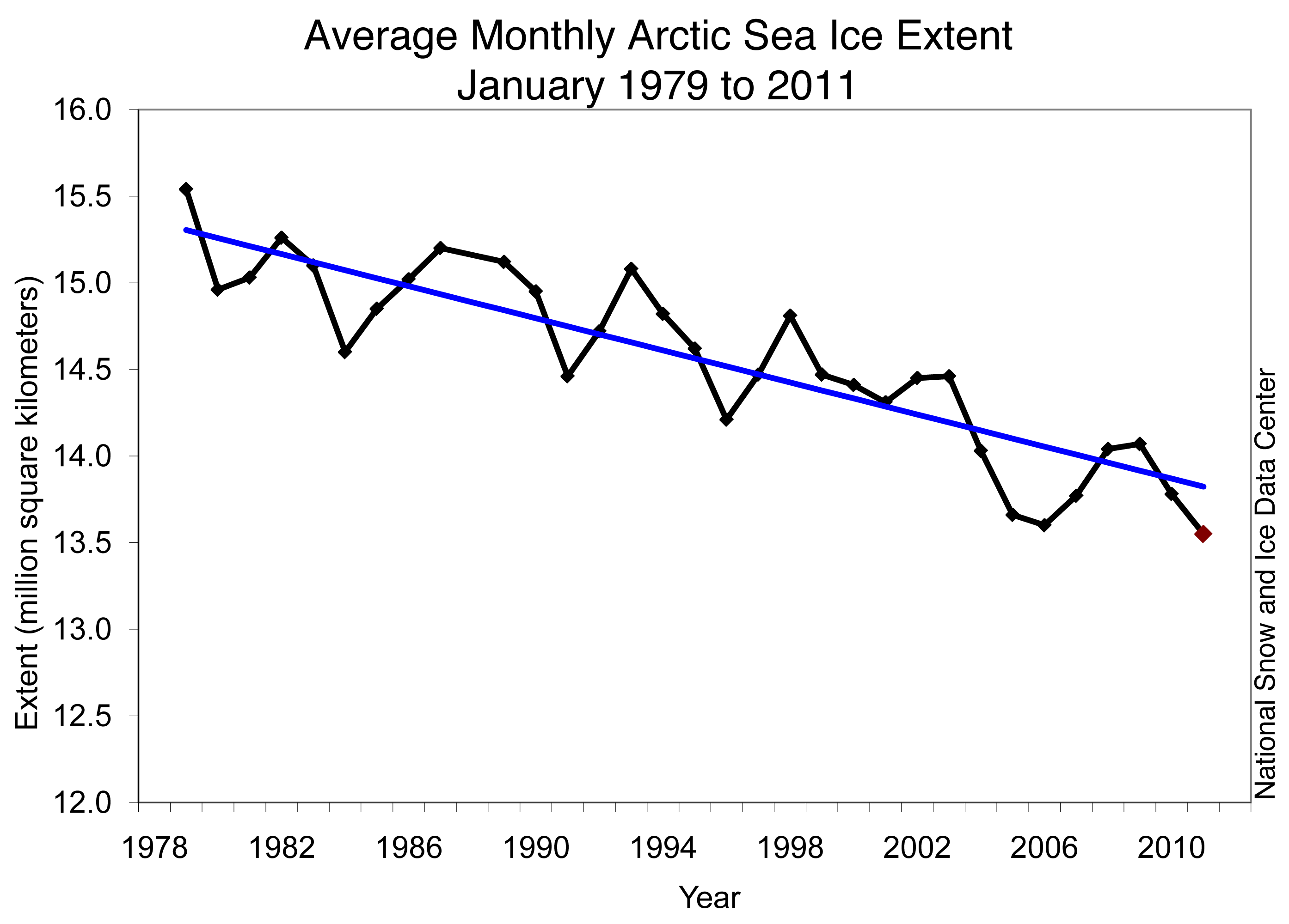
Back to the IPCC 4AR. One of the problems with relying on scenarios that don’t accurately reflect the true state of the climate system is projections are starting to look overly cheerful. Take Arctic sea ice extent as an example. From the 2009 Copenhagen Diagnosis, we can see that not only does the mean of the IPCC models over-project the extent of September Arctic sea ice only a few short years after making the projections, but the worst-case scenario wasn’t able to capture how low sea ice extent would get prior to 2010 (data through 2008); [h/t msobel for reminding me this graph existed].
September 2009’s extent was similar to 2008’s. 2010’s looked more like 2007’s, which is represented by the lowest point of the red line in the above graph. In other words, the observations time series continues to record values substantially lower than the bottom of the IPCC models’ range. Scientists (and others) love to ask, “Why?” So, the question should be, “Why were the IPCC models so far off on this projection?” A quick note: a growing number of other kinds of projections are showing similar signs of being worse than projected much sooner than was thought to be the case. I will discuss some, but not all, of the factors involved in this phenomenon.
I’ve already shown the annual growth of CO2 emissions over the past 50 years. That, of course, is only part of the story. Since CO2 isn’t scrubbed from the atmosphere very quickly, CO2 concentrations have risen with that growth of CO2 emissions. Here is the state of atmospheric CO2 concentrations measured at Mauna Loa, Hawai’i as of early February 2011:
Up and up it goes. 2010’s average CO2 concentration was 389.69ppm. That will be the last time in a long time that the concentration will be below 390ppm. Today’s concentration is higher than at any point during the past few hundreds of thousands of years. Oh yeah, I almost forgot, the last time concentrations were above 400ppm for an extended period of time (somewhere between 400 and 560ppm), the Greenland ice sheets collapsed. That’s because there is a melting ice/warmer air feedback that occurs around Greenland. The problem? Nobody knows exactly where the tipping point leading to collapsing ice sheet exists. Since we’re only 10ppm and 5 years away form 400ppm, does anybody seriously want to continue gambling? After all, it’s going to take quite some time to get that concentration back below 400ppm; more time will be required the longer we wait.
CO2 is being emitted into the atmosphere faster than it is being removed. The concentration of CO2 is therefore increasing. As a result of very basic physical laws, more and more solar energy is accumulating in Earth’s climate system. Part of this energy is manifesting as increased surface temperatures:
This graph shows 5-year and 11-year running averages of global temperatures as analyzed by NASA’s James Hansen. Within this data, something interesting is occurring. And it didn’t become obvious until Hansen published a different kind of temperature anomaly graph. Instead of averaging the entire globe’s temperatures together, Hansen averaged temperatures over different latitude bands together:
If it’s too hard to make out all the little details, check out this web page, where you can click on a PDF which shows a much larger version. I’m going to concentrate on the top two boxes in this graph, which show temperature anomalies for five zones (upper-left) and for the two polar zones (upper-right).
The first thing I want to point out is the period between 1940 and 1980. This period has been cited recently by climate zombies as one reason not to listen to climate scientists. According to the zombies, predictions were made in the 1970s about global cooling. Nothing exists in the scientific literature supporting this claim, of course. What scientists did say in the 1970s was the recent warming trend was no longer evidenced and they wondered what could be causing it. Without getting further into the minutiae, the top two time series show where the global signal originated from: the Arctic. It was the zone that showed the strongest signal that looks similar to the signal seen in the global temperature anomaly time series. Since the 1970s, the Arctic’s surface temperatures have warmed more than any other zone. You can see that in 2010, the Arctic temperature anomaly was greater than 3.6F (2C). The northern mid-latitudes (23.6°N to 64.2°N, or the zone in which most of us live) has “only” warmed by just under 1.8F. The northern mid-latitudes showed a slight cooling from the mid-1960s to the mid-1970s, but if you look at the time series on the bottom-left, the scale is much smaller than the Arctic graph in the upper-right.
So that’s what’s happened in the lowest part of the atmosphere above the Arctic: the greatest warming of any zonal area on Earth since the 1880s. Arctic sea ice, of course, rests on water – the Arctic Ocean, to be precise. Something has been occurring to the Arctic Ocean at the same time that the atmosphere above the ice has been steadily warming. Unfortunately, it’s the same phenomenon: water entering the Arctic from the Atlantic is warmer than it has been at any point in at least the past 2,000 years. This water is 3.5F warmer today than it was one century ago. It is 2.5F warmer today than it was during a favorite time period for climate zombies, the Medieval Warm Period, during which Europe warmed while most of the rest of the globe didn’t see much change. But even if the effect was global, as they wish it was, conditions are warmer today by a substantial margin. Not only that, but the volume of water entering the Arctic from the Atlantic has also increased over the past century. If the same volume of water that was warmer was the situation, that would be bad enough. But significantly more water that is significantly warmer than similar water was 100 years ago is a double whammy. What this mean is Arctic ice has a harder time forming along the edge of the ice pack on a year-to-year and decade-to-decade basis. This is evident in the following graphic:
The red arrows represent flow direction of Atlantic water entering the Arctic Ocean at depth. The white arrows represent flow direction of ice exiting the Arctic Ocean at the surface. The solid white line represents the average sea ice coverage for April from 1989 to 1995. The broken white line represents the average sea ice coverage for April from 1963 to 1969.
Why are the time series and study results relevant to the comparison of ice extent observations against IPCC model projections? Because they represent only a small number of examples of how increasing understanding of the Arctic has occurred in recent years and that’s problematic when interpreting the IPCC’s results. I haven’t covered how the warming observed in the Arctic so far is thawing permafrost both on land and underwater, which is projected to release 1 Billion tons of carbon into the atmosphere yearly by the 2030s – and how such a process likely won’t be included in the IPCC 5AR. Additionally, most of that carbon will be released as methane, which is 72 times as efficient a greenhouse gas over a 25 year period than CO2. I haven’t covered how the retreat of Arctic sea ice is causing additional solar energy to be collected by dark sea water instead of being reflected back into space by white ice – and how such a process also isn’t included in today’s climate models. I haven’t covered how over 80% of the solar energy absorbed in the past couple hundred years is currently stored in the world’s oceans, mostly at depth. When that warmer water rises to the surface, it will interact with a warmer atmosphere in ways that are not completely understood. Of course, warmer waters means Arctic sea ice will have even less of a chance of existing year-round in tomorrow’s world.
To some extent, I have talked about the dangers involved with spending most of our research time on moderate emission/warming scenarios, when our actual emission scenario is closer to the worst-case considered in the 2007 report. But all of the feedbacks I’ve discussed so far are lacking from all of the emission scenarios. What will happen when those feedbacks are included? Instead of “5.0 °F with a likely range of 3.1 to 7.9 °F” for the A1B scenario or “7.2 °F with a likely range of 4.3 to 11.5 °F” for the A1FI scenario from the 4AR by 2100, the globe could experience 10-13°F warming by 2100. Long before then, the Arctic will likely have attained a new stable climate; one that is quite different from the climate present during most of our species’ existence.
The Arctic has entered into a new regime. Even climate scientists are playing catch-up right now, which means the American public is way behind in understanding what changes in the Arctic mean to them.
The government is not like a family figuring out how to cut back on expenses. (If it is Dad is a real deadbeat because he decided to give up half his income last December to some rich frat boys.) And this isn’t really about programs President Obama “cares about” or about how “tough” it is for him. President Obama will not have to personally worry about these things and neither will his children, so the idea that he “cares” is just a tiny bit abstract in this context. This is about actual human beings and their ability to survive now and build a decent future.The main problem with all this, of course, is that he willingly signed a tax cut extension for the wealthiest people on the planet just two months ago even as they are making money hand over fist as it is, so any talk about “shared sacrifice” rings just a little bit hollow now. If he wants to be honest about this and admit that he’s catering to spoiled plutocrats and Wall Street Demi-Gods because he truly believes that he needs to sacrifice ordinary Americans on the alter of their egos, that’s one thing. But blowing smoke about how this hurts him just as much as the college kid who has to drop out in a terrible labor market — but he’s willing to make the sacrifice and so should we — well, it is too cynically cheap for words.
I’ve been emphasizing the part in bold for months now.
Politicians want to pretend like they’re treating the federal budget like they would their family budget. Nothing could be further from the truth.
It really comes down to something this simple: if you are looking at a huge family budget debt, would you demand less income from your boss while you continued to give away cash to your rich friends from an account your family members contributed to and you promised they could withdraw from in a few more years?
Hell no, you wouldn’t. But that’s exactly the game the D.C. crowd is trying to play.
Now, if you’re a liberal, you’re probably questioning why I’m Obama-bashing. And if you’re a conservative, you’re probably congratulating yourself on telling everybody back in 2008 that Obama wasn’t who he said he was. And if you’re a teabagger, you’re probably grabbing your gun and looking for the nearest Democratic politician to assassinate.
What I want to say is this: This is why I and other liberals were saying back in December that Obama shouldn’t have accepted the crap deal he ended up with in the lame duck session of Congress. This is why President Obama shouldn’t have pre-capitulated on welfare for the rich for 2 years while accepting only 13 months of unemployment insurance extension. The START treaty? It would have been passed this session, regardless of who was in control of which chamber of Congress. DADT? The Democratic-led Congress should have passed it much earlier in the session, especially if it was such a necessary thing to do.
The biggest problem with the totally awesome “deal” that President Obama accepted was the Bush tax cuts, now the Obama tax cuts, were not paid for. They haven’t been paid for since their inception. Because making sure they’re paid for would require drastic cuts somewhere else in the budget – to the tune of $858 Billion in two years. Which is exactly why the “oh-so-liberal” President Obama is now proposing to cut programs that help the working poor, help the needy heat their homes (witness the brutal winter most of the U.S. has experience this year and tell me that’s a moral thing to do), provide access to graduate-level education programs and even undermine the same kind of community organization programs that catapulted Obama to his career. All of which will help the budget out by … oh, look at that … only $100 Billion per year. Which means there are still $350 Billion in cuts yet to come. Sweet.
The rich don’t need more welfare checks from the government. The working poor, middle class and students do need some assistance.
So I hope those folks who were arguing the President had to take the only deal he could possibly ever get are satisfied and pleased with the results.
If this is “Winning The Future“, I’d hate to see what losing the future looks like.
In last month’s post, I rhetorically asked whether the yearly absolute minimum global sea ice area would look more like 2005, 2009 and 2010 (~15 million sq. km.) or whether 2011′s minimum would be more like 2006 and 2007 (~14.5 million sq. km.). Click-thru to the link provided above and you’ll see that 2011 unfortunately already looks more like 2006 and 2007. With about one month remaining in the Southern Hemisphere’s melt season remaining, and with the freeze season in the Northern Hemisphere winding down, this year’s global minimum may not have been reached yet. In 2006, 2007 and 2009, extent hovered near 14.5 million sq. km. for about one month. Regardless of the specific date and the specific absolute minimum extent value, the trend in January’s from 2008 through 2011 look very similar to the trend from 2003 through 2007. Global sea ice is once again in bad condition at the end of January, 2011.
Arctic Ice
According to the National Snow and Ice Data Center, Arctic sea ice extent set a record low in January. Averaged over January 2010, Arctic sea ice extent was only 13.55 million sq. km., which was 50,000 sq. km. below the previous record low set in 2006. Areas like Hudson Bay and the Davis Strait finally froze over in January, nearly 2 months behind normal. The Labrador Sea remains unfrozen, even at this extremely late date in the Northern Hemispheric winter season.
In January, the ice extent was about 1.1 million sq. km. less every day than the normal value. This was the first time on record that the extent was so low for so long during the first calendar month of the year. The extent was >500,000 sq. km. lower than during the same period in 2008-2010. Moreover, the last 2 times a calendar year started out anywhere near this negative was in 2006 and 2007. In 2007, the all-time record low ice extent was set. For the record, the extent at the end of January 2011 is ~100,000 sq. km. lower than it was in either 2006 or 2007. Does that mean that a new record low extent will be set this year? Not necessarily. 2007 witnessed weather conditions that helped ice flow out of the upper Arctic and into warmer waters, where it melted. That hadn’t happened prior to 2007 in the satellite era, nor has it happened since. However, the record low volume of ice that was measured in 2010 could mean that ice area extent is in danger of shrinking to near-record lows again in 2011.
Here is a satellite representation of Arctic sea ice conditions from February 7th centered on the North Pole:
Compare these with January 6th’s satellite representation, centered on the North Pole:
The area highlighted by the white oval in the January picture has finally frozen over – only 2 months later than at any point in recorded history. The NSIDC has a nice multi-year time-series showing how abnormal this winter’s freezing delay has been. In the past month, the Sea of Okhotsk (east of Russia, north of Japan) has stated to freeze over. I feel like a broken record with this, but it is doing so at a much slower pace than is normal. The Baffin and Newfoundland sea ice also remain well behind normal schedule to freeze.
There are different factors affecting each of these areas. As I’ve discussed previously, the Arctic Oscillation was in an extremely negative phase for months again this winter. This allowed cold air that normally remains trapped over the Arctic to pour south and affect eastern North America and Europe. At the same time, a huge dome of high pressure settled over northeastern Canada, allowing much warmer than normal temperatures to remain in place. I’m not talking just a little warmer than usual, I’m talking about parts of Canada being an average of 38°F warmer for an entire month – and that month should have been one of the coldest of the year for that region.
It was recently announced that there is a phenomenon underlying all of the various weather patterns and climatic oscillations. According to a new study, water entering the Arctic Ocean between northeastern Greenland and Svalbard is now warmer than it has been at any time over the past 2,000 years. To make matters worse, the volume of water entering the Arctic is also greater than it was in the past. So more water that is warmer is being funneled into the Arctic Ocean, which is resulting in a warmer Arctic from below. This finding has serious implications for the future state of Arctic sea ice. Even if abnormal weather patterns and oscillations didn’t set up, ice will have a harder and harder time forming and being maintained from year to year because of the additional heat being forced into the ocean. That heat will have to dissipate prior to any ice formation, let alone ice thickening. Like I’ve written before, the Arctic has entered into a new climate regime. It might take a little longer for the effects of that to cascade through the climate system to places where people live. But once it does, it will be too late to prevent the worst of further effects from continuing to cascade.
Here is the time series graph of Arctic sea ice extent with the +/- 2 standard deviations as a light-gray envelope around the climatological average through February 6th:
You can see how truly poor the Arctic sea ice conditions are with this graph. The 2010-2011 line shows us that conditions are the worst for the date on record since the middle of December, beating out 2006-2007 every day. Arctic sea ice continues to track far, far below climatological norms. The up-shot from the previous paragraph is this: the conditions we’re seeing for the first time this winter are likely to be the new normal. That thick gray line and the light-gray envelope will be shifted downward.
Antarctic Pictures and Graphs
Here is a satellite representation of Antarctic sea ice conditions from February 7th:
For comparison purposes, here is the similar picture from January 6th:
The sea ice off western Antarctica has fully melted. The fields adjacent to the coast west and east of the Antarctic peninsula remain in good shape, largely thanks to cooler than normal surface temperatures and sea surface temperatures. This is an example of a weather phenomenon helping to keep sea ice intact rather than destroying it.
Here is the time series graph of Antarctic sea ice extent with the +/- 2 standard deviations in light gray and the climatological mean in dark gray through the 6th:
It’s pretty obvious to see what happened during January: sea ice extent was whittled down at a much faster rate than normal. It started out slightly above average and ended the month near the bottom of the 2 standard deviation envelope. While conditions aren’t as dire as they are in the Arctic, Antarctic sea ice melted very quickly this year, especially considering the extent was well above the 2 standard deviation envelope back in mid-November. It is at this point in the year that ice shelves typically start to break off. Will 2011 have another big ice shelf break-up news story? Stay tuned.
Errata
Here are my State of the Poles posts from January and December.
You can find the NSIDC’s February report here. The page is dynamic, so if you’re reading this after February 2011, that month’s report will show up first. If that’s the case, you can look for any report in their archive on the top pull-down tab on the right-hand side of the page.
That value is 2.74ppm higher than January 2010. It is 1.5ppm higher than December 2010.
2011 will be the first year that global CO2 concentrations will be higher than 390ppm for the first time in hundreds of thousands of years. And concentrations aren’t going down any time soon either. Despite the worst economic conditions since the Great Depression, global emissions in 2010 didn’t increase, but were “merely” flat. Until global emissions decrease by significant amounts year after year after year, concentrations will continue to rise to dangerous levels, precipitating changes in the globe’s climate system that will be irreversible for tens of thousands of years, at best.
How close are we to “dangerous levels”? The last collapse of the Greenland ice-sheet was found to occur between 400 and 560ppm. We’re only 10ppm away from the minimum of that range. We’ll blow past 400ppm within 5 years, which means dangers are just around the corner. As we’ve discovered in the past 10 years, global warming effects are not well predicted. Those effects have been larger, more complex and occurred sooner than anybody thought possible. There is no reason to assume situations will be different moving forward.
Meanwhile, China is planning on investing $451 Billion to $602 Billion on their high-speed rail networks between 2011 and 2015.
China is all but assured of spending that money. I find it doubtful that Biden will be successful in convincing enough Republican Teabaggers in the U.S. House of Representatives to spend even 1/10th as much as the Chinese, even on a longer time frame. Guess who’s more likely to lead the world through the 21st century?
After the Arctic, it can be argued that Australia has acquired the non-flattering distinction of being impacted more by the first set of global warming effects than most places on Earth. Australia suffered from widespread and severe drought during most of the 2000’s. As projected, when rain has fallen, it has started to fall in greater quantities at once, followed by long stretches of little to no precipitation. This was especially evident in December 2010 and January 2011 when historic floods impacted an area of northeast Australia larger than the area of France and Germany combined. 2010 was the warmest year in Australian history; meanwhile the Southern Hemisphere was warmer during the 2000’s than the 1990’s, which were warmer than the 1980’s, and so on back through the modern era. And then this week, a tropical cyclone nearly the size of the continental United States hit northeast Australia. Top winds at landfall were measured to be near 125mph, the strongest storm to make landfall on Australia in over 100 years. As global warming effect take further hold, storms of this intensity will likely become more common.
By the time these kinds of effects occur to the U.S. with any degree of regularity, it will be too late to prevent further worsening of global warming and its effects. Unfortunately, it’s looking like it will take persistent impacts on Americans daily lives before enough of us decide to take action to make an eventual difference. Because we have refused to pay attention to the effects for so long, taking action will be many times more expensive and will actually be much less effective than if action had started taking place 30-40 years ago.
File this under the “I’m Not Surprised” category. Drilling corporations have spent years and millions of dollars trying to prevent anyone from finding out what the constituents of the fluids they were pumping into the ground to force natural gas and oil up. Now, thanks to an investigation by the U.S. House Energy and Commerce Committee’s year-long investigation, part of the answer has come to light.
I will borrow a phrase from all the anti-American voices who came out from the shadows during the Bush Regime: “If you have nothing to hide, you have nothing to fear from us looking into your business.” Hiding behind claims of proprietary business information is just about as cowardly as these corporations can get.
The congressional investigation found that oil and gas service companies have injected over 32 million gallons of diesel fuel or hydraulic fracturing fluids containing diesel fuel in wells in 19 states between 2005 and 2009. In addition, the investigation finds that no oil and gas service companies have sought – and no state and federal regulators have issued – permits for diesel fuel use in hydraulic fracturing, which appears to be a violation of the Safe Drinking Water Act.
We all know who was “running” the country during these years. And don’t think I’ll hold back any condemnation if I find out the Obama administration continued these disgusting practices. I’m not surprised that dirty energy corporations didn’t seek approval for their likely illegal actions – they think they’re above American law. I also won’t be surprised if they’re never held accountable either – they have worked hard to buy off our elected officials.


