Weatherdem's Weblog

Bridging climate science, citizens, and policy


Leave a comment

GHG Emissions: 2C Pathways Are A Fantasy

A new commentary piece in Nature Climate Change continues to make significant errors and propagates a mistaken core assumption too many in the climate community make: that with enough [insert: political will or technological breakthroughs], 2C warming is still an achievable goal.

I have disagreed with this assumption and therefore its conclusion for six years – ever since establishment Democrats decided to waste valuable political capital on a right-wing insurance bill with a vague promise that climate legislation would come someday.  That decision essentially assured that, absent a global economic collapse or catastrophic geologic events, our species would easily push the planet past 2C warming.

The following graphic shows global historical emissions in solid black.  The green curve represents the fantasy projection of an emissions pathway that leads to <2C global warming.  As you can see, emissions have to start declining this year in the assumed scenario.  The yellow curve represents what is likely to happen if climate action is delayed for 8 years and this year’s emissions remain constant during those 8 years.  It gets increasingly difficult to achieve the same long-term warming cap because of that 8 year delay.

The red curve builds on the yellow curve projection by keeping the next 8 year’s emissions constant but reducing federal money to research decarbonization technology.  This is the linchpin to any emissions pathway that could potentially put us on a pathway to a less warm climate.  Decarbonization technology has to not only be fully researched but fully deployed on a planetary scale for the 2C pathway to happen.  It’s hard to see on this graph, but global emissions have to go net negative for us to achieve <2C warming.  While the yellow curve has a harder time achieving that than the green curve, the red curve doesn’t get there one century from now.  But the red curve isn’t the most likely pathway – it wasn’t in 2010 and it isn’t today.

The most likely pathway is the solid black curve out to 2125.  It assumes the same things as the red curve and adds an important component of reality: emissions are likely to increase in the near-term due to continued increased fossil fuel use.  Natural gas and coal plants continue to be built – any assumption otherwise might be interesting academically but has no place in the real world.  By assuming otherwise, scientists make themselves a target of future policy makers because the latter won’t pay attention to the nuanced arguments the scientists will make once it’s clear we’re hurtling past 2C.  Once we burn increasing amounts of fossil fuels during the next 8 years (as we did the 8 years before that and so on), it is harder still to cut emissions fast enough to try to keep global warming <2C.  The reasons should be obvious: the emitted GHGs will radiatively warm the planet so long as they’re in the atmosphere and it will take even more technological breakthroughs to achieve the level of carbon removal necessary to keep warming below some level.

ghg-emissions-201612-nature-climate-paper

The authors recognize this challenge:

[…]to remain within a carbon budget for 2 °C in the baseline scenario considered, peak reduction rates of CO2 emissions around 2.4% per year are needed starting mitigation now. A global delay of mitigation action of eight years increases that to 4.2% per year (black dashed in Fig. 1a) — extremely challenging both economically and technically. The only alternative would be an overshoot in temperature and negative emissions thereafter. Research in negative emissions should therefore be a priority, but near term policy should work under the assumption that such technology would not be available at large scale and low cost soon.

I disagree with the author’s conclusion:

Society is at a crossroad, and the decisions made in the US and elsewhere over the next 4–8 years may well determine if it is possible to limit climate change to levels agreed in Paris.

We passed the crossroad already.  It really doesn’t matter when, the fact is we passed it.  I think it is a waste of time to examine low-end emission scenarios for policy purposes.  They serve some scientific use.  Policy makers need relevant scientific advice and 2C scenarios don’t do that.  They perpetuate a myth and therefore pose a real danger to society.  The so-called reality-based community needs to critically self-examine what they’re doing and why they’re doing it.  We’re headed for >3C warming and we need to come to terms with what that means.


Leave a comment

Wildfire – Policy and climate change

I read a wildfire article today that was breathless about the scope of total acreage burned across the drought-stricken northwest US and of course included a climate change angle.  This is the first wildfire article I’ve read that did not include some mention of decades of ill-conceived fire policies in the intermountain West.

Let’s not mince words: a lot of fires are burning on a lot of acres this year primarily because of those man-made policies.  Millions of overcrowded acres of forest because people put tiny fires out for decades and allowed trees (fuel) to grow and grow.  Fire is a natural process that we purposefully interrupted.  Prior years with extensive fires also generated media and environmentalist attention.  As I stated above, the difference between then and now is climate activists politicized the science.  An EcoWatch article now contains no mention of historical decisions because it is more important to satisfy the environmentalist base by claiming nature is pure without humans and impure with us.

This is disappointing but not surprising.  For now, I am glad there are more responsible media outlets that continue to acknowledge the very real and dominant influence people have on forests (forest management), the very real and strong influence nature has on forests (drought), as well as the growing influence that people will have on forests in the future (climate change).


Leave a comment

Climate Papers

I found this article from a Tweet this morning:
Prof John Mitchell: How a 1967 study greatly influenced climate change science

The Carbon Brief blog asked climate scientists to nominate the most influential refereed paper.  Manabe & Wetherland’s 1967 paper entitled, “Thermal Equilibrium of the Atmosphere with a Given Distribution of Relative Humidity” was the winner.  The paper incorporated the transfer of heat from the Earth’s surface to the atmosphere and back for the first time in a model.  Their model produced surface temperatures that were closer to reality than previous efforts.  They also tested constant and doubled atmospheric CO2 and found global mean temperatures increased by 2.4C under a doubling scenario.  In a nutshell, a simple model in 1967 projected the same warming signal as dozens of more sophisticated models do today.

I am not the first to pose the following question: what additional value do today’s extensive models provide over simple models?  Climate scientists still use simple models in their investigations.  They’re obviously useful.  But posing the question differently addresses my more recent interests: does the public derive more value from today’s climate model results than they did before with simpler and cheaper models?  The most obvious addition to me is the increasing ability to resolve regional climate change which is more variable than the global mean.  I do wonder how the public would react if they heard that climate models are largely generating the same projections given the amount of money invested in their development and analysis.  We have a partial answer already with the growth of climate skeptics in the public sphere.  Some people are obviously drawn to the problem.  As complex as all the aspects of the problem are and as busy as most people are, perhaps it is in science’s best interest to not make too much noise.

I will also note that one of the drawbacks of climate science in the academy is the utter lack of historical context for results.  My experience really has been the proverbial information dump as part of the information deficit model of learning.  The Facts Speak For Themselves.  I don’t remember hearing about this article that so many in my field consider seminal.  My colleagues would benefit from exposure to the history of their science.


Leave a comment

Warming Pause Research Continues

By my count, there are four leading scientific explanations for the short-term slowdown overlaying the long-term rate of global surface warming.  They are:

Enhanced heat uptake by the world’s oceans, especially over the Pacific due to enhanced easterly winds

Sustained small to medium-sized equatorial volcanic activity

Slightly reduced solar irradiance

Natural variability, including the Interdecadal Pacific Oscillation

One interesting aspect to  these explanations’ presence is most researchers believe their explanation is the leading one.  It is a symptom of the state of climate science:  specialization proliferation leads to poor cross-disciplinary communication.  Someone might have this within their purview, but I am currently unaware whether anyone is apportioning relative causality of these explanations together.  Attribution is challenging, of course, but such an effort seems worthwhile to me.

Some recent science updates on these explanations:

Heat Uptake by Several Oceans Drives Pause

Reconciling Warming Trends


Leave a comment

2 °C Warming Goal: Zombie Myths Continues

Fresh on the heels of my last post on whether 2 °C should be the exclusive threshold in international diplomacy negotiations, a link to a Grist article written yesterday caught my eye: “What you need to know about the next big climate report“.  What did I find in the 4th paragraph but this appeal to scientific expertise (emphasis mine):

The panel intends for this assessment report to guide international negotiators as they work, in the run-up to the big Paris climate summit in December 2015, to hammer out an agreement to reduce global greenhouse gas emissions. The U.N. hopes nations will find a way to squeeze through the ever-shrinking window of opportunity and cut a deal to keep the planet from exceeding 2 degrees Celsius of warming — the goal scientists have set to avoid the worst impacts of climate change — before we blow right past that target.

It is worth reminding yourself that everything you encounter in any media is biased somehow.  We’re all human and we all have our own biases.  Nothing is unbiased or objective because the act of putting words to concepts is derived from brains with preferred neural pathways.  There is nothing inherently bad with the bolded language above.  It comes from Grist, which many in the climate activist community view as a legitimate source of information (unlike say, Fox News).  However, the 2 °C threshold was not originally scientific.  That was one of the fundamental take home messages of my last post.

Negotiators in the early 1990s for the IPCC asked for some type of threshold that they might use in negotiations because, not being scientists, they didn’t know what threshold might be useful or appropriate.  A German scientist offered up the 2 °C threshold as part of the UNFCCC process and because nobody else came up with a different threshold or challenged the temperature threshold, negotiators moved it through their process until politicians from countries around the world agreed to insert the language in a formal report.  As is usually the case with these type of things, it has remained as the public threshold ever since.  Climate scientists started using the threshold as part of their work in an attempt to maintain legitimacy in the funding process because politicians control research purse strings.  Finally, as I wrote in my last post, the status quo is very hard to change.  Witness the personalized (not science-based!) attacks on the authors of the Nature Comment that initiated the most recent version of the threshold discussion.

The language Grist uses plays into skeptics hands.  “The goal scientists have set.”  That implies that scientists have political power and have already exercised it at the expense of every other person.  Unsurprisingly, most people aren’t fans of yielding power without a chance at involvement.  Hence one very good reason to subvert those scientists.  Grist is helping perpetrate the meme that there is a conspiracy against non-scientists – a meme that many climate scientist activists further inflame when they claim exclusive providence over anything climate related.  If activists don’t view someone as a perfect example of their tribe, they attack the “other” without hesitation because they’re using the climate issue as a proxy for arguments they should have instead.

Politicians and diplomats set the 2 °C threshold.  They were the only ones that had the power to do so.  Scientists don’t approve the IPCC’s language.  They write their own papers and contribute to the IPCC process, but politicians are responsible for approving every last word in IPCC reports.  Grist writers and editors should know this.  They’re all too willing to allow zombie myths to keep roaming the discussion space, it appears.


2 Comments

What About That 2 °C Warming Goal?

David G. Victor and Charles F. Kennel, who are researchers in International Relations and Oceanography, respectively, wrote a Comment article for Nature at the beginning of October.  In it, they argued that climate and policy folks should stop using 2 °C as the exclusive goal in international climate policy discussions.  I agree with them on principle, but after reading their paper and numerous rebuttals to it, I also agree with their reasoning.

I’ll start with what they actually said because surprise, surprise, tribal and proxy arguments against their commentary focused on very narrow interpretations.

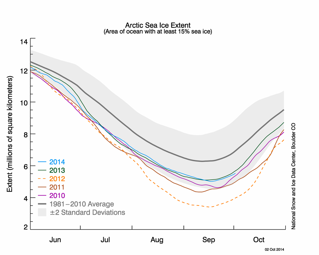
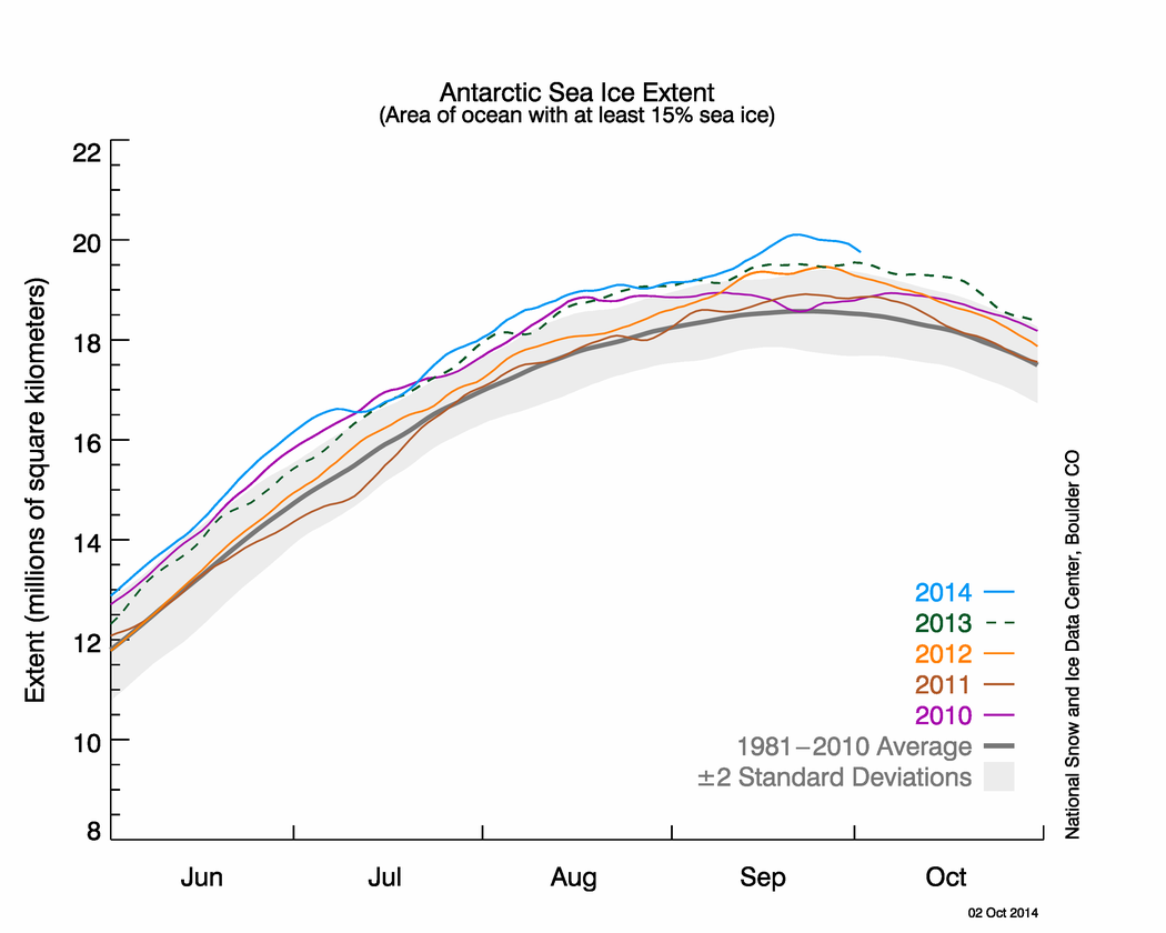
Bold simplicity must now face reality. Politically and scientifically, the 2 °C goal is wrong-headed. Politically, it has allowed some governments to pretend that they are taking serious action to mitigate global warming, when in reality they have achieved almost nothing. Scientifically, there are better ways to measure the stress that humans are placing on the climate system than the growth of average global surface temperature — which has stalled since 1998 and is poorly coupled to entities that governments and companies can control directly.

I agree with their political analysis.  What have governments – including the US – done to achieve the 2 °C goal?  Germany for instance largely switched to biomass to reduce GHG emissions while claiming that renewables (read: solar and wind) are replacing fossil fuels.  The US established more robust vehicle emissions and efficiency requirements, but the majority of US emission reductions in recent years result from cheap natural gas and the Great Recession.  No country will meet its Kyoto Protocol emissions goal – hence the hand-wringing in advance of the Paris 2015 climate conference.  And by the way, even if countries were meeting Kyoto goals, the goals would not lead to < 2 °C warming.

More from the authors:

There was little scientific basis for the 2 °C figure that was adopted, but it offered a simple focal point and was familiar from earlier discussions, including those by the IPCC, EU and Group of 8 (G8) industrial countries. At the time, the 2 °C goal sounded bold and perhaps feasible.

To be sure, models show that it is just possible to make deep planet-wide cuts in emissions to meet the goal. But those simulations make heroic assumptions — such as almost immediate global cooperation and widespread availability of technologies such as bioenergy carbon capture and storage methods that do not exist even in scale demonstration.

We will not achieve either of the last two requirements.  So we will very likely not achieve <2 °C warming, a politically, not scientifically, established goal.

A single index of climate-change risk would be wonderful. Such a thing, however, cannot exist. Instead, a set of indicators is needed to gauge the varied stresses that humans are placing on the climate system and their possible impacts. Doctors call their basket of health indices vital signs. The same approach is needed for the climate.

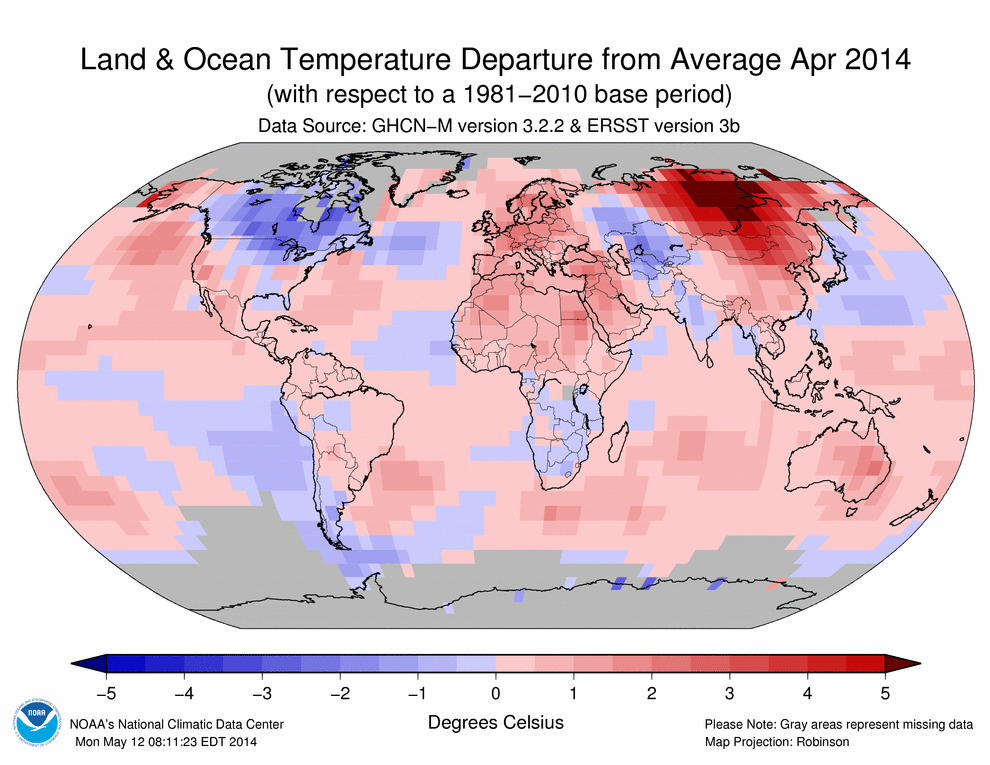
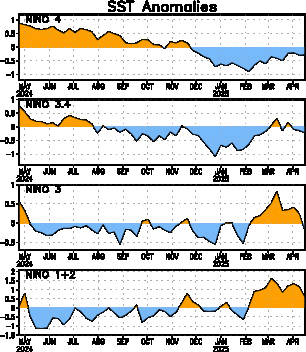
Policy-makers should also track ocean heat content and high-latitude temperature. […]

What is ultimately needed is a volatility index that measures the evolving risk from extreme events — so that global vital signs can be coupled to local information on what people care most about. A good start would be to track the total area during the year in which conditions stray by three standard deviations from the local and seasonal mean.

So the authors propose tracking a set of indicators including GHG concentrations, ocean heat content, and high-latitude temperature.  What is most needed? An index that measures evolving risk from extreme events.  That’s pretty cut and dry reading to me.

Of course, climate scientist activists took umbrage that somebody left their tribe and tried to argue for something other than a political goal that they didn’t have any input on that, by the way, we won’t meet anyway.

RealClimate (RC) starts by attacking the authors personally for not describing why the recent surface global warming pause isn’t really a pause – which is a tangential discussion.  RC also writes that “the best estimate of the annual cost of limiting warming to 2 °C is 0.06 % of global GDP”.  Really?  The “best” according to whom and under what set of assumptions?  These aren’t details RC shares, of course.  Cost estimates are increasing in number and accuracy, but this claim also misses the fundamental point the authors made: “technologies such as bioenergy carbon capture and storage methods that do not exist even in scale demonstration”.  RC confuses theoretical calculations of economic cost with the real-world deployment of new technologies.   To achieve the 2 °C goal requires net removal of CO2 from the atmosphere.  That means we need to deploy technologies that can remove more CO2 than the entire globe emits every year.  Those technologies do not exist today.  Period.  IF they were available, they would cost a fraction of global annual GDP.  It’s the IF in that sentence that too many critics willfully ignore.

RC then takes the predictable step toward a more stringent goal: 1.5 °C.  Wow.  Please see the previous paragraph to realize why this won’t happen.

RC also dismisses the authors’ claim that the 2 °C guardrail was “uncritically adopted”.  RC counters this wildness by claiming a group came up with the goal in 1995 before being adopted by Germany and the EU in 2005 and the IPCC in 2009.  Um, what critical arguments happened in between those dates?  RC provides no evidence for its own claim.  Was the threshold debated?  If so, when, where, and how?  What happened during the debates?  What were the alternative thresholds and why were they not accepted?  What was it about the 2 °C threshold that other thresholds could not or did not achieve in debates?  We know it wasn’t the technological and political features that demanded we choose 2 °C.  Diplomats and politicians don’t know the scientific details between IPCC emission scenarios or why 2 °C is noteworthy other than a couple of generic statements that a couple of climate-related feedbacks might start near 2 °C.  Absent that scientific expertise, politicians were happy to accept a number from the scientific community and 2 °C was one of the few numbers available to use.  Once chosen, other goals have to pass a higher hurdle than the status quo choice, which faced no similar scrutiny.

RC then rebuts the authors’ proposed long-term goal for a robust extreme events index, claiming that such an index would be more volatile than global temperature.  The basis for such an index, like any, is its utility.  People don’t pay much attention to annual global temperatures because it’s a remote metric.  Who experienced an annual mean global temperature?  Nobody.  We all experienced local temperature variability and psychological research details how those experiences feed directly into a person’s perception of the threat of climate change.  Nothing will change those psychological effects.  So the proposed index, at least in my mind, seeks to leverage them instead of dismissing them.  Will people in Miami experience different climate-related threats at a different magnitude than mid-Westerners or Pacific Islanders?  Of course they will.  2 °C is insufficient because the effects of that threshold will impact different areas differently.  It’s about a useful a threshold as the poverty level or median wage.  Those levels mean very different things in rural areas compared to urban areas due to a long list of factors.  That’s where scientific research can step in and actually help develop a robust index, something that RC dismissed at first read – a very uncritical, knee-jerk response.

Also unsurprisingly, ClimateProgress (CP) immediately attacks the authors’ legitimacy.  It’s telling that the same people who decry such tactics from the right-wing so often employ them in their own discourse with people who are trying to achieve similar goals.  CP also spends time hand waving about theoretical economic analyses while ignoring the basic simple real-world fact that technologies don’t exist today that do what the IPCC assumes they will do starting tomorrow on a global scale.  It’s an inherent and incorrect assumption which invalidates any results based on it.  I can cite lots of theoretical economic analyses in any number of discussions, but the theory has to be implemented in the real world to have any practical meaning.  I want carbon capture technologies deployed globally tomorrow too because I know how risky climate change is.  Wishing doesn’t make it so.  It’s why I’ve been critical of the Obama administration for putting all of their political capital into a plan to drive millions of US consumers into for-profit insurance markets instead of addressing the multitude of problems facing the country, including the desperate need to perform research and development on technologies to help alleviate future climate change.

The authors responded to RC and CP in a DotEarth piece.  I agree with this statement:

The reality is that MOST of the debate about goals should centrally involve the social sciences—more on that below.

What I find interesting about this statement is that if we were to follow RC’s and CP’s heavy-handed criticism, they shouldn’t have a seat at the climate goal-setting table because they don’t have the requisite expertise to participate.  What social science credibility do physical scientists have?  Too many activists like those at RC and CP don’t want anyone else to have a seat at the table, but have they staked out a legitimate claim why they get one while nobody else does?  They continue a little later on:

This is where a little bit of political science is helpful. I can’t think of any complex regulatory function that is performed according to single indicators. Central bankers don’t behave this way when they set (unilaterally and in coordination) interest rates and make other interventions in the economy. Trade policy isn’t organized this way. In our article we use the example of the Millennium Development Goals because that example is perhaps closest to what the UN-oriented policy communities know—again, multiple goals, many indicators. That’s exactly what’s needed on climate.

They also note that different perspectives leads to different types of goals – which directly contradicts the climate community’s acceptance of 2 °C as the only goal to pursue.  They push back against their critics’ denouncement for not including enough about how people set the 2 °C threshold:

The reason it is important to get this story right is not so that the right community gets “credit” for focusing on 2 degrees but so that we can understand how the scientific community has allowed itself to get lulled into thinking that it is contributing to serious goal-setting when, in fact, we have actually not done our jobs properly.

They identify what I think is the real critical issue which people bury with the proxy battles I present above:

That means that for nearly everyone, the question of goals is deeply intertwined with ultimate impacts, adaptability and costs.  Very quickly we can see that matter of goal-setting isn’t some abstract number that is a guardrail but it is bound up in our assessments of risk and of willingness to pay for abatement as well as bear risk.

The point here is perhaps most salient: the 2 °C threshold is but one value in a very large set.  Different people have different goals for different reasons – based on their value system.  As well they should.  The 2 °C threshold is treated as a sacred cow by too many in the climate community.  What happens when, as I now believe will happen, the globe warms more than 2 °C?  Will folks finally stop cherry picking statistics and brow-beating other folks who are really their allies in this effort?  Will folks set aside tribalism and accept expertise from other researchers, you know, acceptance of other sciences?

There are many more pieces written about this Nature Comment that I didn’t get into here.  They all serve as interesting exhibits in the ongoing effort to get our heads around the wicked problem of climate change and design efficient policies to change our emissions habits.  This unfortunately won’t be the final example of such exhibits.


Leave a comment

State of Polar Sea Ice – September 2014: Arctic Sea Ice Minimum and Antarctic Sea Maximum

Global polar sea ice area in September 2014 remained at or near climatological normal conditions (1979-2008).  This situation has held true since early 2013 – a clear departure from conditions during the past 10+ years.  Global sea ice area values consist of two components: Arctic and Antarctic sea ice.  Conditions are quite different between these two regions: there is abundant Antarctic sea ice while Arctic sea ice remained well below normal again during 2014.  I’ll discuss both regions below.

Arctic Sea Ice

According to the NSIDC, September 2014′s average extent was 5.28 million sq. km., a 1.24 million sq. km. below normal conditions.  This value is the minimum for 2014 as less sunlight and colder fall temperatures now allow for melting ice.  September 2014 sea ice extent continued a two-plus year-long trend of monthly mean below normal values.  The deficit from normal was different each month during that time due to weather conditions overlaying longer term climate signals.

Sea ice anomalies at the edge of the pack are of interest.  Laptev and East Siberian Sea ice, for instance, was lower than their respective normals this year while Beaufort Sea and Canadian Archipelago ice maintained higher ice extent this year than they did a few years ago.  Arctic Basin ice extent was lower than its normal, but higher than it was during the late-2000s.

September 2014 average sea ice extent was the sixth lowest in the satellite record (post-1979).  Figure 1 shows that the September linear rate of decline is 13.3% per decade (blue line) relative to the 1981 to 2012 mean, compared to 2.6% per decade decline for March through 2014.  Summer ice is more affected from climate change than winter ice.  Of note, the trend through September 2013 was 13.7%, so this year’s minimum, while historically significant, was not as bad as it was during recent years.

 photo Arctic_monthly_sea_ice_extent_201409_zpsc2d01bbf.png

Figure 1 – Mean Sea Ice Extent for September: 1979-2014 [NSIDC].

Arctic Pictures and Graphs

The following graphic is a satellite representation of Arctic ice as of April 1st, 2014:

 photo Arctic_sea_ice_20140401_zpsdd9dbc04.png

Figure 2 UIUC Polar Research Group‘s Northern Hemispheric ice concentration from 20140401.

Compare that with the following graphic – a satellite representation of Arctic ice as of October 7th, 2014:

 photo Arctic_sea_ice_20141007_zps42639b5f.png

Figure 3UIUC Polar Research Group‘s Northern Hemispheric ice concentration (color contours) from 20141007.  Recent snowfall is indicated by gray-scheme contours over land.

As described above, the 2014 melt season ended with the sixth lowest Arctic sea ice extent during the satellite era.  Approximately 10 million sq. km. of sea ice  melted again this year.  That isn’t a record (11.5 million sq. km. melted in 2012), but that is a lot of melted ice.

Of greater importance is the overall health of the ice pack, which we can begin to ascertain by looking at the volume of ice, as in Figure 4:

 photo SeaIceVolumeAnomaly_20140930_zps48c8bf58.png

Figure 4PIOMAS Arctic sea ice volume time series through September 2014.

This graph shows something unique: a recent resurgence of ice volume anomalies during the past 2-3 years.  You can see that in 2011 and 2012, Arctic sea ice volume reached values below the 2nd standard deviation from normal – near -7000 and -8000 km^3.  2013 looked a bit better and 2014 looks better still: volume anomalies are back above the long-term trend line.  While that isn’t enough to declare no problems exist in the Arctic, the situation certainly is different from it was just a couple of years ago.  Put another way, these graphics show something quite different from the strident proclamations of doom from climate activists in early 2013 when holes and cracks were seen earlier than normal on Arctic sea ice.  At the time, they wondered (too loudly at times) whether an ice-free summer was in our immediate future.  I cautioned against such radical conclusions at the time and continue to do so now.  While not healthy, Arctic sea ice isn’t in as bad a shape as some wanted to believe.

Arctic Sea Ice Extent

Take a look at September’s areal extent time series data:

 photo N_stddev_timeseries_20141001_1_zpsa497f1ad.png

Figure 5NSIDC Arctic sea ice extent time series through early Ocrtober 2014 (light blue line) compared with four recent years’ data, climatological norm (dark gray line) and +/-2 standard deviation envelope (light gray).

This figure puts 2014 into context against other recent winters.  As you can see, Arctic sea ice extent was at or below the bottom of the negative 2nd standard deviation from the 1981-2012 mean during each of the past five years.  The 2nd standard deviation envelope covers 95% of all observations.  That means the past five years’ ice extents were extremely low compared to climatology.  Thankfully, 2014 sea ice extent did not set another all-time record.  This year’s values were within the 2nd standard deviation envelope and look similar to 2013’s.

Antarctic Pictures and Graphs

Here is a satellite representation of Antarctic sea ice conditions from April 2nd, 2014:

 photo Antarctic_sea_ice_20140401_zpsd15f0ddf.png

Figure 6UIUC Polar Research Group‘s Southern Hemispheric ice concentration from 20140402.

And here is the corresponding figure from October 7th, 2014:

 photo Antarctic_sea_ice_20141007_zps57847a53.png

Figure 7UIUC Polar Research Group‘s Southern Hemispheric ice concentration from 20141007.

Here we see evidence that the Antarctic is quite different from the Arctic.  Instead of record minimums, Antarctic sea ice is recording record maximums.  The April graphic begins the story: the Antarctic sea ice minimum value this year was quite high, so ice started from a different (higher) point than in recent decades.  This new pattern evolved during the past few years and absent additional changes is likely to continue for the foreseeable future.  With a head-start on ice extent, mid-winter ice grew to the largest extent on record: 20.03 million sq. km., 1.24 million sq. km. above the 1981 to 2010 average for September ice extent.

Figure 8 shows this situation in time series form:

 photo S_stddev_timeseries_20141001_zps52351c47.png

Figure 8NSIDC Antarctic sea ice extent time series through early October 2014.

The big surge in extent in late September is all the more impressive because it set another all-time record for extent, as also happened in 2012 and 2013, as Figure 9 shows:

 photo Antarctic_monthly_sea_ice_extent_201409_zps735c9cd0.png

Figure 9 – Mean Antarctic Sea Ice Extent for September: 1979-2014 [NSIDC].

You’re eyes aren’t deceiving you: the Antarctic September sea ice extent trend is opposite that of the Arctic sea ice extent trend.  The Antarctic trend is +1.3%/decade.  The reason for this seeming discrepancy is rooted in atmospheric chemistry and dynamics (how and why the atmosphere moves the way it does) and ice dynamics.  A reasonable person without polar expertise likely looks at Figures 1 and 9 and says, “I don’t see evidence of catastrophe here.   I see something bad in one place and something good in another place.”  For people without the time or inclination to invest in the layered nuances of climate, most activists come off sounding out of touch when they always preach gloom and doom.  If climate change really were as clearly devastating as activists screamed it was, wouldn’t it be obvious in all these pictures and plots?  Or, as I’ve commented at other places recently, do you really think people who are insecure about their jobs and savings even have the time for this kind of information?

Policy

Given the lack of climate policy development at a national or international level to date, Arctic conditions will likely continue to deteriorate for the foreseeable future.  This is especially true when you consider that climate effects today are largely due to greenhouse gas concentrations from 30 years ago.  It takes a long time for the additional radiative forcing to make its way through the entire climate system.  The Arctic Ocean will soak up additional energy (heat) from the Sun due to lack of reflective sea ice each summer.  Additional energy in the climate system creates cascading and nonlinear effects throughout the system.  For instance, excess energy can push the Arctic Oscillation to a more negative phase, which allows anomalously cold air to pour south over Northern Hemisphere land masses while warm air moves over the Arctic during the winter.  This in turn impacts weather patterns throughout the year (witness winter 2013-14 weather stories) across the mid-latitudes and prevents rapid ice growth where we want it.

More worrisome for the long-term is the heat that impacts land-based ice.  As glaciers and ice sheets melt, sea-level rise occurs.  Beyond the increasing rate of sea-level rise due to thermal expansion (excess energy, see above), storms have more water to push onshore as they move along coastlines.  We can continue to react to these developments as we’ve mostly done so far and allocate billions of dollars in relief funds because of all the human infrastructure lining our coasts.  Or we can be proactive, minimize future global effects, and reduce societal costs.  The choice remains ours.

Errata

Here are my State of Polar Sea Ice posts from April 2014 and October 2013.


2 Comments

REMI’s Carbon Tax Report

I came across former NASA climate scientist James Hansen’s email last week supporting a carbon tax.  At the outset, I fully support this policy because it is the most economically effective way to achieve CO2 emission reductions.  An important point is this: it matters a lot how we apply the tax and what happens to the money raised because of it.  Many policy analysts think that the only way a carbon tax will ever pass is for the government to distribute the revenue via dividends to all households.  This obviously has appealing aspects, not least of which is Americans love free stuff.  That is, we love to reap the benefits of policies so long as they cost us nothing.  That attitude is obviously unsustainable – you have simply to look at the state of American infrastructure today to see the effects.

All that said, the specific carbon tax plan Hansen supported came from a Regional Economic Models, Inc. report, which the Citizens Climate Lobby commissioned.  The report found what CCL wanted it to find: deep emission cuts can result from a carbon tax.  There isn’t anything surprising with this – many other studies found the exact same result.  What matters is how we the emission cuts are achieved.  I think this study is another academic dead-end because I see little evidence how the proposed tax actually achieves the cuts.  It looks like REMI does what the IPCC does – they assume large-scale low-carbon energy technologies.  The steps of developing and deploying those technologies are not clearly demonstrated.  Does a carbon tax simply equate to low-carbon technology deployment?  I don’t think so.

First, here is an updated graphic showing REMI’s carbon emission cuts compared to other sources:

 photo EPA2014vsEIA2012vsKyotovsREMI2014_zps961bb7c7.png

The blue line with diamonds shows historical CO2 emissions.  The dark red line with squares shows EIA’s 2013 projected CO2 emissions through 2030.  EIA historically showed emissions higher than those observed.  This newest projection is much more realistic.  Next, the green triangles show the intended effect of EPA’s 2014 power plant rule.  I compare these projections against Kyoto `Low` and `High` emission cut scenarios.  An earlier post showed and discussed these comparisons.  I added the modeled result from REMI 2014 as orange dots.

Let me start by noting I have written for years now that we will not achieve even the Kyoto `Low` scenario, which called for a 20% reduction of 1990 baseline emissions.  The report did not clearly specify what baseline year they considered, so I gave them the benefit of the doubt in this analysis and chose 2015 as the baseline year.  That makes their cuts easier to achieve since 2015 emissions were 20% higher than 1990 levels.  Thus, their “33% decrease from baseline” by 2025 results in emissions between Kyoto’s `Low` and `High` scenarios.

REMI starts with a $10 carbon tax in 2015 and increases that tax by $10/year.  In 10 years, carbon costs $100/ton.  That is an incredibly aggressive taxing scheme.  This increase would have significant economic effects.  The report describes massive economic benefits.  I will note that I am not an economist and don’t have the expertise to judge the economic model they used.  I will go on to note that as a climate scientist, all models have fundamental assumptions which affect the results they generate.  The assumptions they made likely have some effect on their results.

Why won’t we achieve these cuts?  As I stated above, technologies are critical to projecting emission cuts.  What does the REMI report show for technology?

 photo REMI2014ElectricalPowerGeneration-2scenarios_zpse41c17d9.png

The left graph shows US electrical power generation without any policy intervention (baseline case).  The right graph shows generation resulting from the $10/year carbon tax policy.  Here is their models’ results: old unscrubbed coal plants go offline in 2022 while old scrubbed coal plants go offline in 2025.  Think about this: there are about 600 coal plants in the US generating the largest single share of electricity of any power source.  The carbon tax model results assumes that other sources will replace ~30% of US electricity in 10 years.  How will that be achieved?  This is the critical missing piece of their report.

Look again at the right graph.  Carbon captured natural gas replaces natural gas generation by 2040.  Is carbon capture technology ready for national-level deployment?  No, it isn’t.  How does the report handle this?  That is, who pays for the research and development first, followed by scaled deployment?  The report is silent on this issue.  Simply put, we don’t know when carbon capture technology will be ready for scaled deployment.  Given historical performance of other technologies, it is safe to assume this development would take a couple of decades once the technology is actually ready.

Nuclear power generation also grows a little bit, as does geothermal and biopower.  This latter technology is interesting to note since it represents the majority of the percentage increase of US renewable power generation in the past 15 years (based on EIA data) – something not captured by their model.

The increase in wind generation is astounding.  It grows from a few hundred Terawatt hours to over 1500 TWh in 20 years time.  This source is the obvious beneficiary to a carbon tax.  But I eschew hard to understand units.  What does it mean to replace the majority of coal plants with wind plants?  Let’s step back from academic exercises that replace power generation wholesale and get into practical considerations.  It means deploying more than 34,000 2.5MW wind turbines operating at 30% efficiency per year every year.  (There are other metrics by which to convey the scale, but they deal with numbers few people intuitively understand.)  According to the AWEA, there were 46,100 utility-scale wind turbines installed in the US at the end of 2012.  How many years have utilities installed wind turbines?  Think of the resources required to install almost as many wind turbines in just one year as already exist in the US.  Just to point out one problem with this installation plan: where do the required rare earth metals come from?  Another: are wind turbine supply chains up to the task of manufacturing 34,000 wind turbines per year?  Another: are wind turbine manufacturing plants equipped to handle this level of work?  Another: are there enough trained workers to supply, make, transport, install, and maintain this many wind turbines?  Another: how is wind energy stored and transmitted from source to use regions (thousands of miles in many cases).

Practical questions abound.  This report is valuable as an academic exercise, but  I don’t see how wind replaces coal in 20 years time.  I want it to, but putting in a revenue-neutral carbon tax probably won’t get it done.  I don’t see carbon capture and sequestration ready for scale deployment in 10 years time.  I would love to be surprised by such a development but does a revenue-neutral carbon tax generate enough demand for low-risk seeking private industry to perform the requisite R&D?  At best, I’m unconvinced it will.

After doing a little checking, a check reminded me that British Columbia implemented a carbon tax in 2008; currently it is $40 (Canadian).  Given that, you might think it serves as a good example of what the US could do with a similar tax.  If you dig a little deeper, you find British Columbia gets 86% of its electricity from hydropower and only 6% from natural gas, making it a poor test-bed to evaluate how a carbon tax effects electricity generation in a large, modern economy.


3 Comments

EPA’s Proposed CO2 Emissions Rule in Context

 photo EPA2014vsEIA2012vsKyoto_zps8d150e25.png

If you follow climate and energy news, you probably have or will encounter media regarding today’s proposed CO2 emissions rule by the EPA.  Unfortunately, that media will probably not be clear about what the rule means in understandable terms.  I’m writing this in an attempt to make the proposed rule more clear.

The graph above shows US CO2 emissions from energy consumption.  This includes emissions from coal, oil, and natural gas.  I have differentiated historical emissions in blue from 2013 EIA projections made in red, what today’s EPA proposal would mean for future emission levels, and low and high reductions prescribed by the Kyoto Protocol, which the US never ratified.

In 2011, historical US energy-related emissions totaled 5,481 million metric tons of CO2.  For the most part, you can ignore the units and just concentrate on emission’s magnitude: 5,481.  If the EPA’s proposed rule goes into effect and achieves what it sets out to achieve, 2020 emissions could be 4,498 MMT and 2030 emissions could be 4,198 MMT (see the two green triangles).  Those 2030 emissions would be lower than any time since 1970 – a real achievement.  It should be apparent by the other comparisons that this potential achievement isn’t earth shaking however.

Before I get further into that, compare the EPA-related emissions with the EIA’s projections out to 2030.  These projections were made last year and are based on business as usual – i.e., no federal climate policy or EPA rule.  Because energy utilities closed many of their dirtiest fossil fuel plants following the Great Recession due to their higher operating costs and the partial transfer from coal to natural gas, the EIA now projects emissions just above 2011’s and below the all-time peak.  I read criticism of EIA projections this weekend (can’t find the piece now) that I think was too harsh.  The EIA historically projected emissions in excess of reality.  I don’t think their over-predictions are bad news or preclude their use in decision-making.  If you know the predictions have a persistent bias, you can account for it.

So there is a measurable difference between EIA emission projections and what could happen if the EPA rule is enacted and effective.  With regard to that latter characterization, how effective might the rule be?

If you compare the EPA emission reductions to the Kyoto reductions, it is obvious that the reductions are less than the minimum requirement to avoid significant future climate change.  But first, it is important to realize an important difference between Kyoto and the EPA rule: the Kyoto pathways are based off 1990 emissions and the EPA is based off 2005 emissions.  What happened between 1990 and 2005 in the real world?  Emissions rose by 19% from 5,039 MMT to 5,997 MMT.  The takeaway: emission reductions using 2005 as a baseline will result in higher final emissions than using a 1990 baseline.

If the US ratified and implemented Kyoto on the `Low` pathway (which didn’t happen), 2020 emissions would be 4,031 MMT (467 MMT less than EPA; 1445 MMT less than EIA) and 2050 emissions would be 2,520 MMT (no comparison with EPA so far).  If the US implemented the `High` pathway, 2020 emissions would be 3,527 MMT (971 MMT less than EPA!; 1,949 MMT less than EIA!) and 2050 emissions would be drastically slashed to 1,008 MMT!

Since we didn’t implement the Kyoto Protocol, we will not even attain 2020 `Kyoto Low` emissions in 2030.  Look at the graph again.  Connect the last blue diamond to the first green triangle.  Even though they’re the closest together, you can immediately see we have a lot of work to do to achieve even the EPA’s reduced emissions target.  Here is some additional context: to keep 2100 global mean temperatures <2C, we have to achieve the lowest emissions pathway modeled by the IPCC for the Fifth Assessment Report (see blue line below):

 photo CO2_Emissions_AR5_Obs_Nature_article_zps1e766d71.jpg

Note the comment at the bottom of the graph: global CO2 emissions have to turn negative by 2070, following decades of declines.  How will global emissions decline and turn negative if the US emits >3,000 MMT annually in 2050?  The short answer is easy: they won’t.  I want to combine my messages so far in this post: we have an enormous amount of work to reduce emissions to the EPA level.  That level is well below Kyoto’s Low level, which would have required a lot of work in today’s historical terms.  That work now lies in front of us if we really want to avoid >2C warming and other effects.  I maintain that we will not reduce emissions commensurate with <2C warming.  I think we will emit enough CO2 that our future will be along the RCP6.0 to RCP8.5 pathways seen above, or 3-5C warming and related effects.

Another important detail: the EPA’s proposed rule has a one-year comment period which will result in a final rule.  States then have another year to implement individual plans to achieve their reductions (a good idea).  The downside: the rule won’t go into effect until 2016 – only four years before the first goal.  What happens if the first goal isn’t achieved?  Will future EPA administrators reset the 2030 goal so it is more achievable (i.e., higher emissions)?  Will lawsuits prevent rule implementation for years?  There are many potential setbacks for implementing this rule.  And it doesn’t achieve <2C warming, not even close.


Leave a comment

NASA & NOAA: April 2014 Warmest Globally On Record

According to data released by NASA and NOAA this month, April was the warmest April globally on record.  Here are the data for NASA’s analysis; here are NOAA data and report.  The two agencies have different analysis techniques, which in this case resulted in slightly different temperature anomaly values but the same overall rankings within their respective data sets.  The analyses result in different rankings in most months.  The two techniques do provide a check on one another and confidence for us that their results are robust.  At the beginning, I will remind readers that the month-to-month and year-to-year values and rankings matter less than the long-term climatic warming.  Weather is the dominant factor for monthly and yearly conditions, not climate.

The details:

April’s global average temperature was 0.73°C (1.314°F) above normal (14°C; 1951-1980), according to NASA, as the following graphic shows.  The past three months have a +0.63°C temperature anomaly.  And the latest 12-month period (May 2013 – Apr 2014) had a +0.62°C temperature anomaly.  The time series graph in the lower-right quadrant shows NASA’s 12-month running mean temperature index.  The 2010-2012 downturn was largely due to the last La Niña event (see below for more).  Since then, ENSO conditions returned to a neutral state (neither La Niña nor El Niño).  As previous anomalously cool months fell off the back of the running mean, the 12-month temperature trace tracked upward again throughout 2013 and 2014.

 photo NASA-Temp_Analysis_20140430_zps82150da6.gif

Figure 1. Global mean surface temperature anomaly maps and 12-month running mean time series through April 2014 from NASA.

According to NOAA, April’s global average temperatures were +0.77°C (1.386°F) above the 20th century average of 13.7°C (56.7°F).  NOAA’s global temperature anomaly map for April (duplicated below) shows where conditions were warmer and cooler than average during the month.

 photo NOAA-Temp_Analysis_201404_zps92d3f6cb.gif

Figure 2. Global temperature anomaly map for August 2013 from NOAA.

The two different analyses’ importance is also shown by the preceding two figures.  Despite differences in specific global temperature anomalies, both analyses picked up on the same spatial temperature patterns and their relative strength.

Influence of ENSO

 photo NinoSSTAnom20140501_zpsc925f282.gif

Figure 3. Time series of weekly SST data from NCEP (NOAA).  The highest interest region for El Niño/La Niña is `NINO 3.4` (2nd time series from top).

There has been neither El Niño nor La Niña in the past couple of years.  This ENSO-neutral phase is common.  As you can see in the NINO 3.4 time series (2nd from top in Figure 3), Pacific sea surface temperatures were relatively cool in January through March, then quickly warmed.  This switch occurred because normal easterly winds (blowing toward the west) across the equatorial Pacific relaxed and two significant westerly wind bursts occurred in the western Pacific.  These anomalous winds generated an eastward moving Kelvin wave, which causes downwelling and surface mass convergence.  Warm SSTs collect along the equator as a result.  These Kelvin waves eventually crossed the entire Pacific Ocean, as Figure 4 shows.

 photo PacifcOcEqTAnomaly20140523_zpsff7554f1.gif

Figure 4.  Sub-surface Pacific Ocean temperature anomalies from Jan-Apr 2014.  Anomalously cool eastern Pacific Ocean temperatures in January gave way to anomalously warm temperatures by April.  Temperatures between 80W and 100W warmed further since April 14.

The Climate Prediction Center announced an El Niño Watch earlier this year.  The most recent update says the chances of an El Niño during the rest of 2014 exceeds 65%.  There is no reliable prediction of the potential El Niño’s strength at this time.  Without another westerly wind burst, an El Niño will likely not be very strong.  Even moderate strength El Niños impact global weather patterns.

An important detail is whether the potential 2014 El Niño will be an Eastern or Central Pacific El Niño (see figure below).  Professor Jin-Yi Yu, along with colleagues, first proposed the difference in a 2009 Journal of Climate paper.  More recently, Yu’s work suggested a recent trend toward Central Pacific El Niños influenced the frequency and intensity of recent U.S. droughts.  This type of El Niño doesn’t cause global record temperatures, but still impacts atmospheric circulations and the jet stream, which impacts which areas receive more or less rain.  If the potential 2014 El Niño is an Eastern Pacific type, we can expect monthly global mean temperatures to spike and the usual precipitation anomalies commonly attributed to El Niño.

 photo EastvsCentralPacificENSOschematic_zps08856e81.jpg

Figure 5. Schematic of Central-Pacific ENSO versus Eastern-Pacific ENSO as envisioned by Dr. Jin-Yi Yu at the University of California – Irvine.

If an El Niño does occur later in 2014, it will mask some of the deep ocean heat absorption by releasing energy back to the atmosphere.  If that happens, the second half of 2014 and the first half of 2015 will likely set global surface temperature records.  2014, 2015, or both could set the all-time global mean temperature record (currently held by 2010).  Some scientists recently postulated that an El Niño could also trigger a shift from the current negative phase of the Interdecadal Pacific Oscillation (IPO; or PDO for just the northern hemisphere) to a new positive phase.  This would be similar in nature, though different in detail, as the shift from La Niña or neutral conditions to El Niño.  If this happens, the likelihood of record hot years would increase.  I personally do not believe this El Niño will shift the IPO phase.  I don’t think this El Niño will be strong enough and I don’t think the IPO is in a conducive state for a switch to occur.

The “Hiatus”

Skeptics have pointed out that warming has “stopped” or “slowed considerably” in recent years, which they hope will introduce confusion to the public on this topic.  What is likely going on is quite different: since an energy imbalance exists (less energy is leaving the Earth than the Earth is receiving; this is due to atmospheric greenhouse gases) and the surface temperature rise has seemingly stalled, the excess energy is going somewhere.  The heat has to go somewhere – energy doesn’t just disappear.  That somewhere is likely the oceans, and specifically the deep ocean (see figure below).  Before we all cheer about this (since few people want surface temperatures to continue to rise quickly), consider the implications.  If you add heat to a material, it expands.  The ocean is no different; sea-levels are rising in part because of heat added to it in the past.  The heat that has entered in recent years won’t manifest as sea-level rise for some time, but it will happen.  Moreover, when the heated ocean comes back up to the surface, that heat will then be released to the atmosphere, which will raise surface temperatures as well as introduce additional water vapor due to the warmer atmosphere.  Thus, the immediate warming rate might have slowed down, but we have locked in future warming (higher future warming rate).

 photo Ocean_heat_content_balmaseda_et_al_zps23184297.jpg

Figure 6. Recent research shows anomalous ocean heat energy locations since the late 1950s.  The purple lines in the graph show how the heat content of the whole ocean has changed over the past five decades. The blue lines represent only the top 700 m and the grey lines are just the top 300 m.  Source: Balmaseda et al., (2013)

You can see in Figure 6 that the upper 300m of the world’s oceans accumulated less heat during the 2000s (5*10^22 J) than during the 1990s.  In contrast, accumulated heat greatly increased in ocean waters between 300m and 700m during the 2000s (>10*10^22 J).  We cannot and do not observe the deep ocean with great frequency.  We do know from frequent and reliable observations that the sea surface and relatively shallow ocean did not absorb most of the heat in the past decade.  We also know how much energy came to and left the Earth from satellite observations.  If we know how much energy came in, how much left, and how much the land surface and shallow ocean absorbed, it is a relatively straightforward computation to determine how much energy likely remains in the deep ocean.

Discussion

The fact that April 2014 was the warmest on record despite a negative IPO and a neutral ENSO is eye-opening.  I think it highlights the fact that there is an even lower frequency signal underlying the IPO, ENSO, and April weather: anthropogenic warming.  That signal is not oscillatory, it is increasing at an increasing rate and will continue to do so for decades to centuries.  The length of time that occurs and its eventual magnitude is dependent on our policies and activities.  We continue to emit GHGs at or above the high-end of the range simulated by climate models.  Growth in fossil fuel use at the global scale continues.  This growth dwarfs any effect of a switch to energy sources with lower GHG emissions.  I don’t think that will change during the next 15 years, which would lock us into the warmer climate projections through most of the rest of the 21st century.  The primary reason for this is the scale of humankind’s energy infrastructure.  Switching from fossil fuels to renewable energy will take decades.  Acknowledging this isn’t defeatist or pessimistic; it is I think critical in order to identify appropriate opportunities and implement the type and scale of policy responses to encourage that switch.