The storm systems that moved over the US in the past month alleviated some of the drought conditions across the US, according to the Drought Monitor. As of Jan 15, 2013, 58.9% of the contiguous US is experiencing moderate or worse drought (D0-D4). The percentage area experiencing extreme to exceptional drought decreased from 21.3% to 19.4%. Percentage areas experiencing drought across the West stayed mostly the same in the middle of January as they were at the end of December. Drought across the High Plains expanded slightly during the same period. Meanwhile, drought across the Southeast and Midwest shrank due to the aforementioned storm systems.
Figure 1 – US Drought Monitor map of drought conditions as of the 15th of January.
Figure 2 – US Drought Monitor map of drought conditions in Western US as of the 15th of January. Note the lack of change of drought conditions across the regions, despite recent snows throughout the mountains. Mountainous areas and river basins will have to wait until spring for snowmelt to help start to alleviate drought conditions.
Figure 3 – US Drought Monitor map of drought conditions in Midwest US as of the 15th of January. This region also has not seen any meaningful shift in drought conditions recently. The Plains will likely have to wait until spring and summer for drought relief. This sector of the country does plant a significant amount of crops. The winter wheat crop has already been devastated.
Figure 4 – US Drought Monitor map of drought conditions in Colorado as of the 15th of January. Drought conditions worsened slightly across the state in the past week. Now, 100% of Colorado is experiencing Severe or worse drought conditions. The percentage area with Extreme drought conditions is 5% higher than last week. There was no significant difference in Exceptional drought area since last week.
Figure 5 – US Drought Monitor map of drought conditions in Colorado as of July 31, 2012. This figure shows how extensive the current drought is – both in space and time. Severe or worse drought has afflicted close to 100% of the state for almost six months now. While specific regions of the state have received some rain or snow, it hasn’t been enough to break the drought yet. The percent area with Extreme or worse drought has decreased from 73.67% on July 24th to 65.35% on July 31st to 58.64% on January 15th. The southeast part of the state has seen the worst of conditions, as Figure 5 and 6 demonstrate.
Figure 6 – US Drought Monitor map of drought conditions in Colorado as of June 14, 2011. Eighteen months ago, more than half of Colorado was drought-free. As you can see, the southeast part of the state has seen Severe or worse drought conditions for a long time now.
The US is not likely to see drought relief through March (drought predictions are accurate for ~3 months at a time) . A negative Arctic Oscillation (AO; Figure 7) is challenging the return to ENSO-neutral conditions, which should allow normal precipitation to fall over the US. The AO has been negative in previous winters and it has caused the severe winter storms that affected the northeastern US as well as UK (record wet year in 2012) and Scandinavia.
The lack of sea ice in the Arctic back in September is part caused the negative phase of the AO. The Arctic Ocean absorbed solar radiation instead of reflecting it back to space. The ocean then slowly released that heat to the atmosphere before new ice could form. That extra heat in the atmosphere changed how and where the polar jet stream established this winter. Instead of a tight loop near the Arctic Circle, the jet stream has grown in N/S amplitude, allowing cold air to pour to latitudes more southerly than usual and warm air to move over northern latitudes. The large amplitude jet has kept the normal type of storms from moving over locations that used to see them regularly during the winter.
Hence, the drought we see now over the US is causally linked to the Arctic Oscillation as well as the long-lasting, moderate La Niña (2010-2012). Both of the natural variations exist on top of the background climate, which we are warming (this is why there was record low Arctic sea ice in 2012). We will continue to see the climate modulate normal weather conditions until we stop emitting greenhouse gases. As I’ve written, that isn’t likely to happen any decade soon.
According to data released by NASA and NOAA this week, 2012 was the 9th and 10th warmest years (respectively) globally on record. NASA’s analysis produced the 9th warmest year in its dataset; NOAA recorded the 10th warmest year in its dataset. The two agencies have slightly different analysis techniques, which in this case resulted in not only different temperature anomaly values but somewhat different rankings as well.
The details:
2012’s global average temperature was +0.56°C (1°F) warmer than the 1951-1980 base period average (1951-1980), according to NASA, as the following graphic shows. The warmest regions on Earth (by anomaly) were the Arctic and central North America. The fall months have a +0.68°C temperature anomaly, which was the highest three-month anomaly in 2012 due to the absence of La Niña. In contrast, Dec-Jan-Feb produced the lowest temperature anomaly of the year because of the preceding La Niña, which was moderate in strength. And the latest 12-month period (Nov 2011 – Oct 2012) had a +0.53°C temperature anomaly. This anomaly is likely to grow larger in the first part of 2013 as the early months of 2012 (influenced by La Niña) slide off. The time series graph in the lower-right quadrant shows NASA’s 12-month running mean temperature index. The recent downturn (2010 to 2012) shows the effect of the latest La Niña event (see below for more) that ended in early 2012. During the summer of 2012, ENSO conditions returned to a neutral state. Therefore, the temperature trace (12-mo running mean) should track upward again as we proceed through 2013.
Figure 1. Global mean surface temperature anomaly maps and 12-month running mean time series through December 2012 from NASA.
According to NOAA, 2012’s global average temperatures were 0.57°C (1.03°F) above the 20th century mean of 13.9°C (57.0°F). NOAA’s global temperature anomaly map for 2012 (duplicated below) reinforces the message: high latitudes continue to warm at a faster rate than the mid- or low-latitudes.
The two different analyses’ importance is also shown by the preceding two figures. Despite differences in specific global temperature anomalies, both analyses picked up on the same temperature patterns and their relative strength.
The continued anomalous warmth over Siberia is especially worrisome due to the vast methane reserves locked into the tundra and under the seabed near the region. Methane is a stronger greenhouse gas than carbon dioxide over short time-frames (<100y),which is the leading cause of the warmth we’re now witnessing. As I discussed in the comments in post this summer, the warming signal from methane likely hasn’t been captured yet since the yearly natural variability and the CO2-caused warming signals are much stronger. It is likely that we will not detect the methane signal for many more years.
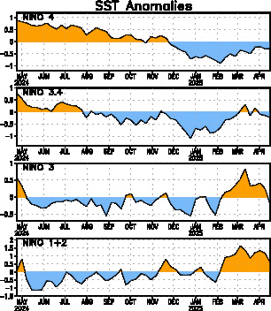
These observations are also worrisome for the following reason: the globe came out of a moderate La Niña event in the first half of the year. During the second half of the year, we remained in a ENSO-neutral state (neither El Niño nor La Niña):
As the second time series graph (labeled NINO3.4) shows, the last La Niña event hit its highest (most negative) magnitude more than once between November 2011 and February 2012. Since then, SSTs peaked at +0.8 in September (y-axis). You can see the effect on global temperatures that the last La Niña had via this NASA time series. Both the sea surface temperature and land surface temperature time series decreased from 2010 (when the globe reached record warmth) to 2012. So the globe’s temperatures were affected by a natural, low-frequency climate oscillation during the past couple of years. And yet temperatures were still in the top-10 warmest for a calendar year in recorded history.
Indeed, this was the warmest La Niña year on record:
This figure shows that 2012 edged out 2011 as the warmest La Niña year on record (since 1950). It also shows a clear trend seen in every temperature record of this length: La Niña years are getting warmer with time (note the difference between 2012 and 1956, for instance). El Niño years are getting warmer with time (note the difference between 2010 and 1958). ENSO-neutral years are getting warmer with time. The globe got warmer throughout the 20th and into the 21st century. Do not pay too much attention to any single year as “evidence” that global warming stopped. As I stated above, natural low-frequency climate oscillations introduce a lot of noise into the temperature signal. Climate is measured over decades and the decadal trend is obvious here: warmer with time.
Skeptics have pointed out that warming has “stopped” or “slowed considerably” in recent years, which they hope will introduce confusion to the public on this topic. What is likely going on is quite different: if an energy imbalance exists (less outgoing energy than incoming) and the surface temperature rise has seemingly stalled, the excess energy has to be going somewhere. That somewhere is likely to be the oceans, and specifically the deep ocean. Before we all cheer about this (since few people want surface temperatures to continue to rise quickly), consider the implications. If you add heat to a material, it expands. The ocean is no different; sea-levels are rising because of heat added to it in the past. The heat that has entered in recent years won’t manifest as sea-level rise for some time, but it will happen. Moreover, when the heated ocean comes back up to the surface, that heat will then be released to the atmosphere, which will raise surface temperatures as well as additional water vapor. Thus, the immediate warming might have slowed down, but we have locked in future warming.
In my previous post on global temperatures, I pointed a few things out and asked some questions. The Conference of Parties summit produced no meaningful climate action. Countries agreed to have something on paper by 2015 and enacted by 2020. If everything goes as planned, significant carbon reductions wouldn’t occur until later in the 2020s – too late to ensure <2°C warming by 2100. If, as is much more likely, everything doesn’t go as planned, reductions wouldn’t occur until later than the 2020s. Additional meetings are scheduled for later this year, but I maintain my expectation that nothing meaningful will come from them. The international process is ill-equipped to handle all the legitimate interest groups in one fell swoop.
The northeast continues to recover from Superstorm Sandy. New York and New Jersey began to plan for infrastructure with increased resilience from the next storm, which will eventually hit the area. Congress took way too long to approve relief money (months, instead of days as it did after Katrina). $60 billion will go a long ways toward assisting the region, especially if people take seriously the threat of living next to the ocean, which has been uncharacteristically quiet for decades.
Paying for recovery is and always will be more expensive than paying to increase resilience from disasters. As drought continues to impact US agriculture, as Arctic ice continues to melt to new record lows, as storms come ashore and impacts communities that are not prepared for today’s high-risk events (due mostly to poor zoning and destruction of natural protections), economic costs will accumulate in this and in future decades. It is up to us how much grief we subject ourselves to. As President Obama begins his second term and climate change “will be a priority in his second term”, he tosses aside the tool most recommended by economists: a carbon tax. Every other policy tool will be less effective than a Pigouvian tax at minimizing the actions that cause future economic harm. It is up to the citizens of this country, and others, to take the lead on this topic. We have to demand common sense actions that will actually make a difference. But be forewarned: even if we take action today, we will still see more warmest La Niña years, more warmest El Niño years, more ENSO-neutral years.
A quick description of the project: Xcel Energy planned to hook up residential, commercial, and industrial properties in Boulder, CO to new technologies so that the utility could more easily see which parts of the grid were performing well or poorly and so customers had real-time access to their energy usage. The latter feature was particularly intriguing to me since I’m a data junkie. I look at my solar PV system’s website constantly to see how much energy its generating. I would do backflips of joy if I had access to energy consumption by my appliances and outlets.
The initial cost of the project was reported to be $15 million, although Xcel said that collectively with its partners, $100 million might be spent to lay the infrastructure and get everything working. Xcel’s publicly stated plan was to install digital meters in 15,000 homes Aug. 1 2008 and approximately 50,000 meters by year’s end. Xcel targeted 1,850 installations of in-home energy devices. They told Boulder’s mayor that they would not seek payment for customers for their grand experiment. Their overall plan? To revolutionize how power was monitored and controlled by stakeholders. That’s about where the good news ends.
Due to the Great Recession as well as overall mismanagement, costs tripled: $44.5 million was the final price tag. Xcel had a good idea a few months after their original announcement that costs would approximately double, but did not inform either the Public Utilities Commission (PUC) or the public. As usually happens when a corporation has an epic fail, the customer was held financially responsible. Xcel filed rate increase requests with the PUC that increased over time as they sought more and more money from all its ratepayers. Customers throughout Xcel’s service region (not just Boulder customers) have already paid $27.9 million!
For what did ratepayers actually pay? Today, only 23,000 meters are hooked up. Customer’s with the meters can view 15-minute energy data, not up-to-the-minute data. Only 101 homes have in-home energy devices (5.5% of the original number). So fewer than half the original number of smart meters and 5% of in-home energy devices were installed. The service delivered does not match the service promised when the project was first proposed. For all this, Xcel wants 3X the money they initially requested.
Which brings us to the judge’s decision. In November 2008, Xcel filed a $15.3 million SmartGridCity (SGC) request with the PUC. In May 2009, they re-filed for $27.3 million with the PUC for SGC. In July 2009, they re-filed for $42 million. Xcel included $44.5 million in a 2010 general rate increase, which the city of Boulder and the Colorado Office of Consumer Counsel challenged. In January 2011, the PUC approved SGC and allowed Xcel to collect $27.9 million for the project (more than the 1st re-filing and almost 2X the original filing). In December 2011, Xcel filed to collect the remaining $16.6 million. Yesterday, the judge ruled that “The lack of information provided here regarding customer-facing benefits or justification of the cost overruns fails to meet the Company’s burden of proof.” The PUC will consider the judge’s ruling at a future meeting, which means that customers still might have to pay for this folly of an experiment.
I could make a dozen analogies why I think this situation is so bad. Suffice to say corporate experiments should not be paid for by customers, especially when the corporation hasn’t acted in good faith. Moreover, I challenge anyone to find the local libertarians who take up space in the media railing against Xcel for this money grab. They’ll complain long and loud about the Transportation District and its decisions regarding expansion of light rail across the Denver metro area. Due to rising commodity prices and mismanagement, an entire line could be delayed until 2042 while every other line is built out by 2019 and some lines receive luxury stops because District personnel live by them. There is a big difference, however, in a public agency issuing transit projections based on revenue projections which turned out to be more optimistic because they didn’t forsee the Great Recession and a corporation hiding ballooning costs from a public regulatory agency. But while RTD is a governmental entity, Xcel is a corporate entity. In these so-called libertarains’ minds, government can do little good while corporations can do little harm. Hence, the only commentary on the topic was 3 paragraphs from Vincent Carroll back in August: “SmartGridCity delivered less consumer benefit than originally advertised. More to the point, however, it cost way more than Xcel estimated. Surely this sort of major miscalculation should cost Xcel more than a little bad publicity.” That’s the same Carroll who has had plenty to say about FasTracks and little of it useful for discussion.
The PUC needs to tell Xcel to eat the costs because Xcel severely mismanaged their project. Ratepayers already are responsible for twice the originally quoted amount. Xcel should revamp their smart grid strategy. The smart grid will be a valuable tool for higher energy awareness in the future. Other utilities are implementing smaller but more reasonable portions of their smart grids. A lesson a supervisor hammered into me years ago is apt: don’t go out and design the Cadillac version of something on your first try. With all the mistakes that will occur with a ground-breaking venture, design something basic but solid first, from which you can add bells and whistles later.
Figure 2 – US Drought Monitor map of drought conditions as of the 8th of January.
The US Department of Agriculture released estimates for 2013 crops. The larger picture isn’t pretty, as the link explains. Due to climatological as well as global market pressures, crop prices have risen leading up to 2013. We can expect those prices to rise further in 2013, especially if there is limited or nonexistent drought relief. Consider the following:
Corn prices are 3x what the average price from 1988-2006.
Soybean prices are more than 2X their average price from 1988-2006.
Wheat prices are more than 2X their average price from 1988-2006.
If nothing else, we will likely see a great deal of price volatility in crop prices in 2013. But any further price increases will pinch most of our bank accounts more so than they already are. This is another downstream effect of climate change and the lack of a national climate policy. Moreover, how are farmers supposed to stay afloat if they never take climate change effects (record high temperatures and widespread drought) into account? As elected officials in D.C. continue to think there is not enough political capital in return for climate change action, crop prices double and triple, impacting every person in the country. We need to remove the politicization surrounding the issue.
In March-April 2012, global sea ice area was above normal, but sea ice area anomaly quickly turned negative and then spent an unprecedented length of time near the -2 million sq. km. deficit in the modern era in 2012. Generally poor environmental conditions (warm surface temperatures and certain wind patterns) established and maintained this condition, predominantly across the Arctic last year. For the third time in modern history, the minimum global sea ice area fell below 17.5 million sq. km. and for the fourth time in modern history, the anomalous global sea ice area fell below -2 million sq. km. This is a significant development given that Antarctic sea ice area has been slightly above average during the past few years. This means that the global anomaly is almost entirely due to worsening Arctic ice conditions.
The rapid ice melt and record-setting area and extent values that occurred in 2012 are the top weather/climate story for 2012, in my opinion. I think we have clearly seen a switch to new conditions in the Arctic. Whether these events will occur in similar magnitude or are merely transitory as the Arctic continues to move to a new stable state that the climate will not achieve for years or decades remains to be seen. The problem is we don’t know all of the ramifications of moving toward or achieving that new state. Additionally, I don’t think we want to know.
Arctic Ice
According to the NSIDC, weather conditions once again caused less freezing to occur on the Atlantic side of the Arctic Ocean and more freezing on the Pacific side. Similar conditions occurred during the past six years. Sea ice creation during December measured 2.33 million sq. km. Despite this rather rapid growth, December′s extent remained far below average for the month. Instead of measuring near 13.36 million sq. km., December 2012’s extent was only 12.2 million sq. km., a 1.16 million sq. km. difference! The Barents and Kara Seas remained ice-free, which is a very unusual condition for them in December. Recent ice growth in the Seas has slightly alleviated this state, but this is happening very late in the season. The Bering Sea, which saw ice extent growth due to anomalous northerly winds in 2011-2012, saw similar conditions in December 2012. This has caused anomalously high ice extent in the Bering Sea. Temperatures over the Barents and Kara Seas were 5-9°F above average while temperatures over Alaska were 4-13°F below average. The reason for this is another negative phase of the Arctic Oscillation, which allows cold Arctic air to move southward. This allows warm sub-arctic air to move north.
In terms of longer, climatological trends, Arctic sea ice extent in December has decreased by 3.5% per decade. This rate is closest to zero in the spring months and furthest from zero in late summer/early fall months. Note that this rate also uses 1979-2000 as the climatological normal. There is no reason to expect this rate to change significantly (more or less negative) any time soon, but increasingly negative rates are likely in the foreseeable future. Additional low ice seasons will continue. Some years will see less decline than other years (like this past year) – but the multi-decadal trend is clear: negative. The specific value for any given month during any given year is, of course, influenced by local and temporary weather conditions. But it has become clearer every year that humans have established a new climatological normal in the Arctic with respect to sea ice. This new normal will continue to have far-reaching implications on the weather in the mid-latitudes, where most people live.
Arctic Pictures and Graphs
The following graphic is a satellite representation of Arctic ice as of September 17, 2012 (yes, it’s been that long since I’ve written a Polar post):
September’s picture shows the minimum extent that occurred in 2012. You can easily see the substantial growth of sea ice since then. This comparison provides a good opportunity to point out something important: even in an epoch of anthropogenic global warming, the Arctic will continue to see wintertime sea ice. There is no solar radiation warming the surface directly and temperatures fall well below freezing for a long time. The loss of sea ice will continue to occur and will worsen significantly in the summer. That loss of ice when the sun is overhead is what climate scientists expect to drive numerous changes around the globe. Incoming solar radiation, instead of being largely reflected back out into space, will instead be mostly absorbed by a darker ocean. That radiation will stay in the Earth’s climate system as heat, which will cause many cascading effects to occur – effects we largely do not know about because we’ve never lived on a planet with missing summer sea ice at a pole.
The lack of sea ice in the Barents and Kara Seas (north of Europe and far western Russia) is problematic because wind and ocean currents typically pile sea ice up on the Atlantic side of the Arctic. Sea ice presence in the Bering Sea (between Alaska and Russia) does not alleviate this problem because currents take ice from that area and transport it into the Arctic. That sea ice will be among the first to melt completely come spring. With sea ice missing on the Atlantic side, currents will transport Arctic sea ice to southern latitudes where it melts. The possibility that January’s picture will look similar to September’s picture is therefore higher in 2013 than it was in say 1983.
Overall, the health of the remaining ice pack is not healthy, as the following graph of Arctic ice volume from the end of December demonstrates:
Figure 3 – PIOMAS Arctic sea ice volume time series through December 2012.
As the graph shows, volume (length*width*height) hit another record minimum in June 2012. Moreover, the volume is far, far outside the 2 standard deviation envelope (lighter gray contour surrounding the darker gray contour and blue median value). I understand that most readers don’t have an excellent handle on statistics, but conditions between -1 and -2 standard deviations are rare and conditions outside the -2 standard deviation threshold (see the line below the shaded area on the graph above) are incredibly rare: the chances of 3 of them occurring in 3 subsequent years under normal conditions are extraordinarily low (you have a better chance of winning your state lottery than this). Hence my assessment that “normal” conditions in the Arctic are shifting from what they were in the past few centuries; a new normal is developing. Note further that the ice volume anomaly returned to near the -1 standard deviation envelope in early 2011, early 2012, and now early 2013. In each of the previous two years, volume fell rapidly outside of the -2 standard deviation area with the return of summer. That means that natural conditions are not the likely cause; rather, another cause is much more likely to be responsible for this behavior: human influence.
Arctic Sea Ice Extent
Take a look at December’s areal extent time series data:
As you can see, the extent (light blue line) grew rapidly in October, then remained at historically low levels through November and December. The extent remained well below average values (thick gray line) throughout the fall and early winter. The time series of sea ice extent for previous low years is also shown on this graph, which is what I term NSIDC’s supplemental graph. In this month’s version, they also plotted the previous five years’ data. You can see the effect of the winter-time conditions that I described above: the difference between a year’s extent and the average value in Jan/Feb is smaller than the difference in October. This leads us to examine the differences between the historical mean, the negative two standard deviation (light gray) below that mean, and the 2012-2013 time series. I can come up with a number of adjectives to describe that difference, but I’ll settle with “stunning”.
Antarctic Pictures and Graphs
Here is a satellite representation of Antarctic sea ice conditions from September 17th:
Ice loss is easily visible around the continent, the more so since there is a 3+ month time difference between Figures 5 and 6. There is slightly more Antarctic sea ice today than there normally is on this date in the year. As a reminder, the difference between long-term Arctic ice loss and relative lack of Antarctic ice loss is largely and somewhat confusingly due to the ozone depletion that took place over the southern continent in the 20th century. This depletion has caused a colder southern polar stratosphere than it otherwise would be, reinforcing the polar vortex over the Antarctic Circle. This is almost exactly the opposite dynamical condition than exists over the Arctic with the negative phase of the Arctic Oscillation. The southern polar vortex has helped keep cold, stormy weather in place over Antarctica that might not otherwise would have occurred to the same extent and intensity. As the “ozone hole” continues to recover during this century, the effects of global warming will become more clear in this region, especially if ocean warming continues to melt sea-based Antarctic ice from below (subs. req’d). For now, we should perhaps consider the lack of global warming signal due to lack of ozone as relatively fortunate. In the next few decades, we will have more than enough to contend with from melting on Greenland. Were we to face melting West Antarctic Ice Sheet at the same time, we would have to allocate many more resources. Of course, in a few decades, we’re likely to face just such a situation.
Finally, here is the Antarctic sea ice extent time series from January 9th:
Antarctic sea ice extent remained at or above average to some extent through the austral spring and early summer, which is good news.
Policy
I just read an opinion piece in Scientific American regarding the sorry state of Arctic sea ice. The author, a scientist, advocated that we do not have time to negotiate mitigation treaties. In order to save the ice, we have to research and deploy geoengineering technologies. Let me state by position on this clearly and strongly: we do not know the effects from geoengineering (solar radiation management or carbon dioxide removal) and more than the know the range and magnitude of effects from greenhouse gas emissions. Moreover, basic governance structures for geoengineering research do not currently exist, to say nothing of deployment. If you think international climate policy is complex and hasn’t moved forward quickly, you should think long and hard before advocating for geoengineering research and deployment. Single-actors are probably the biggest worry when you consider the lack of accountability if somebody conducts an experiment. The few small-scale experiments that have come close to real-world execution by national government scientists around the world caused quick and severe public outcries. The main reason for this is something that affects most scientific endeavors: the lack of effective communication with the public prior to carrying out research. Engaging the public could be viewed as surrendering power and autonomy. But I view it as a critical component to continued public funding of science and technology research.
Errata
Here are my State of the Poles posts from September and July.
It’s official: 2012 was indeed the hottest year in 100+ years of record keeping for the contiguous U.S. (lower 48 states). The record-breaking heat in March certainly set the table for the record and the heat just kept coming through the summer. The previous record holder is very noteworthy. 2012 broke 1998’s record by more than 1°F! Does that sound small? Let’s put in perspective: that’s the average temperature for thousands of weather stations across a country over 3,000,000 sq. mi. in area for an entire year. Previously to 2012, temperature records were broken by tenths of a degree or so. Additionally, 1998 was the year that a high magnitude El Niño occurred. This El Niño event caused global temperatures to spike to then-record values. The latest La Niña event, by contrast, wrapped up during 2012. La Niñas typically keep global temperatures cooler than they otherwise would be. So this new record is truly astounding!
The official national annual mean temperature: 55.3°F, which was 3.3°F above the 20th century mean value of 52°F.
Figure 1 – NOAA Graph showing year-to-date average US temperatures from 1895-2012.
This first graph shows that January and February started out warmer than usual (top-5), but it was March that separated 2012 from any other year on record. The heat of July also caused the year-to-date average temperature to further separate 2012 from other years. Note the separation between 2012 and the previous five-warmest years on record from March through December. Note further that four of the six warmest years on record occurred since 1999. Only 1921 and 1934 made the top-five before 2012 and now 1921 will drop off that list.
Figure 2 – Contiguous US map showing state-based ranks of 2012 average temperature.
Nineteen states set all-time annual average temperature records. This makes sense since dozens of individual stations set all-time monthly and annual temperature records. Another nine states witnessed their 2nd warmest year on record. Nine more states had top-five warmest years. Only one state (Washington) wasn’t classified as “Much Above Normal” for the entire year. The 2012 heat wave was extensive in space and severe in magnitude.
Usually, dryness tends to accompany La Niña events for the western and central US. This condition was present again in 2012, as the next figure shows.
Figure 3 – Contiguous US map showing state-based ranks of 2012 average precipitation.
As usual, precipitation patterns were more complex than were temperature patterns. Record dryness occurred in Nebraska and Wyoming. Colorado and New Mexico saw bottom-five precipitation years. Severely dry conditions spread across the Midwest all the way to the mid-Atlantic and Georgia continued to experience dryness. Washington and Oregon were wetter than normal as a result of the northerly position of the mean jet stream in 2012. Louisiana and Mississippi saw wetter than normal conditions, largely as a result of Hurricane Isaac.
Figure 4 – Contiguous US map showing state-based average actual precipitation.
I always find it useful to know the magnitude of measurements as well as how they stack up comparatively. Figure 4 provides the former while Figure 3 provides the latter. “Normal” precipitation varies widely across the country and even between neighboring states. How much precipitation fell to allow NE and WY to record driest years on record? 13.04 and 8.03″, respectively. Another useful map would be state-based difference from “normal”.
So the brutal heat that most Americans experienced was one for the record books. As the jet stream remained in a more northerly than usual position, heat across the country dominated. More heat and fewer storm systems in 2012 meant widespread and severe drought expanded across the country. That drought tended to reinforce both the temperatures recorded (drying soils meant incoming solar radiation was more easily converted directly to sensible heat) and the lack of precipitation (dry soils required extra moisture to return to normal conditions).
Thankfully, record-setting temperatures didn’t occur all over the globe in 2012 (although Australia is having their own problems now in 2013). I therefore don’t expect 2012 will be the warmest year on record globally, but a top-10 finish certainly is not out of the question. Again, this is significant because of the extended La Niña event that ended in mid-2012. Without the influence of anthropogenic (man-made) climate change, 2012 probably would have been cooler than will be recorded. The background climate is warming and so La Niñas today are warmer than El Niños of yesterday.
These warming and drying conditions have massive implications for our society. The drought that afflicted the Midwest in 2012 helped push up commodity prices as crops failed. If that trend continues into 2013, prices will rise further, which will pinch all of our finances. Drought in the Southwest and Midwest impacted flows in rivers (Colorado & Mississippi, among others). The former could mean imposed restrictions in 2013 while the latter could mean reduced river transportation, which puts further pressure on goods sold in the US. Conditions aren’t the worst recorded yet, but it is imperative that we examine resource management policies. Are policies robust enough to handle the variability of today’s climate? If not, they probably aren’t equipped to address future variability or change either. What systems are critical to today’s society? If the Southwest remains dry, does agriculture (largest user of CO river water) reduce its use or do urban users? What sets of values guide these and other decision-making processes?
The Scripps Institution of Oceanography measured an average of 394.39ppm CO2 concentration at their Mauna Loa, Hawai’i’s Observatory during December 2012.
394.39ppm is the highest value for December concentrations in recorded history. Last year’s 391.79ppm was the previous highest value ever recorded. This December’s reading is 2.60ppm higher than last year’s. This increase is significant. Of course, more significant is the unending trend toward higher concentrations with time, no matter the month or specific year-over-year value, as seen in the graphs below.
The yearly maximum monthly value normally occurs during May. Last year was no different: the 396.78ppm concentration in May 2012 was the highest value reported this year and in recorded history (neglecting proxy data). Note that December 2012’s value is only 2.39ppm less than May 2012’s. If we extrapolate last year’s maximum value out in time, it will only be 2 years until Scripps reports 400ppm average concentration for a singular month (likely May 2014; I expect May 2013’s value will be ~398ppm). Note that I previously wrote that this wouldn’t occur until 2015 – another climate variable that is increasing faster than energy or climate experts predicted.
It is worth noting here that stations measured 400ppm CO2 concentration for the first time in the Arctic last year. The Mauna Loa observations represent more well-mixed (global) conditions while sites in the Arctic and elsewhere more accurately measure local and regional concentrations. That is why scientists and media reference the Mauna Loa observations most often.
Earlier last year, I predicted that 2012 would not see an average monthly CO2 concentration below 390ppm. I was correct: September and October 2012 concentration values were the lowest recorded last year (391ppm). It wasn’t the hardest prediction to make: the trend was going up at a steady rate and based on humanity’s continued reliance on fossil fuels, we weren’t going to break that trend. The next prediction to verify is the first month at Mauna Loa during which Scripps records an 400ppm average. After that, the first year during which the minimum concentration is at least 400ppm, which I think will occur within the next 5 years.
Figure 1 – Time series of CO2 concentrations measured at Scripp’s Mauna Loa Observatory in December: from 1958 through 2012.
This time series chart shows concentrations for the month of December in the Scripps dataset going back to 1958. As I wrote above, concentrations are persistently and inexorably moving upward. How do concentration measurements change in calendar years? The following two graphs demonstrate this.
Figure 2 – Monthly CO2 concentration values from 2008 through 2013 (NOAA). Note the yearly minimum observations are now in the past and we are five months removed from the yearly maximum value.
Figure 3– 50 year time series of CO2 concentrations at Mauna Loa Observatory. The red curve represents the seasonal cycle. The black curve represents the data with the seasonal cycle removed to show the long-term trend. This graph shows the ongoing increase in CO2 concentrations. Remember that as a greenhouse gas, CO2 increases the radiative forcing toward the Earth, which eventually increases lower tropospheric temperatures.
We could instead take a 10,000 year view of CO2 concentrations from ice cores and compare that to the recent Mauna Loa observations. This allows us to determine how today’s concentrations compare to geologic conditions:
Figure 4 – Historical (10,000 year) CO2 concentrations from ice core proxies (blue and green curves) and direct observations made at Mauna Loa, Hawai’i (red curve).
Or we could take a really, really long view into the past:
Figure 5 – Historical record of CO2 concentrations from ice core proxy data, 2008 observed CO2 concentration value, and 2 potential future concentration values resulting from lower and higher emissions scenarios used in the IPCC’s AR4.
Note that this last graph includes values from the past 800,000 years, 2008 observed values (~8-10ppm less than this year’s average value will be) as well as the projected concentrations for 2100 derived from a lower emissions and higher emissions scenarios used by the IPCC’s Fourth Asssessment Report from 2007. Has CO2 varied naturally in this time period? Of course it has. But you can easily see that previous variations were between 180 and 280ppm. In contrast, the concentration has, at no time during the past 800,000 years, risen to the level at which it currently exists. That is important because of the additional radiative forcing that increased CO2 concentrations impart on our climate system. You or I may not detect that warming on any particular day, but we are just starting to feel their long-term impacts.
Moreover, if our current emissions rate continues unabated, it looks like a tripling of average pre-industrial concentrations will be our reality by 2100 (278 *3 = 834). Figure 5 clearly demonstrates how anomalous today’s CO2 concentration values are (much higher than the average, or even the maximum, recorded over the past 800,000 years). It further shows how significant projected emission pathways are. I will point out that our actual emissions to date are greater than the higher emissions pathway shown above. That means that if we continue to emit CO2 at an increasing rate, end-of-century concentration values would exceed the value shown in Figure 5. This reality will be partially addressed in the upcoming 5th Assessment Report (AR5), currently scheduled for public release in 2013-14.
Given our historical emissions to date and the likelihood that they will continue to grow at an increasing rate for at least the next 25 years, we will pass a number of “safe” thresholds – for all intents and purposes permanently as far as concerns our species. It is time to start seriously investigating and discussing what kind of world will exist after CO2 concentrations peak at 850 or 1200ppm. No knowledgeable body, including the IPCC, has done this to date. To remain relevant, I think institutions who want a credible seat at the climate science-policy table will have to do so moving forward. The work leading up to AR5 will begin to fill in some of this knowledge gap. I expect most of that work has recently started and will be available to the public around the same time as the AR5 release. This could potentially cause some confusion in the public since the AR5 will tell one storyline while more recent research might tell a different storyline.
The fourth and fifth graphs imply that efforts to pin any future concentration goal to a number like 350ppm or even 450ppm will be incredibly difficult – 350ppm more so than 450ppm, obviously. Beyond an education tool, I don’t see the utility in using 350ppm – we simply will not achieve it, or anything close to it, given our history and likelihood that economic growth goals will trump any effort to address CO2 concentrations in the near future (as President Obama himself stated in 2012). That is not to say that we should abandon hope or efforts to do something. On the contrary, this series informs those who are most interested in doing something. With a solid basis in the science, we become well equipped to discuss policy options. I join those who encourage efforts to tie emissions reductions to economic growth through scientific and technological research and innovation. This path is the only credible one moving forward.
Inspired by a tweet, this blog post spurred me to think about how to answer a question: who is doing more on carbon emissions: the US or some other country? I think looking ahead to the next 5-10 years, the author is probably correct: it appears that the US is on a path toward additional CO2 reductions while some other nations’ efforts might not yield the results they did in the past. But that only captures part of the story. To get a good idea of who has done what, it is instructive to look at multiple time periods, as the following table does for OECD countries (link has raw data; calculations are mine):
Environment – Air and land – Emissions of Carbon Dioxide
CO2 emissions
Million tonnes
1990
1999
2006
2009
09-06
09-99
09-90
09-71
Australia
260
333
393
395
1%
19%
52%
174%
Austria
56
61
72
63
-13%
3%
13%
29%
Belgium
108
117
110
101
-8%
-14%
-6%
-14%
Canada
432
511
544
521
-4%
2%
21%
54%
Chile
31
57
60
65
8%
14%
110%
210%
Czech R.
155
111
121
110
-9%
-1%
-29%
-27%
Denmark
50
55
56
47
-16%
-15%
-6%
-15%
Estonia
36
15
16
15
-6%
0%
-58%
####
Finland
54
56
67
55
-18%
-2%
2%
38%
France
352
378
380
354
-7%
-6%
1%
-18%
Germany
950
829
824
750
-9%
-10%
-21%
-23%
Greece
70
80
94
90
-4%
13%
29%
260%
Hungary
67
57
56
48
-14%
-16%
-28%
-20%
Iceland
2
2
2
2
0%
0%
0%
100%
Ireland
30
39
45
39
-13%
0%
30%
77%
Israel
33
50
62
65
5%
30%
97%
364%
Italy
397
425
464
389
-16%
-8%
-2%
33%
Japan
1064
1169
1205
1093
-9%
-7%
3%
44%
Korea
229
385
476
515
8%
34%
125%
890%
Luxem.
10
7
11
10
-9%
43%
0%
-33%
Mexico
265
334
395
400
1%
20%
51%
312%
Netherl.
156
169
178
176
-1%
4%
13%
35%
N. Zealand
23
30
34
31
-9%
3%
35%
121%
Norway
28
38
37
37
0%
-3%
32%
54%
Poland
342
303
304
287
-6%
-5%
-16%
0%
Portugal
39
60
56
53
-5%
-12%
36%
279%
Slovak R.
57
39
37
33
-11%
-15%
-42%
-15%
Slovenia
13
14
16
15
-6%
7%
15%
####
Spain
206
269
332
283
-15%
5%
37%
136%
Sweden
53
57
48
42
-13%
-26%
-21%
-49%
Switzerland
41
43
44
42
-5%
-2%
2%
8%
Turkey
127
177
240
256
7%
45%
102%
524%
UK
549
515
534
466
-13%
-10%
-15%
-25%
USA
4869
5506
5685
5195
-9%
-6%
7%
21%
EU27 total
4052
3812
3996
3577
-10%
-6%
-12%
####
OECD total
11158
12293
12999
12045
-7%
-2%
8%
29%
Brazil
194
292
327
338
3%
16%
74%
271%
China
2211
3047
5603
6832
22%
124%
209%
754%
India
582
939
1252
1586
27%
69%
173%
693%
Indonesia
142
261
356
376
6%
44%
165%
####
Russian Federation
2179
1468
1580
1533
-3%
4%
-30%
####
S. Africa
255
291
331
369
11%
27%
45%
112%
World
20966
22947
28093
28994
3%
26%
38%
106%
I have included data from 5 years: 1971 (the first of the dataset), 1990, 1999, 2006, and 2009 (the last year with data). The blog post I link to above asks which nation has reduced CO2 emissions the most since 2006. In many ways, this is like choosing 1998 for the start of a global temperature data comparison. You can do it, but that doesn’t mean you should do it. I will use 2006-2009 as the baseline against which I make comparisons with other start years. The story changes (of course) when you do this.
How did the US fare from 2006 to 2009? Emissions were reduced (-9%), there is no denying that. The Great Recession and the relatively widespread switch from old expensive coal plants to newer cheaper natural gas plants accounted for most of that reduction. How do we know? What is the US’s national climate policy? We don’t know because we don’t have one. Sure, there are actions that the EPA and other agencies of the Obama administration have taken, but they occurred simultaneously with the recession and market responses to a different cheap fuel. It will take years before their effects are noticeable in aggregate numbers like total CO2 emissions. But look, most European nations’ emissions were also reduced during the 2006-2009 time period. The biggest factors: the Great Recession and austerity measures keeping economies from growing.
What does the next time period show us? From 1999 to 2009 (11 years), US emissions fell by 6% – still a noteworthy accomplishment given the lack of national policy pushing us towards any type of meaningful goal. How did European nations do in comparison? Belgium, Denmark, Germany, Hungary, Portugal, Slovak Republic, Sweden, and the United Kingdom all posted double-digit percentage emission declines. All but two of those countries posted double the US’ 6% value (>=12%). What happened in the late-1990s? The signing of the Kyoto Protocol (all except the US, of course). Did the European nations hit their Kyoto targets? No, but they decreased their CO2 emissions substantially.
I often write that we should benchmark nations’ CO2 emissions to 1990, since that was prior to Kyoto or even the Rio Conference. In other words, before emissions garnered widespread international attention. Let’s compare the US and European nations on that basis. I would further advocate for this comparison because of the length of time involved: 19 years, which represents a lot of time.
Unsurprisingly, US emissions increased from 1990 to 2009 – by 7%. What about their European counterparts? In this case, I’ll collect all the nations who posted emission decreases. Belgium (-6%), Czech Republic (-29%), Denmark (-6%), Estonia (-58%), Germany (-21%!), Hungary (-28%), Italy (-2%), Poland (-16%), Solvak Republic (-42%), Sweden (-21%!), and the United Kingdom (-15%). Well, well, well. It appears that Germany’s reputation for reducing emissions is pretty well deserved. Take away the former Eastern bloc nations and there are six European countries which accomplished something the US did not.
The last column represents the longest look possible: from 1971 to 2009. I have never looked at this time frame and it held some surprises. In contrast to the US’ (+21%) change in CO2 emissions, Belgium (-14%), Czech Republic (-27%), Denmark (-15%), France (-18%), Germany (-23%), Hungary (-20%), Luxembourg (-33%), Slovak Republic (-15%), Sweden (-49%), and the United Kingdom (-25%) all posted declines compared to 38 years ago! Let’s give credit where credit is due: that is impressive!
I am not saying that European countries are perfect or that they accomplished their task. Anything but: they still have positive emissions, which is changing the climate. But their emissions are, in yearly magnitude and in cumulative sum, dwarfed by the US’s. The US has a very long way to go before it can claim any environmental success story related to climate change. We do have things we can learn from the other side of the pond. We could start by developing and publicizing a national climate policy. Absent that, efforts from US mayors are needed and welcomed as part of a bottom-up approach, which I am convinced is the only way this problem will be tackled successfully.
The storm systems that moved over the US since the 20th of December didn’t do much to alleviate drought conditions across the US, according to the Drought Monitor. As of Jan 1, 2013, 61% of the contiguous US is experiencing moderate or worse drought (D0-D4). The percentage area experiencing exceptional drought edged up slightly from 6.7% to 6.8%. Percentage areas experiencing drought across the West stayed mostly the same at the end of December as they were the 11th of December. Drought across the High Plains expanded slightly during the same period. Meanwhile, drought across the Southeast and Northeast improved somewhat. Midwest drought remained largely unchanged.
The snow that fell over the intermountain west will have to melt in the spring before conditions improve there. Additional help will have to come this summer via the monsoon before this wide expanse of severe drought is alleviated.
The snow that fell over these areas prior to Christmas didn’t help with drought conditions – yet. Above-average snow will also have to fall over the High Plains before conditions improve much. It was simply too hot and dry over these states last year for one storm to significantly impact drought conditions.
According to the US Climate Prediction Center’s Seasonal Outlook issued yesterday, little relief is likely through March 2013:
As this figure shows, the edges of the drought affecting the western 2/3 of the nation could see some improvement. Conditions over the southeast, which experienced drought for a couple of years, could also improve in the next three months.
I’ve been reading a large number of scientific papers on drought. While extensive and severe in absolute magnitude, the current drought isn’t worse than the droughts of the 20th century (1950s and 1930s). So far, enough precipitation has fallen in the right areas at the right times to alleviate severe impacts on societies. In contrast, 20th century droughts affected people quickly – largely because they were unprepared for the conditions they experienced. Those prior circumstances helped inform decision makers so that future effects would not be as severe as quickly. That said, people would not be adequately prepared if conditions revert back to those last seen in the 1100s. Multidecadal droughts have occurred over substantial parts of the US. The relative wetness of the 19th and 20th centuries are not likely to continue into the 21st, especially as global temperatures continue to rise. How will we prepare and respond?
A new paper published in today’s Nature (subs. req’d) estimates costs to keep total man-made temperature rise below a set of thresholds (including 2°C). This paper joins a long list of previous estimates, all of which are highly dependent on sets of assumptions. The authors try to take uncertainties from four disciplines into account: geophysical, technological, social and political. They state that “Our information on temperature risk and mitigation costs provides crucial information for policy-making, because it clarifies the relative importance of mitigation costs, energy demand and the timing of global action in reducing the risk of exceeding a global temperature increase of 2°C, or other limits such as 3°C or 1.5°C, across a wide range of scenarios.” Given my recent push into the policy side of climate change, this paper provides a good example of something interesting and useful.
I will briefly state a central economic tenet: if you want to reduce how often an action takes place, the most direct way of doing so is to tax it. Thus, if we want to minimize CO2 emissions, we should tax carbon at the source. It is also obvious that the higher the cost of carbon, the lower carbon emissions will be within a set of real-world constraints. What then should a carbon price be today that would work to keep global temperature rise above pre-industrial values below 2°C? With a 50% probability, the authors estimate the 2012 price of carbon should be US$20 tCO2e−1 ($20 per ton of CO2-equivalent emission), as the following graph shows:
You should ask yourself a question at this point. If there was a 50% probability of arriving safely at a destination airport on an airplane, would you buy the ticket? If there was a 1-in-2 chance of me not surviving that trip, there is no way I would buy that ticket. But that’s me. But let’s try to stay away from dire sounding language when talking about climate policy. Yes, substantial changes would result from 2°C warming. But most people and ecosystems would survive intact. I mean only to illustrate what probability looks like for scenarios you or I might encounter.
What prices would generate higher probabilities? A price of more than US$40 tCO2e−1 would achieve the 2°C objective with a probability exceeding 66% – much better odds for something we might think is a worthy goal.
It makes sense too that the graph shows an 80% probability of achieving a 2.5°C objective with a 2012 carbon price of US$20 tCO2e−1 and a >90% probability of achieving a 3°C objective at the same price. We might not want to use 2.5°C or 3°C as our goal – that is our policy choice. But probabilities increase for higher temperatures as well as higher carbon prices. Our climate policies determine which of these two represents our actual goal.
The authors’ also state the following: “Yet, despite all of the uncertainty in the geophysical, social and technological aspects, our analysis indicates that the dominant factor affecting the likelihood and costs of achieving the 2°C objective is politics. Only for low-energy-demand pathways can global mitigation action be delayed until 2020 and the 2°C objective still be achieved with a probability exceeding 66% (or delayed until 2030 with a 50% probability).”
Does anyone seriously believe that we can keep energy demand at turn-of-the-21st-century levels? Developing nations want the same access to energy that developed nations have enjoyed for decades. Demand will continue to rise throughout the 21st century. Absent radical technological innovation (and continued political inaction), I find a 2°C target is already out of reach. If carbon prices aren’t enacted in the next few years, it won’t matter very much what the price of carbon is afterwards, with respect to a 2°C target – the target will simply be unachievable. Other targets will have to come into view. Left unsaid in this discussion is whether a temperature value should even be our target. There are other values that likely make more sense to more people in the world and should therefore be the central focus instead.


