Weatherdem's Weblog

Bridging climate science, citizens, and policy


Leave a comment

NASA & NOAA: April 2014 Warmest Globally On Record

According to data released by NASA and NOAA this month, April was the warmest April globally on record.  Here are the data for NASA’s analysis; here are NOAA data and report.  The two agencies have different analysis techniques, which in this case resulted in slightly different temperature anomaly values but the same overall rankings within their respective data sets.  The analyses result in different rankings in most months.  The two techniques do provide a check on one another and confidence for us that their results are robust.  At the beginning, I will remind readers that the month-to-month and year-to-year values and rankings matter less than the long-term climatic warming.  Weather is the dominant factor for monthly and yearly conditions, not climate.

The details:

April’s global average temperature was 0.73°C (1.314°F) above normal (14°C; 1951-1980), according to NASA, as the following graphic shows.  The past three months have a +0.63°C temperature anomaly.  And the latest 12-month period (May 2013 – Apr 2014) had a +0.62°C temperature anomaly.  The time series graph in the lower-right quadrant shows NASA’s 12-month running mean temperature index.  The 2010-2012 downturn was largely due to the last La Niña event (see below for more).  Since then, ENSO conditions returned to a neutral state (neither La Niña nor El Niño).  As previous anomalously cool months fell off the back of the running mean, the 12-month temperature trace tracked upward again throughout 2013 and 2014.

 photo NASA-Temp_Analysis_20140430_zps82150da6.gif

Figure 1. Global mean surface temperature anomaly maps and 12-month running mean time series through April 2014 from NASA.

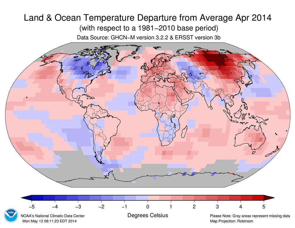
According to NOAA, April’s global average temperatures were +0.77°C (1.386°F) above the 20th century average of 13.7°C (56.7°F).  NOAA’s global temperature anomaly map for April (duplicated below) shows where conditions were warmer and cooler than average during the month.

 photo NOAA-Temp_Analysis_201404_zps92d3f6cb.gif

Figure 2. Global temperature anomaly map for August 2013 from NOAA.

The two different analyses’ importance is also shown by the preceding two figures.  Despite differences in specific global temperature anomalies, both analyses picked up on the same spatial temperature patterns and their relative strength.

Influence of ENSO

 photo NinoSSTAnom20140501_zpsc925f282.gif

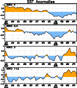
Figure 3. Time series of weekly SST data from NCEP (NOAA).  The highest interest region for El Niño/La Niña is `NINO 3.4` (2nd time series from top).

There has been neither El Niño nor La Niña in the past couple of years.  This ENSO-neutral phase is common.  As you can see in the NINO 3.4 time series (2nd from top in Figure 3), Pacific sea surface temperatures were relatively cool in January through March, then quickly warmed.  This switch occurred because normal easterly winds (blowing toward the west) across the equatorial Pacific relaxed and two significant westerly wind bursts occurred in the western Pacific.  These anomalous winds generated an eastward moving Kelvin wave, which causes downwelling and surface mass convergence.  Warm SSTs collect along the equator as a result.  These Kelvin waves eventually crossed the entire Pacific Ocean, as Figure 4 shows.

 photo PacifcOcEqTAnomaly20140523_zpsff7554f1.gif

Figure 4.  Sub-surface Pacific Ocean temperature anomalies from Jan-Apr 2014.  Anomalously cool eastern Pacific Ocean temperatures in January gave way to anomalously warm temperatures by April.  Temperatures between 80W and 100W warmed further since April 14.

The Climate Prediction Center announced an El Niño Watch earlier this year.  The most recent update says the chances of an El Niño during the rest of 2014 exceeds 65%.  There is no reliable prediction of the potential El Niño’s strength at this time.  Without another westerly wind burst, an El Niño will likely not be very strong.  Even moderate strength El Niños impact global weather patterns.

An important detail is whether the potential 2014 El Niño will be an Eastern or Central Pacific El Niño (see figure below).  Professor Jin-Yi Yu, along with colleagues, first proposed the difference in a 2009 Journal of Climate paper.  More recently, Yu’s work suggested a recent trend toward Central Pacific El Niños influenced the frequency and intensity of recent U.S. droughts.  This type of El Niño doesn’t cause global record temperatures, but still impacts atmospheric circulations and the jet stream, which impacts which areas receive more or less rain.  If the potential 2014 El Niño is an Eastern Pacific type, we can expect monthly global mean temperatures to spike and the usual precipitation anomalies commonly attributed to El Niño.

 photo EastvsCentralPacificENSOschematic_zps08856e81.jpg

Figure 5. Schematic of Central-Pacific ENSO versus Eastern-Pacific ENSO as envisioned by Dr. Jin-Yi Yu at the University of California – Irvine.

If an El Niño does occur later in 2014, it will mask some of the deep ocean heat absorption by releasing energy back to the atmosphere.  If that happens, the second half of 2014 and the first half of 2015 will likely set global surface temperature records.  2014, 2015, or both could set the all-time global mean temperature record (currently held by 2010).  Some scientists recently postulated that an El Niño could also trigger a shift from the current negative phase of the Interdecadal Pacific Oscillation (IPO; or PDO for just the northern hemisphere) to a new positive phase.  This would be similar in nature, though different in detail, as the shift from La Niña or neutral conditions to El Niño.  If this happens, the likelihood of record hot years would increase.  I personally do not believe this El Niño will shift the IPO phase.  I don’t think this El Niño will be strong enough and I don’t think the IPO is in a conducive state for a switch to occur.

The “Hiatus”

Skeptics have pointed out that warming has “stopped” or “slowed considerably” in recent years, which they hope will introduce confusion to the public on this topic.  What is likely going on is quite different: since an energy imbalance exists (less energy is leaving the Earth than the Earth is receiving; this is due to atmospheric greenhouse gases) and the surface temperature rise has seemingly stalled, the excess energy is going somewhere.  The heat has to go somewhere – energy doesn’t just disappear.  That somewhere is likely the oceans, and specifically the deep ocean (see figure below).  Before we all cheer about this (since few people want surface temperatures to continue to rise quickly), consider the implications.  If you add heat to a material, it expands.  The ocean is no different; sea-levels are rising in part because of heat added to it in the past.  The heat that has entered in recent years won’t manifest as sea-level rise for some time, but it will happen.  Moreover, when the heated ocean comes back up to the surface, that heat will then be released to the atmosphere, which will raise surface temperatures as well as introduce additional water vapor due to the warmer atmosphere.  Thus, the immediate warming rate might have slowed down, but we have locked in future warming (higher future warming rate).

 photo Ocean_heat_content_balmaseda_et_al_zps23184297.jpg

Figure 6. Recent research shows anomalous ocean heat energy locations since the late 1950s.  The purple lines in the graph show how the heat content of the whole ocean has changed over the past five decades. The blue lines represent only the top 700 m and the grey lines are just the top 300 m.  Source: Balmaseda et al., (2013)

You can see in Figure 6 that the upper 300m of the world’s oceans accumulated less heat during the 2000s (5*10^22 J) than during the 1990s.  In contrast, accumulated heat greatly increased in ocean waters between 300m and 700m during the 2000s (>10*10^22 J).  We cannot and do not observe the deep ocean with great frequency.  We do know from frequent and reliable observations that the sea surface and relatively shallow ocean did not absorb most of the heat in the past decade.  We also know how much energy came to and left the Earth from satellite observations.  If we know how much energy came in, how much left, and how much the land surface and shallow ocean absorbed, it is a relatively straightforward computation to determine how much energy likely remains in the deep ocean.

Discussion

The fact that April 2014 was the warmest on record despite a negative IPO and a neutral ENSO is eye-opening.  I think it highlights the fact that there is an even lower frequency signal underlying the IPO, ENSO, and April weather: anthropogenic warming.  That signal is not oscillatory, it is increasing at an increasing rate and will continue to do so for decades to centuries.  The length of time that occurs and its eventual magnitude is dependent on our policies and activities.  We continue to emit GHGs at or above the high-end of the range simulated by climate models.  Growth in fossil fuel use at the global scale continues.  This growth dwarfs any effect of a switch to energy sources with lower GHG emissions.  I don’t think that will change during the next 15 years, which would lock us into the warmer climate projections through most of the rest of the 21st century.  The primary reason for this is the scale of humankind’s energy infrastructure.  Switching from fossil fuels to renewable energy will take decades.  Acknowledging this isn’t defeatist or pessimistic; it is I think critical in order to identify appropriate opportunities and implement the type and scale of policy responses to encourage that switch.


1 Comment

Climate and Energy Topics – 21 May 2014

The New York Times’ Andy Revkin had this very interesting post last week: “Three Long Views of Life With Rising Seas“.  He asked three folks for their long-term view on how human might deal with the centennial-scale effects of Antarctic glacier melt.  Some of their (partial) responses merit further thought:

Curt Stager, Paul Smith: Imagine the stink we would all raise if another nation tried to take even one inch of our coastline away from us – and yet here is a slow taking of countless square miles from our shores by a carbon-driven ocean-turned-invader.

David Grinspoon: But I think if our society is around for several more centuries we will have to have found different ways to deal collectively with our world-changing technologies. If we’ve made it that far, we’ll find ways to adapt.

Kim Stanley Robinson: It was when the ice core data in Greenland established the three-year onset of the Younger Dryas that the geologists had to invent the term “abrupt climate change” because they had so frequently abused the word “quick” sometimes meaning several thousand years when they said that. Thus the appearance of “Abrupt Climate Change” as a term (and a National Research Council book in 2002).

Andy Revkin finished with: The realities of sea-level rise and Antarctic trends and China’s emissions, etc., make me feel ever more confident that the [bend, stretch, reach, teach] shift I charted for my goals in my TEDx talk (away from numbers and toward qualities) is the right path.

Chinese coal use almost equals that of the rest of the world combined, according to the EIA:

 photo ChineseCoalUsage20140521_zpsac73e973.png

This is but one reason I believe <2C warming is already a historical consideration.  All of this coal production and consumption would have to stop immediately if we have any hope of meeting this political goal.  That will not happen – absent coal generated power, which constitutes the majority generated, the global economy would spin into a depression.

On the good news front, U.S. consumers are expanding home energy efficiency and distributed power generation, according to Deloitte.  These practices started with the Great Recession, but for the first time are continuing after the economy “recovers”.  In 2013, new solar growth occurred among families making between $40,000 and $90,000.  The most engaged demographic could be Generation Y: “1/3 said they “definitely/probably” will buy a smart energy application, which is up from 28 percent in 2011.”

I’ve let my drought series lapse, but have kept watching conditions evolve across the country.  California has obviously been in the news due its drought and wildfires.  All of California is currently in a “severe” drought for the first time since the mid-1970s (see picture below).  So the quick science point: this has happened before (many times; some worse than this) and isn’t primarily caused by anthropogenic forcing.  The quick impacts point: California’s population is double today what it was in the mid-1970s.  Therefore, the same type of drought will have more impact.  Wrapping these points together: drought impacts could be greater in the 2010s than the 1970s due to sociological and not physical factors.  An important caveat: Californians are more adept now at planning for and responding to drought.  They recognize how dry normal conditions can get and have adapted more so than other places in the U.S.  Drought conditions likely won’t improve until this winter during the next rainy season since last winter was a bust for them.

 photo CAdrought20140521_zpsd403ee59.jpg

An incredible story comes from the New York Times about what it takes to engage communities on climate and energy issues.  Nebraska farmers and ranchers are fighting against the Keystone XL pipeline.  Why, you might ask?  Well, they’re certainly not a bunch of hippie greens.  No, they’re responding to their lifestyle and value system.  If KXL is built, it will be built on their land.  That means someone will take away small pieces of a bunch of farmers land, because the locals have already refused $250,000 payments for them.  If KXL is built, it will risk locals’ cattle.  Who do you think will suffer if the pipeline leaks?  The cows, the ranchers, and the Ogallala Aquifer of course.  A critical piece of the paper is this:

Here was one of the best stories she’d ever seen: Conservative American farmers rise up to protect their land. She could use the image of the family farm to reframe the way Nebraskans thought about environmentalism. It wasn’t going to be Save the Sandhill Cranes. It was going to be Save the Neighbors.

To get Nebraskans to respond to environmental issues, you have to engage them on their values, not yours (unless of course you share them).  This is the key that environmentalists have missed for decades and its part of the reason why environmentalism is so politicized.  It’s why conservatives tend not to respond to climate activism framing.

There’s plenty more where this came from.  Stay tuned.


1 Comment

Research: Antarctic Glaciers – What’s The Real Story?

Two new papers examine historical and projected Antarctic glacier behavior.  The research is illuminating.  Some of the commentary about it is downright confusing.  I’ll sort it out in this post.

From the source: West Antarctic Ice Sheet Is Collapsing at the highly respected journal Science.  This news intern’s article references a paper published in Science this week, “Marine Ice Sheet Collapse Potentially Under Way for the Thwaites Glacier Basin, West Antarctica.”  You can already see where some confusion arose: the actual science article itself used the key work “potentially” while the news piece trumpeting the article used the word “is”.  Potentially implies there is a chance the marine ice sheet may not collapse.  The news article headline completely misses that critical descriptive adverb.

Just as importantly, the news headline misses the operative time scale, which is of course of great importance.  The decision to not include the time scale leads casual readers to assume this collapse will happen soon.  Well, what is soon?  It depends on one’s perspective.  I think the time scale omission was purposeful, so as to boost readership.  Because if the headline had included the article’s values, few people would have paid much attention to it: 200 to 900 years.  Based on a computer model simulation, the authors suggest that the Thwaites Glacier may finish its collapse in two to nine centuries – nowhere near the operative time frame that people think about.  The article dances around the issue a bit in the first three paragraphs – long enough for the author to come out and report on what the paper actually said in my opinion.

If you’re interested, I’ve covered previous research findings on Antarctic glaciers, including in January 2009, November 2009, January 2010, and December 2012.

What is not in question is the science results.  The glacier is indeed melting faster than snowfall can replenish it, and this is increasingly due to human influence.  Once the edge of the glacier recedes past a ridge, the glacier’s melt will accelerate.  As most sea-based glaciers do, Thwaites holds back land-based ice.  As this ice melts, sea level rises.  Thus, the rate of sea level rise could increase from <0.25mm per year to >1mm per year due to all melting land-based glaciers.

The second paper, published in Geophysical Research Letters, Widespread, rapid grounding line retreat of Pine Island, Thwaites, Smith and Kohler glaciers, West Antarctica from 1992 to 2011, the authors report on satellite data analysis showing that

Pine Island Glacier retreated 31 km at its center, with most retreat in 2005–2009 when the glacier un-grounded from its ice plain. Thwaites Glacier retreated 14 km along its fast-flow core and 1 to 9 km along the sides. Haynes Glacier retreated 10 km along its flanks. Smith/Kohler glaciers retreated the most, 35 km along its ice plain

Upstream of the 2011 grounding line, there remain no more physical obstacles (higher sea bed regions) that will hold back the glaciers.  Thus nothing remains to stop further melting of the basin.  These results are an independent corroboration of the Science paper results and build the body of literature on Antarctic glaciers.  Once Thwaites melts, the rest of the West Antarctic ice sheet is at risk of melt.  There are other researchers who think the 200-900 year timeline is too slow because important feedbacks are not properly modeled.  But so far no evidence suggests the time scale is off by an order of magnitude (i.e., not 20-90 years).

Absent significant climatological shifts away from anthropogenically forced climate change, West Antarctic and Greenland ice sheets will continue to melt for centuries.  Sea levels will rise, probably at a faster rate than what we’ve seen historically.

But the presentation of these studies is disappointing.  Here are some places that covered this news.  I found probably the best headline at Slate: “Huge Antarctic Glacier Slow-Speed Collapse May Now Be Past Point of No Return“.  That gives the reader all the critical information.  Thwaites is huge, it will undergo slow-speed collapse, and that process is likely now irreversible.  Good on Slate.  The normally staid Jeff Masters’ somewhat less accurate headline: “Slow-Motion Collapse of West Antarctic Glaciers is Unstoppable, 2 New Studies Say“.  This is better than Science’s own headline, but notice the “is” in this one.  Again, I don’t think we can justifiably conclude based on science to date that the collapse is definitely unstoppable, as this headline claims.  Is it likely?  Yes, it is.  This headline doesn’t convey that.

And now the worst example, from an Environment America fundraising email: “Antarctica to melt completely”.  What?!  These two studies do not say Antarctica will melt completely; such an event will take at least thousands of years, even under the highest GHG emissions scenarios.  And again, there is no mention of any time line in the email header.  The email includes this nonsense: “The melting of the West Antarctic ice sheet is now unstoppable — but we can still prevent even worse disasters, and President Obama is taking action right now.”  I’m not sure what they consider a worse disaster than the entire Antarctic ice sheet melting (they certainly don’t make a specific claim in their fundraising request).  They go on to include the worst type of messaging: “This is the nightmare scenario”.  Fantastic – shut down everybody’s response mechanisms with the worst possible language.  Moreover, if this is the nightmare scenario, what is the “worse disaster” they can prevent if only I send them money?  The email continues “As bad as this news is, we simply don’t have time for despair.”  Then why use language that causes despair?

This is exactly what the Science news piece tried to generate, and it worked.  Unfortunately, that’s where the working stops.  People that know about Antarctic glaciers melting are already taking action.  People that don’t won’t do so just because of this email.  It operates from the wrong frame and doesn’t engage alternative values.  It doesn’t engage and it doesn’t present opportunities.  But it’s what prominent environmental groups do and it’s why there has been polarization and inaction surrounding the issue. They continue to squander time and resources.


Leave a comment

Climate Communication: Case Study

Climate Communication

What gas do most scientists believe causes temperatures in the atmosphere to rise?  Is it carbon dioxide, hydrogen, helium, or radon?

I’ll give you an opportunity to think about your answer.

.

.

.

.

.

.

.

.

.

60% of 2013 Pew poll respondents answered correctly: carbon dioxide.

What was the political affiliation of those correct responders: Democratic, Unaffiliated, or Republican?

.

.

.

.

.

.

.

There was no statistically significant difference between the responders’ affiliation, but Republicans were somewhat more likely than Unaffiliateds and Democrats to answer correctly:

 photo PewPoll-CO2andTempbyPoliticalParty_zps96cdd163.png

What a minute.  Does that make sense?  More Democrats than Republicans believe that humans are causing global warming, but they don’t know the most fundamental fact about the topic.  Conversely, more Republicans do not believe the human-global warming relationship, but know that CO2 is a GHG and causes the atmosphere to warm.  Don’t climate activists rail against Republicans for dismissing facts or being uneducated?  They sure do, and I  think it increasingly hurts their cause.

In a nutshell, it’s not about education.  Belief statements about climate change don’t convey science knowledge; they express who people are.

This is a very good piece, which Dan Kahan delivered at Earthday “Climate teach in/out” at Yale University last month.  The  upshot: What you “believe” about climate change doesn’t reflect what you know; it expresses *who you are*.  This flies in the face of the approach many physical scientists (and academic faculty) take.  According to them, people are stupid and need only be filled with knowledge they possess.  That isn’t the case at all.  Instead, people respond to this and similar questions according to their identification with a cultural group.  As Kahan writes:

It [the result of taking the “wrong” position in relation to a cultural group] could drive a wedge—material, emotional, and psychological—between individual the people whose support are indispensable to his or her well-being.

And note this doesn’t just apply to evangelical Christians, a group many climate activists derogatorily cite.  This applies just as equally to those climate activists – which explains ideological positions entrenchment on the topic of climate change, evolution, the Big Bang, etc.

Kahan continues:

But while that’s the rational way for people to engage information as individuals, given what climate change signifies about their cultural identities, it’s a disaster for them collectively.  Because if everyone does this at the same time, members of a culturally diverse democratic society are less likely to converge on scientific evidence that is crucial to the welfare of all of them.

So there’s more helplessness as a result of climate change?  No, there’s not.  Kahan offers a solution and well stated opinion on where things stand:

If we want to overcome it, then we must disentangle competing positions on climate change from opposing cultural identities, so that culturally pluralistic citizens aren’t put in the position of having to choose between knowing what’s known to science and being who they are.

[…]

That means you, as a science communicator, can enable these citizens to converge on the best available evidence on climate change.

But to do it, you must banish from the science communication environment the culturally antagonistic meanings with which positions on that issue have become entangled—so that citizens can think and reason for themselves free of the distorting impact of identity-protective cognition.

If you want to know what that sort of science communication environment looks like, I can tell you where you can see it: in Florida, where all 7 members of the Monroe County Board of Commissioners — 4 Democrats, 3 Republicans — voted unanimously to join Broward County (predominantly Democratic), Monroe County (predominantly Republican), and Miami-Dade County (predominantly Republican) in approving the Southeast Climate Compact Action plan, which, I quote from the Palm Beach County Board summary, “includes 110 adaptation and mitigation strategies for addressing seal-level risk and other climate issues within the region.”

I’ll tell you another thing about what you’ll see if you make this trip: the culturally pluralistic, and effective form of science communication happening in southeast Florida doesn’t look anything  like the culturally assaultive “us-vs-them” YouTube videos and prefabricated internet comments with which Climate Reality and Organizing for America are flooding national discourse.

And if you want to improve public engagement with climate science in the United States, the fact that advocates as high profile and as highly funded as that still haven’t figured out the single most important lesson to be learned from the science of science communication should make you very sad.

Those last two paragraphs convey my sentiments well.  Climate activists rail against skeptics as uneducated and ideologically motivated.  They label them anti-scientific and Luddites.  They try to put themselves on the high ground of the debate landscape by claiming the science flag.  Unfortunately, they focus their attention singularly on physical science and discount social science results.  While they do this, they alienate potentially receptive audiences and ensure the pace of climate action remains glacial.

There are proven ways to better communicate climate risk to a culturally pluralistic population.  Small examples are available for study and emulation.  We need to break old communication habits and adopt new ones.


Leave a comment

Climate and Energy Stories May 11, 2014

The following are stories that I recently found interesting:

Research: Natural Variations in Atlantic Drive Extreme Winters (abstract here).  This research identifies the Atlantic Multidecadal Oscillation as the primary driver of blocking patterns (via the North Atlantic Oscillation) that have caused extreme cold winters over Europe and east US in recent years.  This Oscillation is a natural feature of the climate system.  This means that anthropogenic effects on extreme winters are likely not the dominant factor.  This challenges many climate activists’ statements that extreme weather we experience today are man-made.  The actual message is more nuanced.  The work combines 20th century observations with climate model results.  They write “A negative NAO in winter usually goes hand-in-hand with cold weather in the eastern US and north-western Europe.” The observations also suggest that it takes around 10-15 years before the positive phase of AMO has any significant effect on the NAO.  The AMO has been positive since the early 1990s.

German electricity demand and generation changing, but are the assumptions valid?  The figure below shows German government power generation historically and for the next 15 years:

 photo Germanpowergenerationprojection201405_zps8395b943.png

As indicated in the graphic, fossil power generation could hold constant until 2029, then decline as additional renewable power comes online.  In the aftermath of Japan’s Fukushima nuclear power plant disaster, Germany is decommissioning their nuclear power plants.  What I find interesting in this graphic is Germany projects renewables will pick up the electricity generation lost by nuclear power in the next 15 years as well as satisfy new electric demand.  Only after that would renewables eat into fossil power generation.  I’m not an expert on the German energy system, but I do know based on my expertise that this projection means Germany will not accelerate system decarbonization until 2030, give or take a few years.  By direct consequence, Germany’s CO2 emissions will likewise not decline until 2030.  This provides additional evidence that CO2 emissions will not decline soon enough to avoid 2C warming by 2100.  We don’t have 15 more years to act if that’s really the goal.  Emissions have to start declining in 2014-2015 if 2C is the goal.  This projection tells me Germans are more willing to accept unknown but certain and common climate change risks but are unwilling to accept known but rare nuclear power risks.

Two new solar projects will be built in Arizona.  This news isn’t terribly unique; companies make similar releases regularly now.  What I wanted to point out is the scale of the projects compared to the scale of electricity needed.  These systems will generate 42.76MW of electricity.  The mean size of a coal plant in the US is 667MW.  Thus, 15-16 new solar projects of this size have to be built to substitute solar generation for one coal plant.  Remember, then number of coal plant retirements is increasing.  Demand is also increasing.  As in the case of the graphic above, renewable energy generation has to replace existing generation but also meet demand that doesn’t currently occur.  In 2012, coal generated 1,514,043 thousand MWh, natural gas generated 1,225,894 thousand MWh, and renewables generated 218,333 thousand MWh (141,000 by wind; 4,000 by solar).  To displace coal and later natural gas in the next 50 years, we have to boost the number of solar and wind projects by 10-100X.  I cheer every new project announcement; we need many more of them.

3 Dont’s: Ed Maibach, director of George Mason University’s Center for Climate Change Communication, says there are at least three things “we know that you shouldn’t do,” when communicating the science: don’t use language people don’t understand, don’t use too many numbers, and don’t talk about “plants, penguins and polar bears” instead of people. Maibach says another error is talking about the threat of climate change without giving people solutions.

Guess what most activists do (and did historically)?  They use inappropriate language, they talk mostly about numbers, and they talk about polar bears.  Moreover, they talk about threats (devastation, civilization ending, epic disasters, apocalypse , trouble, strife, etc.) and don’t offer solutions.  Is it any wonder most people remain disconnected on the topic?  It’s not to me.  What makes this worse?  People “aggressively filter” information that doesn’t conform to their worldview.  The more education they have, they more they filter that information.  Thus, climate believers are more likely to believe in climate change with more education and climate skeptics are more likely not to believe in climate change.  It’s not a matter of education; it’s a matter of values.  Climate communicators therefore need to talk to people about people in their local setting, not obscure numbers of global phenomena.

Among other things, the EIA’s January report shows total January energy production in 2014 than 2013 or 2012.  Most of the renewable energy in the graphs are hydroelectric, not wind or solar, which continue to lag far behind other generation sources despite recent year-over-year percentage increases.  It also shows that contrary to pro-fossil fuel industry claims, the cost of residential energy continued to hold steady, as it has for 30 years now.  In other words, adding renewable energy doesn’t significantly impact energy costs.

As the US shifts from coal to natural gas (not coal to renewables), US GHG emissions falls led developed countries in 2012: by 3.4% vs. 1.3% for the EU (see German energy generation above).  That’s one way to measure progress.  Another: actual EU emissions are far lower than US emissions compared to 1990.  That means the US, as the 2nd largest GHG emitter worldwide, has a very long way to go before it achieves stated climate goals.  The Obama administration for instance has a recent talking point that the US will meet 2020 GHG emission cut goals due to their leadership.  The big devil in the details: they’re using 2005 emissions instead of 1990 emissions.  Even if you don’t know the exact numbers, you should be able to state with confidence that 2005 US emissions were higher than 1990 emissions because we weren’t deploying renewable energy, our population grew, and our demand per person grew.  Well, the EU’s emission cuts reference their 1990 levels.  Moreover, peak US GHG emissions occurred in 2005.  It’s easy to hit big percentage cuts from a maximum value; it’s much harder to hit those same percentage cuts from an intermediate value.  The US would have to cut all emissions from 1990 to 2005 and then an additional amount from 1990 to achieve Kyoto goals.  We will not achieve that by 2020 under current policies because we never wanted to.  We may not achieve a 17% reduction in 1990 emissions by 2030.  This constitutes a persuasive argument that <2C warming by 2100 will not occur.

In rereading my list of topics to cover in this post, I found a couple that deserve more singular attention.  More to come later this week.


1 Comment

April 2014 CO2 Concentrations: 401.33ppm

During April 2014, the Scripps Institution of Oceanography measured an average of 401.33 ppm CO2 concentration at their Mauna Loa, Hawai’i Observatory.

This value is important because 401.33 ppm is the largest CO2 concentration value for any April in recorded history.  This year’s April value is approximately 2.97 ppm higher than April 2013′s.  Month-to-month differences typically range between 1 and 2 ppm.  This particular year-to-year jump is outside of that range, but not extreme.  For example, February 2012’s year-over-year change was +3.37 ppm and May 2012’s change was +3.02 ppm.  Of course, the unending long-term trend toward higher concentrations with time, no matter the month or specific year-over-year value, as seen in the graphs below, is more significant.

April 2014’s mean value of 401.33 ppm also represents the first time in contemporary history that a monthly mean exceed 400 ppm.  The last time CO2 concentrations were this high was at least 800,000 years ago, and likely even longer – on the order of millions of years ago.  The implications of this measurement are in some ways subtle and in some ways overt, as I discuss below.

The yearly maximum monthly value normally occurs during May. 2013 was no different: the 399.89ppm mean concentration in May 2013 was the highest recorded value (neglecting proxy data) in 2013.  May 2013′s record held until April of this year when the annual cycle pushed a monthly value above this record.  Just like in years past, May 2014 is likely to set another new all-time monthly record (until February or March 2015 … you get the idea.)  April 2014 is the first calendar month with mean CO2 concentrations above 400 ppm, but it won’t be the last.  May 2014 will be the second.  September 2015 will likely be one of the last months with mean concentrations below 400 ppm.  After that, we probably won’t witness <400 ppm again.

 photo co2_widget_brundtland_600_graph_201404_zpsf4794b1c.gif

Figure 1 – Time series of CO2 concentrations measured at Scripp’s Mauna Loa Observatory in February from 1958 through 2014.

How do concentration measurements change in calendar years?  Let’s take a look at two charts that set that context up for us:

 photo CO2_concentration_5y_trend_NOAA_201404_zps537c4cea.png

Figure 2 – Monthly CO2 concentration values (red) from 2010 through 2014 (NOAA). Monthly CO2 concentration values with seasonal cycle removed (black). Note the yearly minimum observation occurred seven months ago (red curve) and the yearly maximum value occurred eleven months ago. CO2 concentrations will increase through May 2014, as they do every year, before falling again towards this year’s minimum value.

The data in this graph doesn’t look that threatening.  What’s the big deal about CO2 concentrations rising a couple of parts per million per year anyway?  The problem is the long-term rise in those concentrations and the increased heating they impart on our climate system.  Let’s take a longer view – say 50 years:

 photo CO2_concentration_50y_trend_NOAA_201404_zps13abf83e.png

Figure 3 – 50 year time series of CO2 concentrations at Mauna Loa Observatory (NOAA).  The red curve represents the seasonal cycle based on monthly average values.  The black curve represents the data with the seasonal cycle removed to show the long-term trend (as in Figure 2).  This graph shows the relatively recent and ongoing increase in CO2 concentrations.

The big deal is, as a greenhouse gas, CO2 increases radiative forcing toward the Earth, which over time increases the amount of energy in our climate system as heat.  This excess and increasing heat has to go somewhere or do something within the climate system because the Earth can only emit so much long wave radiation every year.  The extra heat added to the climate system during the past 150 years has almost exclusively gone into the ocean; during the past 15 years into the deep ocean (>700m).  The latter is the result of low-frequency climate oscillations’ recent states (e.g., negative IPO phase).  That process cannot and will not last forever.  Within the next 5-15 years, those oscillations will switch phase and the excess energy will once again be more apparent near the Earth’s surface (where measurements are numerous and accurate).  Meanwhile, the extra oceanic heat will continue to expand the ocean’s volume, which will further increase global mean sea level.  That heat will also one day transfer to the atmosphere, causing further changes for land-based systems.

CO2 concentrations are increasing at an increasing rate – not a good trend with respect to minimizing future warming.  Natural systems are not equipped to remove CO2 emissions quickly from the atmosphere.  Indeed, natural systems will take tens of thousands of years to remove the CO2 we emitted in the course of a couple short centuries.  Moreover, human technologies do not yet exist that remove CO2 from any medium (air or water).  They are not likely to exist at a large-scale for some time.  Therefore, the general CO2 concentration rise in the figures above will continue for many years, with effects lasting tens of thousands of years.

Climate change as a result of increasing GHGs is affected cumulatively – that is, climate change effects we witness today are mostly a result of previous decades’ GHG concentrations, not today’s.  Today’s concentrations will exert climate influence in future decades, not tomorrow.  This lagged effect is one significant problem with climate action.  Theoretically, if we could reduce CO2 emissions to zero today, today’s concentrations would cause further climate change for decades.  All that said, the most obvious way to reduce additional future climate change is to reduce emissions.  That requires either economic contraction or decarbonization (reducing the amount of carbon emitted per unit of economic output).

Since we don’t want the former to happen, we have to focus on the latter.  What does that entail?  That entails directing public money to widespread science and technology research, development, and deployment.  That entails innovators trying thousands of ideas so that we implement a few successes that are really efficient.  Not every attempt will succeed – indeed, most will fail.  We have to find out what doesn’t work as part of the process to find out what does work.  That entails a sustained commitment to such efforts.  This won’t happen with three years’ funding.  It will happen with thirty and three hundred years funding.  The California-related reports I mentioned yesterday (and will write about) demonstrate just how challenging the task is.  Those challenges relate to opportunities, which is exactly how we have to frame them in order to get people to support them.  As I often write, CO2 emissions and later concentrations will decline when we as a society want them to.


1 Comment

2014 US National Climate Assessment Released

The US Global Change Research Program issued its latest National Climate Assessment today. There are lots of goodies in it.  I want to focus on a couple of things that caught my eye in an initial skim.

Impacts will increase in frequency and severity (no big surprise there). This assessment includes up-t0-date research results on those impacts.  Like most reports, they leave `Responses` as a final category.  I understand the logic of laying out the evidence of climate change and its impacts prior to discussing solutions, but as I’ve written before today, people primarily respond to solutions and not problems.  Only the most dedicated readers will make it all the way through the report to get to the Response section.  My worry is that the Response section will not be the focus of activists’ attention; a continuation of decades of wasted energy.

Extreme Weather

The report summarizes the state-of-the-science well: “Over the last 50 years, much of the U.S. has seen increases in prolonged periods of excessively high temperatures, heavy downpours, and in some regions, severe floods and droughts.”  That is accurate.  I do not think one example is valid, however.  The report discusses anomalous warmth and dryness in Texas and Oklahoma in 2011.  I do not argue that the event occurred; I blogged about it and the subsequent 2012 Great Plains drought.  Where I deviate from the Assessment is this: there is scant evidence that the 2011 Southern Plains drought had a strong climate signal.  The same goes for the 2012 Great Plains drought.  Instead, these droughts were strongly linked to drier summertime conditions during the recent decade as part of a regime shift, most probably due to natural decadal variability (Hoerling et al. 2014).  The 2011 Texas heat wave was more likely to occur than it was 40 years ago.  This is not the same thing as identifying a clear attribution – something that remains at the cutting edge of climate science.

Likewise, the largest determinant of Atlantic hurricanes remains natural variability.  The Assessment’s statement that Atlantic hurricane activity increased since the early 1980s is true, but there are important details to consider.  The Atlantic signal is opposite the global signal (a small reduction in overall hurricane activity in that same time period), so regional effects are important to consider.  The Atlantic Multidecadal Oscillation is currently in a positive phase (since the early 1980s – isn’t that interesting?), which includes a warmer than usual Atlantic Ocean.  All else equal, this facilitates tropical storm development, which we’ve seen.

The Assessment’s conclusion stands in direct contrast to a couple of peer-reviewed papers, including Chylek and Lesins 2008 (we find no increase in the number of major hurricanes (category 3–5); If there is an increase in hurricane activity connected to a greenhouse gas induced global warming, it is currently obscured by the 60 year quasi-periodic cycle.) and Enfield and Cid-Serrano 2009 (Projections to the year 2025 show that the cumulative change in summer warm pool size since 1975 will depend critically on whether a subsequent cooling in the multidecadal cycle occurs, comparable to the warming between 1975 and 2000 AD.)  In other words, determining how man-made warming affects Atlantic hurricanes will not be detectable from the natural signal for many years to come.

That doesn’t mean we do nothing.  To the contrary, I argue that we need to adapt our current infrastructure to our current climate.  Multi-billion dollar events occur today.  Most of that is related to increases in population and wealth, as the Assessment reports.  We can lessen impacts by hardening our infrastructure (taking the likeliest climate effects into account) today while simultaneously mitigating future climate effects.  One should not happen without the other, but at a minimum, we need to adapt to today’s climate while recognizing tomorrow’s climate will be different.

Southwest

I want to cite the impacts the Assessment identifies for the Southwest, which includes California, Nevada, Utah, Colorado, New Mexico, and Arizona.  This region is the hottest and driest of the US.  They include: “increased heat, drought, insect outbreaks, and wildfires.  Declining water supplies, reduced agricultural yields, health impacts in cities due to heat, and flooding and erosion in coastal areas are additional concerns.”

Key messages:

  • Reduced snowpack and streamflow
  • Agricultural threats
  • Increased wildfire
  • Sea level rise
  • Heat threats to health

Southwest Responses

I really want to highlight one of the responses.  Without having read through all the responses carefully, I want to point out that I hope other responses are better than this one.  The selected response shows one scenario that could theoretically achieve 80% GHG reductions from 1990 levels by 2050:

 photo SW_energy-generation-by-2045_12447_v10-hi_0_zps2c73bc2c.jpg

I’ll discuss Colorado here; the Assessment included references to exhaustive reports for California, which I’ll cover in the future.

The latest data for Colorado’s net generation shares (2012) demonstrate the immense challenge confronting the scenario shown above.  Broken down by percentage: coal (64.3%), natural gas (20.1%), wind (11.2%), hydroelectric (3.7%), solar (0.3%), biomass and other (0.1% each).  The scenario above (still trying to pin down units) shows that wind can become the dominant source of electricity generation.  In principle, I agree.  But wind would have to switch places with coal as the dominant generation type by 2050 to achieve 80% GHG reductions.  Wind has penetrated the electricity generation market, which I fought for and applaud.  But it still trails natural gas (1/2 the generation) and significantly trails coal (1/5 the generation).  Changing those ratios requires a policy upheaval which I don’t think is likely.  Renewables will eventually supplant fossil fuels as primary generation technologies.  At this time, I don’t think it will happen in Colorado or anywhere else (California has an outside shot) by 2050.

Conclusion

This Assessment is useful for academics and activists, but is probably not useful for the general public.  A brief review of the Response section didn’t convince me that the writers and editors had the public as their primary audience.  I’ve seen Twitter explode today with comments regarding how people were at the forefront of this report, how actionable the information is, etc.  I’m not convinced yet.  Hopefully that will change.