The US-China climate deal announced in December 2014 generated big news. It was yet another diplomatic success for the Obama administration and John Kerry’s State Department. Nothing I say below takes away from that success. In terms of climate action success, the deal ranks pretty low to me. I’ll quickly summarize what I understand of the deal and then share why I think it isn’t a significant climate deal.
China, the world’s biggest emitter of greenhouse gases, pledged in the far-reaching agreement to cap its rapidly growing carbon emissions by 2030, or earlier if possible. It also set an ambitious goal of increasing the share of non-fossil fuels to 20 percent of its energy mix by 2030.
Obama announced a target to cut U.S. emissions 26 to 28 percent below 2005 levels by 2025 – eight years after he leaves office — the first time the president has set a goal beyond the existing 17 percent target by 2020.
The bolded portions highlight the agreement’s big news. China agreed to a carbon emissions cap and the U.S. pushed its emissions reduction target out 5 years and increased the target by ~11% below 2005 levels.
Those are good goals. Are they sufficient goals? It depends on what you consider sufficient. I consider goals that will actually achieve the stated climate target of <2C warming by 2100 as sufficient. These goals won’t achieve that target. But then, as I’ve written for some time now, I don’t think we can set goals that achieve the <2C by 2100 target. There are technical and political hurdles that we chose not to surmount during the past 30+ years. Why won’t this agreement achieve that target? Let’s take a quick look from the same International Business Times article:
China completes a new coal plant every eight to 10 days, and while its economic growth has slowed, it is still expanding at a brisk rate exceeding 7 percent.
The scale of construction for China to meet its goals is huge even by Chinese standards. It must add 800 to 1,000 gigawatts of nuclear, wind, solar and other zero-emission generation capacity by 2030 — more than all the coal-fired power plants that exist in China today and close to the total electricity generation capacity in the United States.
And to meet its target, the United States will need to double the pace of carbon pollution reduction from 1.2 percent per year on average from 2005 to 2020 to 2.3 to 2.8 percent per year between 2020 and 2025.
Who out there truly believes that China can deploy 800 GW of zero-emission generation capacity in less than 15 years? Remember before you answer in the affirmative that China’s deployment of coal-fired plants exceeded anything in history and that coal remains an extremely cheap energy resource. All the other technologies currently cost more in terms of deployment. What incentives does China, as a developing nation, have to spend more money for intermittent power sources? They’re more interested in growing their economy, as the U.S. is. Speaking of the U.S. – I emphasized part of that quote quite purposefully to highlight the scale of the issue. China must, in 15 years, deploy as much generation infrastructure as exists in the entire U.S. today. Our infrastructure took decades and decades to build out. China needs to do the same thing, with more expensive infrastructure, in 15 short years!? I will be among the first to congratulate China if they accomplish this daunting task and I don’t think China should shy away from working towards it. I just don’t think they have a realistic chance of actually accomplishing it.
What about the U.S.? We need to more than double the decarbonization rate of our economy to achieve our emissions goals. Remember that most of the decarbonization achieved since 2005 was due first to the Great Recession and second to the natural gas boom. The Great Recession is finally behind us, though effects linger. The natural gas boom? It’s currently experiencing strong headwinds as OPEC pushes the cost of oil down to the $50 range from the $100-110 range last year. It’s economically unfeasible to frack for natural gas with $50 per barrel of oil. While the natural gas industry won’t collapse (at least I hope it doesn’t), it won’t support additional decarbonization for the foreseeable future either.
I believe we are well on our way toward 3-4C warming by 2100 and must plan and act accordingly. This deal, while diplomatically ambitious, is not climate ambitious enough to drive us away from those thresholds.
David G. Victor and Charles F. Kennel, who are researchers in International Relations and Oceanography, respectively, wrote a Comment article for Nature at the beginning of October. In it, they argued that climate and policy folks should stop using 2 °C as the exclusive goal in international climate policy discussions. I agree with them on principle, but after reading their paper and numerous rebuttals to it, I also agree with their reasoning.
I’ll start with what they actually said because surprise, surprise, tribal and proxy arguments against their commentary focused on very narrow interpretations.
Bold simplicity must now face reality. Politically and scientifically, the 2 °C goal is wrong-headed. Politically, it has allowed some governments to pretend that they are taking serious action to mitigate global warming, when in reality they have achieved almost nothing. Scientifically, there are better ways to measure the stress that humans are placing on the climate system than the growth of average global surface temperature — which has stalled since 1998 and is poorly coupled to entities that governments and companies can control directly.
I agree with their political analysis. What have governments – including the US – done to achieve the 2 °C goal? Germany for instance largely switched to biomass to reduce GHG emissions while claiming that renewables (read: solar and wind) are replacing fossil fuels. The US established more robust vehicle emissions and efficiency requirements, but the majority of US emission reductions in recent years result from cheap natural gas and the Great Recession. No country will meet its Kyoto Protocol emissions goal – hence the hand-wringing in advance of the Paris 2015 climate conference. And by the way, even if countries were meeting Kyoto goals, the goals would not lead to < 2 °C warming.
More from the authors:
There was little scientific basis for the 2 °C figure that was adopted, but it offered a simple focal point and was familiar from earlier discussions, including those by the IPCC, EU and Group of 8 (G8) industrial countries. At the time, the 2 °C goal sounded bold and perhaps feasible.
To be sure, models show that it is just possible to make deep planet-wide cuts in emissions to meet the goal. But those simulations make heroic assumptions — such as almost immediate global cooperation and widespread availability of technologies such as bioenergy carbon capture and storage methods that do not exist even in scale demonstration.
We will not achieve either of the last two requirements. So we will very likely not achieve <2 °C warming, a politically, not scientifically, established goal.
A single index of climate-change risk would be wonderful. Such a thing, however, cannot exist. Instead, a set of indicators is needed to gauge the varied stresses that humans are placing on the climate system and their possible impacts. Doctors call their basket of health indices vital signs. The same approach is needed for the climate.
Policy-makers should also track ocean heat content and high-latitude temperature. […]
What is ultimately needed is a volatility index that measures the evolving risk from extreme events — so that global vital signs can be coupled to local information on what people care most about. A good start would be to track the total area during the year in which conditions stray by three standard deviations from the local and seasonal mean.
So the authors propose tracking a set of indicators including GHG concentrations, ocean heat content, and high-latitude temperature. What is most needed? An index that measures evolving risk from extreme events. That’s pretty cut and dry reading to me.
Of course, climate scientist activists took umbrage that somebody left their tribe and tried to argue for something other than a political goal that they didn’t have any input on that, by the way, we won’t meet anyway.
RealClimate (RC) starts by attacking the authors personally for not describing why the recent surface global warming pause isn’t really a pause – which is a tangential discussion. RC also writes that “the best estimate of the annual cost of limiting warming to 2 °C is 0.06 % of global GDP”. Really? The “best” according to whom and under what set of assumptions? These aren’t details RC shares, of course. Cost estimates are increasing in number and accuracy, but this claim also misses the fundamental point the authors made: “technologies such as bioenergy carbon capture and storage methods that do not exist even in scale demonstration”. RC confuses theoretical calculations of economic cost with the real-world deployment of new technologies. To achieve the 2 °C goal requires net removal of CO2 from the atmosphere. That means we need to deploy technologies that can remove more CO2 than the entire globe emits every year. Those technologies do not exist today. Period. IF they were available, they would cost a fraction of global annual GDP. It’s the IF in that sentence that too many critics willfully ignore.
RC then takes the predictable step toward a more stringent goal: 1.5 °C. Wow. Please see the previous paragraph to realize why this won’t happen.
RC also dismisses the authors’ claim that the 2 °C guardrail was “uncritically adopted”. RC counters this wildness by claiming a group came up with the goal in 1995 before being adopted by Germany and the EU in 2005 and the IPCC in 2009. Um, what critical arguments happened in between those dates? RC provides no evidence for its own claim. Was the threshold debated? If so, when, where, and how? What happened during the debates? What were the alternative thresholds and why were they not accepted? What was it about the 2 °C threshold that other thresholds could not or did not achieve in debates? We know it wasn’t the technological and political features that demanded we choose 2 °C. Diplomats and politicians don’t know the scientific details between IPCC emission scenarios or why 2 °C is noteworthy other than a couple of generic statements that a couple of climate-related feedbacks might start near 2 °C. Absent that scientific expertise, politicians were happy to accept a number from the scientific community and 2 °C was one of the few numbers available to use. Once chosen, other goals have to pass a higher hurdle than the status quo choice, which faced no similar scrutiny.
RC then rebuts the authors’ proposed long-term goal for a robust extreme events index, claiming that such an index would be more volatile than global temperature. The basis for such an index, like any, is its utility. People don’t pay much attention to annual global temperatures because it’s a remote metric. Who experienced an annual mean global temperature? Nobody. We all experienced local temperature variability and psychological research details how those experiences feed directly into a person’s perception of the threat of climate change. Nothing will change those psychological effects. So the proposed index, at least in my mind, seeks to leverage them instead of dismissing them. Will people in Miami experience different climate-related threats at a different magnitude than mid-Westerners or Pacific Islanders? Of course they will. 2 °C is insufficient because the effects of that threshold will impact different areas differently. It’s about a useful a threshold as the poverty level or median wage. Those levels mean very different things in rural areas compared to urban areas due to a long list of factors. That’s where scientific research can step in and actually help develop a robust index, something that RC dismissed at first read – a very uncritical, knee-jerk response.
Also unsurprisingly, ClimateProgress (CP) immediately attacks the authors’ legitimacy. It’s telling that the same people who decry such tactics from the right-wing so often employ them in their own discourse with people who are trying to achieve similar goals. CP also spends time hand waving about theoretical economic analyses while ignoring the basic simple real-world fact that technologies don’t exist today that do what the IPCC assumes they will do starting tomorrow on a global scale. It’s an inherent and incorrect assumption which invalidates any results based on it. I can cite lots of theoretical economic analyses in any number of discussions, but the theory has to be implemented in the real world to have any practical meaning. I want carbon capture technologies deployed globally tomorrow too because I know how risky climate change is. Wishing doesn’t make it so. It’s why I’ve been critical of the Obama administration for putting all of their political capital into a plan to drive millions of US consumers into for-profit insurance markets instead of addressing the multitude of problems facing the country, including the desperate need to perform research and development on technologies to help alleviate future climate change.
The authors responded to RC and CP in a DotEarth piece. I agree with this statement:
The reality is that MOST of the debate about goals should centrally involve the social sciences—more on that below.
What I find interesting about this statement is that if we were to follow RC’s and CP’s heavy-handed criticism, they shouldn’t have a seat at the climate goal-setting table because they don’t have the requisite expertise to participate. What social science credibility do physical scientists have? Too many activists like those at RC and CP don’t want anyone else to have a seat at the table, but have they staked out a legitimate claim why they get one while nobody else does? They continue a little later on:
This is where a little bit of political science is helpful. I can’t think of any complex regulatory function that is performed according to single indicators. Central bankers don’t behave this way when they set (unilaterally and in coordination) interest rates and make other interventions in the economy. Trade policy isn’t organized this way. In our article we use the example of the Millennium Development Goals because that example is perhaps closest to what the UN-oriented policy communities know—again, multiple goals, many indicators. That’s exactly what’s needed on climate.
They also note that different perspectives leads to different types of goals – which directly contradicts the climate community’s acceptance of 2 °C as the only goal to pursue. They push back against their critics’ denouncement for not including enough about how people set the 2 °C threshold:
The reason it is important to get this story right is not so that the right community gets “credit” for focusing on 2 degrees but so that we can understand how the scientific community has allowed itself to get lulled into thinking that it is contributing to serious goal-setting when, in fact, we have actually not done our jobs properly.
They identify what I think is the real critical issue which people bury with the proxy battles I present above:
That means that for nearly everyone, the question of goals is deeply intertwined with ultimate impacts, adaptability and costs. Very quickly we can see that matter of goal-setting isn’t some abstract number that is a guardrail but it is bound up in our assessments of risk and of willingness to pay for abatement as well as bear risk.
The point here is perhaps most salient: the 2 °C threshold is but one value in a very large set. Different people have different goals for different reasons – based on their value system. As well they should. The 2 °C threshold is treated as a sacred cow by too many in the climate community. What happens when, as I now believe will happen, the globe warms more than 2 °C? Will folks finally stop cherry picking statistics and brow-beating other folks who are really their allies in this effort? Will folks set aside tribalism and accept expertise from other researchers, you know, acceptance of other sciences?
There are many more pieces written about this Nature Comment that I didn’t get into here. They all serve as interesting exhibits in the ongoing effort to get our heads around the wicked problem of climate change and design efficient policies to change our emissions habits. This unfortunately won’t be the final example of such exhibits.
Global polar sea ice area in September 2014 remained at or near climatological normal conditions (1979-2008). This situation has held true since early 2013 – a clear departure from conditions during the past 10+ years. Global sea ice area values consist of two components: Arctic and Antarctic sea ice. Conditions are quite different between these two regions: there is abundant Antarctic sea ice while Arctic sea ice remained well below normal again during 2014. I’ll discuss both regions below.
Arctic Sea Ice
According to the NSIDC, September 2014′s average extent was 5.28 million sq. km., a 1.24 million sq. km. below normal conditions. This value is the minimum for 2014 as less sunlight and colder fall temperatures now allow for melting ice. September 2014 sea ice extent continued a two-plus year-long trend of monthly mean below normal values. The deficit from normal was different each month during that time due to weather conditions overlaying longer term climate signals.
Sea ice anomalies at the edge of the pack are of interest. Laptev and East Siberian Sea ice, for instance, was lower than their respective normals this year while Beaufort Sea and Canadian Archipelago ice maintained higher ice extent this year than they did a few years ago. Arctic Basin ice extent was lower than its normal, but higher than it was during the late-2000s.
September 2014 average sea ice extent was the sixth lowest in the satellite record (post-1979). Figure 1 shows that the September linear rate of decline is 13.3% per decade (blue line) relative to the 1981 to 2012 mean, compared to 2.6% per decade decline for March through 2014. Summer ice is more affected from climate change than winter ice. Of note, the trend through September 2013 was 13.7%, so this year’s minimum, while historically significant, was not as bad as it was during recent years.
Figure 1 – Mean Sea Ice Extent for September: 1979-2014 [NSIDC].
Arctic Pictures and Graphs
The following graphic is a satellite representation of Arctic ice as of April 1st, 2014:
Compare that with the following graphic – a satellite representation of Arctic ice as of October 7th, 2014:
Figure 3 – UIUC Polar Research Group‘s Northern Hemispheric ice concentration (color contours) from 20141007. Recent snowfall is indicated by gray-scheme contours over land.
As described above, the 2014 melt season ended with the sixth lowest Arctic sea ice extent during the satellite era. Approximately 10 million sq. km. of sea ice melted again this year. That isn’t a record (11.5 million sq. km. melted in 2012), but that is a lot of melted ice.
Of greater importance is the overall health of the ice pack, which we can begin to ascertain by looking at the volume of ice, as in Figure 4:
Figure 4 – PIOMAS Arctic sea ice volume time series through September 2014.
This graph shows something unique: a recent resurgence of ice volume anomalies during the past 2-3 years. You can see that in 2011 and 2012, Arctic sea ice volume reached values below the 2nd standard deviation from normal – near -7000 and -8000 km^3. 2013 looked a bit better and 2014 looks better still: volume anomalies are back above the long-term trend line. While that isn’t enough to declare no problems exist in the Arctic, the situation certainly is different from it was just a couple of years ago. Put another way, these graphics show something quite different from the strident proclamations of doom from climate activists in early 2013 when holes and cracks were seen earlier than normal on Arctic sea ice. At the time, they wondered (too loudly at times) whether an ice-free summer was in our immediate future. I cautioned against such radical conclusions at the time and continue to do so now. While not healthy, Arctic sea ice isn’t in as bad a shape as some wanted to believe.
Arctic Sea Ice Extent
Take a look at September’s areal extent time series data:
Figure 5 – NSIDC Arctic sea ice extent time series through early Ocrtober 2014 (light blue line) compared with four recent years’ data, climatological norm (dark gray line) and +/-2 standard deviation envelope (light gray).
This figure puts 2014 into context against other recent winters. As you can see, Arctic sea ice extent was at or below the bottom of the negative 2nd standard deviation from the 1981-2012 mean during each of the past five years. The 2nd standard deviation envelope covers 95% of all observations. That means the past five years’ ice extents were extremely low compared to climatology. Thankfully, 2014 sea ice extent did not set another all-time record. This year’s values were within the 2nd standard deviation envelope and look similar to 2013’s.
Antarctic Pictures and Graphs
Here is a satellite representation of Antarctic sea ice conditions from April 2nd, 2014:
Here we see evidence that the Antarctic is quite different from the Arctic. Instead of record minimums, Antarctic sea ice is recording record maximums. The April graphic begins the story: the Antarctic sea ice minimum value this year was quite high, so ice started from a different (higher) point than in recent decades. This new pattern evolved during the past few years and absent additional changes is likely to continue for the foreseeable future. With a head-start on ice extent, mid-winter ice grew to the largest extent on record: 20.03 million sq. km., 1.24 million sq. km. above the 1981 to 2010 average for September ice extent.
Figure 8 shows this situation in time series form:
The big surge in extent in late September is all the more impressive because it set another all-time record for extent, as also happened in 2012 and 2013, as Figure 9 shows:
Figure 9 – Mean Antarctic Sea Ice Extent for September: 1979-2014 [NSIDC].
You’re eyes aren’t deceiving you: the Antarctic September sea ice extent trend is opposite that of the Arctic sea ice extent trend. The Antarctic trend is +1.3%/decade. The reason for this seeming discrepancy is rooted in atmospheric chemistry and dynamics (how and why the atmosphere moves the way it does) and ice dynamics. A reasonable person without polar expertise likely looks at Figures 1 and 9 and says, “I don’t see evidence of catastrophe here. I see something bad in one place and something good in another place.” For people without the time or inclination to invest in the layered nuances of climate, most activists come off sounding out of touch when they always preach gloom and doom. If climate change really were as clearly devastating as activists screamed it was, wouldn’t it be obvious in all these pictures and plots? Or, as I’ve commented at other places recently, do you really think people who are insecure about their jobs and savings even have the time for this kind of information?
Policy
Given the lack of climate policy development at a national or international level to date, Arctic conditions will likely continue to deteriorate for the foreseeable future. This is especially true when you consider that climate effects today are largely due to greenhouse gas concentrations from 30 years ago. It takes a long time for the additional radiative forcing to make its way through the entire climate system. The Arctic Ocean will soak up additional energy (heat) from the Sun due to lack of reflective sea ice each summer. Additional energy in the climate system creates cascading and nonlinear effects throughout the system. For instance, excess energy can push the Arctic Oscillation to a more negative phase, which allows anomalously cold air to pour south over Northern Hemisphere land masses while warm air moves over the Arctic during the winter. This in turn impacts weather patterns throughout the year (witness winter 2013-14 weather stories) across the mid-latitudes and prevents rapid ice growth where we want it.
More worrisome for the long-term is the heat that impacts land-based ice. As glaciers and ice sheets melt, sea-level rise occurs. Beyond the increasing rate of sea-level rise due to thermal expansion (excess energy, see above), storms have more water to push onshore as they move along coastlines. We can continue to react to these developments as we’ve mostly done so far and allocate billions of dollars in relief funds because of all the human infrastructure lining our coasts. Or we can be proactive, minimize future global effects, and reduce societal costs. The choice remains ours.
Some goodies I’ve marked but don’t have time to go into detail on—
The recent slowdown in near-surface global temperature rise has been tackled by many researchers. This is what research science is all about: proposing hypotheses to explain phenomena. None of the hypotheses offered can, by themselves, explain all of the slowdown. They are likely co-occurring, which is one reason why pinning the exact cause is so challenging. The most recent is that the Atlantic Meridional Overturning Circulation is transporting upper-oceanic heat to intermediate depths, where satellites and surface observations cannot detect it. This theory is in line with separate theories that Pacific circulation is doing much the same thing. I myself now think the Pacific is probably the largest contributor to heat transport from the surface to ocean depth. GHG concentrations remain higher than at any point in the past 800,00 years (or more). Their radiative properties are not changing – which means they continue to re-radiate longwave energy back toward the Earth’s surface. That energy is going somewhere in the Earth’s climate system because we know it isn’t escaping to space. This process is hypothesized to last another 15-20 years – whether in the Pacific or Atlantic or both.
After initially predicting with 90 per cent certainty we’d see an El Niño by the end of the year, forecasters began scaling back their predictions earlier this month.
Number one – that’s not what forecasters predicted and the difference is important. Forecasters predicted that there was a 90% probability that an El Niño would develop. Probability and certainty are two very separate concepts – which is why we use two different words to describe two different things. You’ll notice the forecasters didn’t predict either a 100% probability or with 100% certainty an El Niño would develop. 90% probability is very high, but there remained a 10% probability an El Niño wouldn’t develop. And so far, it hasn’t. It is still likelier than not that one will develop, but the chances that one won’t develop are higher now than in June. A number of factors have not yet come together to initiate an El Niño event. If they don’t come together, an El Niño likely won’t form this year. But a blog devoted to climate science and energy policy should know how to write about these topics better than they did in this case. Oh, and to all the climate activists who bet the farm an El Niño would definitely form this year and prove all those skeptics wrong … you look just as foolish as the skeptics screaming about their closely-held beliefs. Scientists in particular should know better: wait until groups make observations about El Niño. Predicting them remains much trickier than weather forecasting. Because the next time you shout wolf…
Which means 50% of the U.S. population scattered across the entire rest of this big country is trying to tell urbanites how to lead their lives. Something about tyranny and devotion to small government comes to mind…
This is certainly a small piece of good news. Now the reality check: these numbers need to be orders of magnitude higher to keep global temperatures below 2C above the recent mean. Furthermore, they need to be higher in every country. China’s deployment of renewable energy dwarfs the U.S.’s and even that isn’t enough. This is good, but we need much better.
According to data released by NASA and NOAA this month, April was the warmest April globally on record. Here are the data for NASA’s analysis; here are NOAA data and report. The two agencies have different analysis techniques, which in this case resulted in slightly different temperature anomaly values but the same overall rankings within their respective data sets. The analyses result in different rankings in most months. The two techniques do provide a check on one another and confidence for us that their results are robust. At the beginning, I will remind readers that the month-to-month and year-to-year values and rankings matter less than the long-term climatic warming. Weather is the dominant factor for monthly and yearly conditions, not climate.
The details:
April’s global average temperature was 0.73°C (1.314°F) above normal (14°C; 1951-1980), according to NASA, as the following graphic shows. The past three months have a +0.63°C temperature anomaly. And the latest 12-month period (May 2013 – Apr 2014) had a +0.62°C temperature anomaly. The time series graph in the lower-right quadrant shows NASA’s 12-month running mean temperature index. The 2010-2012 downturn was largely due to the last La Niña event (see below for more). Since then, ENSO conditions returned to a neutral state (neither La Niña nor El Niño). As previous anomalously cool months fell off the back of the running mean, the 12-month temperature trace tracked upward again throughout 2013 and 2014.
Figure 1. Global mean surface temperature anomaly maps and 12-month running mean time series through April 2014 from NASA.
According to NOAA, April’s global average temperatures were +0.77°C (1.386°F) above the 20th century average of 13.7°C (56.7°F). NOAA’s global temperature anomaly map for April (duplicated below) shows where conditions were warmer and cooler than average during the month.
The two different analyses’ importance is also shown by the preceding two figures. Despite differences in specific global temperature anomalies, both analyses picked up on the same spatial temperature patterns and their relative strength.
There has been neither El Niño nor La Niña in the past couple of years. This ENSO-neutral phase is common. As you can see in the NINO 3.4 time series (2nd from top in Figure 3), Pacific sea surface temperatures were relatively cool in January through March, then quickly warmed. This switch occurred because normal easterly winds (blowing toward the west) across the equatorial Pacific relaxed and two significant westerly wind bursts occurred in the western Pacific. These anomalous winds generated an eastward moving Kelvin wave, which causes downwelling and surface mass convergence. Warm SSTs collect along the equator as a result. These Kelvin waves eventually crossed the entire Pacific Ocean, as Figure 4 shows.
Figure 4.Sub-surface Pacific Ocean temperature anomalies from Jan-Apr 2014. Anomalously cool eastern Pacific Ocean temperatures in January gave way to anomalously warm temperatures by April. Temperatures between 80W and 100W warmed further since April 14.
The Climate Prediction Center announced an El Niño Watch earlier this year. The most recent update says the chances of an El Niño during the rest of 2014 exceeds 65%. There is no reliable prediction of the potential El Niño’s strength at this time. Without another westerly wind burst, an El Niño will likely not be very strong. Even moderate strength El Niños impact global weather patterns.
An important detail is whether the potential 2014 El Niño will be an Eastern or Central Pacific El Niño (see figure below). Professor Jin-Yi Yu, along with colleagues, first proposed the difference in a 2009 Journal of Climate paper. More recently, Yu’s work suggested a recent trend toward Central Pacific El Niños influenced the frequency and intensity of recent U.S. droughts. This type of El Niño doesn’t cause global record temperatures, but still impacts atmospheric circulations and the jet stream, which impacts which areas receive more or less rain. If the potential 2014 El Niño is an Eastern Pacific type, we can expect monthly global mean temperatures to spike and the usual precipitation anomalies commonly attributed to El Niño.
If an El Niño does occur later in 2014, it will mask some of the deep ocean heat absorption by releasing energy back to the atmosphere. If that happens, the second half of 2014 and the first half of 2015 will likely set global surface temperature records. 2014, 2015, or both could set the all-time global mean temperature record (currently held by 2010). Some scientists recently postulated that an El Niño could also trigger a shift from the current negative phase of the Interdecadal Pacific Oscillation (IPO; or PDO for just the northern hemisphere) to a new positive phase. This would be similar in nature, though different in detail, as the shift from La Niña or neutral conditions to El Niño. If this happens, the likelihood of record hot years would increase. I personally do not believe this El Niño will shift the IPO phase. I don’t think this El Niño will be strong enough and I don’t think the IPO is in a conducive state for a switch to occur.
The “Hiatus”
Skeptics have pointed out that warming has “stopped” or “slowed considerably” in recent years, which they hope will introduce confusion to the public on this topic. What is likely going on is quite different: since an energy imbalance exists (less energy is leaving the Earth than the Earth is receiving; this is due to atmospheric greenhouse gases) and the surface temperature rise has seemingly stalled, the excess energy is going somewhere. The heat has to go somewhere – energy doesn’t just disappear. That somewhere is likely the oceans, and specifically the deep ocean (see figure below). Before we all cheer about this (since few people want surface temperatures to continue to rise quickly), consider the implications. If you add heat to a material, it expands. The ocean is no different; sea-levels are rising in part because of heat added to it in the past. The heat that has entered in recent years won’t manifest as sea-level rise for some time, but it will happen. Moreover, when the heated ocean comes back up to the surface, that heat will then be released to the atmosphere, which will raise surface temperatures as well as introduce additional water vapor due to the warmer atmosphere. Thus, the immediate warming rate might have slowed down, but we have locked in future warming (higher future warming rate).
Figure 6. Recent research shows anomalous ocean heat energy locations since the late 1950s. The purple lines in the graph show how the heat content of the whole ocean has changed over the past five decades. The blue lines represent only the top 700 m and the grey lines are just the top 300 m. Source: Balmaseda et al., (2013)
You can see in Figure 6 that the upper 300m of the world’s oceans accumulated less heat during the 2000s (5*10^22 J) than during the 1990s. In contrast, accumulated heat greatly increased in ocean waters between 300m and 700m during the 2000s (>10*10^22 J). We cannot and do not observe the deep ocean with great frequency. We do know from frequent and reliable observations that the sea surface and relatively shallow ocean did not absorb most of the heat in the past decade. We also know how much energy came to and left the Earth from satellite observations. If we know how much energy came in, how much left, and how much the land surface and shallow ocean absorbed, it is a relatively straightforward computation to determine how much energy likely remains in the deep ocean.
Discussion
The fact that April 2014 was the warmest on record despite a negative IPO and a neutral ENSO is eye-opening. I think it highlights the fact that there is an even lower frequency signal underlying the IPO, ENSO, and April weather: anthropogenic warming. That signal is not oscillatory, it is increasing at an increasing rate and will continue to do so for decades to centuries. The length of time that occurs and its eventual magnitude is dependent on our policies and activities. We continue to emit GHGs at or above the high-end of the range simulated by climate models. Growth in fossil fuel use at the global scale continues. This growth dwarfs any effect of a switch to energy sources with lower GHG emissions. I don’t think that will change during the next 15 years, which would lock us into the warmer climate projections through most of the rest of the 21st century. The primary reason for this is the scale of humankind’s energy infrastructure. Switching from fossil fuels to renewable energy will take decades. Acknowledging this isn’t defeatist or pessimistic; it is I think critical in order to identify appropriate opportunities and implement the type and scale of policy responses to encourage that switch.
Global polar sea ice area in March 2014 remained at or near climatological normal conditions (1979-2008). This represents early 2013 conditions continuing to present when sea ice area was at or above the average daily value. Global sea ice area values consist of two components: Arctic and Antarctic sea ice. Conditions are quite different between these two regions: Antarctic sea ice continues to exist abundantly while Arctic sea ice remained well below normal again during the past five months.
The NSIDC made a very important change to its dataset in June. With more than 30 years’ worth of satellite-era data, they recalculated climatological normals to agree with World Meteorological Organization standards. The new climatological era runs from 1981-2010 (see Figure 6 below). What impacts did this have on their data? The means and standard deviations now encompass the time period of fastest Arctic melt. As a consequence, the 1981-2010 values are much lower than the 1979-2000 values. This is often one of the most challenging conditions to explain to the public. “Normal”, scientifically defined, is often different from “normal” as most people refer to it. U.S. temperature anomalies reported in the past couple of years refer to a similar 1981-2010 “normal period”. Those anomalies are smaller in value than if we compared them to the previous 1971-2000 “normal period”. Thus, temperature anomalies don’t seem to increase as much as they would if scientists referred to the same reference period.
Arctic Sea Ice
According to the NSIDC, March 2014′s average extent was 14.80 million sq. km., a 730,000 sq. km. difference from normal conditions. This value is the maximum for 2014 as more sunlight and warmer spring temperatures now allow for melting ice. March 2014 sea ice extent continued a nearly two-year long trend of below normal values. The deficit from normal was different each month during that time due to weather conditions overlaying longer term climate signals. Arctic sea ice extent could increase during the next month or so depending on specific wind conditions, but as I wrote above, we likely witnessed 2014’s maximum Arctic sea ice extent 10 or so days ago.
Sea ice anomalies at the edge of the pack are of interest. There is slightly more ice than normal in the St. Lawrence and Newfounland Seas on the Atlantic side of the pack. Barents sea ice area, meanwhile, is slightly below normal. Bering Sea ice recently returned to normal from below normal, while Sea of Okhotsk sea ice remains below normal. The ice in these seas will melt first since they are on the edge of the ice pack and are the thinnest since they just formed in the last month.
March average sea ice extent for 2014 was the fifth lowest in the satellite record. The March linear rate of decline is 2.6% per decade relative to the 1981 to 2012 average, as Figure 1 shows (compared to 13.7% per decade decline for September: summer ice is more affected from climate change than winter ice). Figure 1 also shows that March 2014′s mean extent ranked fifth lowest on record.
Figure 1 – Mean Sea Ice Extent for March: 1979-2014 [NSIDC].
Arctic Pictures and Graphs
The following graphic is a satellite representation of Arctic ice as of October 1st, 2013:
I captured Figure 2 right after 2013’s date of minimum ice extent occurrence. I wasn’t able to put together a post in January on polar sea ice, but captured Figure 3 for future reference. You can see the rapid growth of ice area and extent in three month’s time. Since January, additional sea ice formed, but not nearly as much as during the previous three months. Figure 4 shows conditions just after the annual maximum sea ice area occurred. From this point through late September, the overall trend will be melting ice – from the edge inward.
The following graph of Arctic ice volume from the end of January (PIOMAS updates are not available from the end of February or March) demonstrates the relative decline in ice health with time:
Figure 5 – PIOMAS Arctic sea ice volume time series through January 2014.
The blue line is the linear trend, identified as -3,000 km^3 (+/- 1,000 km^3) per decade. In 1980, there was a +5,000 km^3 anomaly compared to 2013’s -6,000 km^3 anomaly – a difference of 11,000 km^3. How much ice is that? That volume of ice is equivalent to the volume in Lake Superior!
Arctic Sea Ice Extent
Take a look at March’s areal extent time series data:
Figure 6 – NSIDC Arctic sea ice extent time series through early April 2014 (light blue line) compared with four recent years’ data, climatological norm (dark gray line) and +/-2 standard deviation envelope (light gray).
This figure puts winter 2013-14 into context against other recent winters. As you can see, Arctic sea ice extent was at or below the bottom of the negative 2nd standard deviation from the 1981-2012 mean. The 2nd standard deviation envelope covers 95% of all observations. That means the past five winters were extremely low compared to climatology. With the maximum ice extent in mid-March, 2014’s extent now hovers near record lows for the date. Previous winters saw a late-season ice formation surge caused by specific weather patterns. Those patterns are not likely to increase sea ice extent this boreal spring. This doesn’t mean much at all for projections of minimum sea ice extent values, as the NSIDC discusses in this month’s report.
Antarctic Pictures and Graphs
Here is a satellite representation of Antarctic sea ice conditions from October 1, 2013:
Antarctic sea ice clearly hit its minimum between mid-January and early April. In fact, that date was likely six weeks ago. Antarctic sea ice is forming again as austral fall is underway. As in recent austral summers, the lack of sea ice around some locations in Figure 8 is related to melting land-based ice. Likewise, sea ice presence around other locations is a good indication that there is less land-based ice melt. Figure 8 looks different from other January’s prior to 2012 and 2013. Additionally, Antarctic weather in recent summers differed from previous years in that winds blew land-based ice onto the sea, especially east of the Antarctic Peninsula (jutting up towards South America), which replenished the sea ice that did melt. The net effect of the these and other processes kept Antarctic sea ice at or above the 1979-2008 climatology’s positive 2nd standard deviation, as Figure 10 below shows.
Finally, here is the Antarctic sea ice extent time series through early April:
The fact that Arctic ice extent continues well below average while Antarctic ice extent continues well above average for the past couple of years works against climate activists who claim climate change is nothing but disaster and catastrophe. A reasonable person without polar expertise likely looks at Figures 6 and 10 and says, “I don’t see evidence of catastrophe here. I see something bad in one place and something good in another place.” For people without the time or inclination to invest in the layered nuances of climate, most activists come off sounding out of touch. If climate change really were as clearly devastating as activists screamed it was, wouldn’t it be obvious in all these pictures and plots? Or, as I’ve commented at other places recently, do you really think people who are insecure about their jobs and savings even have the time for this kind of information? I don’t have one family member or friend that regularly questions me about the state of the climate, despite knowing that’s what I research and keep tabs on. Well actually, I do have one family member, but he is also a researcher and works in supercomputing. Neither he nor I are what most people would consider “average Joes” on this topic.
Policy
Given the lack of climate policy development at a national or international level to date, Arctic conditions will likely continue to deteriorate for the foreseeable future. This is especially true when you consider that climate effects today are largely due to greenhouse gas concentrations from 30 years ago. It takes a long time for the additional radiative forcing to make its way through the entire climate system. The Arctic Ocean will soak up additional energy (heat) from the Sun due to lack of reflective sea ice each summer. Additional energy in the climate system creates cascading and nonlinear effects throughout the system. For instance, excess energy pushes the Arctic Oscillation to a more negative phase, which allows anomalously cold air to pour south over Northern Hemisphere land masses while warm air moves over the Arctic during the winter. This in turn impacts weather patterns throughout the year (witness winter 2013-14 weather stories) across the mid-latitudes and prevents rapid ice growth where we want it.
More worrisome for the long-term is the heat that impacts land-based ice. As glaciers and ice sheets melt, sea-level rise occurs. Beyond the increasing rate of sea-level rise due to thermal expansion (excess energy, see above), storms have more water to push onshore as they move along coastlines. We can continue to react to these developments as we’ve mostly done so far and allocate billions of dollars in relief funds because of all the human infrastructure lining our coasts. Or we can be proactive, minimize future global effects, and reduce societal costs. The choice remains ours.
Errata
Here are my State of Polar Sea Ice posts from October and July 2013. For further comparison, here is my State of Polar Sea Ice post from late March 2013.
The NSIDC made a very important change to its dataset in June. With more than 30 years’ worth of satellite-era data, they recalculated climatological normals to agree with World Meteorological Organization standards. The new climatological era runs from 1981-2010 (see Figure 6 below). What impacts did this have on their data? The means and standard deviations now encompass the time period of fastest Arctic melt. As a consequence, the 1981-2010 values are much lower than the 1979-2000 values. This is often one of the most challenging conditions to explain to the public. “Normal”, scientifically defined, is often different than “normal” as most people refer to it. U.S. temperature anomalies reported in the past couple of years refer to a similar 1981-2010 “normal period”. Those anomalies are smaller in value than if we compared them to the previous 1971-2000 “normal period”. Thus, temperature anomalies don’t seem to increase as much as they would if scientists referred to the same reference period.
Arctic Sea Ice
According to the NSIDC, September 2013′s average extent was only 5.35 million sq. km., a 1.17 million sq. km. difference from normal conditions. This value is the minimum for 2013 as less sunlight and cooler autumn temperatures now allow for ice to refreeze. September 2013 sea ice extent was 1.72 million square kilometers higher than the previous record low for the month that occurred in 2012. The shift from a record low value one year to a non-record low the next is completely normal. Indeed, had Arctic sea ice extent fallen to a new record low, conditions this year would have been much more inhospitable to sea ice than they were. To be clear, I do not cheer new record lows. They are worthy of discussion not simply because of the record they set, but because they are part of a larger ongoing trend. This year’s minimum extent value did not break that trend, it continued it.
Overall, conditions across the Arctic Ocean this summer prevented record-setting ice loss. There were more clouds in 2013 than 2012. Clouds reflect most incoming solar radiation, which means less sea ice melts. At the end of the melt season, many small seas had normal sea ice extent, which is to say none. Anomalous areas include the East Siberian Sea and the Arctic Basin, which recorded less sea ice extent than normal.
September average sea ice extent for 2013 was the sixth lowest in the satellite record. The 2012 September extent was 32% lower than this year’s extent. The September linear rate of decline is 13.7% per decade relative to the 1981 to 2010 average, as Figure 1 shows. Figure 1 also shows that September 2013’s mean extent ranked sixth lowest on record. You can see from the graph that although a new record minimum was not set in 2013, the negative multi-year trend continued.
Figure 1 – Mean Sea Ice Extent for Septembers: 1979-2013 [NSIDC].
According to data released by NASA and NOAA this month, August was the 4th warmest August globally on record. Here are the data for NASA’s analysis; here are NOAA data and report. The two agencies have different analysis techniques, which in this case resulted in different temperature anomaly values but the same overall rankings within their respective data sets. The analyses result in different rankings in most months. The two techniques do provide a check on one another and confidence for us that their results are robust. At the beginning, I will remind readers that the month-to-month and year-to-year values and rankings matter less than the long-term climatic warming. Monthly and yearly conditions changes primarily by the weather, which is not climate.
The details:
August’s global average temperature was 0.62°C (1.12°F) above normal (1951-1980), according to NASA, as the following graphic shows. The past three months have a +0.58°C temperature anomaly. And the latest 12-month period (Aug 2012 – Jul 2013) had a +0.59°C temperature anomaly. The time series graph in the lower-right quadrant shows NASA’s 12-month running mean temperature index. The 2010-2012 downturn was largely due to the latest La Niña event (see below for more) that ended early last summer. Since then, ENSO conditions returned to a neutral state (neither La Niña nor El Niño). Therefore, as previous anomalously cool months fall off the back of the running mean, and barring another La Niña, the 12-month temperature trace should track upward again throughout 2013.
Figure 1. Global mean surface temperature anomaly maps and 12-month running mean time series through August 2013 from NASA.
According to NOAA, April’s global average temperatures were 0.62°C (1.12°F) above the 20th century average of 15.6°C (60.1°F). NOAA’s global temperature anomaly map for August (duplicated below) shows where conditions were warmer and cooler than average during the month.
The two different analyses’ importance is also shown by the preceding two figures. Despite differences in specific global temperature anomalies, both analyses picked up on the same temperature patterns and their relative strength.
The last La Niña event hit its highest (most negative) magnitude more than once between November 2011 and February 2012. Since then, tropical Pacific sea-surface temperatures peaked at +0.8 (y-axis) in September 2012. You can see the effect on global temperatures that the last La Niña had via this NASA time series. Both the sea surface temperature and land surface temperature time series decreased from 2010 (when the globe reached record warmth) to 2012. Recent ENSO events occurred at the same time that the Interdecadal Pacific Oscillation entered its most recent negative phase. This phase acts like a La Niña, but its influence is smaller than La Niña. So natural, low-frequency climate oscillations affect the globe’s temperatures. Underlying these oscillations is the background warming caused by humans, which we detect by looking at long-term anomalies. Despite these recent cooling influences, temperatures were still top-10 warmest for a calendar year (2012) and during individual months, including August 2013.
Skeptics have pointed out that warming has “stopped” or “slowed considerably” in recent years, which they hope will introduce confusion to the public on this topic. What is likely going on is quite different: since an energy imbalance exists (less energy is leaving the Earth than the Earth is receiving; this is due to atmospheric greenhouse gases) and the surface temperature rise has seemingly stalled, the excess energy is going somewhere. The heat has to be going somewhere – energy doesn’t just disappear. That somewhere is likely the oceans, and specifically the deep ocean (see figure below). Before we all cheer about this (since few people want surface temperatures to continue to rise quickly), consider the implications. If you add heat to a material, it expands. The ocean is no different; sea-levels are rising in part because of heat added to it in the past. The heat that has entered in recent years won’t manifest as sea-level rise for some time, but it will happen. Moreover, when the heated ocean comes back up to the surface, that heat will then be released to the atmosphere, which will raise surface temperatures as well as introduce additional water vapor due to the warmer atmosphere. Thus, the immediate warming rate might have slowed down, but we have locked in future warming (higher future warming rate).
Figure 4. New research that shows anomalous ocean heat energy locations since the late 1950s. The purple lines in the graph show how the heat content of the whole ocean has changed over the past five decades. The blue lines represent only the top 700 m and the grey lines are just the top 300 m. Source: Balmaseda et al., (2013)
Paying for recovery from seemingly localized severe weather and climate events is and always will be more expensive than paying to increase resilience from those events. As drought continues to impact the US, as Arctic ice continues its long-term melt, as storms come ashore and impacts communities that are not prepared for today’s high-risk events (due mostly to poor zoning and destruction of natural protections), economic costs will accumulate in this and in future decades. It is up to us how many costs we subject ourselves to. As President Obama begins his second term with climate change “a priority”, he tosses aside the most effective tool available and most recommended by economists: a carbon tax. Every other policy tool will be less effective than a Pigouvian tax at minimizing the actions that cause future economic harm. It is up to the citizens of this country, and others, to take the lead on this topic. We have to demand common sense actions that will actually make a difference.
But be forewarned: even if we take action today, we will still see more warmest-ever La Niña years, more warmest-ever El Niño years, more drought, higher sea levels, increased ocean acidification, more plant stress, and more ecosystem stress. The biggest difference between efforts in the 1980s and 1990s to scrub sulfur and CFC emissions and future efforts to reduce CO2 emissions is this: the first two yielded an almost immediate result. It will take decades to centuries before CO2 emission reductions produce tangible results humans can see. That is part of what makes climate change such a wicked problem.
Global polar sea ice area in June 2013 remained at or slightly above climatological normal conditions (1979-2008). This follows early 2013 conditions’ improvement from September 2012′s significant negative deviation from normal conditions (from -2.5 million sq. km. to +500,000 sq. km.). Early austral fall conditions helped create an abundance of Antarctic sea ice while colder than normal boreal spring conditions helped slow the rate of ice melt in the Arctic.
The NSIDC made a very important change to its dataset in June. With more than 30 years’ worth of satellite-era data, they recalculated climatological normals to agree with World Meteorological Organization standards. The new climatological era runs from 1981-2010 (see Figure 5 below). What impacts did this have on their data? The means and standard deviations now encompass the time period of fastest Arctic melt. As a consequence, the 1981-2010 values are much lower than the 1979-2000 values. This is often one of the most challenging conditions to explain to the public. “Normal”, scientifically defined, is often different than “normal” as most people refer to it. U.S. temperature anomalies reported in the past couple of years refer to a similar 1981-2010 “normal period”. Those anomalies are smaller in value than if they were compared to the previous 1971-2000 “normal period”. Thus, temperature anomalies don’t seem to increase as much as they would if scientists referred to the same reference period.
Arctic Sea Ice
According to the NSIDC, sea ice melt during June measured 2.10 million sq. km. This melt rate was slower than normal for the month, but June′s extent remained below average – a condition the ice hasn’t hurdled since this time last year. Instead of measuring near 11.89 million sq. km., June 2013′s average extent was only 11.5 million sq. km., a 300,000 sq. km. difference.
Barents Sea (Atlantic side) ice remained below its climatological normal value during the month, which continues the trend that began this last winter. Kara Sea (Atlantic side) ice temporarily recovered from its wintertime low extent and reached normal conditions earlier this year, but fell back below normal during May through June. Arctic Basin sea ice (surrounding the North Pole) fell below normal during June due to earlier weather conditions that sheared ice apart. The Bering Sea (Pacific side), which saw ice extent growth due to anomalous northerly winds in 2011-2012, saw similar conditions in December 2012 through March 2013. Since then, Bering Sea ice extent returned to normal for this time of year: zero. The previous negative Arctic Oscillation phase gave way to normal conditions throughout June. However, a stronger than normal Arctic Low set up which kept Arctic weather conditions cooler and stormier than normal. These conditions prevented Arctic sea ice from melting as quickly in June as it did in 2012. In the past few days, these conditions eased and rapid Arctic melt is once again underway. I’ll have more to say about this in next month’s post.
For the first time in a number of years, Arctic sea ice extent in June didn’t reach a bottom-ten status. June Arctic sea ice extent was “only” the 11th lowest on record. In terms of climatological trends, Arctic sea ice extent in June decreased by 3.6% per decade. This rate is closest to zero in the late winter/early spring months and furthest from zero in late summer/early fall months. Note that this rate also uses 1981-2010 as the climatological normal. There is no reason to expect this rate to change significantly (much more or less negative) any time soon, but negative rates are likely to slowly become more negative for the foreseeable future. Additional low ice seasons will continue. Some years will see less decline than other years (e.g., 2011) – but the multi-decadal trend is clear: negative. The specific value for any given month during any given year is, of course, influenced by local and temporary weather conditions. But it has become clearer every year that humans have established a new climatological normal in the Arctic with respect to sea ice. This new normal will continue to have far-reaching implications on the weather in the mid-latitudes, where most people live.
Arctic Pictures and Graphs
The following graphic is a satellite representation of Arctic ice as of June 13, 2013:
Continued melt around the Arctic ice periphery is evident in the newest figure. Hudson Bay ice is nearly gone. Rapid melt is also evident in the Kara, Barents, and Bering Seas. Compared to last year at the same time, more ice is present in the Baffin/Newfoundland, Beaufort, and Kara Seas. This is due to interannual weather and sea variability. The climate trend remains clear: widespread and rapid sea ice melt is the new normal for the Arctic.
So far, the early season thinning of sea ice near the North Pole hasn’t caused a mid-season mid-ocean collapse of sea ice, as many people feared. This is not to say that rapid ice melt in the central Arctic Ocean will not happen this year. We simply have to wait and see what happens before we issue obituaries.
The following graph of Arctic ice volume from the end of June demonstrates the relative decline in ice health with time:
Figure 3 – PIOMAS Arctic sea ice volume time series through June 2013.
As the graph shows, volume (length*width*height) hit another record minimum in June 2013. Moreover, that volume remained far from normal for the past three years in a clear break from pre-2010 conditions. Conditions between -1 and -2 standard deviations are somewhat rare and conditions outside the -2 standard deviation threshold (see the line below the shaded area on the graph above) are incredibly rare: the chances of 3 of them occurring in 3 subsequent years under normal conditions are extraordinarily low (you have a better chance of winning the Powerball than this). Hence my assessment that “normal” conditions in the Arctic shifted from what they were in the past few centuries; humans are creating a new normal for the Arctic. Note further that the ice volume anomaly returned to near the -1 standard deviation envelope in early 2011, early 2012, and now early 2013. In each of the previous two years, volume fell rapidly outside of the -2 standard deviation area with the return of summer. That provides further evidence that natural conditions are not the likely cause; rather, the more likely cause is human influence.
Arctic Sea Ice Extent
Take a look at May’s areal extent time series data:
Figure 4 – NSIDC Arctic sea ice extent time series through early July 2013 compared with five recent years’ data, climatological norm (dark gray line) and standard deviation envelope (light gray).
As you can see, this year’s extent (light blue curve) remained at historically low levels throughout the spring, well below average values (thick gray curve), just as it did in the previous five springs. Sea ice extent did something different this spring and early summer: the late season surge of ice formation seen in the 2009, 2010, and 2012 curves was not as strong this year; the early summer surge of ice melt seen in the 2010, 2011, and 2012 curves was also not as strong this year, at least not until the last week or so. This graph also demonstrates that late-season ice formation surges have little effect on ice extent minima recorded in September each year. The primary reason for this is the lack of ice depth due to previous year ice melt. I will pay close attention to this time series throughout June to see if this year’s curve follows 2012′s. Note the sharp decrease in sea ice extent in mid-June 2012. That helped pave the way for last year’s record low September extent, even though weather conditions were not as a factor as they were during the 2007 record low season.
Figure 5 – Graph comparing two climatological normal periods: 1979-2000 (light blue solid line with dark gray shaded envelope) and 1981-2010 (purple solid line with light gray shaded envelope). Also displayed is the Arctic sea ice extent for 2012 (green dashed line) and 2013 (light purple solid line).
This figure demonstrates the effect of adding ten years’ of low sea ice extent data in a data set’s mean and standard deviation values. The 1981-2010 mean is lower than the 1979-2000 mean for all dates but the difference is greatest near the annual minimum extent in mid-September. Likewise, the new standard deviation is much larger than the previous standard deviation. This means that recent variance exceeds variance from the previous period. This shows graphically what I’ve written about in these posts: the Arctic entered a new normal within the past 10 years. What awaits us in the future? For starters, scientists expect that the annual minimum extent will nearly reach zero. The timing of that condition remains up for debate. I think it will happen within the next ten years, rather than thirty years as others predict.
Antarctic Pictures and Graphs
Here is a satellite representation of Antarctic sea ice conditions from June 13, 2013:
Sea ice growth in the past two months is within climatological norms. However, there is more Antarctic sea ice today than there normally is on this calendar date. The reason for this is the presence of early-season extra ice in the Weddell Sea (east of the Antarctic Peninsula that juts up toward South America). This ice existed this past austral (Southern Hemisphere) summer due to an anomalous atmospheric circulation pattern: persistent high pressure west of the Weddell Sea. This pressure system caused winds that pushed the sea ice north and also moved cold Antarctic air over the Sea, which kept ice melt rate well below normal. A similar mechanism helped sea ice form in the Bering Sea last winter. Where did the anomalous winds come from? We can again point to a climatic relationship.
The difference between the noticeable and significant long-term Arctic ice loss and relative lack of Antarctic ice loss is largely and somewhat confusingly due to the ozone depletion that took place over the southern continent in the 20th century. This depletion has caused a colder southern polar stratosphere than it otherwise would be. Why? Because ozone heats the air around it after it absorbs UV radiation and re-radiates it to its environment. Will less ozone, there is less stratospheric heating. This process reinforced the polar vortex over the Antarctic Circle. This is almost exactly the opposite dynamical condition than exists over the Arctic with the negative phase of the Arctic Oscillation. The southern polar vortex has helped keep cold, stormy weather in place over Antarctica that might not otherwise would have occurred to the same extent and intensity. The vortex and associated anomalous high pressure centers kept ice and cold air over places such as the Weddell Sea this year.
As the “ozone hole” continues to recover during this century, the effects of global warming will become more clear in this region, especially if ocean warming continues to melt sea-based Antarctic ice from below (subs. req’d). The strong Antarctic polar vortex will likely weaken back to a more normal state and anomalous high pressure centers that keep ice flowing into the ocean will not form as often. For now, we should perhaps consider the lack of global warming signal due to lack of ozone as relatively fortunate. In the next few decades, we will have more than enough to contend with from Greenland ice sheet melt. Were we to face a melting West Antarctic Ice Sheet at the same time, we would have to allocate many more resources. Of course, in a few decades, we’re likely to face just such a situation.
Finally, here is the Antarctic sea ice extent time series through early July:
The 2013 time series continues to track near the top of the +2 standard deviation envelope and above the 2012 time series. Unlike the Arctic, there is no clear trend toward higher or lower sea ice extent conditions in the Antarctic Ocean.
Policy
Given the lack of climate policy development at a national or international level to date, Arctic conditions will likely continue to deteriorate for the foreseeable future. This is especially true when you consider that climate effects today are largely due to greenhouse gas concentrations from 30 years ago. It takes a long time for the additional radiative forcing to make its way through the climate system. The Arctic Ocean will soak up additional energy (heat) from the Sun due to lack of reflective sea ice each summer. Additional energy in the climate system creates cascading and nonlinear effects throughout the system. For instance, excess energy pushes the Arctic Oscillation to a more negative phase, which allows anomalously cold air to pour south over Northern Hemisphere land masses while warm air moves over the Arctic during the winter. This in turn impacts weather patterns throughout the year across the mid-latitudes and prevents rapid ice growth where we want it.
More worrisome for the long-term is the heat that impacts land-based ice. As glaciers and ice sheets melt, sea-level rise occurs. Beyond the increasing rate of sea-level rise due to thermal expansion (excess energy, see above), storms have more water to push onshore as they move along coastlines. We can continue to react to these developments as we’ve mostly done so far and allocate billions of dollars in relief funds because of all the human infrastructure lining our coasts. Or we can be proactive, minimize future global effects, and reduce societal costs. The choice remains ours.
Errata
Here are my State of Polar Sea Ice posts from June and May 2013. For further comparison, here is my State of Polar Sea Ice post from July 2012.
Global polar sea ice area in May 2013 remained at or slightly above climatological normal conditions (1979-2009). This follows early 2013 conditions’ improvement from September 2012′s significant negative deviation from normal conditions (from -2.5 million sq. km. to +500,000 sq. km.). While Antarctic sea ice gain was slightly more than the climatological normal rate following the austral summer, Arctic sea ice loss was slightly more than normal during the same period.
Arctic Sea Ice
According to the NSIDC, sea ice melt during May measured 1.12 million sq. km. This melt rate was slower than normal for the month, but May′s extent remained below average – a condition the ice hasn’t hurdled since this time last year. Instead of measuring near 13.6 million sq. km., May 2013′s average extent was only 13.1 million sq. km., a 500,000 sq. km. difference. In terms of annual maximum values, 2013′s 15.13 million sq. km. was 733,000 lower than normal.
Barents Sea (Atlantic side) ice once again fell from its climatological normal value during the month after remaining low during most of the winter. Kara Sea (Atlantic side) ice temporarily recovered from its wintertime low extent and reached normal conditions earlier this year, but fell back below normal during May. The Bering Sea (Pacific side), which saw ice extent growth due to anomalous northerly winds in 2011-2012, saw similar conditions in December 2012 through March 2013. As it did previously this winter, an extended negative phase of the Arctic Oscillation allowed cold Arctic air to move far southward and brought warmer than normal air to move north over parts of the Arctic. The AO’s tendency toward its negative phase in recent winters relates to the lack of sea ice over the Arctic Ocean in September each fall. Warmer air slows the growth of ice, especially ice thickness. This slow growth allows more melt than normal during the subsequent summer, which helps establish and maintain negative AO phases. This is a destructive annual cycle for Arctic sea ice.
In terms of climatological trends, Arctic sea ice extent in May has decreased by 2.24% per decade. This rate is closest to zero in the late winter/early spring months and furthest from zero in late summer/early fall months. Note that this rate also uses 1979-2000 as the climatological normal. There is no reason to expect this rate to change significantly (much more or less negative) any time soon, but negative rates are likely to slowly become more negative for the foreseeable future. Additional low ice seasons will continue. Some years will see less decline than other years (e.g., 2011) – but the multi-decadal trend is clear: negative. The specific value for any given month during any given year is, of course, influenced by local and temporary weather conditions. But it has become clearer every year that humans have established a new climatological normal in the Arctic with respect to sea ice. This new normal will continue to have far-reaching implications on the weather in the mid-latitudes, where most people live.
Arctic Pictures and Graphs
The following graphic is a satellite representation of Arctic ice as of May 10, 2013:
The recent lack of sea ice thickness near the North Pole is also troubling. This is a result of weather conditions from late May through early June that were able to easily push thin sea ice around; this has not been seen before this year. As I mentioned in my two previous series posts, we do not yet know what effect early season anomalies such as vast ice cracks or thinning sea ice might have on end-of-season sea ice extent. We are literally charting new history with these events, which means we have more theories than answers.
The following graph of Arctic ice volume from the end of May demonstrates the relative decline in ice health with time:
Figure 3 – PIOMAS Arctic sea ice volume time series through May 2013.
As the graph shows, volume (length*width*height) hit another record minimum in June 2012. Moreover, the volume remained far from normal for the past three years in a clear break from pre-2010 conditions. Conditions between -1 and -2 standard deviations are somewhat rare and conditions outside the -2 standard deviation threshold (see the line below the shaded area on the graph above) are incredibly rare: the chances of 3 of them occurring in 3 subsequent years under normal conditions are extraordinarily low (you have a better chance of winning the Powerball than this). Hence my assessment that “normal” conditions in the Arctic shifted from what they were in the past few centuries; humans are creating a new normal for the Arctic. Note further that the ice volume anomaly returned to near the -1 standard deviation envelope in early 2011, early 2012, and now early 2013. In each of the previous two years, volume fell rapidly outside of the -2 standard deviation area with the return of summer. That provides further evidence that natural conditions are not the likely cause; rather, the more likely cause is human influence.
Arctic Sea Ice Extent
Take a look at May’s areal extent time series data:
Figure 4 – NSIDC Arctic sea ice extent time series through early June 2013 compared with four other low years’ data, climatological norm (dark gray line) and standard deviation envelope (light gray).
As you can see, this year’s extent (light blue curve) remained at historically low levels throughout the winter, well below average values (thick gray curve), just as it did in the previous four winters. Sea ice extent did something different this spring: the late season surge of ice formation seen in the 2009, 2010, and 2012 curves was not as strong this year. This graph also demonstrates that late-season ice formation surges have little effect on ice extent minima recorded in September each year. The primary reason for this is the lack of ice depth due to previous year ice melt. I will pay close attention to this time series throughout June to see if this year’s curve follows 2012’s. Note the sharp decrease in sea ice extent in mid-June 2012. That helped pave the way for last year’s record low September extent, even though weather conditions were not as a factor as they were during the 2007 record low season.
Antarctic Pictures and Graphs
Here is a satellite representation of Antarctic sea ice conditions from May 10, 2013:
Sea ice growth in the past two months is within climatological norms. However, there is more Antarctic sea ice today than there normally is on this calendar date. The reason for this is the presence of early-season extra ice in the Weddell Sea (east of the Antarctic Peninsula that juts up toward South America). This ice existed this past austral (Southern Hemisphere) summer due to an anomalous atmospheric circulation pattern: persistent high pressure west of the Weddell Sea. This pressure system caused winds that pushed the sea ice north and also moved cold Antarctic air over the Sea, which kept ice melt rate well below normal. A similar mechanism helped sea ice form in the Bering Sea last winter. Where did the anomalous winds come from? We can again point to a climatic relationship.
The difference between the noticeable and significant long-term Arctic ice loss and relative lack of Antarctic ice loss is largely and somewhat confusingly due to the ozone depletion that took place over the southern continent in the 20th century. This depletion has caused a colder southern polar stratosphere than it otherwise would be. Why? Because ozone heats the air around it after it absorbs UV radiation and re-radiates it to its environment. Will less ozone, there is less stratospheric heating. This process reinforced the polar vortex over the Antarctic Circle. This is almost exactly the opposite dynamical condition than exists over the Arctic with the negative phase of the Arctic Oscillation. The southern polar vortex has helped keep cold, stormy weather in place over Antarctica that might not otherwise would have occurred to the same extent and intensity. The vortex and associated anomalous high pressure centers kept ice and cold air over places such as the Weddell Sea this year.
As the “ozone hole” continues to recover during this century, the effects of global warming will become more clear in this region, especially if ocean warming continues to melt sea-based Antarctic ice from below (subs. req’d). The strong Antarctic polar vortex will likely weaken back to a more normal state and anomalous high pressure centers that keep ice flowing into the ocean will not form as often. For now, we should perhaps consider the lack of global warming signal due to lack of ozone as relatively fortunate. In the next few decades, we will have more than enough to contend with from Greenland ice sheet melt. Were we to face a melting West Antarctic Ice Sheet at the same time, we would have to allocate many more resources. Of course, in a few decades, we’re likely to face just such a situation.
Finally, here is the Antarctic sea ice extent time series through early June:
The 2013 time series continues to track near the top of the +2 standard deviation envelope and above the 2012 time series. Unlike the Arctic, there is no clear trend toward higher or lower sea ice extent conditions in the Antarctic Ocean.
Policy
Given the lack of climate policy development at a national or international level to date, Arctic conditions will likely continue to deteriorate for the foreseeable future. This is especially true when you consider that climate effects today are largely due to greenhouse gas concentrations from 30 year ago. It takes a long time for the additional radiative forcing to make its way through the climate system. The Arctic Ocean will soak up additional energy (heat) from the Sun due to lack of reflective sea ice each summer. Additional energy in the climate system creates cascading and nonlinear effects throughout the system. For instance, excess energy pushes the Arctic Oscillation to a more negative phase, which allows anomalously cold air to pour south over Northern Hemisphere land masses while warm air moves over the Arctic during the winter. This in turn impacts weather patterns throughout the year across the mid-latitudes and prevents rapid ice growth where we want it.
More worrisome for the long-term is the heat that impacts land-based ice. As glaciers and ice sheets melt, sea-level rise occurs. Beyond the increasing rate of sea-level rise due to thermal expansion (excess energy, see above), storms have more water to push onshore as they move along coastlines. We can continue to react to these developments as we’ve mostly done so far and allocate billions of dollars in relief funds because of all the human infrastructure lining our coasts. Or we can be proactive, minimize future global effects, and reduce societal costs. The choice remains ours.
Errata
Here are my State of Polar Sea Ice posts from May and March 2013. For further comparison, here is my State of Polar Sea Ice post from May 2012.


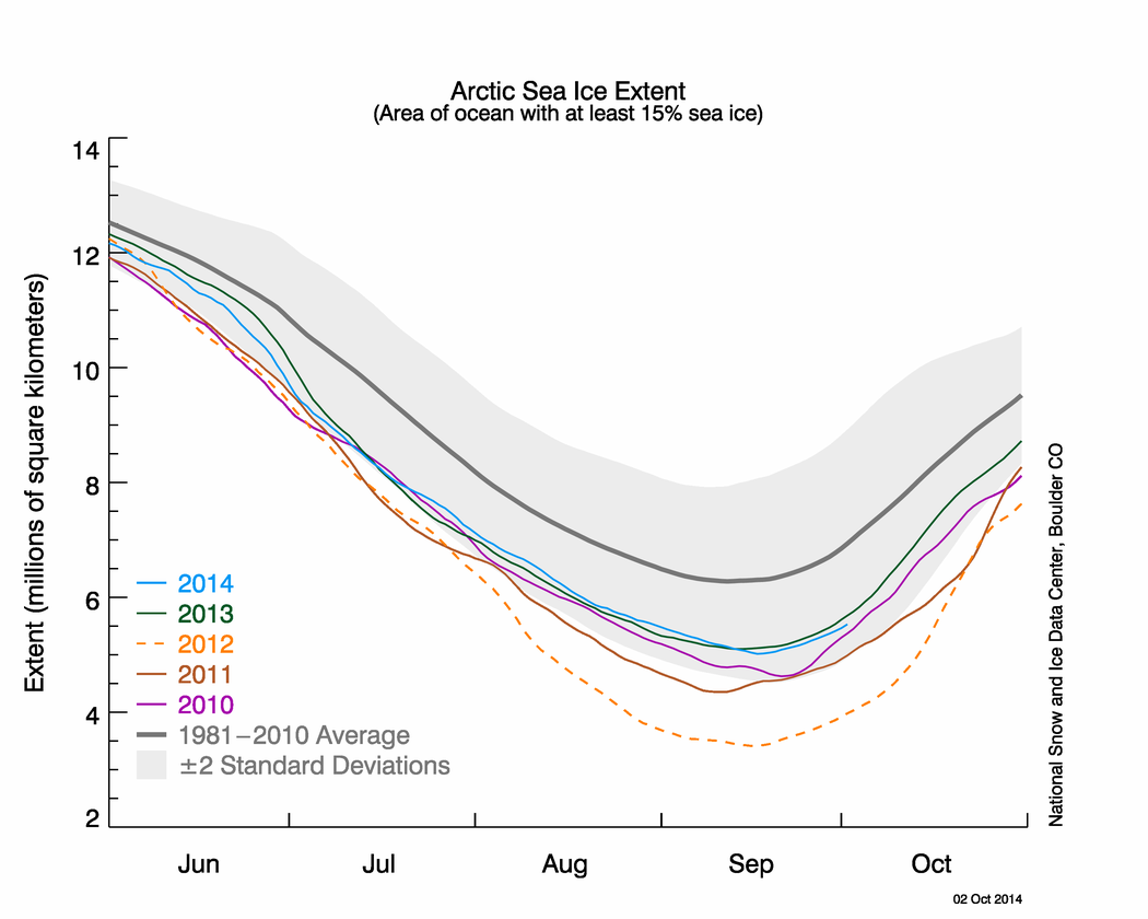
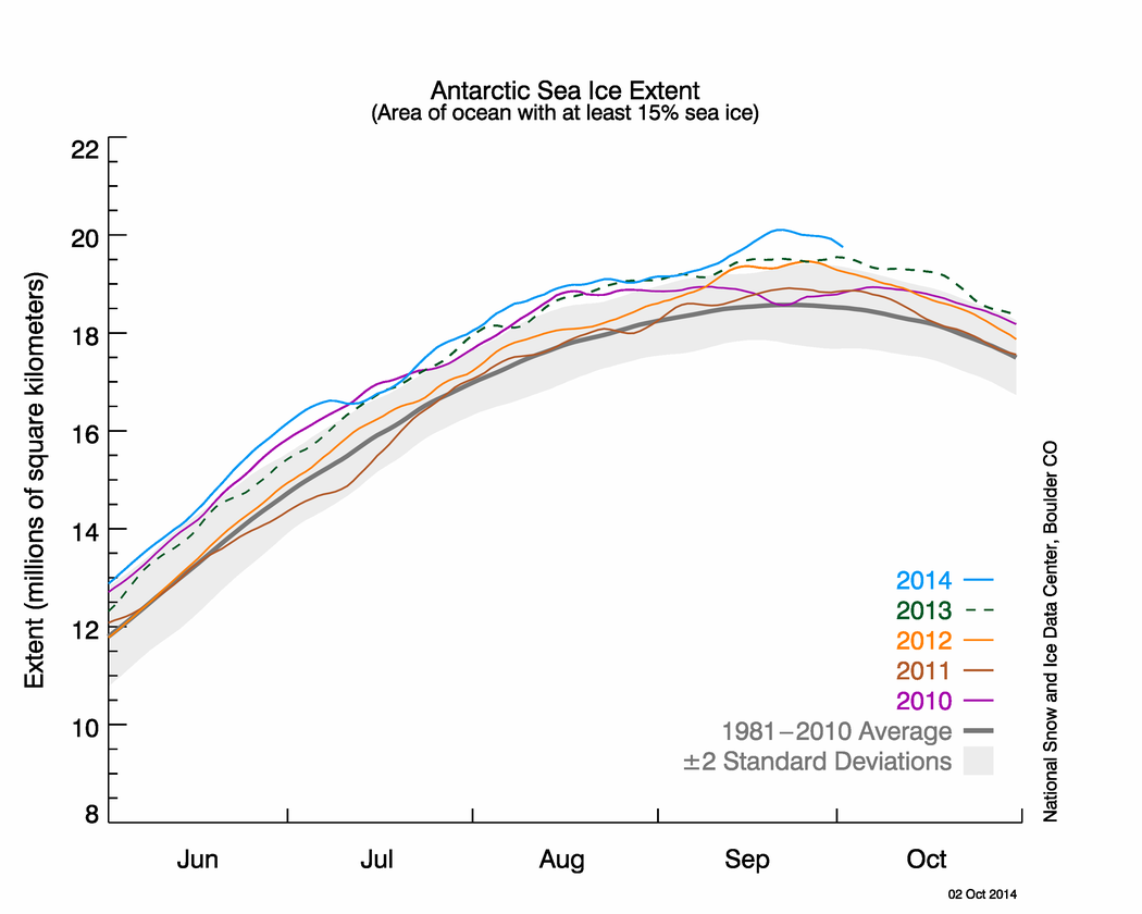
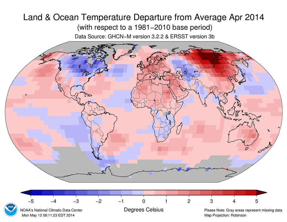
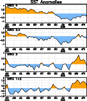
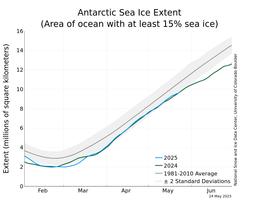
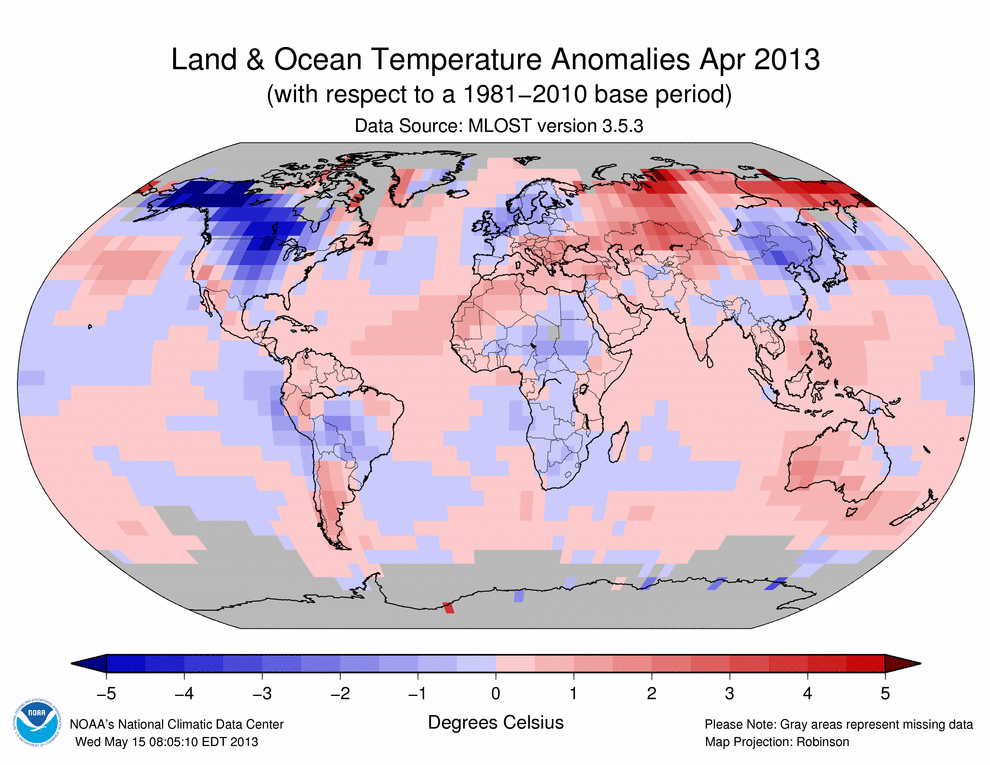
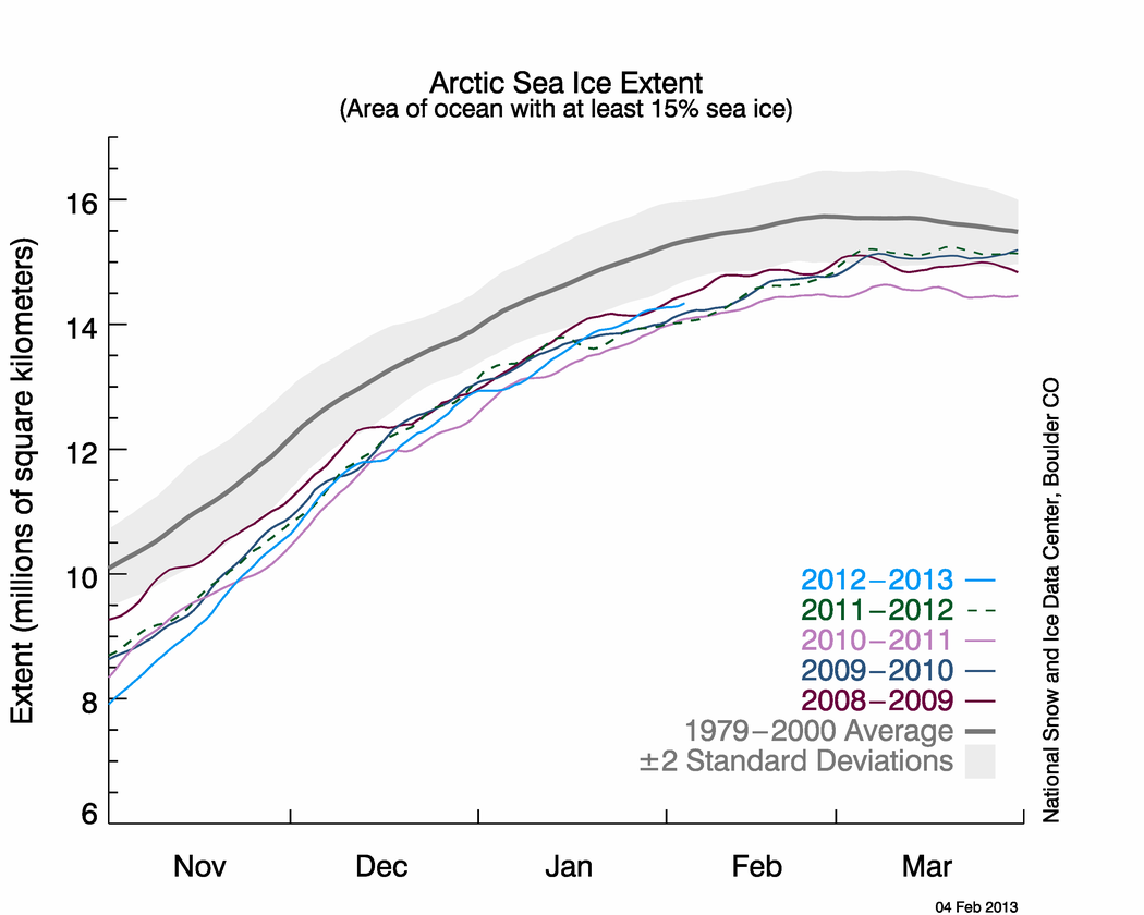