I haven’t written on this topic in a long time, but read something today that inspired me to do so. From a DailyKos article written yesterday (emphasis mine):
In that light, while Obamacare is not the best option, it is the best option that was attainable given a corrupt Congress and a corrupt political process. It is imperative that Americans enroll in the exchanges. It is imperative that Obamacare as a first step in our health care reform is marginally successful.
While it is not spoken about much, Obamacare is the first step on a path toward a single-payer system. Those on the left that are upset that it isn’t a single payer system already must stay in the game. They must continue to fight for single payer. That said, they should not be fighting against this law because it was not their ideal or because in the initial stages of this law private insurance companies will still reap an unearned profit from skimming. Battles are won either incrementally or revolutionarily. The second option is simply not in the current American DNA. As such all must play the long game. HR 676 will be a closer reality if Obamacare is effected.
This is a false choice. It it not an either or situation. The situation is whatever we make it. Reducing health care work to an either/or choice creates an absurdly simple view to a very complex problem.
I characterize people who advocate this position “incrementalists”. And here is my biggest problem with them: what is the strategy in this amorphous “long game”? What steps take us from our current position to single payer health care, which every other industrialized nation on earth except the U.S. implements? There are never any steps, strategies, or tactics that take us from here to there. I adapt a common argument used on DKos:
1. Obamacare
2. ???
3. Single payer! Yay!
Incrementalists make excuse after excuse after excuse, all the while apologizing for all the people who are immersed in the aforementioned corrupt system, but then lecture folks who oppose Obamacare because it was written by industry and not by other health policy entities. Futhermore, Obamacare doesn’t ensure health care to all people, just health insurance to some more people. It took 18 months for the incrementalists to capitulate to industry and the political establishment, after which the Democratic base sat out the 2010 elections. Historically, we address health care legislation once per generation. In 25 years, what steps will we take toward single payer, if that is really the goal of the incrementalists? How many generations need wait until we implement a 20th century health care system? In the meantime, what improvements to today’s system will the rest of the industrialized world implement?
Going back to that first paragraph, let’s highlight the following. “It is imperative that Americans enroll in the exchanges.” If this were true, why didn’t the Obama administration work to make sure Americans were ready to enroll come tomorrow? They’ve only had three years to figure out an enrollment strategy that is absolutely critical to the entire program’s success and implement it. What were they doing? Incremental work, I suppose. Which is why 60+% of Americas have no idea what tomorrow’s open enrollment consists of.
“It is imperative that Obamacare as a first step in our health care reform is marginally successful.”
Really? 18 months of negotiation, three years of shoddy implementation, and the best the author can come up with is it’s imperative Obamacare is only marginally successful?! The insurance companies get 30 million new customers (read: profits) and the best we can do is marginal success? Millions of Americans are shut out from Obamacare because they have the misfortune of Teabagger governorship, but marginal success is incrementally better than no success, right? It is this blind acceptance of sub-par results that lays the foundation for incrementalists. I expect more from my country and fellow Americans. Unfortunately, I am part of a minority. The majority accepts mediocrity as the best they can achieve.
I have waited since 2007 (when they released AR4) for this report’s issuance. I read most of the AR4’s WGI report (1000 pages long). Since it’s release, I have read hundreds of climate-related journal articles so I could stay current on the latest research. I have also read some of AR4’s WGII report, dozens of social science journal papers and books because it became clear to me after the AR4 WGI report that there was no significant problem with the science. As a scientist, I realized that the state of climate science hasn’t changed appreciably for decades. The same top-level messages of the First Assessment Report remain in place today. The AR5 WGI report primarily provides more confidence in the reported numbers. Detail changes are relatively minor compared to the knowledge body that existed in 1990. Scientists will continue to work on important items such as mechanisms behind deep ocean heat uptake and cryosphere dynamics. They need to better model Important feedback processes because of their nonlinearities. But the science, by and large, settled long ago.
What remains is our handling of that science, which is where social science knowledge comes in. The difference between acting today to provide cheap, reliable energy to the 1 billion people on Earth who currently have no such access with clean energy versus dirty energy is monumental. Prior to that, we need a reconciliation between believers and skeptics. Nobody should browbeat anyone else in a conversion effort. Instead, we need to identify solution pathways which acknowledge multiple worldviews. Those pathways exist but the status quo is awfully powerful within today’s systems. Changing from the status quo will not be easy, but it will be fruitful. Unfortunately, that very same Twitter feed puts that status quo on display daily; the more so when the IPCC issues a comprehensive science report. Why do the same climate scientists that demand others believe a particular stance from peer-reviewed physical science articles discount a particular stance from peer-reviewed social science articles? Should we trust experts, or not? The reason is tribalism. Tribalism runs rampant on Twitter and too many people think if they shout a little louder every day that eventually everyone will hear and agree with them, despite years of evidence to the contrary.
There is plenty to write about and discuss within the IPCC AR5 summary. I will do so as time permits. I do want to pass along a good article written by Andrew Revkin (the most salient part is at the end). My own research is climate science-based, but I am also working on a social science aspect in order to make the physical science results meaningful to policymakers.
According to data released by NASA and NOAA this month, August was the 4th warmest August globally on record. Here are the data for NASA’s analysis; here are NOAA data and report. The two agencies have different analysis techniques, which in this case resulted in different temperature anomaly values but the same overall rankings within their respective data sets. The analyses result in different rankings in most months. The two techniques do provide a check on one another and confidence for us that their results are robust. At the beginning, I will remind readers that the month-to-month and year-to-year values and rankings matter less than the long-term climatic warming. Monthly and yearly conditions changes primarily by the weather, which is not climate.
The details:
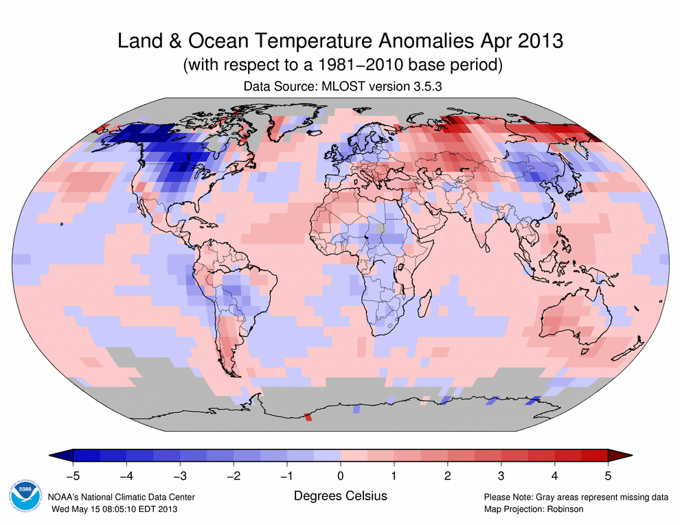
August’s global average temperature was 0.62°C (1.12°F) above normal (1951-1980), according to NASA, as the following graphic shows. The past three months have a +0.58°C temperature anomaly. And the latest 12-month period (Aug 2012 – Jul 2013) had a +0.59°C temperature anomaly. The time series graph in the lower-right quadrant shows NASA’s 12-month running mean temperature index. The 2010-2012 downturn was largely due to the latest La Niña event (see below for more) that ended early last summer. Since then, ENSO conditions returned to a neutral state (neither La Niña nor El Niño). Therefore, as previous anomalously cool months fall off the back of the running mean, and barring another La Niña, the 12-month temperature trace should track upward again throughout 2013.
Figure 1. Global mean surface temperature anomaly maps and 12-month running mean time series through August 2013 from NASA.
According to NOAA, April’s global average temperatures were 0.62°C (1.12°F) above the 20th century average of 15.6°C (60.1°F). NOAA’s global temperature anomaly map for August (duplicated below) shows where conditions were warmer and cooler than average during the month.
The two different analyses’ importance is also shown by the preceding two figures. Despite differences in specific global temperature anomalies, both analyses picked up on the same temperature patterns and their relative strength.
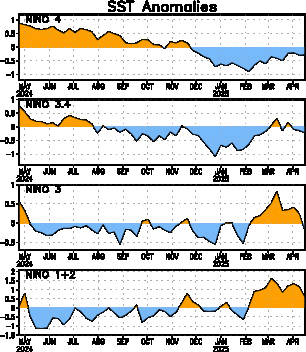
The last La Niña event hit its highest (most negative) magnitude more than once between November 2011 and February 2012. Since then, tropical Pacific sea-surface temperatures peaked at +0.8 (y-axis) in September 2012. You can see the effect on global temperatures that the last La Niña had via this NASA time series. Both the sea surface temperature and land surface temperature time series decreased from 2010 (when the globe reached record warmth) to 2012. Recent ENSO events occurred at the same time that the Interdecadal Pacific Oscillation entered its most recent negative phase. This phase acts like a La Niña, but its influence is smaller than La Niña. So natural, low-frequency climate oscillations affect the globe’s temperatures. Underlying these oscillations is the background warming caused by humans, which we detect by looking at long-term anomalies. Despite these recent cooling influences, temperatures were still top-10 warmest for a calendar year (2012) and during individual months, including August 2013.
Skeptics have pointed out that warming has “stopped” or “slowed considerably” in recent years, which they hope will introduce confusion to the public on this topic. What is likely going on is quite different: since an energy imbalance exists (less energy is leaving the Earth than the Earth is receiving; this is due to atmospheric greenhouse gases) and the surface temperature rise has seemingly stalled, the excess energy is going somewhere. The heat has to be going somewhere – energy doesn’t just disappear. That somewhere is likely the oceans, and specifically the deep ocean (see figure below). Before we all cheer about this (since few people want surface temperatures to continue to rise quickly), consider the implications. If you add heat to a material, it expands. The ocean is no different; sea-levels are rising in part because of heat added to it in the past. The heat that has entered in recent years won’t manifest as sea-level rise for some time, but it will happen. Moreover, when the heated ocean comes back up to the surface, that heat will then be released to the atmosphere, which will raise surface temperatures as well as introduce additional water vapor due to the warmer atmosphere. Thus, the immediate warming rate might have slowed down, but we have locked in future warming (higher future warming rate).
Figure 4. New research that shows anomalous ocean heat energy locations since the late 1950s. The purple lines in the graph show how the heat content of the whole ocean has changed over the past five decades. The blue lines represent only the top 700 m and the grey lines are just the top 300 m. Source: Balmaseda et al., (2013)
Paying for recovery from seemingly localized severe weather and climate events is and always will be more expensive than paying to increase resilience from those events. As drought continues to impact the US, as Arctic ice continues its long-term melt, as storms come ashore and impacts communities that are not prepared for today’s high-risk events (due mostly to poor zoning and destruction of natural protections), economic costs will accumulate in this and in future decades. It is up to us how many costs we subject ourselves to. As President Obama begins his second term with climate change “a priority”, he tosses aside the most effective tool available and most recommended by economists: a carbon tax. Every other policy tool will be less effective than a Pigouvian tax at minimizing the actions that cause future economic harm. It is up to the citizens of this country, and others, to take the lead on this topic. We have to demand common sense actions that will actually make a difference.
But be forewarned: even if we take action today, we will still see more warmest-ever La Niña years, more warmest-ever El Niño years, more drought, higher sea levels, increased ocean acidification, more plant stress, and more ecosystem stress. The biggest difference between efforts in the 1980s and 1990s to scrub sulfur and CFC emissions and future efforts to reduce CO2 emissions is this: the first two yielded an almost immediate result. It will take decades to centuries before CO2 emission reductions produce tangible results humans can see. That is part of what makes climate change such a wicked problem.
According to the Drought Monitor, drought conditions worsened slightly across the entire US compared to three weeks ago. As of September 17, 2013, 48.2% of the contiguous US is experiencing moderate or worse drought (D1-D4), as the early 2010s drought continues month after month. This value is about 11 percentage points lower than it was in the early spring. The percentage area experiencing extreme to exceptional drought decreased from 14.8% last month to 6.9% last week! This is more than 10% lower than it was six months ago. The eastern third of the US was wetter than normal during August, which helped keep drought at bay. The east coast in particular was much wetter than normal and the summer monsoon was much more active this summer compared to 2012, assisted by a persistent upper level blocking pattern. Instead of Exceptional drought in the West like there was earlier this summer, record rains and flash flooding was the story in September. While this record-breaking series of events broke the drought in some areas of the West, long-term drought continues to exert its hold over the region. Compared to earlier this summer, drought increased in area and intensity across the Midwest.
Figure 1 – US Drought Monitor map of drought conditions as of September 17th.
If we compare this week’s maps with previous dates (here and here, for example), we can see recent shifts in drought categories. Compared to mid-August and early September, and despite recent rain events, drought expanded or worsened in the Midwest (Iowa, Missouri, Illinois, Minnesota, and the Dakotas) as well as Louisiana, Arkansas, and Mississippi. On the other hand, alleviation is evident in small places in the West, as the following map shows.
Figure 2 – US Drought Monitor map of drought conditions in Western US as of September 17th.
After worsening during late winter into spring 2013, drought conditions steadied in late summer. The differences between this map and early September’s is the reduction in area and severity of drought, especially in the southern half of the West. The area experiencing Exceptional drought decreased significantly over the West and the percent area with no drought increased. Figure 2 also shows that the percent area with no drought is still lower since the start of the calendar year (24% to 18%).
Here are the current conditions for Colorado:
Figure 3 – US Drought Monitor map of drought conditions in Colorado as of September 17th.
There is evidence of substantial improvement in Colorado since just a few weeks ago and certainly compared to earlier this year, when drought conditions were their worst. Compared to the start of the calendar year or even three months ago, the percent area of every drought category decreased significantly. Only 1.5% of the state currently has Exceptional drought. Only 84% of the state is even experiencing any drought condition today, a far cry from the 100% that lasted for well over one year. The links in the first paragraph dealing with last week’s rains combine with this graphic to demonstrate that places that receive one year’s worth of precipitation in one week’s time bust their drought! Many communities would trade those record rains for a little bit of drought, given the extensive damage to infrastructure and the eight people who, as of this morning, perished in the severe weather event.
Let’s compare Figure 3 to similar Colorado maps from earlier in the year. First, this is what conditions looked like just two weeks ago:
Figure 4 – US Drought Monitor map of drought conditions in Colorado as of September 3rd.
The over-active monsoon season helped reduce drought severity from Denver northwest toward the Wyoming border. I said at the time I hoped that trend continued, but I could never imagine what would happen in the interim.
Here is a look at some of the worst drought conditions Colorado experienced in the past year, from late April 2013:
Figure 5 – US Drought Monitor map of drought conditions in Colorado as of April 25th.
Conditions were horrible earlier this year. Reservoir levels declined and crops failed as a result of the higher than normal temperatures and much lower than normal precipitation. I certainly don’t want to see additional flooding, but I would like to see normal precipitation return to the state and the region.
Figure 6 – US Drought Monitor map of drought conditions in the Midwest as of September 17th.
Drought expanded in the Midwest in the past two weeks: the percent area with no drought decreased significantly from 48% to 43%. Three months ago, the value was 93%. This region collected rainfall this month, but the amounts continued to track below average.
Figure 7 – US Drought Monitor map of drought conditions in the South as of September 17th.
Compared to early summer, drought as a whole expanded across the South in 2013. Instead of 44% area with no drought three months ago, there is only 16% today.
Policy Context
US drought conditions are more influenced by Pacific and Atlantic sea surface temperature conditions than the global warming observed to date. Different natural oscillation phases preferentially condition environments for drought. Droughts in the West tend to occur during the cool phases of the Interdecadal Pacific Oscillation and the El Niño-Southern Oscillation, for instance. Beyond that, drought controls remain a significant unknown. Population growth in the West in the 21st century means scientists and policymakers need to better understand what conditions are likeliest to generate multidecadal droughts, as have occurred in the past. Without comprehensive planning, dwindling fresh water supplies will threaten millions of people. That very circumstance is already occurring in western Texas where town wells are going dry. An important factor in those cases is energy companies’ use of well water for natural gas drilling. This presents a dilemma more of us will face in the future: do we want cheap energy or cheap water? In the 21st century, we will not have both options available at the same time as happened in the 20th century. This presents a radical departure from the past.
As drought affects regions differentially, our policy responses vary. A growing number of water utilities recognize the need for a proactive mindset with respect to drought impacts. The last thing they want is their reliability to suffer. Americans are privileged in that clean, fresh water flows every time they turn on their tap. Crops continue to show up at their local stores despite terrible conditions in many areas of their own nation (albeit at a higher price, as found this year). Power utilities continue to provide hydroelectric-generated energy.
That last point will change in a warming and drying future. Regulations that limit the temperature of water discharged by power plants exist. Generally warmer climate conditions include warmer river and lake water today than what existed 30 years ago. Warmer water going into a plant either means warmer water out or a longer time spent in the plant, which reduces the amount of energy the plant can produce. Alternatively, we can continue to generate the same amount of power if we are willing to sacrifice ecosystems which depend on a very narrow range of water temperatures. As with other facets of climate change, technological innovation can help increase plant efficiency. I think innovation remains our best hope to minimize the number and magnitude of climate change impacts on human and ecological systems.
During August 2013, the Scripps Institution of Oceanography measured an average of 395.15 ppm CO2 concentration at their Mauna Loa, Hawai’i Observatory.
This value is important because 395.15 ppm is the largest CO2 concentration value for any August in recorded history. This year’s July value is 2.74 ppm higher than August 2012′s! Month-to-month differences typically range between 1 and 2 ppm. This particular year-to-year jump is clearly well outside of that range. This change is in line with other months this year: February’s year-over-year change was +3.37 ppm and May’s change was +3.02 ppm. Of course, the unending trend toward higher concentrations with time, no matter the month or specific year-over-year value, as seen in the graphs below, is more significant.
The yearly maximum monthly value normally occurs during May. This year was no different: the 399.89ppm mean concentration in May 2013 was the highest value reported this year and, prior to the last six months, in recorded history (neglecting proxy data). I expected May of this year to produce another all-time record value and it clearly did that. May 2013′s value will hold onto first place all-time until February 2014, due to the annual CO2 oscillation that Figure 2 displays.
Figure 1 – Time series of CO2 concentrations measured at Scripp’s Mauna Loa Observatory in August from 1958 through 2013.
CO2Now.org added the `350s` and `400s` to the past few month’s graphics. I suppose they’re meant to imply concentrations shattered 350 ppm back in the 1980s and are pushing up against 400 ppm now in the 2010s. I’m not sure that they add much value to this graph, but perhaps they make an impact on most people’s perception of milestones within the trend.
How do concentration measurements change in calendar years? The following two graphs demonstrate this.
Figure 2 – Monthly CO2 concentration values (red) from 2009 through 2013 (NOAA). Monthly CO2 concentration values with seasonal cycle removed (black). Note the yearly minimum observation occurred ten months ago and the yearly maximum value occurred three months ago. CO2 concentrations will decrease through October 2013, as they do every year after May, before rebounding towards next year’s maximum value. The red points and line demonstrate the annual CO2 oscillation that exists on top of the year-over-year increase, which the black dots and line represents.
This graph doesn’t look that threatening. What’s the big deal about CO2 concentrations rising a couple of parts per million per year anyway? The problem is the long-term rise in those concentrations and the increased heating they impart on our climate system. Let’s take a longer view – say 50 years:
Figure 3 – 50 year time series of CO2 concentrations at Mauna Loa Observatory (NOAA). The red curve represents the seasonal cycle based on monthly average values. The black curve represents the data with the seasonal cycle removed to show the long-term trend (as in Figure 2). This graph shows the relatively recent and ongoing increase in CO2 concentrations.
As a greenhouse gas, CO2 increases the radiative forcing of the Earth, which increases the amount of energy in our climate system as heat. This excess and increasing heat has to go somewhere or do something within the climate system because the Earth can only emit so much longwave radiation every year. Additional figures below show where most of the heat has gone.
CO2 concentrations are increasing at an increasing rate – not a good trend with respect to minimizing future warming. Natural systems are not equipped to remove CO2 emissions quickly from the atmosphere. Indeed, natural systems will take tens of thousands of years to remove the CO2 we emitted in the course of a couple short centuries. Human technologies do not yet exist that remove CO2 from any medium (air or water). They are not likely to exist for some time. Therefore, the general CO2 concentration rise in Figures 2 and 3 will continue for many years.
This month, I will once again present some graphs that provide additional context for CO2 concentration. Here is a 10,000 year view of CO2 concentrations from ice cores to compare to the recent Mauna Loa observations:
Figure 4 – Historical CO2 concentrations from ice core proxies (blue and green curves) and direct observations made at Mauna Loa, Hawai’i (red curve).
Clearly, concentrations are significantly higher today than they were for thousands of years in the past. While never completely static, the climate system our species evolved in was relatively stable in this time period.
Or we could take a really, really long view:
Figure 5 – Historical record of CO2 concentrations from ice core proxy data, 2008 observed CO2 concentration value, and 2 potential future concentration values resulting from lower and higher emissions scenarios used in the IPCC’s AR4.
Note that this graph includes values from the past 800,000 years, 2008 observed values (10ppm less than this year’s average value will be) as well as the projected concentrations for 2100 derived from a lower emissions and higher emissions scenarios used by the 2007 IPCC Fourth Assessment report. If our current emissions rate continues unabated, it looks like a tripling of average pre-industrial (prior to 1850) concentrations will be our future reality: 278 * 3 = 834. This graph also clearly demonstrates how anomalous today’s CO2 concentration values are in the context of paleoclimate. It further shows how significant projected emission pathways could be when we compare them to the past 800,000 years. It is important to realize that we are currently on the higher emissions pathway (towards 800+ppm; yellow dot).
The rise in CO2 concentrations will slow down, stop, and reverse when we decide it will. It depends primarily on the rate at which we emit CO2 into the atmosphere. We can choose 400 ppm or 450 ppm or almost any other target (realistically, 350 ppm seems out of reach within the next couple hundred years). That choice is dependent on the type of policies we decide to implement. It is our current policy to burn fossil fuels because we think doing so is cheap, although current practices are massively inefficient and done without proper market signals. We will widely deploy clean sources of energy when they are cheap; we control that timing. We will remove CO2 from the atmosphere if we have cheap and effective technologies and mechanisms to do so, which we also control to some degree. These future trends depend on today’s innovation and investment in research, development, and deployment. Today’s carbon markets are not the correct mechanism, as they are aptly demonstrating. But the bottom line remains: We will limit future warming and climate effects when we choose to do so.
I mentioned above that CO2 is a greenhouse gas. If CO2 concentrations were very low, the average temperature of the planet would be 50°F cooler. Ice would cover much more of the planet’s surface than it does today. So some CO2 is a good thing. The problem with additional CO2 in the atmosphere is that it throws off the radiative balance of the past 10,000 years. This sets in motion a set of consequences, most of which we cannot anticipate simply because our species has never experienced them. The excess heat absorbed by the climate system went to the most efficient heat sink on our planet, the oceans:
Figure 6 – Heat content anomaly from 1950 to 2004 from Murphy et al., 2009 (subs. req’d).
20th century global surface temperature rise measured +0.8°F. That relatively small increase, which is already causing widespread effects today, is a result of the tiny heat content anomaly shown in red in Figure 6. This situation continued since Murphy’s 2009 publication.
Figure 7 – Oceanic heat content by depth since 19
This figure shows where most of the excess heat went since 2000: the deep ocean (>700m depth). The heat content change of the upper 300m increased by 5 * 10^22 Joules/year in that time (and most of that in the 2000-2003 time span) while the 300-700m layer’s heat increased by an additional 5 * 10^22 J/y and the >700m ocean’s heat increased by a further 8 * 10^22 J/y. That’s a lot of energy. How much energy is it? In 2008 alone, the oceans absorbed as much energy as 6.6 trillion Americans used in the same year. Since there is only 7 billion people on the planet, the magnitude of this energy surplus is staggering.
More to the point, deep water heat content continued to surge with time while heat content stabilized in the ocean’s top layers. Surface temperature measurements largely reflect the top layer of the ocean. If heat content doesn’t change with time in those layers, neither will sea surface temperatures. The heat is instead going where we cannot easily measure it. Does that mean “global warming has stopped” as some skeptics recently claimed? No, it means the climate system is transferring the heat where and when it can. If the deep ocean can more easily absorb the heat than other media, then the heat will go there.
The deep ocean will not permanently store this heat however. The globe’s oceans turn over on long time scales. The absorbed heat will come back to the surface where it can transfer to the atmosphere, at which point we will be able to easily detect it again. So at some point in the future, perhaps decades or a century from now, a temperature surge could occur. We have been afforded time that many scientists did not think we had to mitigate and adapt to the changing climate. That time is not limitless.
From Monday through 11:30A today, eight to nine inches of rain fell over Boulder County. This shattered the previous September record of 4.8″ of rain set in 1919! These values are simply stunning in magnitude. The rain continued to fall through the day today. Additional rain is forecasted for tonight through Sunday, which means this disaster may not be over for days yet.
The flash floods and ongoing rainfall hampered rescue efforts since roads were washed out by creeks and helicopters were grounded. Previous years’ wildfires left mountainsides outside of Boulder devoid of plant life, which allowed the majority of water that fell to flow directly into streams that are not equipped for these rainfall rates. The cities of Lyons and Longmont are currently cut off from surrounding areas by flooding waters. The effects spread this afternoon into north and east Denver suburbs.
These conditions were in stark contrast to different record-setting weather just last week. Three daily high temperatures were set or tied at DIA: 97 on the 5th and 6th, 95 on the 7th. Two record high low temperatures (nighttime) were also set: 68F on the 3rd and 69F on the 4th. Daily average temperatures were 12 and 13 degrees warmer than normal during this late-season heat spell. These were caused by a ridge of high pressure that previously slid west over the Front Range.
The same ridge of high pressure moved back to the east earlier in the week. This allowed a cool front from Canada to slide south over the Denver metro area Monday. It also allowed subtropical monsoon moisture flowing north to move over the Front Range. The cool front brought moist low-level air in from the east and forced it up against the mountains. The combination of low-level and high-level moisture with decent instability generated rains that started on Monday and haven’t really stopped very long since then. The only good news is these rains will lessen the severity of the ongoing drought over the region.
This event harkens back to the Big Thompson River Flood of 1976. More than 100 people died in that event, but it also occurred overnight.
Here are some stories I found interesting this week:
California’s GHG emissions are already lower than the 2015 threshold established as part of California’s cap-and-trade policy. The reasons emissions fell more than expected include the slow economy and relative widespread renewable energy deployment. The problem with this is the lack of innovation. We have seen what companies do with no incentive to innovate their operations: nothing that gets in the way of profit, which is the way companies should operate. That’s why we need regulations – to incentivize companies to act in the public interest. Should CA adjust future cap thresholds in light of this news?
Scientific American’s latest microgrid article got to the point: “self-sufficient microgrids undermine utilities’ traditional economic model” and “utility rates for backup power [need to be] fair and equitable to microgrid customers.” To the first point, current utility models will have to change in 21st century America. Too much depends on reliable and safe energy systems. The profit part of the equation will take a back seat. Whatever form utilities take in the future, customers will demand equitable pricing schemes. That said, there is currently widespread unfair pricing in today’s energy paradigm. For example, utilities continue to build coal power plants that customers don’t want. Customers go so far as to voluntarily pay extra for non-coal energy sources. In the end, I support microgrids and distributed generation for many reasons.
A Science article (subs. req’d) shared results of an investigation into increasing amplitude of CO2 oscillations in the Northern Hemisphere in the past 50 years. This increase is greater for higher latitudes than middle latitudes. The increase’s reason could be longer annual times of decomposition due to a warming climate (which is occurring faster at higher latitudes). Additional microbial decomposition generates additional CO2 and aids new plant growth at increasing latitudes (which scientists have observed). New plant growth compounds the uptake and release of CO2 from microbes. The biosphere is changing in ways that were not predicted, as I’ve written before. These changes will interact and generate other changes that will impact human and ecosystems through the 21st century and beyond.
And the EPA has adjusted new power plant emissions rules: “The average U.S. natural gas plant emits 800 to 850 pounds of carbon dioxide per megawatt, and coal plants emit an average of 1,768 pounds. According to those familiar with the new EPA proposal, the agency will keep the carbon limit for large natural gas plants at 1,000 pounds but relax it slightly for smaller gas plants. The standard for coal plants will be as high as 1,300 or 1,400 pounds per megawatt-hour, the individuals said Wednesday, but that still means the utilities will have to capture some of the carbon dioxide they emit.” This is but one climate policy that we need to revisit in the future. This policy is good, but does not go far enough. One way or another, we face increasing costs; some we can afford and others we can’t. We can proactively increase regulations on fossil fuels which will result in an equitable cost comparison between energy sources. Or we can continue to prevent an energy free market from working by keeping fossil fuel costs artificially lower than they really are and end up paying reactive climate costs, which will be orders of magnitude higher than energy costs.
According to the Drought Monitor, drought conditions worsened slightly across the entire US compared to three weeks ago. As of September 3, 2013, 50.1% of the contiguous US is experiencing moderate or worse drought (D1-D4), as the early 2010s drought continues month after month. This value is about 9 percentage points lower than it was in the early spring. The percentage area experiencing extreme to exceptional drought decreased from 14.8% three weeks ago to 9.9% last week; this is approximately 10% lower than it was six months ago. The eastern third of the US was wetter than normal during August, which helped keep drought at bay. The east coast in particular was much wetter than normal and the summer monsoon was much more active this summer compared to 2012. Instead of Exceptional drought in Georgia and Extreme drought in Florida two years ago, there is flash flooding and rare dam water releases in the southeast. Four eastern states experienced their top-four wettest Julys on record. The West presents a different story. Long-term drought continues to exert its hold over the region, as it remained warmer than normal but six southwestern states received top-20 July precipitation this year. Meanwhile, Oregon recorded its driest July on record. Compared to three weeks ago, drought area increased in the Midwest.
Figure 1 – US Drought Monitor map of drought conditions as of September 3rd.
If we compare this week’s maps with previous dates (here and here, for example), we can see recent shifts in drought categories. Compared to early July and mid-August, and despite recent rain events, drought expanded or worsened in the Midwest (Iowa, Missouri, Illinois, Minnesota, and the Dakotas) as well as Louisiana, Arkansas, and Mississippi.
Figure 2 – US Drought Monitor map of drought conditions in Western US as of September 3rd.
After worsening during late winter into spring 2013, drought conditions steadied during the past month. The differences between this map and mid-August’s is the spatial shift of conditions; the total percent area values are about the same. The area experiencing Exceptional drought decreased slightly over the West and the percent area with no drought increased slightly, but remains at low levels. Figure 2 also shows that the percent area with no drought decreased since the start of the year (24% to 14%).
Here are the current conditions for Colorado:
Figure 3 – US Drought Monitor map of drought conditions in Colorado as of September 3rd.
There is clear evidence of relief evident over the past three months here. Severe drought area dropped from 72% to 60% (this was 100% about last year!). Extreme drought area dropped from 27% to 22% (also down from 50%+ six months ago). Exceptional drought decreased significantly from three and six months ago. Instead of 16% of Colorado (and as much as 17% earlier this year), Exceptional drought now covers only 3% of the state. The good news for southeastern Colorado was the recent delivery of substantial precipitation. I didn’t think it would be enough to completely alleviate the worst conditions, but they received enough precipitation that drought conditions improved from Exceptional to Extreme. Their drought is not over yet, but they are finally trending in a good direction. And for the first time in over one year, some small percentage (2%; up from 1% three weeks ago) of Colorado does not currently have any drought. This is great news – hopefully this area expands throughout the rest of the year.
Figure 4 – US Drought Monitor map of drought conditions in the Midwest as of September 3rd.
Drought expanded and worsened slightly in the Midwest in the past few months: the percent area with no drought decreased significantly from 91% to 52%. The percent area with Moderate drought increased significantly from 3% to 29% this week. Severe drought now impacts most of Iowa and small portions of Missouri, Wisconsin and Minnesota.
US drought conditions are more influenced by Pacific and Atlantic sea surface temperature conditions than the global warming observed to date. Different natural oscillation phases preferentially condition environments for drought. Droughts in the West tend to occur during the cool phases of the Interdecadal Pacific Oscillation and the El Niño-Southern Oscillation, for instance. Beyond that, drought controls remain a significant unknown. Population growth in the West in the 21st century means scientists and policymakers need to better understand what conditions are likeliest to generate multidecadal droughts, as have occurred in the past. Without comprehensive planning, dwindling fresh water supplies will threaten millions of people. That very circumstance is already occurring in western Texas where town wells are going dry. An important factor in those cases is energy companies’ use of well water for natural gas drilling. This presents a dilemma more of us will face in the future: do we want cheap energy or cheap water? In the 21st century, we will not have both options available at the same time as happened in the 20th century. This presents a radical departure from the past.
As drought affects regions differentially, our policy responses vary. A growing number of water utilities recognize the need for a proactive mindset with respect to drought impacts. The last thing they want is their reliability to suffer. Americans are privileged in that clean, fresh water flows every time they turn on their tap. Crops continue to show up at their local stores despite terrible conditions in many areas of their own nation (albeit at a higher price, as found this year). Power utilities continue to provide hydroelectric-generated energy.
That last point will change in a warming and drying future. Regulations that limit the temperature of water discharged by power plants exist. Generally warmer climate conditions include warmer river and lake water today than what existed 30 years ago. Warmer water going into a plant either means warmer water out or a longer time spent in the plant, which reduces the amount of energy the plant can produce. Alternatively, we can continue to generate the same amount of power if we are willing to sacrifice ecosystems which depend on a very narrow range of water temperatures. As with other facets of climate change, technological innovation can help increase plant efficiency. I think innovation remains our best hope to minimize the number and magnitude of climate change impacts on human and ecological systems.
During the month of August 2013, Denver, CO’s (link updated monthly) temperatures were 2.1°F above normal (74.6°F vs. 72.5°F). The National Weather Service recorded the maximum temperature of 99°F on the 20th and they recorded the minimum temperature of 52°F on the 9th. Here is the time series of Denver temperatures in August 2013:
Figure 1. Time series of temperature at Denver, CO during August 2013. Daily high temperatures are in red, daily low temperatures are in blue, daily average temperatures are in green, climatological normal (1981-2010) high temperatures are in light gray, and normal low temperatures are in dark gray. [Source: NWS]
The month started off cooler than normal as this year’s very active monsoon continued well into August 2013. High pressure began to dominate the region again in the middle of the month. Note the large number of days with daily mean temperatures equal to or greater than 78°F. This was mainly due to the excessive nighttime heat (note the blue line above the climatological normal lows), but also the daily high temperatures in the mid to upper-90s.
Denver’s temperature was above normal for the past four months in a row. May 2013 ended a short streak of four months with below normal temperatures. October 2012 broke last year’s extreme summer heat including the warmest month in Denver history: July 2012 (a mean of 78.9°F which was 4.7°F warmer than normal!).
I haven’t determined if the NWS (or anyone else) collects record high minimum temperatures (warm nighttime lows) in a handy table, chart, or time series. Denver’s 68°F on Sep. 3rd was such a record (previously 67, set in 1947), as was Sep. 4th’s 69°F (previously 64°F, set in 1995 and previous years). I’m curious how Denver’s nightly lows have changed in the past 100+ years. If I find or put something together, I’ll include it in a future post..
Precipitation
Precipitation was greater than normal during August 2013: 2.78″ precipitation fell at Denver during the month instead of the normal 1.69″. Most of this fell at DIA on the 22nd of the month (1.94″). This wasn’t the case for every location in the Denver metro area however since precipitation is such a variable phenomenon.
Precipitation that fell during the past couple of months alleviated some of the worst drought conditions in northern Colorado. The link goes to a mid-August 2013 post. Almost all of Colorado continues under at least some measure of drought in early September 2013 (the exception being along the Front Range in northern Colorado, which received almost daily monsoon rainfall in August). The worst drought conditions (D4: Exceptional) continue to impact southeast Colorado however. The good news is this area shrank in the last month or so. Colorado still needs the jet stream to substantially shift position this fall and next spring in order to receive the amount of precipitation required to break the long-term drought. The last NWS 3-month projection didn’t indicate that this was likely to happen. Hopefully, for the state’s sake, I hope the NWS is wrong.
Interannual Variability
I have written hundreds of posts on the effects of global warming and the evidence within the temperature signal of climate change effects. This series of posts takes a very different look at conditions. Instead of multi-decadal trends, this series looks at highly variable weather effects on a very local scale. The interannual variability I’ve shown above is a part of natural change. Climate change influences this natural change – on long time frames. The climate signal is not apparent in these figures because they are of too short of duration. The climate signal is instead apparent in the “normals” calculation, which NOAA updates every ten years. The most recent “normal” values cover 1981-2010. The temperature values of 1981-2000 are warmer than the 1971-2000 values, which are warmer than the 1961-1990 values. The interannual variability shown in the figures above will become a part of the 1991-2020 through 2011-2040 normals. If temperatures continue to track warmer than normal in most months, the next set of normals will clearly demonstrate a continued warming trend.
During the month of July 2013, Denver, CO’s (link updated monthly) temperatures were 0.1°F above normal (74.3°F vs. 74.2°F). The National Weather Service recorded the maximum temperature of 100°F on the 11th and they recorded the minimum temperature of 55°F on the 2nd. Here is the time series of Denver temperatures in July 2013:
Figure 1. Time series of temperature at Denver, CO during July 2013. Daily high temperatures are in red, daily low temperatures are in blue, daily average temperatures are in green, climatological normal (1981-2010) high temperatures are in light gray, and normal low temperatures are in dark gray. [Source: NWS]
Compared to spring 2013, June and July brought less extreme weather to the Denver area. After a very warm start to the month’s temperature due to high pressure that covered the area since mid-June, cooler temperatures were the rule for the 2nd half of the month. This change was due to an active monsoon season. Clouds formed nearly every day and the NWS measured rain 9 out of the last 18 days of the month – a big change from last year.
Denver’s temperature was above normal for the past three months (May- June-July). May 2013 ended a short streak of four months with below normal temperatures. Seven of the past twelve months were warmer than normal. October finally broke last year’s extreme summer heat, which included the warmest month in Denver history: July 2012 (a mean of 78.9°F which was 4.7°F warmer than normal!).
Precipitation
Precipitation was lighter than normal during July 2013: only 1.98″ precipitation fell at Denver during the month instead of the normal 2.16″. Precipitation is a highly variable quantity though. The west side of the Denver Metro area received rainfall on days that the official Denver recording site did not, which is the usual case for convective-type precipitation.
Precipitation that fell during the past couple of months alleviated some of the worst drought conditions in northern Colorado. The link goes to a mid-August 2013 post. Almost all of Colorado continues under at least some measure of drought in early September 2013. The worst drought conditions (D4: Exceptional) continue to impact southeast Colorado however and the area with D4 conditions slowly expanded during the past few months. Absent a significant shift in the upper-level jet stream’s position, the NWS expects dry conditions to persist over CO during the next one to three months, which will likely worsen drought conditions.


