Weatherdem's Weblog

Bridging climate science, citizens, and policy


5 Comments

47.3% of the Contiguous United States in Moderate or Worse Drought – 25 Apr 2013

According to the Drought Monitor, drought conditions improved recently across some of the US. As of Mar. 12, 2013, 47.3% of the contiguous US is experiencing moderate or worse drought (D1-D4) as the 2011-2012 drought extended well into 2013.  That is the lowest percentage in a number of months. The percentage area experiencing extreme to exceptional drought increased from 14.6% to 14.7%, but this is ~3% lower than it was three months ago. Percentage areas experiencing drought across the West decreased in the past month as a series of late season cyclones impacted the region.  Drought across the Southwest worsened slightly while rain from storms maintained the low-level of drought conditions in the Southeast.

My previous post preceded the series of major winter storm that affected much of the US.  In some places in the High Plains and Midwest, 12″ or more of snow fell.  With relatively high liquid water equivalency, each storm dropped almost ~1″ of water precipitation, of which the area was in sore need.  Unfortunately, these same areas required 2-4″ of rain to break their long-term drought.  In other words, while welcome, recent snows have reduced the magnitude of the drought in many areas, but have not completely alleviated them.  Ironically, a very different problem arose from these storms: flooding.

 photo USDrought20130425_zps91e60b7e.gif

Figure 1US Drought Monitor map of drought conditions as of April 25th.

If we focus in on the West, we can see recent shifts in drought categories:

 photo west_drought_monitor_20130425_zpsf7678347.png

Figure 2 – US Drought Monitor map of drought conditions in Western US as of April 25th.

Some relief is evident in the past month (see table on left), including some changes in the mountains as storms recently dumped snow across the region.  Mountainous areas and river basins will have to wait until spring for snowmelt to significantly alleviate drought conditions.  As you can probably tell, this is a large area experiencing abnormally dry conditions for about one year now.

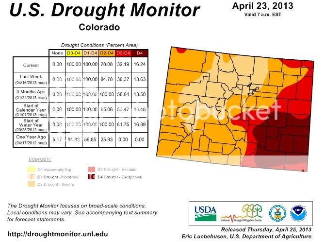
Here are conditions for Colorado:

 photo CO_drought_monitor_20130425_zpsbf9ccb2d.png

Figure 3 – US Drought Monitor map of drought conditions in Colorado as of April 25th.

There is some evidence of relief evident over the past three months here.  Instead of 100% of the state in Severe drought, only 78% is today.  The central & northern mountains, as well as the northern Front Range (Denver north to the border) enjoyed the most relief since February.  The percentage area in Extreme drought also dropped significantly from 59% to 38%.  Exceptional drought shifted in space from northeastern Colorado to central Colorado while southeastern Colorado remained very dry.

Drought conditions improved somewhat across the southwestern portion of the state in the past couple of weeks.  The percentage area that is experiencing less than Severe drought conditions continues to track downward, which is a good sign.  Unfortunately, Exceptional drought conditions continued their hold over the eastern plains.

Here are conditions for the High Plains states:

 photo high_plains_drought_monitor_20130425_zps845616a5.png

Figure 4 – US Drought Monitor map of drought conditions in the High Plains as of April 25th.

The large storms that moved over this area in the past month reduced the worst drought conditions across Nebraska, South Dakota, and Wyoming.  The percentage area with Exceptional drought dropped from 27% to 7%; Extreme drought dropped from 61% to 28%; and Severe drought dropped from 87% to 70%.

With rather significant areas still experiencing moderate or worse drought across much of the US west of the Mississippi River, drought remains a serious concern in 2013.  I previously hypothesized that much of the 2012 drought was partly a result of natural climate variability and underlying long-term warming.  I wrote about NOAA’s examination into the causes of the 2012 drought a couple of weeks ago in which the authors suggested it was not heavily influenced by long-term warming.

US drought conditions are more influenced by Pacific and Atlantic sea surface temperature conditions.  Different natural oscillation phases preferentially condition environments for drought.  Droughts in the West tend to occur during the cool phases of the Interdecadal Pacific Oscillation and the El Niño-Southern Oscillation, for instance.  Beyond that, drought controls remain a significant unknown.  Population growth in the West in the 21st century means scientists and policymakers need to better understand what conditions are likeliest to generate multidecadal droughts, as have occurred in the past.

As drought affects regions differentially, our policy responses vary.  A growing number of water utilities recognize the need for a proactive mindset with respect to drought impacts.  The last thing they want is their reliability to suffer.  Americans are privileged in that clean, fresh water flows when they turn their tap.  Crops continue to show up at their local stores despite terrible conditions in many areas of their own nation (albeit at a higher price, as we will find this year).  Power utilities continue to provide hydroelectric-generated energy.

That last point will change in a warming and drying future.  Regulations that limit the temperature of water discharged by power plants exist.  Generally warmer climate conditions include warmer river and lake water today than what existed 30 years ago.  Warmer water going into a plant either means warmer water out or a longer time spent in the plant, which reduces the amount of energy the plant can produce.  Alternatively, we can continue to generate the same amount of power if we are willing to sacrifice ecosystems which depend on a very narrow range of water temperatures.  As with other facets of climate change, technological innovation can help increase plant efficiency.  I think innovation remains our best hope to minimize the number and magnitude of climate change impacts on human and ecological systems.


2 Comments

4th Daily April Record Low in Denver & Record Snow in Boulder

I spent a lot of time on record temperatures in Colorado in 2012 – they were all record highs.  Due to annual weather variability, there are a couple of different records in April 2013: record lows.  There have been four record lows set or tied in Denver, CO this April:

9F on April 9th

6F on April 10th

22F on April 16th (tie)

21F on April 22nd

Needless to say, with record low temperatures due to vigorous synoptic cyclones that brought Arctic air masses down into the middle of the country, April’s average temperature is among the lowest on record.  I will have more to say about that next week after the month ends.  Denver may not record a bottom-10 moth because much more seasonable weather is on tap for the next week.  In contrast, two record highs were set in April 2012: 84F on the 1st and 88F on the 24th.

In other news, Boulder, CO set a monthly record for snowfall: 47.4″ through the 23rd!  The old record of 44″ was set in 1957.  The official snowfall measurement site for Denver (Denver Int’l Airport) recorded “only” 20.4″ of snow for the month-to-date.  With 60F+ temperatures forecasted from today through next Tuesday, DIA won’t challenge the top-10 snowiest Aprils (#10 recorded 21.0″ of snow).

Remember that one month’s, season’s or year’s temperatures, precipitation, or even drought are not indicative by themselves of climate change.  They are too heavily influenced by individual weather systems.  When I discuss climate change, I write about long-term trends (decadal to multi-decadal).  Natural variability influences individual weather events that overlie the long-term climate signal.  I’ve written before that climate change means we are more likely to see record high temperatures than record low temperatures.  The weather will continue to set both, but will set the former at a higher rate moving forward than the latter.  Of course, I for one am very glad there was more precipitation than normal for April.  Last year’s drought and record hot summer was not enjoyable to live through.  Denver-Boulder and the surrounding region will unfortunately need months in a row of above average precipitation to break the long-term drought.  This spring’s precipitation pattern slightly reduced the intensity and areal coverage of drought.  I will update my last drought post in the next couple of days.


2 Comments

NASA & NOAA: March 2013 9th, 10th Warmest Globally On Record

According to data released by NOAA, March was the 10th warmest globally on record.  Here are the NOAA data and report.  NASA also released their suite of graphics, but their surface temperature data page is down today, so I cannot relay how NASA’s March temperature compares to historical Marches.  Once their site is back up, I will update this post.  [Update: NASA’s analysis resulted in their 9th warmest March on record.  Here are the data for  NASA’s analysis.] The two agencies have slightly different analysis techniques, which in this case resulted in not only different temperature anomaly values but somewhat different rankings as well.  The two techniques provide a check on one another and confidence for us.

The details:

March’s global average temperatures were 0.59°C (1.062°F) above normal (1951-1980), according to NASA, as the following graphic shows.  The past three months have a +0.57°C temperature anomaly.  And the latest 12-month period (Apr 2012 – Mar 2013) had a +0.60°C temperature anomaly.  The time series graph in the lower-right quadrant shows NASA’s 12-month running mean temperature index.  The recent downturn (2010-2012) was largely due to the latest La Niña event (see below for more) that ended early last summer.  Since then, ENSO conditions returned to a neutral state (neither La Niña nor El Niñ0).  Therefore, as previous anomalously cool months fall off the back of the running mean, and barring another La Niña, the 12-month temperature trace should track upward again throughout 2013.

 photo NASA-Temp_Analysis_20130331_zps2e2b340a.gif

Figure 1. Global mean surface temperature anomaly maps and 12-month running mean time series through March 2013 from NASA.

According to NOAA, March’s global average temperatures were 0.58°C (1.044°F) above the 20th century mean of 12.7°C (54.9°F).  NOAA’s global temperature anomaly map for March (duplicated below) shows where conditions were warmer than average during the month.

 photo GlobalTemperatureAnomalyMap201303_zpsf432fd9b.gif

Figure 2. Global temperature anomaly map for March 2013 from NOAA.

The two different analyses’ importance is also shown by the preceding two figures.  Despite small differences in specific global temperature anomalies, both analyses picked up on the same temperature patterns and their relative strength.

The very warm conditions found over Greenland are a concern.  Greenland was warmer than average during more months in recent history than not.  In contrast to 2012, northern Eurasian temperatures were much cooler than normal.  This is likely a temporary, seasonal effect.  Long-term temperatures over much of this region continue to rise at among the fastest rate for any region on Earth.

The NASA and NOAA surface temperature maps correlate well with the 500-mb height pressure anomalies, as seen in this graph:

 photo NOAA500hPaanomalymap201303_zps6d024aed.gif

Figure 3. 500-mb heights (white contours) and anomalies (m; color contours) during March 2013.

Note the correspondence between the height map and the NASA & NOAA surface temperature maps: lower heights (negative height anomalies) present over the North Atlantic and northern Eurasia overlay the cold surface temperature anomalies at the surface.  Similarly, warm surface temperature anomalies are located under the positive 500-mb height anomalies.

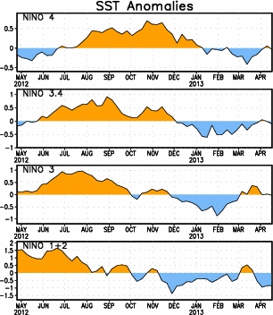
These temperature observations are of interest for the following reason: the globe came out of a moderate La Niña event in the first half of last year.  During the second half of the 2012 and the first part of 2013, we remained in a ENSO-neutral state (neither El Niño nor La Niña):

 photo NinoSSTAnom20130401_zpsf59ac6f7.gif

Figure 4. Time series of weekly SST data from NCEP (NOAA).  The highest interest region for El Niño/La Niña is NINO 3.4 (2nd time series from top).

The last La Niña event hit its highest (most negative) magnitude more than once between November 2011 and February 2012.  Since then, tropical Pacific sea-surface temperatures peaked at +0.8 (y-axis) in September 2012.  You can see the effect on global temperatures that the last La Niña had via this NASA time series.  Both the sea surface temperature and land surface temperature time series decreased from 2010 (when the globe reached record warmth) to 2012.  So a natural, low-frequency climate oscillation affected the globe’s temperatures during the past couple of years.  Underlying that oscillation is the background warming caused by humans.  And yet temperatures were still in the top-10 warmest for a calendar year (2012) and individual months, including March 2013, in recorded history.

Skeptics have pointed out that warming has “stopped” in recent years (by comparing recent temperatures to the 1998 maximum which was heavily influenced by a strong El Niño even), which they hope will introduce confusion to the public on this topic.  What is likely going on is quite different: a global annual energy imbalance exists (less outgoing energy than incoming energy).  If the surface temperature rise has seemingly stalled, the excess energy is going somewhere.  That somewhere is likely the oceans, and specifically the deep ocean (see the figures below).  Before we all cheer about this (since few people want surface temperatures to continue to rise quickly), consider the implications.  If you add heat to a material, it expands.  The ocean is no different; sea-levels are rising in part because of heat added to it in the past.  The heat that has entered in recent years won’t manifest as sea-level rise for some time, but it will happen.  Moreover, when the heated ocean comes back up to the surface, that heat will then be released to the atmosphere, which will raise surface temperatures as well as introduce additional water vapor.  Thus, the short-term warming rate might have slowed down, but we have locked in future warming (higher future warming rate) as well as future climate effects.

 photo Total-Heat-Content.gif

Figure 5. Total global heat content anomaly from 1950-2004. An overwhelming majority of energy went to the global oceans.

 photo Ocean_heat_content_balmaseda_et_al_zps23184297.jpg

Figure 6. New research that shows anomalous ocean heat energy location since the late 1950s.  The purple lines in the graph show how the heat content of the whole ocean has changed over the past five decades. The blue lines represent only the top 700 m and the grey lines are just the top 300 m.  Source: Balmaseda et al., (2013)

Balmaseda et al.’s work demonstrates the transport of anomalous energy through the depth of the global oceans.  Note that the grey lines’ lack of significant change from 2004-2008 (upper 300m).  Observations of surface temperature include the very top part of this 300m layer.  Since the layer hasn’t changed much, neither have surface temperature readings.  Note the rapid increase in heat content within the top 700m.  Given the lack of increase in the top 300m, the 300-700m layer heat content must have increased.  By the same logic, the rapid growth in heat content throughout the depth of the ocean, which did not stall post-2004, provides evidence for anomalous heat location.  You can also see the impact of major volcanic eruptions on ocean heat content: less incoming solar radiation means less absorbed heat.

A significant question for climate scientists is this: are climate models capable of picking up this heat anomaly signal and do they show a similar trend?  If they aren’t, then their projections of surface temperature change is likely to be incorrect since the heat is warming the abyssal ocean and not the land and atmosphere in the 2000s and 2010s.  If they aren’t, climate policy is also impacted.  Instead of warmer surface temperatures (and effects on drought, agriculture, and health to name just a few), anomalous ocean heat content will impact coastal communities more than previously thought.  Consider the implications of that in addition to the AR4’s lack of consideration of land-based ice melt: sea level projections could be too conservative.

That said, it is also a fair question to ask whether today’s climate policies are sufficient for today’s climate.  In many cases, I would say  they aren’t sufficient.  Paying for recovery from seemingly localized severe weather and climate events is and always will be more expensive than paying to increase resilience from those events.  As drought continues to impact US agriculture, as Arctic ice continues to melt to new record lows, as storms come ashore and impacts communities that are not prepared for today’s high-risk events (due mostly to poor zoning and destruction of natural protections), economic costs will accumulate in this and in future decades.  It is up to us how many costs we subject ourselves to.

As President Obama began his second term with climate change “a priority”, he tosses aside the most effective tool available and most recommended by economists: a carbon tax.  Every other policy tool will be less effective than a Pigouvian tax at minimizing the actions that cause future economic harm.  It is up to the citizens of this country, and others, to take the lead on this topic.  We have to demand common sense actions that will actually make a difference.  But be forewarned: even if we take action today, we will still see more warmest La Niña years, more warmest El Niño years, more drought, higher sea levels, increased ocean acidification, more plant stress, and more ecosystem stress.  The biggest difference between efforts in the 1980s and 1990s to scrub sulfur and CFC emissions and future efforts to reduce CO2 emissions is this: the first two yielded an almost immediate result while it will take decades before CO2 emission reductions produce tangible results humans can see.


10 Comments

Recent Carbon Market News – April 2013

I wrote about some carbon market-related items I ran across last month. While I haven’t had time yet to read the RGGI report that Jason Brown linked to (research and family duties leaves very little time for anything else), I have read additional items since that post that I want to collect here for when I do have more time.  Let me state at the outset that I think carbon markets are one piece of a large puzzle.  From what I’ve read to date, I get the impression that most carbon markets are not set up in such a way (yet) that actually addresses what I think they’re supposed to address: a reduction in greenhouse gas emissions, especially CO2.  Part of the reason for this is the way the groups set up and managed markets.  This results from lack of appropriate policy that demands of and allows for organizations to set up and run an efficient market.  To close this introduction, I will observe again that most economists recommend a carbon tax if the true intent of a policy is to reduce emissions.  I was surprised to learn this since I don’t think most economists are bleeding-heart liberals; nor do I think they are part of the vast conspiracy to establish a one-world government that controls every aspect of our lives.  They base their recommendation on fundamental economic principles – a scary thought in today’s reactionary world, I know.

First, some news: “The European Parliament this week voted 334-315 (with 60 abstentions) against a controversial “back-loading” plan that aimed to boost the flagging price of carbon, which since 2008 has fallen from about 31 euros per tonne to about 4 euros (about $5.20). Since the vote, the price has fallen even farther, to 2.80 euros.”

What does “back-loading” mean?  Back-loading would have taken some allowances out of the European market for two years.  Without as many allowances, the price of carbon likely would have increased. How over-allocated is the market?  “The surplus is 1.5 billion-2 billion tonnes, or about a year’s emissions.”  There are varying opinions as to what the appropriate price should be to achieve behavioral change.  Back-loading might have increased the price to ~10 euros (1/3 its original price, which many people think is the minimum necessary).  As I wrote last year, one fundamental problem with the European market was the number of allowances was far too high.  But even if the price was “right”, would carbon markets work?  Probably not right away.  Another problem with them is intense lobbying by fossil fuel entities (to weaken the efficacy of the market; they abandon calls for “free market” support when it comes to carbon taxes/markets) as well as the corruption and non-transparency in the market.

The California cap-and-trade scheme establishes a floor and a ceiling for price, which might alleviate some of the problems the Euro ETS has.  The European scheme, by keeping carbon prices so low, sends the wrong signal.  Thus, power utilities are switching from natural gas to coal, despite the fact that burning coal releases twice as much carbon per unit of energy produced.  In that sense, the US energy market is acting correctly when falling natural gas prices encourage utilities to switch from coal to natural gas.  The European’s situation leads to an interesting dilemma.  They have admonished the US for decades on lack of climate action.  Yet Europe did not achieve the first round of Kyoto Protocol-inspired emissions targets and if they continue the switch from cleaner fuels to dirtier fuels, they will not hit the next round they set for themselves either.

Steffen Böhm’s Guardian article ends with this:

None of these will provide a one-fits-all solution. But we cannot afford to lose another 15 years in our quest to rapidly decarbonise our economies, businesses and societies. Carbon markets have given the appearance of us doing something about climate change, while actually legitimising the constant rise of emissions. We need to go back to the drawing board and come up with solutions that actually work in practice.

One solution could be the implementation of new cap-and-trade schemes in other countries, as this CleanTechnica article discusses.  If other planners examine the European scheme and make efforts to correct as many mistakes as possible, then include mechanisms to trade with other schemes around the world, the Europeans may not abandon their market.  That would also give the Europeans time to see what solutions are implemented around the world and eventually include them in their own program.  The Chinese, as is other energy-climate topics, are very important in this regard, not only because they are currently the largest global emitters.  The Chinese government can put programs in place that are not subject to the same kind of political pressures present in the US or Europe.

The US is also very important for the future of markets, emissions, and concentrations.  The US of course currently does not have a cap-and-trade scheme, thanks to the outsized political influence fossil fuel companies have.  Small schemes exist or are coming on-line however.  The Regional Greenhouse Gas Initiative (RGGI) has been in operation across the Northeast US for six years and has a mechanism to reduce allocations, which was beneficial with the recent coal-to-gas switch.  California’s system came online within the last year.  Given the size of the California economy, if this market is more successful than the European market, we can expect additional good news and participation.  If gruops connect existing these markets, and new ones, the prospect for emissions reductions is better than it looks today.  As Böhm wrote, the time for half-measures is long gone.  The world needs smart, aggressive action to avoid the worst global change effects at the end of the century.  Carbon markets are likely a part of the solution, so long as they’re planned and managed well.


Leave a comment

March 2013 CO2 Concentrations: 397.34 ppm

During March 2013, the Scripps Institution of Oceanography measured an average of 397.34ppm CO2 concentration at their Mauna Loa, Hawai’i’s Observatory.

This value is a big deal.  Why?  Because not only is 397.34 ppm the largest CO2 concentration value for any March in recorded history, it is the largest CO2 concentration value in any month in recorded history.  More on that below.  This year’s March value is 2.89 ppm higher than March 2012′s!  Most month-to-month differences are between 1 and 2 ppm.  This jump of 2.89 ppm is very high, but is ~0.5 ppm less than February’s year-over-year change of 3.37 ppm.  Of course, the unending trend toward higher concentrations with time, no matter the month or specific year-over-year value, as seen in the graphs below, is more significant.

Let’s get back to that all-time high concentration value.  The yearly maximum monthly value normally occurs during May. Last year was no different: the 396.78ppm concentration in May 2012 was the highest value reported last year and, prior to the last two months, in recorded history (neglecting proxy data).  We can expect April and May of this year to produce new record values.  I wrote the following two months ago:

If we extrapolate last year’s maximum value out in time, it will only be 2 years until Scripps reports 400ppm average concentration for a singular month (likely May 2014; I expect May 2013′s value will be ~398ppm).  Note that I previously wrote that this wouldn’t occur until 2015 – this means CO2 concentrations are another climate variable that is increasing faster than experts predicted just a short couple of years ago.

For the most part, I stand by that prediction.  But actual concentration increases might prove  me wrong.  Here is why: the difference in CO2 concentration values between May 2012 and March 2012 was 2.33 ppm (396.78 – 394.45).  If we do the simplest thing and add that same difference to this March’s value, we get 399.67 ppm.  That is awfully close to 400 ppm, but less than the 399.93 ppm extrapolation I performed last month.  I discussed May 2013’s projection with Sourabh after last month’s post.  They predicted 399.5-400 ppm concentration for May 2013.  I think NOAA will measure May 2013’s concentration near 399.3 ppm.  There are other calculations that we could do to come up with a range of predictions, but I unfortunately don’t have the time to do them right now.  I will have content myself with waiting until June to find out how fast concentrations rose through May.

I normally post CO2now.org’s chart of CO2 concentrations since 1958/59 for a given month.  They finally posted last month’s average concentration value yesterday, but have not updated their graph from February 2013 yet.  When they do, I will update this post.

[Update: here is their graphic for March 2013]

 photo co2_widget_brundtland_600_graph_201303_zpsd2636d06.gif

Figure 1 – Time series of CO2 concentrations measured at Scripp’s Mauna Loa Observatory in March from 1958 through 2013.

How do concentration measurements change in calendar years?  The following two graphs demonstrate this.

 photo CO2_concentration_5y_trend_NOAA_201304_zps58ea83d8.png

Figure 2 – Monthly CO2 concentration values from 2009 through 2013 (NOAA).  Note the yearly minimum observation is now in the past and we are two months removed from the yearly maximum value.  NOAA is likely to measure this year’s maximum value near 399ppm.

 photo CO2_concentration_50y_trend_NOAA_201304_zps6f791941.png

Figure 3 – 50 year time series of CO2 concentrations at Mauna Loa Observatory.  The red curve represents the seasonal cycle based on monthly average values.  The black curve represents the data with the seasonal cycle removed to show the long-term trend.  This graph shows the recent and ongoing increase in CO2 concentrations.  Remember that as a greenhouse gas, CO2 increases the radiative forcing of the Earth, which increases the amount of energy in our climate system.

In previous posts on this topic, I showed and discussed historical and projected concentrations at this part of the post.  I will skip this for now because there is something about this data that I think provides a different context of the same conversation.  I saw a graphic last month that I provides useful focus on this topic:

 photo CO2_concentration_annual_growth_rate_NOAA_2012_zps4d9dfbcb.png

Figure 3 – CO2 concentration (top) and annual average growth rate (bottom). Source: Guardian

The top part of Figure 3 should look familiar – it’s the black line in Figure 3.  The bottom part is the annual change in CO2 concentrations.  If we fit a line to the data, the line would have a positive slope, which means annual changes are increasing with time.  So CO2 concentrations are increasing at an increasing rate – not a good trend with respect to minimizing future warming.  In the 1960s, concentrations increased at less than 1 ppm/year.  In the 2000s, concentrations increased at 2.07 ppm/year.  This isn’t surprising – CO2 emissions continue to increase decade after decade.  Natural systems are not equipped to remove CO2 emissions quickly from the atmosphere.  Indeed, natural systems will take tens of thousands of years to remove the CO2 we emitted in the course of a couple short centuries.  Human systems do not yet exist that remove CO2 from any medium (air or water).  They are not likely to exist for some time.  So NOAA will extend the right side of the above graphs for years and decades to come.

The greenhouse effect details how these increasing concentrations will affect future temperatures.  The more GHGs (CO2 and others) are in the atmosphere, all else equal, the more radiative forcing the GHGs cause.  More forcing means warmer temperatures as energy is re-radiated back toward the Earth’s surface.  Conditions higher in the atmosphere affects this relationship, which is what my volcano post addressed.  A number of medium-sized volcanoes injected SO2 into the stratosphere (which is above the troposphere – where we live and our weather occurs) in the last decade.  Those SO2 particles reflected incoming solar radiation.  So while we emitted more GHGs into the troposphere, less radiation entered the troposphere in the past 10 years than the previous 10 years.  With less incoming radiation, the GHGs re-emitted less energy toward the surface of the Earth.  This is likely part of the reason why the global temperature trend leveled off in the 2000s after its relatively rapid run-up in previous decades.

This situation is important for the following reason.  Once the SO2 falls out of the atmosphere, the additional incoming radiation will encounter higher GHG concentrations than was present in the late 1990s.  As a result, we will likely see a stronger surface temperature response sometime in the future than the response of the 1990s.

The rise in CO2 concentrations will slow down, stop, and reverse when we decide it will.  We can choose 350 ppm or 450 ppm or any other target.  That choice is dependent on the type of policies we decide to implement.  It is our current policy to burn fossil fuels because doing so is cheap, albeit inefficient.  We will widely deploy clean sources of energy when they are cheap, which we control.  We will remove CO2 from the atmosphere when we have cheap and effective technologies and mechanisms to do so, which we control.  Today’s carbon markets are not the correct mechanism, as they are aptly demonstrating.  We will limit future warming and downstream climate effects when we choose to do so.


3 Comments

Voting For Lesser of Two Evils Led Directly To Yesterday’s Gun Filibusters

For years I’ve heard fellow Democrats argue that we can’t let the perfect be the enemy of the good, that it’s better to vote for the lesser of two evils, and other inane arguments to convince me to vote for people who have (D) behind their name but are not strong advocates of Democratic values.  “It’s always better to vote for a (D) than an (R),” they say.  Really?  I haven’t thought so for a long time and have voted accordingly come election time.  That means I haven’t voted for “Democrats” than I don’t think will stand up for the issues I think are most important: climate change, privacy, jobs, universal health care, gun safety, etc.

Many pundits are saying today that President Obama was very angry yesterday following the US Senate’s ridiculous failure to pass watered down, gun industry influenced amendments.  Oh, a majority of Senators (50+ out of 100) voted for the legislation, which in sane circumstances would mean the amendments pass.  Not in the US Senate yesterday, where a very small number of fringe Senators stopped honest consideration of any amendments.  That is because of the Senate’s cloture rule, which once invoked requires 60 votes (a supermajority) to break.  Democrats could have changed or removed that rule at the beginning of the current session with only 51 votes.  Unfortunately, Sen. Reid (D-NV) didn’t agree that the majority needed to change or remove the rule.  Instead, he made a deal with Minority Leader Sen. McConnell (R-KY) that cloture would be invoked on legislation and nominees only in “extreme circumstances”.  Since January, Republicans have invoked cloture again and again and again and again.  Apparently, there is a permanent state of “extreme circumstances” in the Senate according to today’s Republicans.  Sen. Reid publicly complains that the rules could be revisited mid-session, but his complaints are ever-moving carrots for the Democratic base, who must enjoy being lied to.  Sen. Reid will not change the cloture rule because he doesn’t want to; it has nothing to do with courage or will.  The sooner the base accepts that, the sooner they’ll vote for Democratic Senators who care more for their constituents than the access to power a Senate position entails.

Observe then that these same Republicans are the people with whom the President wants more desperately than anything to craft a Grand Bargain – be it health insurance in 2009-2010 (note: not health care) or the national debt and social welfare programs (which this “Democratic” President proposed be slashed!) and gun safety legislation now in 2013.  The very same Republicans that so angered the President on his surprising signature issue (gun safety – when did he campaign on that?) have worked since 2009 to stop anything the President wants done.  Yesterday’s public display of anger, which I’m not sure was honest, will not cause the President to evaluate his most desired goal: that Grand Bargain.  The Republicans will not work with the President and the President and his most ardent supporters refuse to acknowledge that basic political reality.

Moreover, the President has only his zealous desire to reach his Grand Bargain to blame for yesterday’s cloture votes.  In the absurd push to enact health insurance legislation in 2009 and 2010, which took months too long precisely because the President wanted that Grand Bargain so badly, health care reform was explicitly removed from consideration a priori to negotiation.  That health care reform was a central plank of the Democratic Party’s most loyal activists, who worked tirelessly in 2008 to get the President and other Democrats elected at all levels across the nation.  There was no mention of a Grand Bargain in the 2008 campaign.  Democrats justifiably felt misled and were extremely disappointed.  Hence, they didn’t vote with similar intensity in 2010 as they did in 2008, which had enormous ramifications.

Governorships and state legislatures flipped from Democratic to Republican.  As a result, the required realignment of political boundaries for the US House and state legislatures following the 2010 census were redrawn in ways that led to more Republicans, many of whom were Teabaggers whose core philosophy is government cannot and should not work, elected in newly safe seats.  That is, people in 2010 made sure that the mix of voters in districts leaned heavily enough Republican that any other candidate would have a very hard time being elected.  Hence today’s Republican-led chamber despite the fact that Democratic candidates nationally received 1,000,000 more votes than Republican candidates.  There simply aren’t enough Democrats and left-leaning unaffiliateds in these districts to challenge what will be Republican dominance.  Remember that when Democrats tell you there are “only 17 seats” they need to flip in 2014 to take back control of the House.  Absent some significant change in the political landscape, Democrats will not take the House back in 2014.  Teabaggers will remain in control of the chamber and a Democratic Senate Majority Leader will not change chamber rules (again) in January 2015, regardless of how many bills Republicans filibuster; regardless of how many judicial and agency nominees Republicans filibuster who are proving that government cannot and will not accomplish anything.

Senators didn’t lack courage yesterday.  They simply do not see any downside to voting  against their constituents’ wishes.  When most Democratic voters “vote for the lesser of two evils” no matter what, they are not holding their elected officials accountable for their actions.  Thus, Republicans will continue to abuse the filibuster.  The President will seek more Grand Bargains.  And we will make very little progress in a time when much progress is needed.  But come November 2014, I will hear once again that I have to vote for the same people who voted against my values, who only want to stay in power, because the alternative is just unthinkable.

Senators who abuse a parliamentary tactic do so for one reason: to remain in power.  Senators are not there to represent anyone or anything except their access to power.  People on the “news” networks are saying Republicans thwarted the will of 90% of the American public yesterday.  The President and the Senate Majority Leader both could have done very different things had they wanted to avoid yesterday’s political result.  They didn’t want to, so they didn’t do things differently.  They did exactly what they wanted to do and stuck the rest of us with the devastating results.  Remember that the next time someone tells you it’s better to vote for the lesser of two evils.  Evil still happens: someone slaughtered 20 innocent children with a tool designed exclusively to kill other humans.  If a plastic toy killed 20 children, we would ban the toy.  The right to own a gun ends at the life of others, especially children.  More than 30,000 people die because of gun violence in the US every year.  Their blood is as much on the hands of “Democrats” who advocate for political cowardice as it is on the shooters; for voting for the lesser of two evils because what other choice have we?  We have choices, but are purposefully misled by people who only want to remain in power, then show public displays of anger.  Finally, minorities can be vocal, but they shouldn’t be able to thwart democratic processes single-handed.

Actually, one more thought.  Does anyone seriously think the NRA won’t target Democratic Senators in their 2014 elections even if those “Democrats” voted against gun safety amendments yesterday?  The same amendments that a majority of constituents in those Democratic Senators states supported?


Leave a comment

Research: Antarctic Summer Melt Highest in 1,000 Years

This graphic says it all:

 photo Antarctic_melt_Nature_20130415_zpsf337d4c7.png

Abram et al.‘s Figure 5| Melt response over the past millennium. a, Schematic of Prince Gustav ice shelf history showing its presence (blue), intervals of rapid retreat (1957 and 1989; yellow) and collapse (1995; red). b,c, JRI mean temperature anomaly (green;b) and melt percentage (red;c) shown as 11-year moving averages. Thick lines are 21-year Gaussian kernel filters; dashed lines denote 1981–2000 mean. Lowest temperatures and melt occurred at AD 1410–1460, followed by progressive warming and a nonlinear melt increase. d, The occurrence of melt layers (grey lines) and a 100-year stepped average of melt frequency (purple) at Siple Dome in West Antarctica.
New research published in Nature Geoscience from Nerilie J. Abram et al. (subs. req’d) presents evidence that West  Antarctic ice melt accelerated over the course of the last 1,000 years.  About 400 years ago, average temperature anomalies (based off the 1981-2000 mean) increased from -1°C to -0.75°C (green curve in above graphic).  You can see the interannual and interdecadal variability in this time period, which was natural.  Then, starting 100 years ago, temperature anomalies rose from -0.75°C to today’s slightly positive anomaly.  As a result, the melt percentage jumped to 5% at James Ross Island.  That melt jump was nonlinear due to the ~0C melt threshold.  As the authors state, “where summer temperatures do exceed the melting threshold, the amount of melt produced is proportional to the sum of the daily positive temperatures rather than their mean.  This means that as average summer temperature increases and positive temperature days become warmer and more frequent, the amount of melt produced will exhibit an exponential increase”.

That cause-and-effect relationship is one reason why a 3°C average temperature rise carries so much more impact than a 2°C average temperature rise in polar regions.  It also explains why small changes in historical temperatures allowed the ice shelves to form in the first place.  The large “permanent” ice shelf collapses in recent history are the effect of rising temperatures.  It should be obvious too that predicting the timing of future ice shelf collapses is difficult if not impossible.
The Wilkins Ice Shelf collapsed suddenly in 2009.  This shelf is located southwest of the James Ross Island site cited above.  As I wrote in the Wilkins post, six other shelves completely collapsed in contemporary times: Prince Gustav Channel, Larsen Inlet, Larsen A, Larsen B, Wordie, Muller and the Jones Ice Shelf.  These ice shelves responded to the West Antarctic Ice Sheet (WAIS) warming observed in the last century or so.  WAIS warming is occurring faster than almost any other location on the globe.  There are areas in the Arctic and now the Antarctic that have observed +2.4°C warming from 1958 through 2009.  In addition to anthropogenic near-surface temperature rise, the ocean surrounding Antarctica has warmed recently.  Ice shelves are therefore being melted from above as well as below.  Does the following sound familiar?  “Over the past 18 years, Martinson and his colleagues have measured the physical properties of the ocean around Antarctica and came to the startling conclusion that the majority of the heat anomalies they have measured have occurred since 1960.  Unfortunately, those anomalies have been growing exponentially ever since.”
Additional coverage of this paper can be found here and here. [h/t Martin Lack for the HuffPo link]
Based on the above, we know that West Antarctica is warming very rapidly.  We know that warming anomalies are growing exponentially.  Problematically, even small temperature changes cause exponential changes in melt.  Exponential change growing off of exponential change creates a highly nonlinear, and therefore very unpredictable system.  What might that mean for the WAIS?  It could mean that rapid effects take place in the future.  In other words, ice sheet properties could change quickly.  Large melt areas could start one day without very little prior signal.  Additional ice sheet collapses could take place without much notice.  Increasing greenhouse gas emissions will cause increasing radiative forcing, which in turn will cause increased heat storage by some climate component (primarily the ocean to date, but also the atmosphere).  Current global energy imbalance guarantees decades’ worth of additional heating.  That heat will eventually impact Antarctica and its massive ice sheet.  Melting of global land-based ice to date increased global sea level by an average of 8 inches in the last 100 years.  If the entire West Antarctic Ice Sheet melted (which would happen sooner than East Antarctica because it rests on bedrock below sea level), sea levels would rise 4.8 meters.  The entire WAIS won’t melt for centuries, but sea levels would easily rise more quickly than the current 3mm/yr as annual WAIS melt increases due to increasing temperatures.
There is no catastrophe knocking on the door today, but WAIS melt will affect coastal regions this century.  Total sea level rise off the east coast of the US exceeded the global average, which has already caused communities to re-examine infrastructure.  Higher levees and other protective structures either have been built or are being considered by cities such as Washington, D.C., Norfolk, and New York City.  Efforts to date haven’t been sufficient (see Hurricane Sandy damage along the New Jersey shore), which points to a need for more aggressive analysis of needs and implementation of new climate-based policies.  Costs to these and other communities will grow as international mitigation efforts stall.


3 Comments

No Significant Climate Change Signal In 2012 US Drought

A team of atmospheric scientists, led by the National Oceanic and Atmospheric Association, issued a report this week that presented initial results of an examination into the extreme 2012 US drought.  Its core finding was the drought likely resulted mostly from natural variability.  Any climate change signal is relatively small but likely made conditions across the Midwest US a little dryer and a little warmer than they otherwise would have been absent climate change.

The 2012 drought did not grow out of the 2010-2011 Southern drought that impacted Texas and Oklahoma, as many, including myself, theorized as the drought developed.  Instead, a stubborn ridge of high pressure took hold over the Plains, which cut off the vital Gulf of Mexico water supply upon which the region depends for agriculture.

This sentence, in the Executive Summary, is key: “The interpretation is of an event resulting largely from internal atmospheric variability having limited long lead predictability.”  Many people think severe weather events should be easy to forecast, but the opposite is true.  The rarer the event, the more difficult it is to accurately forecast with any kind of time difference.  Additionally, the connection to low-frequency climate oscillations (i.e., La Niña: “the 2012 drought occurred in concert with an appreciably warmer ocean in most basins than was the case for any prior historical drought”) were minimal in the 2012 drought, contrary to what I have theorized.  That’s the beauty of science, of course.  You can be incorrect about something and demonstrate as such when data are analyzed.

Recently, some folks have characterized this event as a “flash drought”, owing to the sudden onset of such an event, as the first graphic below shows.  The term obviously borrows from the better known “flash flood” concept.  Unlike a flood however, droughts have longer-term impacts on human and ecosystems.  Costs are still only estimated at this time (because the drought is ongoing) at $12 billion.  While significant, the 1980 drought event that caused 56 billion (2012$) and the 1988 drought that caused 78 billion (2012$) of damages eclipsed the 2012 event (so far).  The $12 billion figure is likely to grow as the drought impacts water supply reductions and livestock.  The 2012 crop yield deficit was the greatest since 1866.

 photo 2012Drought-NOAAReport_zpsde8de4b2.png

Figure 1 – U.S. Drought Monitor maps showing the evolution of the 2012 “flash drought” across the US Great Plains.  Little evidence existed in November 2011 or even May 2012 that the drought would achieve the extent and intensity that it did.

The drought was the worst on record for WY, CO, NE, KS, MO, and IA, as the following graphic shows.  The region experienced a 53% rainfall deficit (39.3mm vs. 73.5mm) in 2012.  1934 held the previous record of -28.4mm deficit.  The 2012 deficit corresponds to a 2.7 standardized deficit, which approaches a 1-in-100 event.  This relates well to the precipitation time series in the graph below.

 photo 2012Drought2-NOAAReport_zpsa23b4e6a.png

Figure 2 – Precipitation and temperature departures from normal for the six states impacted by the 2012 drought.  Note the extreme minimum in precipitation on the right side of the top graph.  2012 temperatures as a whole were not as extreme as those recorded twice during the 1930s, but July 2012 still ranks as the warmest month on record for the six states as well as the entire US.

The analysis also suggests that we should not expect similar 2013 precipitation anomalies on the basis of 2012 anomalies alone (based on the report’s Figures 10 and 11).  Put another way, just because 2012 was drier than normal, 2013 shouldn’t automatically be drier also.  Dry epochs occurred in this region before: in the 1930s and 1950s.  Subsequent dry years occurred then due to longer-term changes in natural variability as well as land use practices.  The currently is no indication that the 2010s will similarly be a dry epoch.  As with the 2012 drought, such a prediction remains beyond current skill.

The diagnosed linkage to low-frequency forcing is interesting.  Warm tropical sea-surface temperatures (SSTs) in the Indo-West Pacific Oceans and cold east Pacific conditions tend to dry the mid-latitudes in the winter/spring season and not the summer season.  As the first graphic demonstrates, the 2012 drought flashed in the summer and not the winter.  So despite primed conditions for drying in winter 2011-12, the Great Plains drought occurred for different reasons.

Of further interest to the future is the following graphs.  The researchers generated a 20-member NCAR CAM-4 ensemble with monthly varying SSTs, sea ice, and specified external radiative forcings consisting of greenhouse gases (e.g. CO2, CH4, NO2, O3, CFCs), aerosols, solar, and volcanic aerosols via observations through 2005 and then an emission scenario thereafter (RCP6.0, a moderate emissions scenario pathway developed for the upcoming IPCC’s AR5).

 photo 2012Drought3-NOAAReport_zpse177772a.png

Figure 3 – Model results of the 1996-2012 precipitation minus the 1979-1995 precipitation.

The NCAR CAM4 model might be representing the actual climate well for this time period.  Left unsaid in the report is any analysis of the model’s future projections.  Other model studies suggest that the central US could experience 2012-type temperature and precipitation conditions more regularly by the end of the 21st century.

 photo 2012Drought4-NOAAReport_zpsdc50c5b9.png

Figure 4 – Model probability density functions of precipitation deficits for the six study states.

This figure suggests that the latter half of the time period (1996-2012) modeled had a higher probability of being drier than did the former half (1979-1995).  The report did not present a potential cause for this shift in probability.  If this probability does not revert back to the 1979-1995 distribution, dry conditions could become a more regular feature of future years.

 photo 2012Drought5-NOAAReport_zps4f4b62c1.png

Figure 5 – Model probability density functions of precipitation surpluses for the six study states.

This figure is not the logical companion to the previous figure.  The probability of being wetter and drier could increase if the overall probability density function existed in a certain way.    This is not the case however.  Instead, the probability of the six states experiencing wetter conditions in the second half of the period studied decreased with respect to the first half.

This report is useful in diagnosing what happened prior to and during the 2012 US drought and in trying to ascertain how predictable such an event might have been.  There is considerable interest in accurately predicting this type of event well in advance so as to prepare those who might be affected.  This capability remains beyond us for now since this event was primarily driven by natural variability enhanced slightly by underlying change.  With climate model projection studies indicating a much warmer and somewhat drier future for this region, stakeholders will likely have to adapt farming and ranching practices.  Similarly, municipalities will have to prepare for extremely dry years in their infrastructure planning and practices.  Of course, future change could be reduced as a result of our efforts to mitigate anthropogenic forcing.  The scale of that endeavor is much larger than most people are aware and thus not likely to take place any time soon.  Climate and energy policies need significant revamping at all levels.


2 Comments

Record Low Temperatures for Denver, CO Today

An arctic air mass plunged down the east side of the Rocky Mountains in the past day.  This air mass will cause record low temperatures for the Denver, CO area.  According to the NWS, the record low maximum temperature for April 9th is 27F, which was set in 1973.  The record low minimum temperature for April 9th is 12F, which was set in 1959.  The temperature at DIA at midnight this morning was 24F.  The maximum temperature during the day today will not be higher than 20F, which means the calendar day’s maximum temperature has likely already been set.  It’s 15F right now, which is quite frigid for April in Denver.

The storm system that brought this cold air to the area was also supposed to bring considerable snow.  Yesterday’s forecast predicted up to 12″.  Because of the chaotic nature of the atmosphere, Denver will not receive 12″ of snow.  The upper level low split into two smaller pieces as it tried to traverse the intermountain west.  This development is not unusual, but numerical models have a hard time handling this behavior due to their limited resolution.  When upper level lows split, the energy associated with the storm also splits.  So instead of 12″ over the Denver area, lower amounts will be spread over a larger area.  The timing of vertical lift and the passage of a series of cold fronts through Denver also affected the beginning of precipitation.  Rain was supposed to fall starting around 6P last night, then switch to snow between 9P and midnight.  Instead, light snow started to fall around 10P.

This storm system is part of a different pattern than what occurred last year.  During early April 2012, record maximum temperatures were set.  Most of the change is due to simple interannual weather and climate variability, including low-frequency climate oscillations like the El Nino-Southern Oscillation and the Interdecadal Pacific Oscillation.  We can attribute part of the change to the underlying warming climate, which impacts those climate oscillations.

Climate change skeptics will likely point to this storm and the record lows that the NWS will record as “proof” that a warming climate is not occurring.  To the contrary, there is a climate-related reason why this storm system is impacting the western US today and bringing record warm temperatures to the eastern US.  The following plot shows today’s jet stream configuration:

 photo upaCNTR_300_20130409_zps969ecb8b.gif

The strength of the jet stream is characterized by the speed of the winds.  As the figure shows, there are very fast winds on the west side of the trough over the western US (red-filled contour where winds are in excess of 125 knots).  There are very slow winds south of Louisiana and east of northern Florida.  I have included an arrow on this figure to highlight the climate-related impact.  As the Arctic warmed more than the equatorial region, the temperature gradient weakened.  Temperature gradients cause pressure and density gradients (Ideal Gas Law).  As the average annual equator-pole temperature gradient weakens, the average pressure gradient similarly weakens.  This reduced pressure gradient causes the west-to-east movement of storm systems to slow down.  The arrow above highlights the amplitude of the current wave traversing North America.  This wave’s amplitude is characterized as high due to its large latitudinal extent (it stretches from Mexico to northern Canada, which is a very large distance).  This high amplitude simultaneously causes cold air to move from the Arctic to more southerly locations, such as Denver, CO, and warm air to move from the sub-tropics to more northerly locations, such as the eastern US.

Absent long-term anthropogenic climate change, this storm system would be much less likely to move slowly and bring record low temperatures to the middle of the US.  Instead, the storm would move quickly across the country.  Denver would receive cooler than average temperatures, but not record cold temperatures.  The cold air would remain further north and impact Canada and the northern US.

To summarize, climate change will not banish record low temperatures.  They will become more rare, however.  Winter will still occur in the mid- and high-latitudes.  But those winters will, on average, become warmer in the future.  Precipitation that would have fallen as snow in the 20th century will be likelier to fall as rain as the 21st century progresses.  More precipitation will likely fall during each event, but there will be longer time periods between precipitation events.  Overall, aridity will increase and flash flooding could become a more common problem for communities.

Thankfully, the NWS predicts temperatures to return to normal by this weekend.  I’m sure happy to receive the precipitation, but I wish it came as rain and left the Arctic air up in the Arctic.


1 Comment

Research: New Land Surface Warming Paper & Post

A quick word and some questions on a SkepticalScience post that discusses yet another warming analysis that comes up with the same answer than other studies have.   The post itself is good if you want a paper summary.  Where I think it needs attention is the “so what” part.  I’ll start with the concluding paragraph because it is what triggered a desire to actually write something about the post instead of walking away from it.

How much more evidence do we need?  The accuracy of the instrumental global surface temperature record is essentially settled science at this point.  The Earth is warming, it’s warming very fast, and continuing to deny this fact is a waste of time.

Many researchers and activists won’t like my answer: we don’t need much more scientific evidence.  Indeed, I would argue that the science largely weighed in years ago and additional information has only provided small-scale refocusing on parts of the issue.  Scientists haven’t discovered anything truly transformative in many years.  Are fields advancing as a result of new observations, methodologies, and expertise.  Yes, but that doesn’t answer Dana’s question.  What climate field advancement will be the one that magically triggers a switch in skeptics’ minds?  What new data set or analysis technique will do the trick?  I argue that no such advancement will ever occur.  Do we really believe that nobody has yet been smart enough to develop the one advancement that unlocks universal understanding of a complex topic?  That’s clearly an absurd assumption, but it seems to permeate this and other similar posts.  The spectrum of people who care about this topic have made up their minds (whether through tribalism or critical thought).  I will not convince any large number of skeptics to accept my argument any more than Hansen, Gore, or McKibben.  And here is where things get raw: strategies that those activists and most others have employed will not convince those people who don’t care about this topic.  As voices get more shrill and combative, more people tune the arguers out.

So if the evidence isn’t the problem, what is?  I believe the problem is the use of climate science as a proxy for a values fight.  Most people are unwilling to identify and fight about their values; it is much easier to throw climate science in the middle of the ring to fight for them.  Skeptics challenge the “facts” because of their beliefs and value system.  Advocates challenge the skeptics because of their beliefs and value system, not because of the “facts”.  Both groups try to bludgeon each other with “facts” and in so doing talk past each other, not to each other.  What concerns do skeptics have regarding climate change; how can advocates listen and address those concerns and vice versa.  Bypassing others’ concerns is the thing that wastes time.  So why do advocates and skeptics do it so much?