
Global polar sea ice area in May 2013 remained at or slightly above climatological normal conditions (1979-2009). This follows early 2013 conditions’ improvement from September 2012′s significant negative deviation from normal conditions (from -2.5 million sq. km. to +500,000 sq. km.). While Antarctic sea ice gain was slightly more than the climatological normal rate following the austral summer, Arctic sea ice loss was slightly more than normal during the same period.
Arctic Sea Ice
According to the NSIDC, sea ice melt during May measured 1.12 million sq. km. This melt rate was slower than normal for the month, but May′s extent remained below average – a condition the ice hasn’t hurdled since this time last year. Instead of measuring near 13.6 million sq. km., May 2013′s average extent was only 13.1 million sq. km., a 500,000 sq. km. difference. In terms of annual maximum values, 2013′s 15.13 million sq. km. was 733,000 lower than normal.
Barents Sea (Atlantic side) ice once again fell from its climatological normal value during the month after remaining low during most of the winter. Kara Sea (Atlantic side) ice temporarily recovered from its wintertime low extent and reached normal conditions earlier this year, but fell back below normal during May. The Bering Sea (Pacific side), which saw ice extent growth due to anomalous northerly winds in 2011-2012, saw similar conditions in December 2012 through March 2013. As it did previously this winter, an extended negative phase of the Arctic Oscillation allowed cold Arctic air to move far southward and brought warmer than normal air to move north over parts of the Arctic. The AO’s tendency toward its negative phase in recent winters relates to the lack of sea ice over the Arctic Ocean in September each fall. Warmer air slows the growth of ice, especially ice thickness. This slow growth allows more melt than normal during the subsequent summer, which helps establish and maintain negative AO phases. This is a destructive annual cycle for Arctic sea ice.
In terms of climatological trends, Arctic sea ice extent in May has decreased by 2.24% per decade. This rate is closest to zero in the late winter/early spring months and furthest from zero in late summer/early fall months. Note that this rate also uses 1979-2000 as the climatological normal. There is no reason to expect this rate to change significantly (much more or less negative) any time soon, but negative rates are likely to slowly become more negative for the foreseeable future. Additional low ice seasons will continue. Some years will see less decline than other years (e.g., 2011) – but the multi-decadal trend is clear: negative. The specific value for any given month during any given year is, of course, influenced by local and temporary weather conditions. But it has become clearer every year that humans have established a new climatological normal in the Arctic with respect to sea ice. This new normal will continue to have far-reaching implications on the weather in the mid-latitudes, where most people live.
Arctic Pictures and Graphs
The following graphic is a satellite representation of Arctic ice as of May 10, 2013:
Figure 1 – UIUC Polar Research Group‘s Northern Hemispheric ice concentration from 20130324.
Here is the similar image from June 13, 2013:

Figure 2 – UIUC Polar Research Group‘s Northern Hemispheric ice concentration from 20130510.
The early season melt is evident in the Sea of Okhotsk, the Bering Sea, the Baffin/Newfoundland Bay area, the Barents Sea, and the Kara Sea. Ice finished forming in these regions at the latest point in the winter. As such, sea ice is the thinnest there and most susceptible to weather and solar heating. Weather and ocean currents are also able to transport this ice around and out of the Arctic, as this animation demonstrates. Currents will continue to transport sea ice out of the Arctic, after which the ice melts at lower latitudes.
The recent lack of sea ice thickness near the North Pole is also troubling. This is a result of weather conditions from late May through early June that were able to easily push thin sea ice around; this has not been seen before this year. As I mentioned in my two previous series posts, we do not yet know what effect early season anomalies such as vast ice cracks or thinning sea ice might have on end-of-season sea ice extent. We are literally charting new history with these events, which means we have more theories than answers.
The following graph of Arctic ice volume from the end of May demonstrates the relative decline in ice health with time:

Figure 3 – PIOMAS Arctic sea ice volume time series through May 2013.
As the graph shows, volume (length*width*height) hit another record minimum in June 2012. Moreover, the volume remained far from normal for the past three years in a clear break from pre-2010 conditions. Conditions between -1 and -2 standard deviations are somewhat rare and conditions outside the -2 standard deviation threshold (see the line below the shaded area on the graph above) are incredibly rare: the chances of 3 of them occurring in 3 subsequent years under normal conditions are extraordinarily low (you have a better chance of winning the Powerball than this). Hence my assessment that “normal” conditions in the Arctic shifted from what they were in the past few centuries; humans are creating a new normal for the Arctic. Note further that the ice volume anomaly returned to near the -1 standard deviation envelope in early 2011, early 2012, and now early 2013. In each of the previous two years, volume fell rapidly outside of the -2 standard deviation area with the return of summer. That provides further evidence that natural conditions are not the likely cause; rather, the more likely cause is human influence.
Arctic Sea Ice Extent
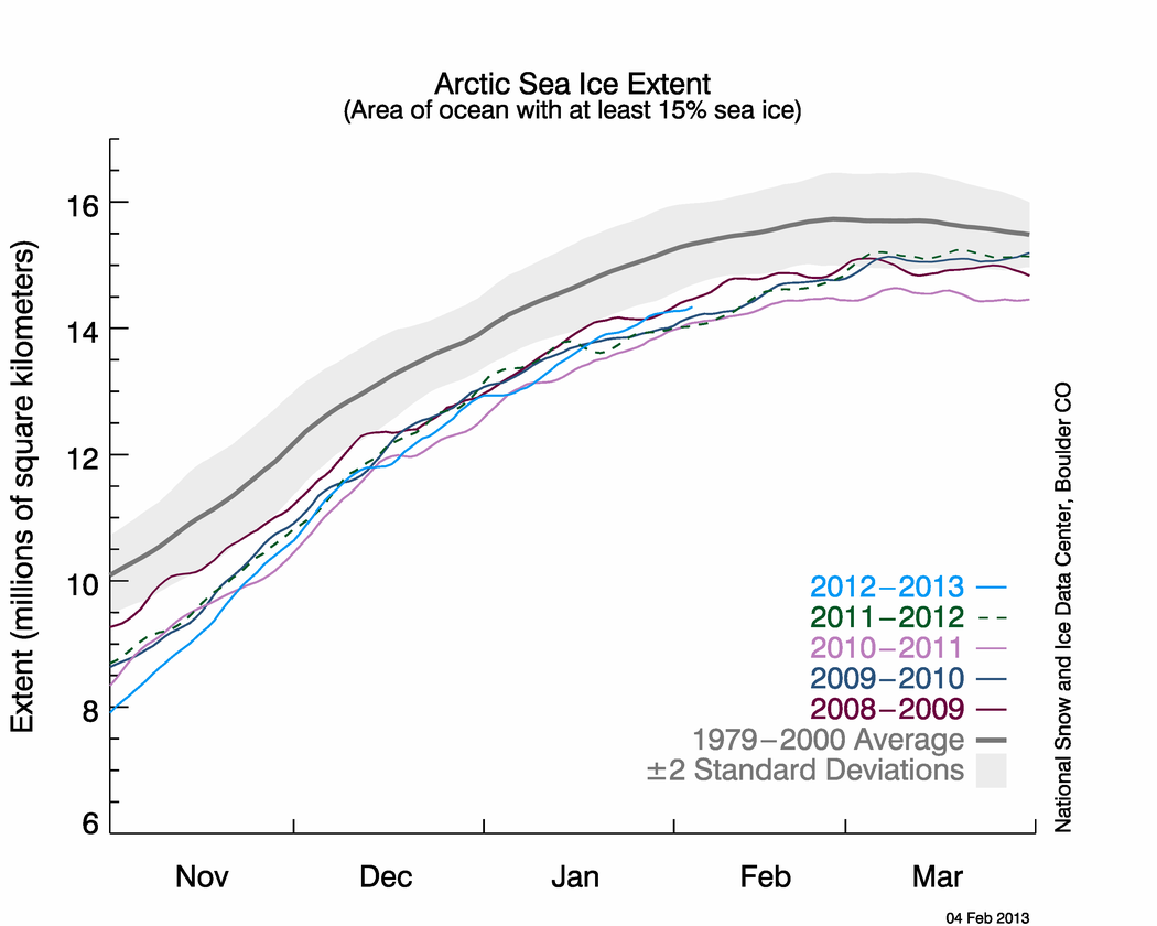
Take a look at May’s areal extent time series data:

Figure 4 – NSIDC Arctic sea ice extent time series through early June 2013 compared with four other low years’ data, climatological norm (dark gray line) and standard deviation envelope (light gray).
As you can see, this year’s extent (light blue curve) remained at historically low levels throughout the winter, well below average values (thick gray curve), just as it did in the previous four winters. Sea ice extent did something different this spring: the late season surge of ice formation seen in the 2009, 2010, and 2012 curves was not as strong this year. This graph also demonstrates that late-season ice formation surges have little effect on ice extent minima recorded in September each year. The primary reason for this is the lack of ice depth due to previous year ice melt. I will pay close attention to this time series throughout June to see if this year’s curve follows 2012’s. Note the sharp decrease in sea ice extent in mid-June 2012. That helped pave the way for last year’s record low September extent, even though weather conditions were not as a factor as they were during the 2007 record low season.
Antarctic Pictures and Graphs
Here is a satellite representation of Antarctic sea ice conditions from May 10, 2013:

Figure 5 – UIUC Polar Research Group‘s Southern Hemispheric ice concentration from 20130510.
And here is the corresponding graphic from June 13, 2013:

Figure 6 – UIUC Polar Research Group‘s Southern Hemispheric ice concentration from 20130613.
Sea ice growth in the past two months is within climatological norms. However, there is more Antarctic sea ice today than there normally is on this calendar date. The reason for this is the presence of early-season extra ice in the Weddell Sea (east of the Antarctic Peninsula that juts up toward South America). This ice existed this past austral (Southern Hemisphere) summer due to an anomalous atmospheric circulation pattern: persistent high pressure west of the Weddell Sea. This pressure system caused winds that pushed the sea ice north and also moved cold Antarctic air over the Sea, which kept ice melt rate well below normal. A similar mechanism helped sea ice form in the Bering Sea last winter. Where did the anomalous winds come from? We can again point to a climatic relationship.
The difference between the noticeable and significant long-term Arctic ice loss and relative lack of Antarctic ice loss is largely and somewhat confusingly due to the ozone depletion that took place over the southern continent in the 20th century. This depletion has caused a colder southern polar stratosphere than it otherwise would be. Why? Because ozone heats the air around it after it absorbs UV radiation and re-radiates it to its environment. Will less ozone, there is less stratospheric heating. This process reinforced the polar vortex over the Antarctic Circle. This is almost exactly the opposite dynamical condition than exists over the Arctic with the negative phase of the Arctic Oscillation. The southern polar vortex has helped keep cold, stormy weather in place over Antarctica that might not otherwise would have occurred to the same extent and intensity. The vortex and associated anomalous high pressure centers kept ice and cold air over places such as the Weddell Sea this year.
As the “ozone hole” continues to recover during this century, the effects of global warming will become more clear in this region, especially if ocean warming continues to melt sea-based Antarctic ice from below (subs. req’d). The strong Antarctic polar vortex will likely weaken back to a more normal state and anomalous high pressure centers that keep ice flowing into the ocean will not form as often. For now, we should perhaps consider the lack of global warming signal due to lack of ozone as relatively fortunate. In the next few decades, we will have more than enough to contend with from Greenland ice sheet melt. Were we to face a melting West Antarctic Ice Sheet at the same time, we would have to allocate many more resources. Of course, in a few decades, we’re likely to face just such a situation.
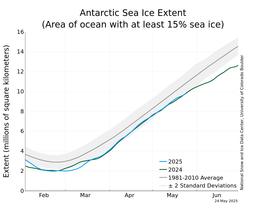
Finally, here is the Antarctic sea ice extent time series through early June:

Figure 7 – NSIDC Antarctic sea ice extent time series through early June 2013.
The 2013 time series continues to track near the top of the +2 standard deviation envelope and above the 2012 time series. Unlike the Arctic, there is no clear trend toward higher or lower sea ice extent conditions in the Antarctic Ocean.
Policy
Given the lack of climate policy development at a national or international level to date, Arctic conditions will likely continue to deteriorate for the foreseeable future. This is especially true when you consider that climate effects today are largely due to greenhouse gas concentrations from 30 year ago. It takes a long time for the additional radiative forcing to make its way through the climate system. The Arctic Ocean will soak up additional energy (heat) from the Sun due to lack of reflective sea ice each summer. Additional energy in the climate system creates cascading and nonlinear effects throughout the system. For instance, excess energy pushes the Arctic Oscillation to a more negative phase, which allows anomalously cold air to pour south over Northern Hemisphere land masses while warm air moves over the Arctic during the winter. This in turn impacts weather patterns throughout the year across the mid-latitudes and prevents rapid ice growth where we want it.
More worrisome for the long-term is the heat that impacts land-based ice. As glaciers and ice sheets melt, sea-level rise occurs. Beyond the increasing rate of sea-level rise due to thermal expansion (excess energy, see above), storms have more water to push onshore as they move along coastlines. We can continue to react to these developments as we’ve mostly done so far and allocate billions of dollars in relief funds because of all the human infrastructure lining our coasts. Or we can be proactive, minimize future global effects, and reduce societal costs. The choice remains ours.
Errata
Here are my State of Polar Sea Ice posts from May and March 2013. For further comparison, here is my State of Polar Sea Ice post from May 2012.


