The White House strategy on the sequester was built around a familiar miscalculation about Republicans. It assumed that, in the end, they would be reasonable and negotiate a realistic alternative to indiscriminate cuts. Because the reductions hurt defense programs long held sacrosanct by Republicans, the White House thought it had leverage that would reduce the damage to the domestic programs favored by Democrats.
Obama chose excellent election staffs throughout his political career.
He did not choose competent political strategists. He himself is not a competent political strategist. His team spent 18 months on health insurance legislation, during which he gave away concession after concession without getting anything of value in return. Why? Because he wanted a Grand Bargain as part of his political legacy. One result of this shortsightedness was the Republican wave election of 2010, when state legislatures and governorships flipped from Democratic to Republican control. The Democratic base didn’t think Obama had done much for them for 2 years, so they didn’t show up to vote. The biggest problem with this: your average Republican wasn’t elected; the far right-wing fringe of the Republican Party was: enter the Teabaggers to the US Congress, governorships, and state legislatures.
Obama’s team made multiple deals on financial items: the debt ceiling (Republicans don’t want to pay for the bills they charged up), the Bush tax cuts (expired after 1 extension), and the 2011 deal to initiate blind spending cuts because the Republican-led House of Representatives can’t execute their Constitutional duty to pass an annual budget on time. Hence the leading NYT paragraph.
Time after time after time, the Teabagging Republicans have refused to negotiate or work with President Obama or Democrats. How many times will it take before Democrats take the Teabaggers at their word: despite the trillions of debt run up by their party in the 2000s, they won’t allow Obama to run up any more debt, regardless of the cost to the US economy or its citizens. Well, it will take at least one more time, apparently.
According to the Drought Monitor, drought conditions are relatively unchanged in the past two weeks. As of Feb. 12, 2013, 55.7% of the contiguous US is experiencing moderate or worse drought (D1-D4). The percentage area experiencing extreme to exceptional drought increased from 19.4% to 17.7% in the last two weeks. Percentage areas experiencing drought across the West stayed mostly the same while snowpack increased. Drought across the Southwest decreased slightly. Meanwhile, storms improved drought conditions in the Southeast.
This post precedes a significant snow event across the High and Great Plains. The NWS expects up to a foot of snow in some areas of the Plains over the next couple of days, which will provide about 1″ of liquid water equivalent. Since these areas currently suffer from a 2-4″ liquid water deficit, this storm will not break the short-term drought. Moreover, long-term drought will only be broken by substantial spring and summer rainfall. After one or two more Drought Monitor updates, we should see some welcome differences in these maps.
Figure 1 – US Drought Monitor map of drought conditions as of the 12th of February.
Figure 2 – US Drought Monitor map of drought conditions in Western US as of the 12th of February. Some small relief is evident in the past week, including some changes in the mountains as storms recently dumped snow across the region. Mountainous areas and river basins will have to wait until spring for snowmelt to significantly alleviate drought conditions.
Figure 3 – US Drought Monitor map of drought conditions in Colorado as of the 12th of February. Drought conditions held mostly steady across the state in the past week. For the first time in over a month, less than 100% of CO is experiencing Severe drought conditions. This improvement occurred over the southwestern portion of the state due to mid-season snow storms. Unfortunately, Exceptional drought conditions expanded over the northeastern plains.
Figure 4 – US Drought Monitor map of drought conditions in Southeast US as of the 12th of February. As mentioned above, drought conditions contracted a little and grew less severe in the past couple of weeks. The worst hit area, in central Georgia, has experienced the longest duration drought conditions on this map.
Cooler than normal sea-surface temperatures (SSTs) are present in the eastern Pacific, according to current MJO and ENSO data. Additionally, eastern Pacific SSTs are cooler than the climatic average due to the current negative phase of the IPO. This in turn is due in part to global warming, which is causing warmer western Pacific and Indian Ocean SSTs than usual. The cool SSTs in the eastern Pacific initiate and reinforce air circulations that generally keep precipitation away from the Southwest and Midwest US. This doesn’t mean that drought will be ever-present; only that we are potentially forcing the climate system toward more frequent drought conditions in these regions. Some years will still be wet or normal; other years (increasing in number) will be dry. This counters skeptics who claim that more CO2 and warmer temperatures are better for plants. If there is no precipitation, plants cannot take advantage of longer growing seasons. Moreover, we will experience years with increased food pressure. These conditions’ extent in the future is up to us and our climate policy (or lack thereof).
While MJO, ENSO, and IPO are all in phases that tend to deflect storm systems from the Southwest, this week’s storm demonstrates that the conditions are not ever-present. Weather variability still occurs with the dryer regime. Put another way, weather is not climate.
The Philadelphia Inquirer wrote a story yesterday about New Jersey Governor Chris Christie’s choices while the NJ coast is rebuilt post-Sandy. As a scientist, I agree with other experts that planners need to incorporate climate change projections in their work. As a scientist transitioning to public policy, I agree with Gov. Christie that the causal link between climate change and Sandy doesn’t matter to victims of the storm in the immediate aftermath. What does matter? Today’s infrastructure is clearly not capable of withstanding today’s weather extremes, as Hurricane Katrina and Superstorm Sandy demonstrated. Both disasters showed it doesn’t matter whether sub-standard infrastructure protects a location (New Orleans) or whether standard or better infrastructure (NY & NJ) does. The first issue is our standards, not the weather. The second issue is mitigation and adaptation to a changing climate.
Of course politics are involved. Gov. Christie’s reelection is this upcoming November. If victims think their needs are unmet or the NJ coast is not open for tourism this summer, his reelection chances will take a hit. This political reality will butt up against physical reality. Sandy occurred in today’s climate. She wasn’t particularly strong at landfall as hurricanes go in the Atlantic basin (nowhere near Hurricane Katrina or other historic storms). A unique set of weather events combined to amplify Sandy’s effects.
The mid-20th century buildup of human infrastructure along the coast with minimal consideration of severe weather effects drove Sandy’s costs. Without buildings abutting the ocean, the storm surge would not have damaged anything but wilderness (which we evidently don’t value). It is foolish to rebuild buildings without consideration of today’s severe weather. It is more foolish to not plan for tomorrow’s climate, but it is Gov. Christie’s prerogative to choose his own vision. What should planners include?
Proper preparation could mean “hardening” infrastructure (moving power lines underground, for example), forbidding construction in flood zones, modifying building codes, and lifting homes off the ground onto pilings. It could mean relocating people to denser developments that are less flood prone or building sea walls on the coast.
If people want to build in flood zones, the rest of us should not bail them out post-disaster. Risky behavior requires appropriate responsibility for engaging in that behavior. Some areas might not be safely inhabitable. It is the government’s responsibility to determine those areas’ locations and issue building permits and assign zones accordingly. In addition to sea walls, planners should include natural barriers to storm surge.
If sea level rises an additional four feet off the NJ coast, what are the implications for NJ infrastructure (i.e., risk and cost)? We build infrastructure to last 100 years, so we should require robust planning and construction. How many citizens are put at risk with each foot of sea level rise? Do New Jersey residents want to invest in the near-term to reduce long-term risk or do they want to confront that long-term risk at some undetermined point in the future? What about the rest of Americans? Our elected officials decided to spend $60 billion on post-Sandy work. Is that the best use of that money? Do we want to spend some of that $60 billion on adaptation measures, and if so how much?
The article includes this (emphasis mine):
Meanwhile, Christie faces pushback from a significant interest group, environmentalists, who want a public planning process to determine the future of the Shore. They want decisions made based on science, not politics.
This is a classic environmentalist complaint. Every decision includes politics. Climate science is largely federally funded. Decision makers are largely politicians. Zoning is political. There is no pure aspect of science that can issue a non-political decision. The appeal to scientific purity is a trait of mainstream environmentalism, but it is just as biased as skeptics’ call for no climate science input into decision-making. Science describes and politics prescribes. The two are naturally different and intertwined in our technically advanced society.
Up and up the value goes. The Scripps Institution of Oceanography measured an average of 395.55ppm CO2 concentration at their Mauna Loa, Hawai’i’s Observatory during January 2013.
395.55ppm is the highest value for January concentrations in recorded history. Last year’s 393.14ppm was the previous highest value ever recorded. This January’s reading is 2.41ppm higher than last year’s. This increase is significant. Of course, more significant is the unending trend toward higher concentrations with time, no matter the month or specific year-over-year value, as seen in the graphs below.
The yearly maximum monthly value normally occurs during May. Last year was no different: the 396.78ppm concentration in May 2012 was the highest value reported last year and in recorded history (neglecting proxy data). Note that January’s value is only 1.23ppm less than May 2012′s. If we extrapolate last year’s maximum value out in time, it will only be 2 years until Scripps reports 400ppm average concentration for a singular month (likely May 2014; I expect May 2013′s value will be ~398ppm). Note that I previously wrote that this wouldn’t occur until 2015 – this means CO2 concentrations are another climate variable that is increasing faster than experts predicted just a short couple of years ago.
Figure 1 – Time series of CO2 concentrations measured at Scripp’s Mauna Loa Observatory in January: from 1959 through 2012.
This time series chart shows concentrations for the month of January in the Scripps dataset going back to 1959. As I wrote above, concentrations are persistently and inexorably moving upward. How do concentration measurements change in calendar years? The following two graphs demonstrate this.
Figure 2 – Monthly CO2 concentration values from 2009 through 2013 (NOAA). Note the yearly minimum observation is now in the past and we are three months removed from the yearly maximum value. NOAA is likely to measure this year’s maximum value at ~398ppm.
Figure 3– 50 year time series of CO2 concentrations at Mauna Loa Observatory. The red curve represents the seasonal cycle. The black curve represents the data with the seasonal cycle removed to show the long-term trend. This graph shows the recent and ongoing increase in CO2 concentrations. Remember that as a greenhouse gas, CO2 increases the radiative forcing toward the Earth, which eventually increases lower tropospheric temperatures.
We could instead take a 10,000 year view of CO2 concentrations from ice cores and compare that to the recent Mauna Loa observations. This allows us to determine how today’s concentrations compare to geologic conditions:
Figure 4 – Historical (10,000 year) CO2 concentrations from ice core proxies (blue and green curves) and direct observations made at Mauna Loa, Hawai’i (red curve) through the early 2000s.
Or we could take a really, really long view into the past:
Figure 5 – Historical record of CO2 concentrations from ice core proxy data, 2008 observed CO2 concentration value, and 2 potential future concentration values resulting from lower and higher emissions scenarios used in the IPCC’s AR4.
Note that this last graph includes values from the past 800,000 years, 2008 observed values (~8-10ppm less than this year’s average value will be) as well as the projected concentrations for 2100 derived from a lower emissions and higher emissions scenarios used by the IPCC’s Fourth Assessment Report from 2007. Has CO2 varied naturally in this time period? Of course it has. But you can easily see that previous variations were between 180 and 280ppm and took thousands of years to move between the two. In contrast, the concentration has, at no time during the past 800,000 years, risen to the level at which it currently exists; nor has the concentration changed so quickly (287ppm to 395ppm in less than two hundred years!). That is important because of the additional radiative forcing that increased CO2 concentrations impart on our climate system. You or I may not detect that warming on any particular day, but we are just starting to feel their long-term impacts.
Moreover, if our current emissions rate continues unabated, it looks like a tripling of average pre-industrial concentrations will be our reality by 2100 (278 *3 = 834). Figure 5 clearly demonstrates how anomalous today’s CO2 concentration values are (much higher than the average, or even the maximum, recorded over the past 800,000 years). It further shows how significant the projected emission pathways are. I will point out that our actual emissions to date are greater than the higher emissions pathway shown above. That means that if we continue to emit CO2 at an increasing rate, end-of-century concentration values would exceed the value shown in Figure 5 (~1100ppm instead of 800). This reality will be partially addressed in the upcoming 5th Assessment Report (AR5), currently scheduled for public release in 2013-14.
Given our historical emissions to date and the likelihood that they will continue to grow at an increasing rate for at least the next 25 years, we will pass a number of “safe” thresholds – for all intents and purposes permanently as far as concerns our species. It is time to start seriously investigating and discussing what kind of world will exist after CO2 concentrations peak at 850 or 1200ppm. No knowledgeable body, including the IPCC, has done this to date. To remain relevant, I think institutions who want a credible seat at the climate science-policy table will have to do so moving forward. The work leading up to AR5 will begin to fill in some of this knowledge gap. I expect most of that work has recently started and will be available to the public around the same time as the AR5 release. This could potentially cause some confusion in the public since the AR5 will tell one storyline while more recent research might tell a different storyline.
The fourth and fifth graphs imply that efforts to pin any future concentration goal to a number like 350ppm or even 450ppm will be incredibly difficult – 350ppm more so than 450ppm, obviously. Beyond an education tool, I don’t see the utility in using 350ppm – we simply will not achieve it, or anything close to it, given our history and likelihood that economic growth goals will trump any effort to address CO2 concentrations in the near future (as President Obama himself stated in 2012). That is not to say that we should abandon hope or efforts to do something. On the contrary, this series informs those who are most interested in action. With a solid basis in the science, we become equipped to discuss policy options. I join those who encourage efforts to tie emissions reductions to economic growth through scientific and technological research and innovation. This path is the only credible one moving forward.
According to the NSIDC, weather conditions once again caused less freezing to occur on the Atlantic side of the Arctic Ocean and more freezing on the Pacific side than normal. Similar conditions occurred during the past six boreal winters. Sea ice creation during January measured 1.36 million sq. km. Despite this rather rapid growth, January′s extent remained well below average for the month. Instead of measuring near 14.84 million sq. km., January 2013′s extent was only 13.78 million sq. km., a 1.06 million sq. km. difference! The Barents Sea recorded lower than average sea ice, which is an unusual condition for January. Kara Sea ice recovered from low extent the past couple of months. The Bering Sea, which saw ice extent growth due to anomalous northerly winds in 2011-2012, saw similar conditions in December 2012 and January 2013. This has caused anomalously high ice extent in the Bering Sea. Previously this winter, a negative phase of the Arctic Oscillation allowed cold Arctic air to move far southward and brought warmer than normal air to move north over parts of the Arctic. The AO has returned to a more neutral phase in the past month, which has kept Arctic air closer to where it normally is this time of year.
In terms of longer, climatological trends, Arctic sea ice extent in January has decreased by 3.2% per decade. This rate is closest to zero in the spring months and furthest from zero in late summer/early fall months. Note that this rate also uses 1979-2000 as the climatological normal. There is no reason to expect this rate to change significantly (more or less negative) any time soon, but increasingly negative rates are likely in the foreseeable future. Additional low ice seasons will continue. Some years will see less decline than other years (e.g., 2011) – but the multi-decadal trend is clear: negative. The specific value for any given month during any given year is, of course, influenced by local and temporary weather conditions. But it has become clearer every year that humans have established a new climatological normal in the Arctic with respect to sea ice. This new normal will continue to have far-reaching implications on the weather in the mid-latitudes, where most people live.
Arctic Pictures and Graphs
The following graphic is a satellite representation of Arctic ice as of January 9, 2013:
The lack of sea ice in the Barents Sea (north of Europe) is problematic because wind and ocean currents typically pile sea ice up on the Atlantic side of the Arctic. Sea ice presence in the Bering Sea (between Alaska and Russia) does not alleviate this problem because currents take ice from that area and transport it into the Arctic. That sea ice will be among the first to melt completely come spring. With sea ice missing on the Atlantic side, currents will more easily transport Arctic sea ice to southern latitudes where it melts.
Overall, the health of the ice pack is not healthy, as the following graph of Arctic ice volume from the end of January demonstrates:
Figure 3 – PIOMAS Arctic sea ice volume time series through January 2013.
As the graph shows, volume (length*width*height) hit another record minimum in June 2012. Moreover, the volume remains far from normal since it just returned to the -2 standard deviation envelope (light gray). I understand that most readers don’t have an excellent handle on statistics, but conditions between -1 and -2 standard deviations are rare and conditions outside the -2 standard deviation threshold (see the line below the shaded area on the graph above) are incredibly rare: the chances of 3 of them occurring in 3 subsequent years under normal conditions are extraordinarily low (you have a better chance of winning the Powerball than this). Hence my assessment that “normal” conditions in the Arctic are shifting from what they were in the past few centuries; a new normal is developing. Note further that the ice volume anomaly returned to near the -1 standard deviation envelope in early 2011, early 2012, and now early 2013. In each of the previous two years, volume fell rapidly outside of the -2 standard deviation area with the return of summer. That means that natural conditions are not the likely cause; rather, another cause is much more likely to be responsible for this behavior: human influence.
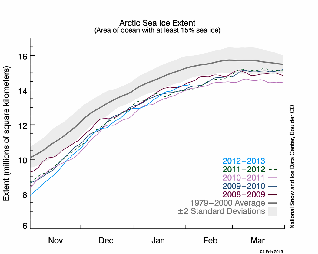
Arctic Sea Ice Extent
Take a look at January’s areal extent time series data:
As you can see, the extent (light blue line) grew rapidly in November but still remained at historically low levels through the winter. The extent remained well below average values (thick gray line) throughout the fall and early winter. The time series of sea ice extent for previous low years is also shown on this graph. In this month’s version, NSIDC also plotted the previous four years’ data. You can see the effect of the wintertime conditions that I described above: the difference between a year’s extent and the average value in January or February is smaller than the difference in October. This leads us to examine the differences between the historical mean, the negative two standard deviation (light gray) below that mean, and the 2012-2013 time series.
Antarctic Pictures and Graphs
Here is a satellite representation of Antarctic sea ice conditions from January 9, 2013:
Ice loss is easily visible around the continent. There is slightly more Antarctic sea ice today than there normally is on this date in the year. The reason for this is the extra ice in the Weddell Sea (east of the Antarctic Peninsula that juts up toward South America). This ice exists this winter due to an anomalous atmospheric circulation pattern: persistent high pressure west of the Weddell sea pushed sea ice north. The same winds that pushed the sea ice north also moved cold Antarctic air over the Sea, which has kept ice melt rate well below normal. A similar mechanism helped sea ice form in the Bering Sea so far this winter.
As a reminder, the difference between long-term Arctic ice loss and relative lack of Antarctic ice loss is largely and somewhat confusingly due to the ozone depletion that took place over the southern continent in the 20th century. This depletion has caused a colder southern polar stratosphere than it otherwise would be, reinforcing the polar vortex over the Antarctic Circle. This is almost exactly the opposite dynamical condition than exists over the Arctic with the negative phase of the Arctic Oscillation. The southern polar vortex has helped keep cold, stormy weather in place over Antarctica that might not otherwise would have occurred to the same extent and intensity. As the “ozone hole” continues to recover during this century, the effects of global warming will become more clear in this region, especially if ocean warming continues to melt sea-based Antarctic ice from below (subs. req’d). For now, we should perhaps consider the lack of global warming signal due to lack of ozone as relatively fortunate. In the next few decades, we will have more than enough to contend with from melting on Greenland. Were we to face melting West Antarctic Ice Sheet at the same time, we would have to allocate many more resources. Of course, in a few decades, we’re likely to face just such a situation.
Finally, here is the Antarctic sea ice extent time series from February 11th:
Given the lack of climate policy development to date, Arctic conditions will likely continue to deteriorate for the foreseeable future. The Arctic Ocean will soak up additional energy from the Sun due to lack of reflective sea ice. Additional energy in the climate system creates cascading effects through the system. The energy pushes the Arctic Oscillation to a negative phase, which allows anomalously cold air to pour south over Northern Hemisphere land masses while warm air moves over the Arctic. This impacts weather patterns throughout the year.
More worrisome for long-term concerns is the heat that impacts land-based ice. As glaciers and ice sheets melt, sea-level rise occurs. Beyond the increasing rate of sea-level rise, storms have more water to push onshore as they move along coastlines. We can continue to react to these developments as we’ve mostly done so far. Or we can be proactive, minimize future global effects, and reduce societal costs. The choice remains ours.
Errata
Here are my State of the Poles posts from January and September.
I want to write about shoddy opining today. I will also write about tribalism and cherry-picking; all are disappointing aspects in today’s climate discussion. In climate circles, a big kerfuffle erupted in the past week that revolves around minutiae and made worse by disinformation. The Research Group of Norway released a press release that somebody’s research showed a climate sensitivity of ~1.9°C (1.2-2.9°C was the range around this midpoint value) due to CO2-doubling, which is lower than other published values.
Important Point #1: The work remains un-peer reviewed. It is part of unpublished PhD work and therefore subject to change.
Important Point #2: Skeptics view some model results as truthful – those that agree with their worldview.
IBD can, of course, opine all it wants about this topic. What obligation to their readers do they have to disclose their biases, however? All the other science results are wrong, except this one with which they agree. What makes the new results so correct when every other result is so absolutely wrong? Nothing, as I show below.
Important Point #3: These preliminary results still show a sensitivity to greenhouse gas emissions, not to the sun or any other factor.
For additional context, you should ask how these results differ from other results. What are IBD and other skeptics crowing about?
Figure 1. Distributions and ranges for climate sensitivity from different lines of evidence. The circle indicates the most likely value. The thin colored bars indicate very likely value (more than 90% probability). The thicker colored bars indicate likely values (more than 66% probability). Dashed lines indicate no robust constraint on an upper bound. The IPCC likely range (2 to 4.5°C) is indicated by the vertical light blue bar. [h/t Skeptical Science]
They’re crowing about a median value of 1.9°C in a range of 1.2-2.9°C. If you look at Figure 1, neither the median nor the range is drastically different from other estimates. The range is a little smaller in magnitude than what the IPCC reported in 2007. Is it surprising that if scientists add 10 more years of observation data to climate models, a sensitivity measurement might shift? The IPCC AR4 dealt with observations through 2000. This latest preliminary report used observations through 2010. What happened in the past 10 years that might shift sensitivity results? Oh, a number of La Niñas, which are global cooling events. Without La Niñas, the 2000s would have been warmer, which would have affected the sensitivity measurement differently. No mention of this breaks into the opinion piece.
Important Point #4: Climate sensitivity and long-term warming are not the same thing.
The only case in which they are the same thing is if we limit our total emissions so that CO2 concentrations are equal to CO2-doubling. That is, if CO2 concentrations peak at 540ppm sometime in the future, the globe will likely warm no more than 1.9°C. Note that analysis’s importance. It brings us to:
Figure 2. Historical emissions (IEA data – black) compared to IPCC AR4 SRES scenario projections (colored lines).
As I’ve discussed before, our historical emissions continue to track at the top of the range considered by the IPCC in the AR4 (between A2 and A1FI). Scientists are working on the AR5 as we speak, but the framework for the upcoming report changed. Instead of emissions, planners built Representative Concentration Pathways (RCPs) for the AR5. A graph that shows these pathways is below. This graph uses emissions to bridge between the AR4 and AR5.
Figure 3. Representative Concentration Pathways used in the upcoming AR5 through the year 2100, displayed using yearly emissions estimates.
The top line (red; RCP8.5) corresponds to the A1FI/A2 SRES scenarios. As Figure 3 shows, our historical emissions most closely match the RCP8.5 pathway. The concentration for this pathway through 2100 is 1370ppm CO2-eq, which results in an anomalous +8.5W/m^2 forcing. This forcing is likely to result in 4 to 6.1°C warming by 2100. A couple of critical points: in this scenario, emissions don’t peak in the 21st century; therefore this scenario projects additional warming in the 2100s. I want to make absolutely clear this point: our business-as-usual concentration pathway blows past CO2-doubling this century, which means the doubling sensitivity is a moot point. We should investigate CO2-quadrupliung. Why? The peak emissions and concentration, which dictates the peak anomalous forcing, which controls the peak warming we face.
The IBD article contains plenty of skeptic-speak: “Predictions of doom have turned out to be nothing more than madness”, “there are too many unknowns, too many variables”, and “nothing ever proposed would have any impact anyway”.
They do have a point with their first quoted statement. I avoid catastrophic language because doom has not befallen the vast majority of people on this planet. Conditions are changing, to be sure, but not drastically. There are too many unknowns. Most of the unknowns scientists worked on the last 10 years ended up with the opposite result that IBD assumes: scientists underestimated feedbacks and results. Events unfolded much more quickly than previously projected. That will continue in the near future due mainly to our lack of knowledge. The third point is a classic: we cannot act because others will not act in concert with us. This flies in the face of a capitalist society’s foundation. Does IBD really believe that US innovation will not increase our competitiveness or reduce inefficiencies? Indeed, Tim Worstall’s Forbes piece posited a significant conclusion: climate change becomes cheaper to solve if the sensitivity is lower than previously estimated. IBD should be cheering for such a result.
Finally, when was the last time you saw the IBD latch onto one financial model and completely discard others? Where was IBD in 2007 when the financial crisis was about to start and a handful of skeptics warned that the mortgage boom was based on flawed models? Were they writing opinion pieces like this one? I don’t think so. Climate change requires serious policy consideration. This opinion piece does nothing to materially advance that goal.
This is the week to publish lots of interesting events and articles apparently. I have a number of things I would love to post about, but only so much time. Here is one that relates directly to something I posted on earlier: warmest La Niña years. Just a few short weeks after NOAA operations wrote that 2012’s La Niña was the warmest on records, NOAA researchers announced they recalculated historical La Niñas because of warming global temperatures. NOAA confirmed something that occurred to me while I was writing that post: eventually, historical El Niños will be cooler than future La Niñas. How then will we compare events across time as the climate evolves? The answer is simple: redefine El Niño and La Niña. Instead of one climate period of record, compare historical ENSO events to their contemporary climate. In other words, “each five-year period in the historical record now has its own 30-year average centered on the first year in the period”: compare 1950-1955 to the 1936-1965 average climate; compare 1956-1960 to the 1941-1970 average. This is different from the previous practice in which NOAA compared 1950-1955 to 1981-2010 and compared 2013 to 1981-2010. The 1950-1955 period existed in a different enough climate that it cannot be equitably compared to the most recent climatological period.
I want to point out something on this graph. Is long-term warming evident in this graph? Yes, there is. But note they plot the breakdown by month. The difference between 1936-1965 and 1981-2010 in October is >1°F. Meanwhile, the same difference in May is ~0.5°F.
Here is the effect of NOAA’s change:
Figure 2. 3-month temperature anomalies in the Nino-3.4 region. (Top) Characterization of ENSO using 1971-2000 data. (Bottom) Same as top, but using 1981-2010 data.
NOAA’s updated methodology resulted in the identification of two new La Niñas: 2005-06 and 2008-09. The reason is warmer temperatures in the most recent decade than the 1970s (it sounds obvious when you say it like that). That warming masked La Niñas with the old methodology. It also means that the 2012 La Niña is no longer the warmest La Niña, as I related from the National Climatic Data Center last month:
That record will now go down as a tie between 2006 and 2009, with 2012 coming in a close third. This situation is analogous to the different methodologies that NOAA and NASA use to compute global temperatures and where they rank individual years. Records might differ because of methodological differences, but the larger picture remains intact: the globe warmed in the 20th and so far in the 21st centuries. That signal is apparent in many datasets. Within the week, I’m sure we’ll hear from GW skeptics that La Niña years have been getting cooler since 2006. Here is what is most important: 2000s La Niñas were warmer than 1990 Niñas, which were warmer than 1980 Niñas, etc.
This is a class paper I wrote this week and thought it might be of interest to readers here. I can provide more information if desired. The point to the paper was to write concisely for a policy audience about a decision support planning method in a subject that interests me. Note that this is only from one journal paper among many that I read every week between class and research. I will let readers know how I did after I get feedback. As always, comments are welcome.
40% of the United States’ total carbon dioxide emissions come from electricity generation. The electric power sector portfolio can shift toward generation technologies that emit less, but their variability poses integration challenges. Variable renewables can displace carbon-based generation and reduce associated carbon emissions. Two Stanford University researchers demonstrated this by developing a generator portfolio planning method to assess California variable renewable energy penetration and carbon emissions (Hart and Jacobson 2011). Other organizations should adopt this approach to determine renewable deployment feasibility in different markets.
The researchers utilized historical and modeled meteorological and load data from 2005 in Monte Carlo system simulations to determine the least-cost generating mix, required reserve capacity, and hourly system-wide carbon emissions. 2050 projected cost functions and load data comprised a future scenario, which assumed a $100 per ton of CO2 carbon cost. They integrated the simulations with a deterministic renewable portfolio planning optimization module in least-cost and least-carbon (produced by minimizing the estimated annual carbon emissions) cases. In simulations, carbon-free generation met 2005 (99.8 ± 0.2%) and 2050 (95.9 ± 0.4%) demand loads in their respective low-carbon portfolios.
System inputs for the 2005 portfolio included hourly forecasted and actual load data, wind speed data generated by the Weather Research and Forecasting model, National Climatic Data Center solar irradiance data, estimated solar thermal generation, hourly calculated state-wide aggregated solar photovoltaic values, hourly temperature and geothermal data, and approximated daily hydroelectric generation and imported generation. They authors calculated 2050 load data using an assumed annual growth rate of 1.12% in peak demand and 0.82% growth in annual generation.
The Monte Carlo simulations addressed the uncertainty estimation of different system states. As an example, the authors presented renewables’ percent generation share and capacity factor standard deviations across all Monte Carlo representations. The portfolio mix (e.g., solar, wind, natural gas, geothermal, and hydroelectric), installed capacities & capacity factors of renewable and conventional energy sources, annual CO2 emissions, expected levelized cost of generation, and electric load constituted this method’s outputs.
A range of results for different goals (i.e., low-cost vs. low-carbon), the capability to run sensitivity studies, and identification of system vulnerabilities comprise this method’s advantages. Conversely, this method’s cons include low model transparency, subjective definition and threshold of risk, and a requirement for modeling and interpretation expertise.
This method demonstrates that renewable technologies can significantly displace carbon-based generation and reduce associated carbon emissions in large-scale energy grids. This capability faces financial, technological, and political impediments however. Absent effective pricing mechanisms, carbon-based generation will remain cheaper than low-carbon sources. The $100 per ton of CO2 assumption made in the study’s 2050 portfolio is important, considering California’s current carbon market limits, its initial credit auction price of $10.09 per metric tonne (Carroll 2012), and its a $50/ton price ceiling. In order to meet the projected 2050 load with renewable sources while reducing emissions, technological innovation deserves prioritization. More efficient and reliable renewable generators will deliver faster investment returns and replace more carbon-based generators. Improved interaction with all stakeholders during the planning phase of this endeavor will likely reduce political opposition.
Hart, E. K., and M. Z. Jacobson. 2011. “A Monte Carlo Approach to Generator Portfolio Planning and Carbon Emissions Assessments of Systems with Large Penetrations of Variable Renewables.” Renewable Energy 36 (8): 2278–2286.
During the month of January 2013, Denver, CO recorded a 78°F difference between maximum and minimum temperatures. Does that tell you anything about whether it was warmer or colder than normal? No, it does not. For the entire month, Denver was 0.4°F below normal (30.3°F vs. 30.7°F). But the maximum temperature of 66°F was recorded on the 24th while the minimum temperature of -12°F was recorded on the 12th.
Figure 1. Time series of temperature at Denver, CO during January 2013. Daily high temperatures are in red, daily low temperatures are in blue, daily average temperatures are in green, climatological normal (1981-2010) high temperatures are in light gray, and normal low temperatures are in dark gray. [Source: NWS]
Precipitation was below normal again during January 2013. 0.31″ of liquid water equivalent precipitation fell during the month, compared to 0.41″ normally. For the first time in my life, rain fell across the Denver metro area in January! Two days after hitting the high for the month, the National Weather Service recorded 0.01″ of rain on the 26th. I haven’t read anything regarding historical rain in Denver in January, but I think such an event is very rare indeed. 4.6″ of snow fell, which was 2.4″ below the normal of 7.0″.
According to the Drought Monitor, drought conditions are relatively unchanged in the past two weeks. As of Jan. 29, 2013, 57.7% of the contiguous US is experiencing moderate or worse drought (D0-D4). The percentage area experiencing extreme to exceptional drought increased from 19.3% to 19.4%. Percentage areas experiencing drought across the West stayed mostly the same at the end of January as they were at in the middle. Drought across the Southwest decreased slightly. Meanwhile, drought across the Southeast grew due to relative lack of precipitation.
Figure 1 – US Drought Monitor map of drought conditions as of the 29th of January.
Figure 2 – US Drought Monitor map of drought conditions in Western US as of the 29th of January. Some small relief is evident in the past week, but note the lack of change of drought conditions across the regions, despite recent snows throughout the mountains. Mountainous areas and river basins will have to wait until spring for snowmelt to help start to alleviate drought conditions.
Figure 3 – US Drought Monitor map of drought conditions in Colorado as of the 29th of January. Drought conditions held steady across the state in the past week. 100% of Colorado experienced Severe or worse drought conditions for the past three weeks.
Figure 4 – US Drought Monitor map of drought conditions in Southeast US as of the 29th of January. As mentioned above, drought conditions expanded and worsened in the past couple of weeks. The worst hit area, in central Georgia, has experienced the longest duration drought conditions on this map. Drought has expanded and contracted around this area during that time.
What is causing this? A combination of factors: the Arctic Oscillation (AO), the Madden-Julian Oscillation (MJO), the El-Nino and Southern Oscillation (ENSO), the Interdecadal Pacific Oscillation (IPO), and background climate warming.
As I discussed in my last drought post:
The lack of sea ice in the Arctic back in September is part of what caused the negative phase of the AO. The Arctic Ocean absorbed solar radiation instead of reflecting it back to space. The ocean then slowly released that heat to the atmosphere before new ice could form. That extra heat in the atmosphere changed how and where the polar jet stream established this winter. Instead of a tight loop near the Arctic Circle, the jet stream has grown in North-South amplitude, allowing cold air to pour to latitudes more southerly than usual and warm air to move over northern latitudes. The large amplitude jet has kept the normal type of storms from moving over locations that used to see them regularly during the winter.
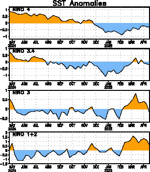
An active MJO is keeping trade winds stronger than they otherwise would be, which piles up warm ocean water in the western tropical Pacific Ocean. This causes cool, deep ocean water to rise in the eastern Pacific, as seen in Figure 5.
Cooler than normal sea-surface temperatures (SSTs) are present in the eastern Pacific due to the current MJO and ENSO data. Additionally, eastern Pacific SSTs are cooler than the climatic average due to the current negative phase of the IPO. This in turn is due in part to global warming, which is causing western Pacific and Indian Ocean SSTs warmer than usual. The cool SSTs in the eastern Pacific initiate and reinforce air circulations that generally keep precipitation away from the Southwest and Midwest US. This doesn’t mean that drought will be ever-present; only that we are potentially forcing the climate system toward more frequent drought conditions in these regions. Some years will still be wet or normal; other years (increasing in number) will be dry. This is a counter to skeptics who claim that more CO2 and warmer temperatures are necessarily better for plants. If there is no precipitation, plants cannot take advantage of longer growing seasons. Moreover, we will experience years with food pressure. These conditions’ extent in the future is up to us and our climate policy (or lack thereof).


