I try not to pay too much attention to people whose view of reality is in stark contrast to obvious facts – Mike Rosen is one of those people. His columns for the Denver Post are usually so absurd, I read them instead of the comics.
Today’s column crosses a line, however. This is the linchpin of his argument today [emphasis mine]:
Another covetous complainer, disparaging “absurdly ridiculous” sports salaries, argued that Manning’s salary could, instead, have gone to pay for school buses, textbooks, free lunches, teachers’ pay and other societal needs. In fact, the degree of our compassion and commitment to governmental largess on such items is already measured by $15 trillion of federal debt and more than $100 trillion in unfunded government liabilities.
As usual, extremists like Rosen over-reach to “make their case”. Rosen wants readers to believe in his fantasy that the $15 trillion of federal debt is 100%, completely due to governmental largess and compassion (Rosen invokes disdain of the mythological welfare queens here).
Really?
Isn’t it interesting that St. Ronnie, the patron saint of modern Teabaggerism, was responsible for $3 trillion of federal debt. Not only that, but St. Ronnie charged up that debt in 8 short years, tripling the debt of the previous 200 years. How much compassion and commitment to governmental largess did St. Ronnie have again, Mr. Rosen?
Furthermore, Bushes Sr. and Jr. threw their weight into the federal debt explosion that Teabaggers like Rosen want to pile onto the shoulders of Democrats. Did Rosen ever write a column taking Bush Jr. to task for invading and occupying two sovereign nations without making sure the budget accommodated such activitie? No, he did not.n You see, it’s alright for Teabaggers to rack up $13+ trillion of federal debt. It’s not alright for a Democrat to rack up $1-2 trillion of federal debt (Clinton was actually paying the debt down in the late 1990s).
Would it be nice to fund schools, textbooks and teachers (not administrators!) to the same tune of Manning’s recent contract? Sure, it would. It would have been even nicer if more Denver voters had felt the same way when they agreed to build Pat Bowlen (a 1%er) a new stadium for him with our hard-earned tax dollars. Denver schools would have seen increased funding and Mr. Bowlen would have faced the choice of extorting another city’s taxpayers or staying in Denver and spending some of his riches to keep his stadium up to date.
Denver voters’ commitment to corporate largess is what we need to discuss. But Rosen would much rather keep convincing readers that the 1%ers are the victims in our society. Boo-hoo!
This comment by Rosen is simply disgusting to read:
There are only a handful of people on this planet who can do what Peyton Manning does on a football field. There are many millions of people in this country who can do what teachers do in a classroom. That’s not to demean teachers, just to recognize an economic reality in a free society.
It’s fascinating to read honest statements from extremists like Rosen. There are many millions of people who can do teachers’ jobs. That’s exactly what Rosen believes and he sees nothing morally wrong with insulting them. The difficulty of a job isn’t what we should discuss here either. What should we discuss? The value we place on a teacher vs. a quarterback. Rosen puts zero value in a teacher and millions of dollars’ worth of value in a quarterback. In his fantasy world, teachers are not needed and quarterbacks deserve the largesse they receive. Because entertainment is far more important than education!
The records really rolled in last week throughout the eastern US. Daily temperature records are normally broken by a degree or two at stations that have existed for 100 years or so. What made last week special? Daily record temperature maxima were broken by 20, 30, even 40 degrees F – at stations that have existed for a long time! These types of events simply do not happen given the length of temperature data already in the books. The geographical extent, magnitude of anomalous warmth and temporal occurrence was simply stunning from a scientific viewpoint.
Put simply, it is extremely unlikely that this event could have happened without the base climate warming beforehand. As the globe continues to warm, these type of events will unfortunately become a little more common. As I and others have explained before, the greatest effects of global warming won’t necessarily be felt first by those who live closer to the Equator. Instead, it is the higher latitudes that will warm more quickly – which will have the effect of extending the yearly warm season to earlier and later dates in a calendar year. So winters and higher latitudes will be affected first – just as we’ve seen to date.
To end on a somewhat foreboding note, keep in mind that this warming is the physical response to greenhouse gas emissions of ~30 years ago. We won’t see the results of the additional emissions throughout those 30 years for another generation. The need for decisive action on mitigation and adaptation grows daily.
Yes, yes environmentalists did cheer the demise of the Keystone XL pipeline. By stopping a Republican amendment earlier this year, the decision on whether to build the pipeline from Canada through the central US was left in President Obama’s hands, which was “rejected“.
I would put more stock into those complaints if those environmentalists hadn’t spent so much time and energy earlier this year trying to convince me that Obama’s “decision” was really and truly final and Keystone wouldn’t get built. I argued then, and was proven correct today, that Obama’s “decision” really was a delay – it was enough action to get the topic out of the headlines in an election year when he can’t afford to piss off elements of his base too much.
The pipeline was always going to be and in fact will be built in the US. The part that people should be paying attention to is this: the fossil fuels the pipeline delivers will not be sold in the US – it will be sold overseas because it can fetch a higher price that way. In return, the “environmentally conscious” President who “cares about the economy” will gladly oversee an increase in deliverable fossil fuels to a largely unregulated, subsidized marketplace which will result in higher fuel prices for every American. Those fossil fuels will be burned faster than they otherwise would have been and the resultant global warming forcing will be left to future generations to deal with.
But please vote for President Obama in November because who knows what would have happened to the Keystone pipeline if a Republican was in office – it might have gotten built or something horrible like that! It will be better to get just a little tiny bit of what you want instead of more of what you want if you stop voting for politicians who take your interests for granted.
Yes, yes environmentalists did cheer the demise of the Keystone XL pipeline. By stopping a Republican amendment earlier this year, the decision on whether to build the pipeline from Canada through the central US was left in President Obama’s hands, which was “rejected“.
I would put more stock into those complaints if those environmentalists hadn’t spent so much time and energy earlier this year trying to convince me that Obama’s “decision” was really and truly final and Keystone wouldn’t get built. I argued then, and was proven correct today, that Obama’s “decision” was indeed a delay – it was enough action to get the topic out of the headlines in an election year when he can’t afford to piss off elements of his base too much.
The pipeline was always going to be and in fact will be built in the US. The part that people should be paying attention to is this: the fossil fuels the pipeline delivers will not be sold in the US – it will be sold overseas because it can fetch a higher price that way. In return, the “environmentally conscious” President who “cares about the economy” will gladly oversee an increase in deliverable fossil fuels to a largely unregulated, subsidized marketplace which will result in higher fuel prices for every American. Those fossil fuels will be burned faster than they otherwise would have been and the resultant global warming forcing will be left to future generations to deal with.
But please vote for President Obama in November because who knows what would have happened to the Keystone pipeline if a Republican was in office – it might have gotten built or something horrible like that! It will be better to get just a little tiny bit of what you want instead of more of what you want if you stop voting for politicians who take your interests for granted.
The Scripps Institution of Oceanography measured an average of 393.65ppm CO2 concentration at their Mauna Loa, Hawai’i’s Observatory during February 2012. These readings are from the Scripps’ dataset, not NOAA’s, which was my original data source when this series began.
393.65ppm is the highest value for February concentrations in recorded history. Last year’s 391.76 was the previous highest value ever recorded. This February’s reading is 1.89ppm higher than last year’s. As I’ve written before, this increase is significant. Of course, more significant is the unending trend toward higher concentrations with time, no matter the month or specific year-over-year value.
The yearly maximum monthly value normally occurs during May. Last year was no different: the 394.34 concentration is the highest value reported both last year and all time. If we extrapolate last year’s value out in time, it will only be 3 years until Scripp’s reports 400ppm average concentration for a singular month (likely May 2015).
Judging by the year-over-year increases seen per month in the past 10 years, I predict 2012 will not see a monthly concentration below 390ppm. I had earlier predicted that 2011′s minimum would be ~388ppm. I overestimated the minimum somewhat since both September’s and October’s measured concentrations were just under 389ppm. One month into 2012 and so far I’m spot on.
CO2Now has the following graph on their front page:
It shows concentrations in the Scripps dataset going back to 1958. As I wrote above, concentrations are persistently and inexorably moving upward.
Given our historical emissions to date and the likelihood that they will continue to grow at an increasing rate in the next 25 years, we will pass a number of “safe” thresholds – for all intents and purposes permanently as far as concerns our species. It is time to start seriously investigating and discussing what kind of world will exist after CO2 concentrations peak at 850 and 1100ppm. I don’t believe the IPCC has done this to date. To remain relevant, I think it will have to do so moving forward.
Additionally, efforts to pin any future concentration goal to a number like 350ppm or even 450ppm will be insanely difficult: 350ppm more so than 450ppm. Beyond an education tool, I don’t see the utility in using 350ppm – we simply will not achieve it, or anything close to it, given our history and likelihood that economic growth goals will trump any effort to address CO2 concentrations.
A couple of articles about solar power caught my eye this week. To be very clear from the outset, I am a huge proponent of solar power via all the myriad technologies out there today as well as those under development. I have a solar PV system on my house that generates more electricity than my family consumes on a monthly and yearly basis (by a decent margin). Keep these facts in mind as you read my comments on the pieces I found.
The first article dealt with solar installations just in the state of Colorado, which “jumped in 2011”. CO installed 91 megawatts (MW) in 2011. Nationwide, according to the author, solar installations more than doubled to 1,885 MW or ~1.9GW – a not insubstantial number in and of itself. California installed 542 MW, New Jersey 313 MW, Arizona 273 MW, and New Mexico 116 MW. Additionally, the weighted average cost of installed systems dropped 20% – also a piece of good news.
While reading up on something unrelated, I came across a graphic from a post at CleanTechnica which was touting U.S. solar installations. As you can see below, they point out that 17 nuclear power plants worth of solar peak power shipped in 2010.
I’m not sure what size power plants they use for comparison, but for now I’ll assume that it was the same size that I used for a class analysis last semester – 0.75GW. Note further the key adjective: “peak power”. That is the power that the solar systems can deliver on a clear day when the sun is as perpendicular to the arrays as is possible. That value lasts for only a short period out of any day with current technologies. This isn’t a criticism – my system had a peak power rating too but I know I can’t expect that power to be generated throughout the day and certainly none will be generated at night.
Okay, with those caveats out of the way, here is my take on all this information: those national numbers aren’t nearly enough to address our CO2 emissions. From the same analysis I referenced above, I calculated that the U.S. needs a minimum of 25 0.75GW nuclear power plants installed per year to meet our stated 2020 GHG reduction goal of 20% of 2005 emissions. That’s well more than the solar PV-equivalent that was installed in 2010. If we instead want to hit our stated 80% GHG reduction goal by 2050, we need a minimum of 111 0.75GW nuclear power plants (or their equivalent) installed per year through 2050. Those numbers include a very conservative increase of 0.32% energy demand per year through the same time frames.
The solar industry has made great strides in the U.S. – but I am convinced it is nowhere close to enough to address the magnitude of global warming that is likely to occur. These numbers are good news, but we need a whole lot more great news. Which means we need some serious policy work done to ensure that great news is reported someday soon.
The state of global polar sea ice area in early January 2012 has convincingly returned to climatologically normal conditions (1979-2009). Arctic sea ice has recovered very quickly after a late start to the freeze season and a late-season slowdown due to certain atmospheric and oceanographic conditions; Antarctic sea ice has melted only slightly more slowly than is normal during the austral summer. Put another way, polar sea ice has recovered from an extensive deficit of -2 million sq. km. area a couple of months ago to zero anomaly today. That said, sea ice area spent an unprecedented length of time near the -2 million sq. km. deficit in the modern era. Generally poor environmental conditions established and maintained this condition, predominantly across the Arctic this year.
Arctic Ice
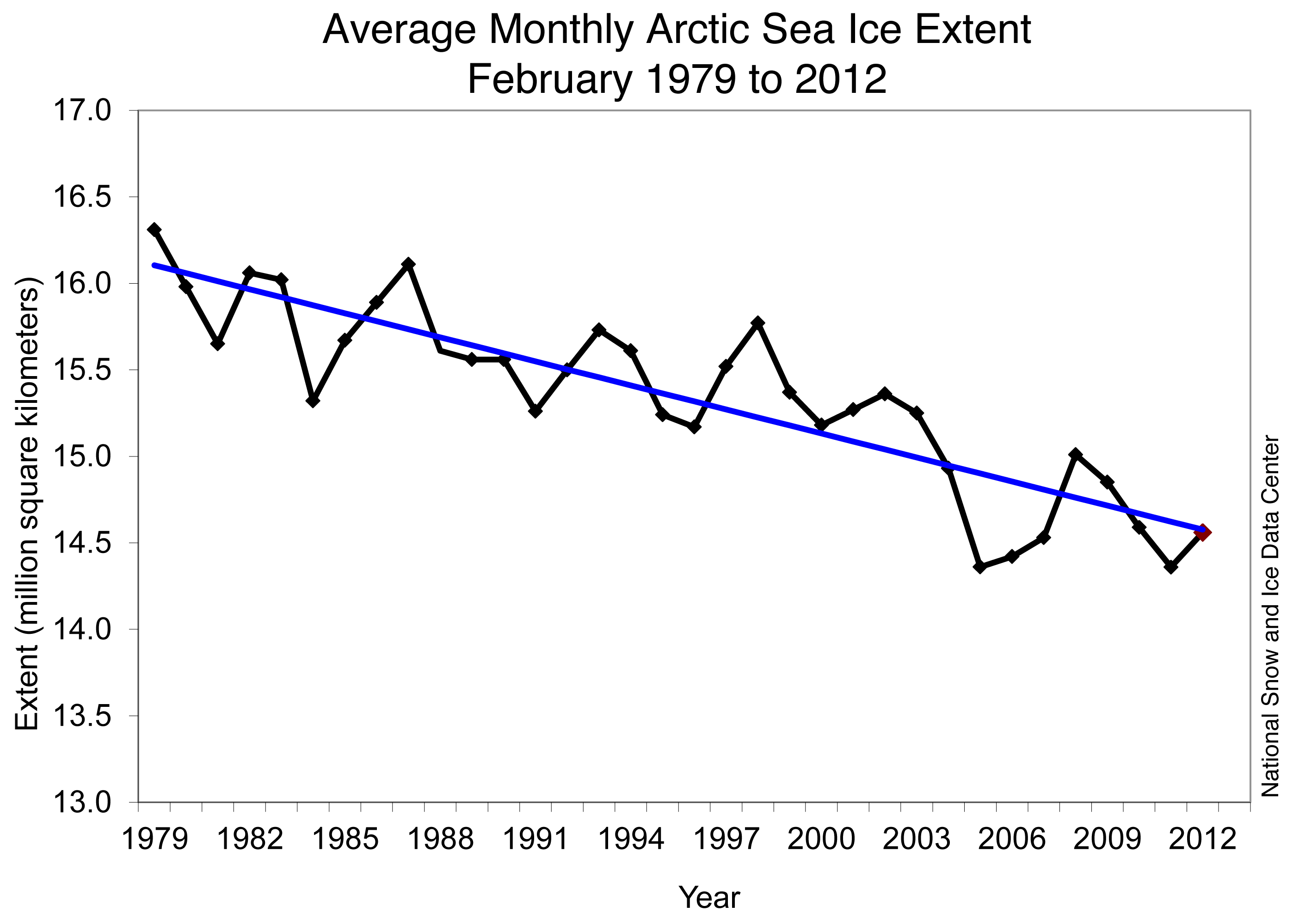
According to the NSIDC, weather conditions this winter were slightly less conducive for Arctic sea ice freezing on the Atlantic side of the Arctic while conditions were more conducive for freezing on the Pacific side. As such, February′s extent was the 5th lowest on record. Additionally, Arctic sea ice extent on in February averaged just 14.56 million sq. km. Sea ice extent was well below average in the Barents Sea due to temperatures that were 7-14°F above normal! The Bering and Baffin Seas meanwhile saw ice extent and ice growth, respectively, above normal during the month.
During February, Arctic sea ice refroze more rapidly than is the case for most Februaries. February’s sea ice extent increased by 956,000 sq. km., almost 2X the normal rate – largely due to previously low ice extent conditions in the Baffin Sea. Specific conditions around the Arctic Ocean were highly influenced by the positive phase of the North Atlantic Oscillation.
In terms of longer, climatological trends, Arctic sea ice extent in February has decreased by -3% per decade. This rate is lowest in the winter months than the late summer months. Note that this rate also uses 1979-2000 as the climatological normal. There is no reason to expect this rate to change significantly (more or less negative) any time soon. Additional low ice seasons will continue. Some years will see less decline than other years – but the multi-decadal trend is clear: negative. The specific value for any given month during any given year is, of course, influenced by local and temporary weather conditions. But it has become clearer every year that a new normal is being established in the Arctic with respect to sea ice. This new normal will continue to have far-reaching implications on the weather in the mid-latitudes, where most people live.
Arctic Pictures and Graphs
The following graphic is a satellite representation of Arctic ice as of January 7, 2012:
Once Hudson Bay finally froze over around the time of the New Year, ice extent grew toward the Atlantic Ocean. The sea ice in the Bering Sea, as mentioned above, formed more quickly than is normal. What is largely still missing is the sea ice north of Scandinavia. This is the result of anomalously warm waters from the Gulf Stream being drawn further north than is normal. This is due to the positive AO & NAO indices during this winter. As a side note, this phenomenon combined with the moderate La Nina in the Pacific Ocean has led to Dec-Mar being a warm and dry month for most of the U.S. so far
Overall, the health of the remaining ice pack is not healthy, as the following graph of Arctic ice volume from the end of February demonstrates:
As the graph shows, volume hit a record minimum earlier in 2011 before returning to the -2 standard deviation envelope. I know most folks don’t have a very good handle on statistics, but conditions between -1 and -2 standard deviations are rare and conditions outside the -2 standard deviation threshold (see the line below the shaded area on the graph above) are incredibly rare: the chances of 2 of them occurring in 2 subsequent years under normal conditions are very, very remote. Hence my assessment that “normal” conditions in the Arctic are shifting from what they were in the past few centuries.
Switching back from volume to area, take a look at February’s areal extent time series data:
As you can see, the sea ice extent has spent all of the fall and early winter well outside of the -2 standard deviation envelope, just as it has for 5 winters in a row. It cannot be stated otherwise: these conditions are not indicative of a healthy system. This winter brought something new that the past few winters did not, however a return of ice extent to within the -2 standard deviation envelope. The reason for this is a shift in wind conditions: speed and direction both changed from early winter through this last month. Those winds pushed sea ice apart instead of piling it up. The advantage: ice extent increased, as seen in Figure 4. The disadvantage: ice volume stopped growing, as seen in Figure 3. The effect on this September’s minimum extent will indicate how helpful the early season winds were in building sea ice that doesn’t melt every year back up.
Occasionally, I also like to include a supplemental time series graph that the NSIDC report contains. Here is this month’s supplemental graph:
This graph contains all of the same data as the previous graph and adds time series from 4 of the previous 5 winters. As you can see, extent varies during the same month from year to year. The recent surge in extent, caused by a change in wind direction and speed, has brought Arctic ice extent up to ~15 million sq. km., which is challenging the highest extent in the most recent 6 winters. The maximum 2007 and 2011 ice extent didn’t come close to 15 million sq. km. while 2010 achieved approximately the same value almost a full month later. Despite these differences in subsequent years, the minimum ice extent values were quite similar: at or near the record low set in 2007. Will fall 2012 be any different?
Antarctic Pictures and Graphs
Here is a satellite representation of Antarctic sea ice conditions from January 7th:
Ice loss is less easily visible around the continent in these two images than they were between previous months. High ice concentrations remain well into the austral summer (nearly fall) east of the Antarctic Peninsula (the land mass that “points” to South America). Conditions of Antarctic sea ice remain good this year. As a reminder, this is largely and somewhat confusingly due to the ozone depletion that took place over the southern continent. This depletion has caused the southern polar stratosphere to be colder than it otherwise would be, reinforcing the polar vortex over the Antarctic Circle. That vortex has helped keep cold, stormy weather in place over Antarctica that might not otherwise would have occurred to the same extent and intensity. As the “ozone hole” continues to recover during this century, the effects of global warming will become more clear in this region. For now, we should perhaps consider the relative fortune the lack of ozone has produced.
Here is the Antarctic sea ice extent time series from February:
Melt rates have been at or near normal throughout the austral summer this year. Year-to-year variation is also present in this graph, which includes the previous winter’s extent as a comparison. At this point, no news is good news. The Arctic is providing more than enough excitement for the time being.
Errata
Here are my State of the Poles posts from January and December.
The Obama administration says they have the Constitutional authority to kill American citizens overseas if they think those Americans are in the process of planning attacks on American soil. No courts; no due process. And most Democrats don’t bat an eye in response – which is troubling news for our “democracy”. An obvious question: Would those same Democrats have voiced their displeasure if President Bush said the exact same thing? Absolutely they would have been. But see – it’s okay since Obama is a Democrat. What Obama says goes. Even though those same Democrats spent years insulting Republicans by calling them mindless drones for accepting whatever Bush said just because.
For too many in this country, Party if more important than Principle.


